PHOTOGRAPHY: PAUL GRDINA
STYLING: SARAH GALLOP
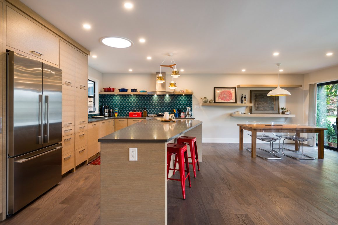
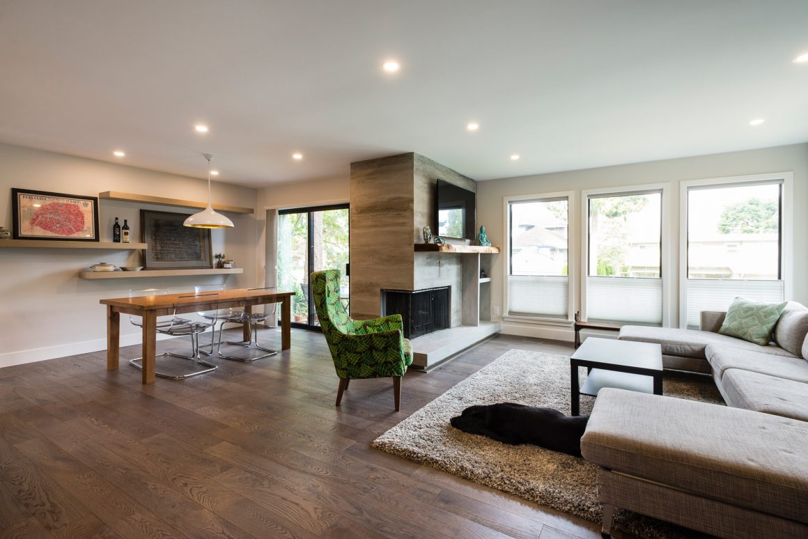
A magical thing has happened since Sharon and Allan Gauld had their Pebble Hill home renovated. Instead of being separated in individual rooms, family members now congregate in the newly opened ground-floor space.
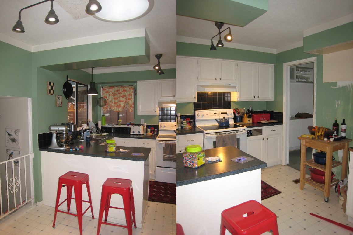
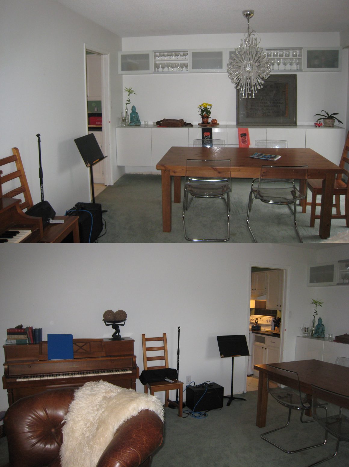
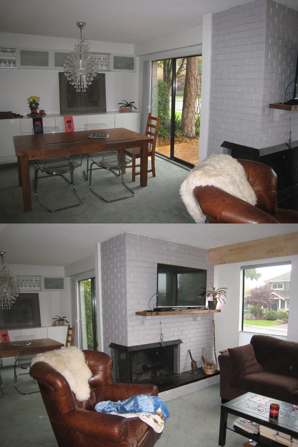
The house, a back-split built in 1974, was divided into enclosed rooms, as was typical in homes of that vintage. The kitchen, for instance, was cramped; while it would accommodate the cook comfortably, there was little space in which the rest of the family or guests could hang out.
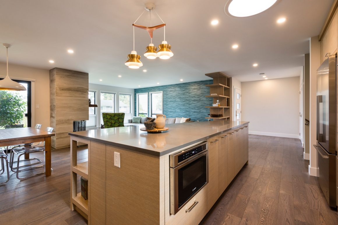
Enter interior designers Sarah Gallop and Stephanie Malhas of Sarah Gallop Design Inc., whose redesign of the space transformed it from a warren of kitchen, dining area and living room to a single open-concept great room. Best Builders did the renovation work.
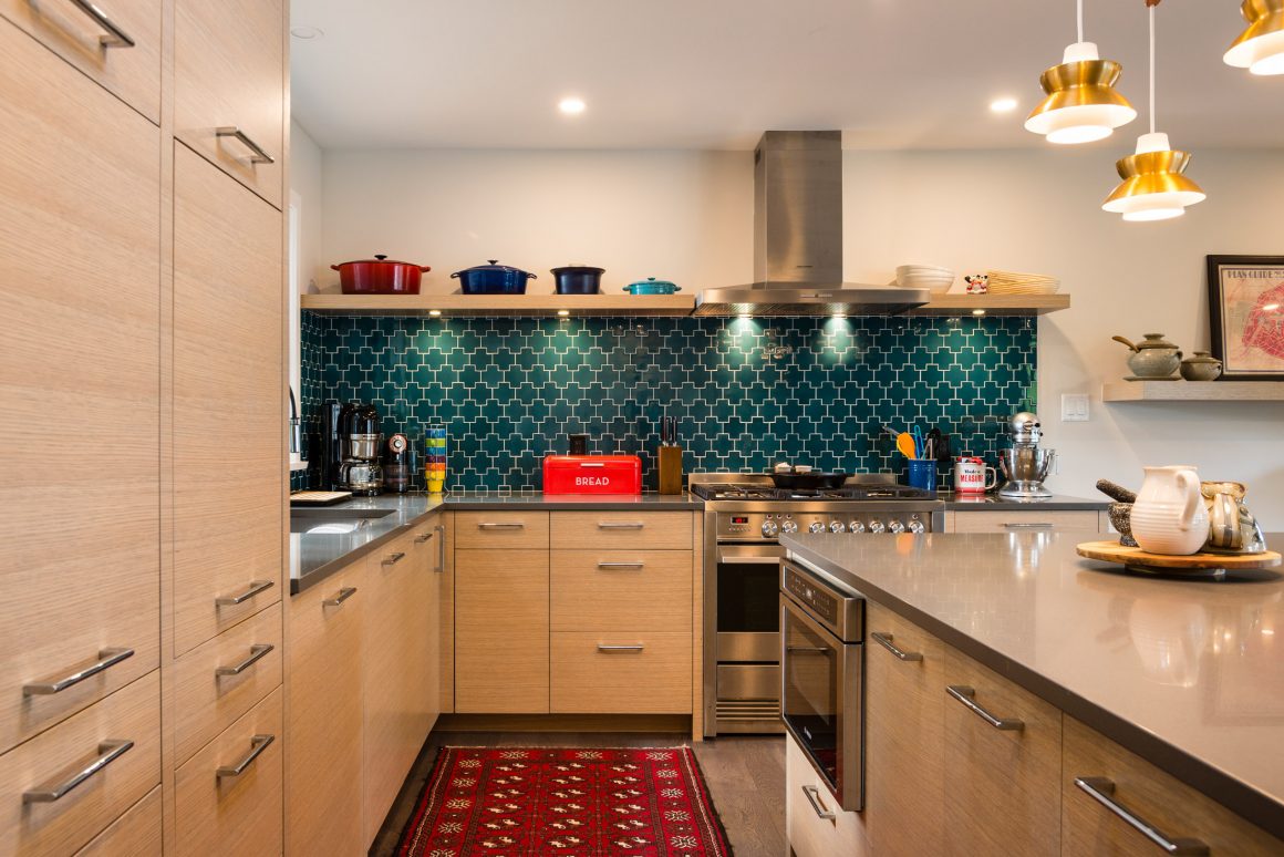
No longer is Sharon hidden in the kitchen cooking while her two children – aged 12 and nine – occupy other rooms. Now, the family is together in the same space. Moreover, opening the space has opened the views. “I can stand at my coffee maker in the kitchen and see right through the living room windows to a view of Boundary Bay,” she says.
Sharon and Allan knew their house would need a facelift when they bought it four years ago. “It was neglected and dilapidated,” says Sharon. “It was being marketed as a potential take-down. It was dark and dank; everything was dank. But we bought it because it had good bones.”
They also decided that a big renovation was in order to update it from what Sharon calls the “Mad Men” look.
“We wanted to give them a space that would flow,” says Gallop. “They like modern design but they wanted warmth. What we did was a modern take on a retro look.”
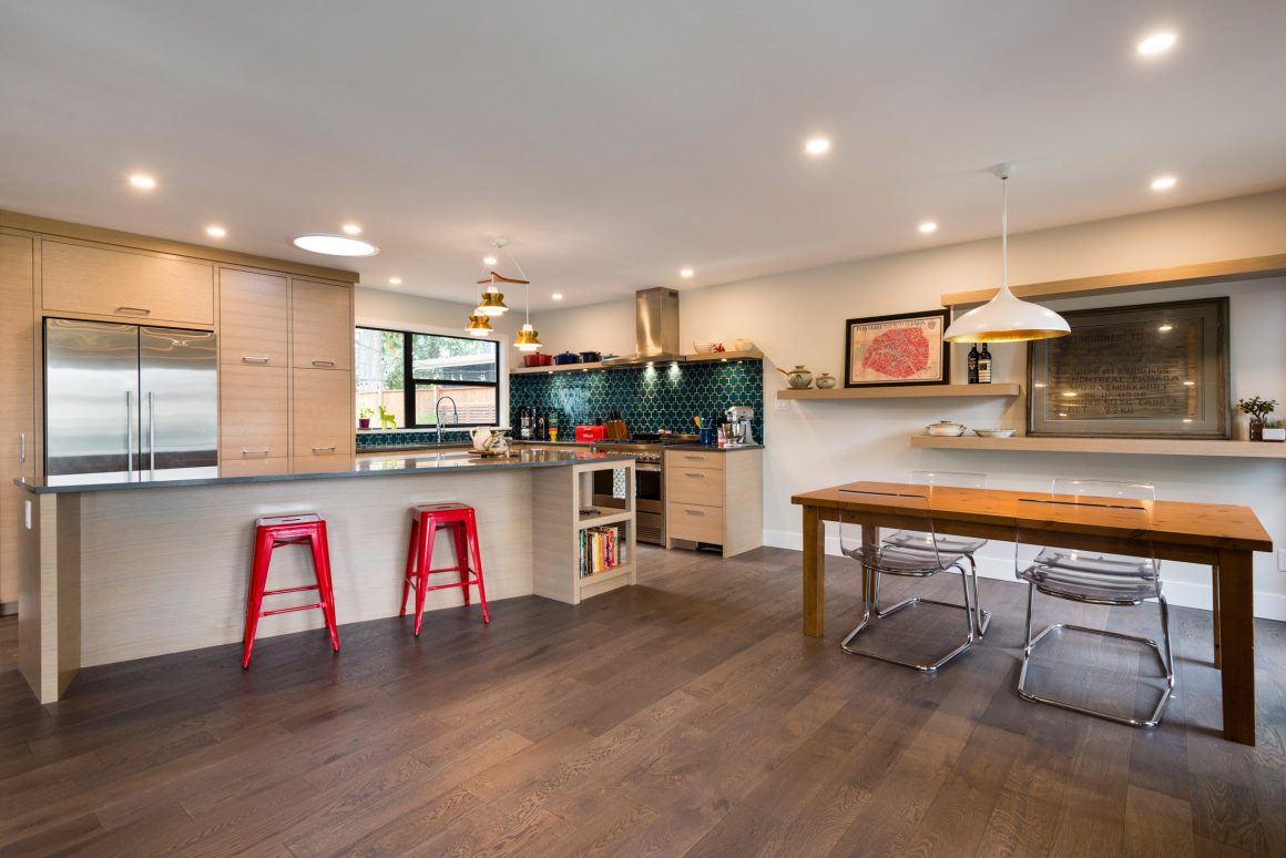
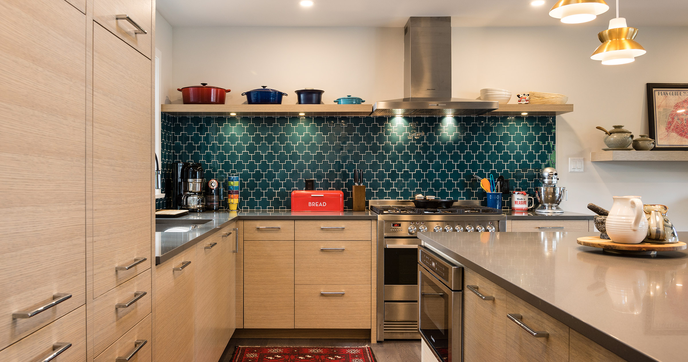
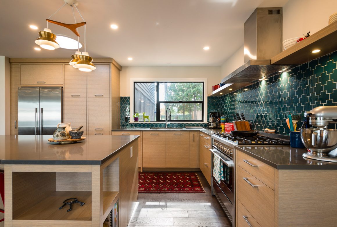
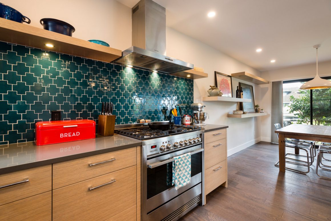
The kitchen is the anchor. Cabinetry, made by Divert Millwork of rift-sawn white oak flanks two walls, but to prevent it from overpowering the space, there are no upper cupboards on one of the walls. The window was kept in its original over-the-sink location.
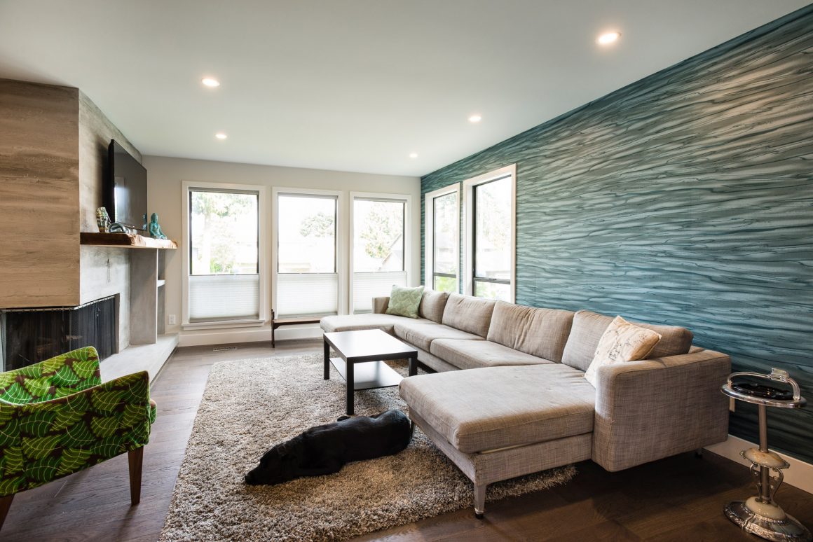
A rich teal-coloured tile by Ann Sacks was chosen for the backsplash. It mirrors wallpaper in the living room of the same colour. “The backsplash and living room wall speak to each other,” says Gallop.
Conscious of ensuring that the kitchen should be as functional as it is aesthetic, the designer gave it a pullout pantry beside the refrigerator and a floating shelf on the wall where the range is positioned. “The shelf creates a nice horizontal line above the backsplash,” says Gallop. It also provides display space for casseroles and serving bowls.
The key challenge, she adds, was to “fit in all of their storage requirements while keeping the space very open.”
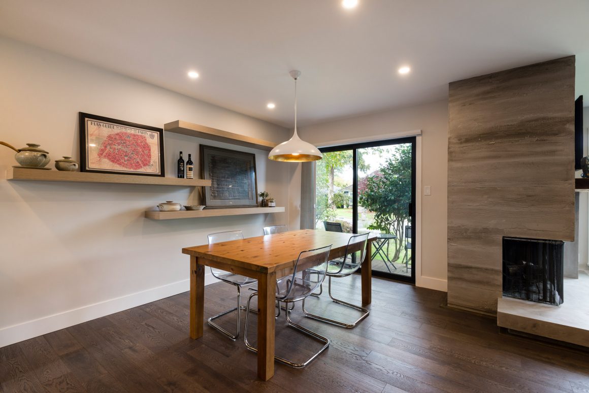
Some of the home’s original architectural elements were maintained, but updated. The living room’s wood-burning fireplace was given a plaster façade that mimics concrete.
At almost 10 feet long, the island, topped with Silestone quartz, is the focus of family activity and entertaining. It is wider at one end than the other. “We did that for visual interest and for more clearance. Apart from that, the goal was to make it different,” says Gallop.
The designer says the rejuvenation of the home has enabled her clients to inhabit it completely. “This project gave them the opportunity to use all of the rooms.” •
Sarah Gallop Design Inc.
www.interiordesignerdelta.com
604-952-4448
Best Builders
www.bestbuilders.ca
604-943-2378

