PHOTOGRAPHY: DREW HADLEY
STYLING: DENISE PALISAITIS
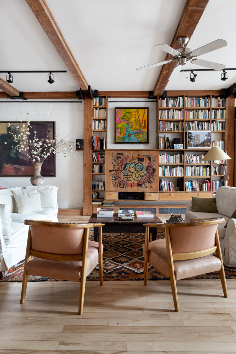
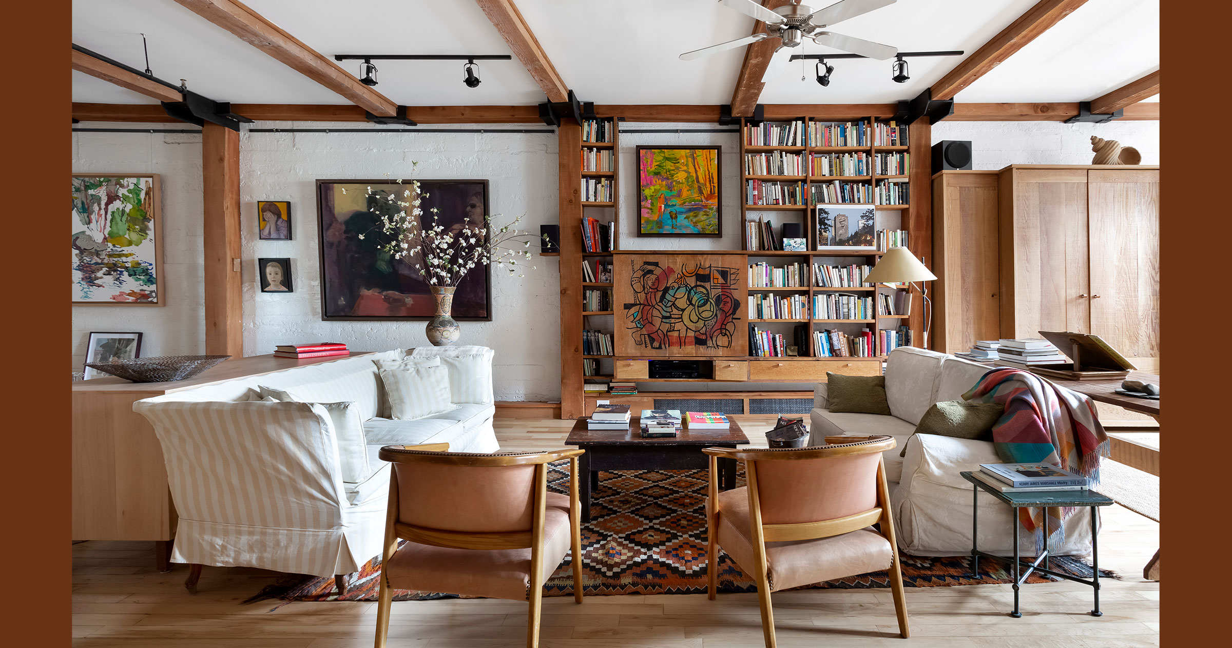
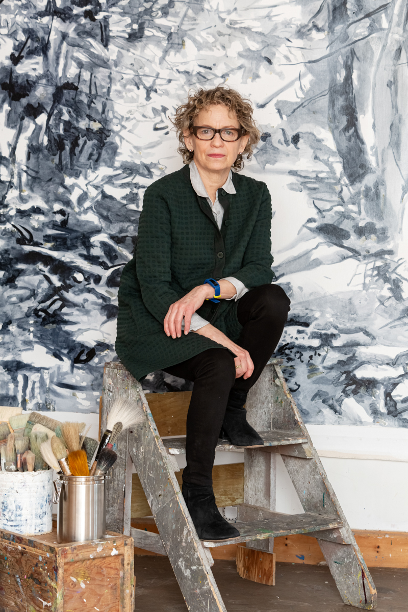
François Séguin has an enviable commute to work: 16 steps upstairs from the loft he shares with his wife, painter Susan G. Scott, to their joint studio. Or, if he’s feeling lazy, he can hop on the freight elevator. Home and work are housed on two floors in what was once a broom factory built in the 1930s, close to Montreal’s downtown core. The couple bought their third-floor studio space in 2004; a decade or so later, when their children were grown and gone, the second floor went on the market, and so they bought that, too.
François, an award-winning production designer who has worked in film, television, theatre and opera, says creating his own living space wasn’t all that different from creating a home for a film set. “I decided to make a home that’s a production designer’s house,” he says. “I say that as a joke, but designing a home for a film is based on the character. I go by who is supposed to be living there. I take clues from the character and from the script. I did the same for my home.”
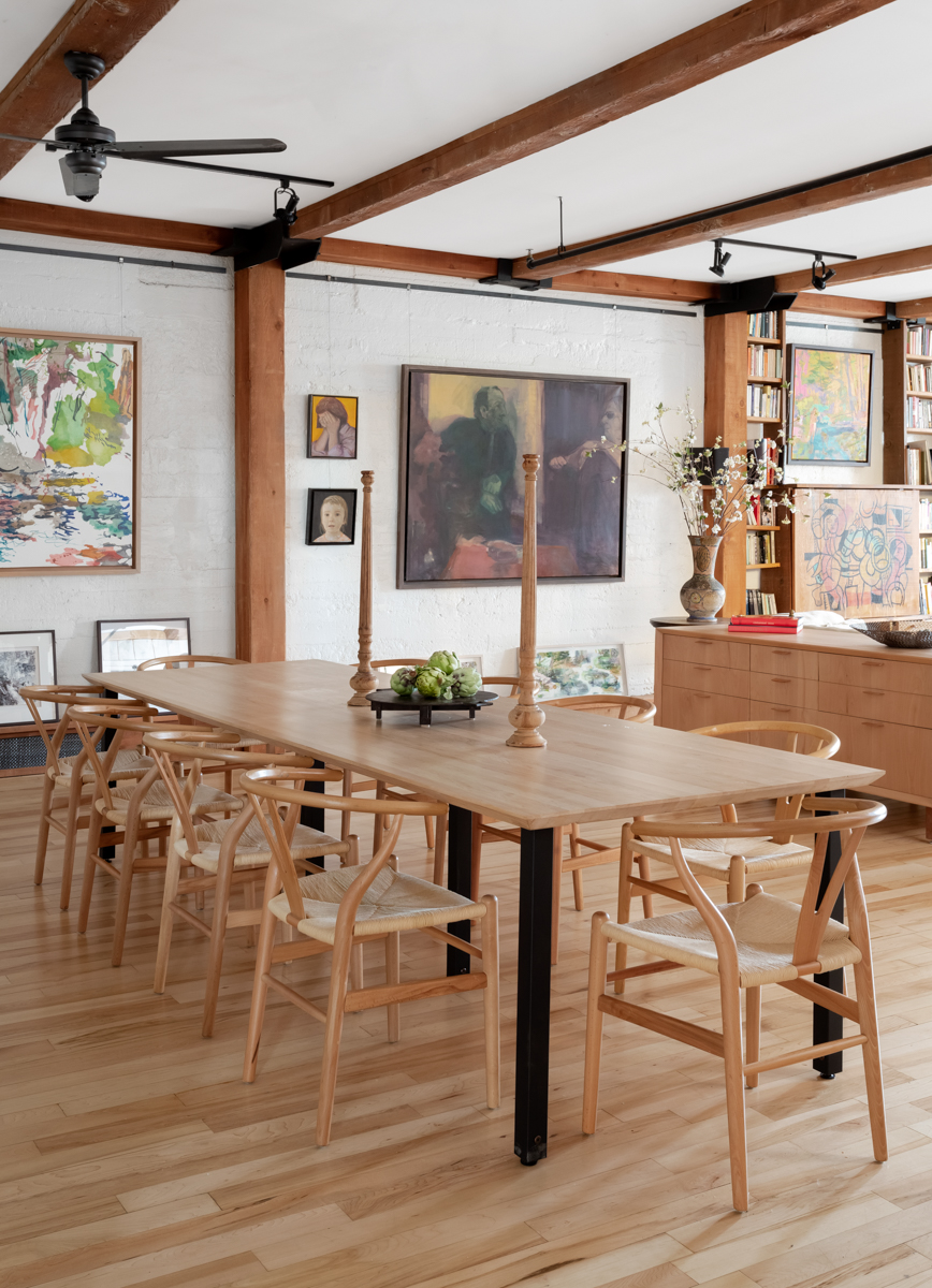
To create a home destined to be shared by a production designer and a painter, François needed to make shelf space for their books, wall space for their art, a large dining area to entertain and have dinner parties, and a comfortable kitchen that would be not just a place to cook, but also a cozy space to hang out. For his wife, specifically, he needed to make sure she could reach the kitchen shelves, and that they would find a bath tub just the right length for soaking and reading.
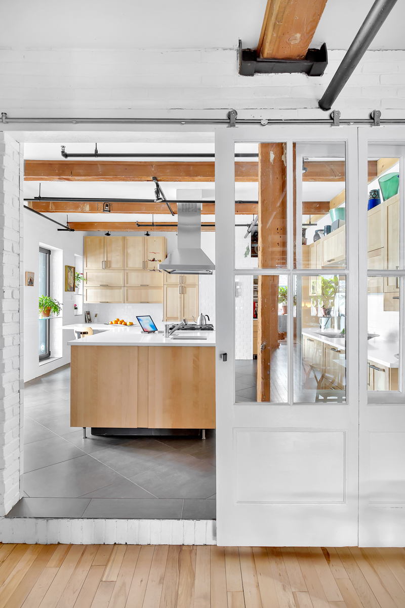
With light coming in only from the front and back of the house, he kept the main living space very open, and took down the wall to the kitchen, but kept it separate from the main area by adding sliding glass doors. François added several inches of sound insulation to the ceiling, hiding part of the existing wood beams, but still leaving them visible. He added other matching vertical beams along the walls, both to define space, including bookshelves, and to hide such things as electrical wiring and cables. He used tile, wood, even fake brick to clad the walls. “I’m not a big fan of gyproc,” he says. “I tried to get rid of all of the gyproc I could.”
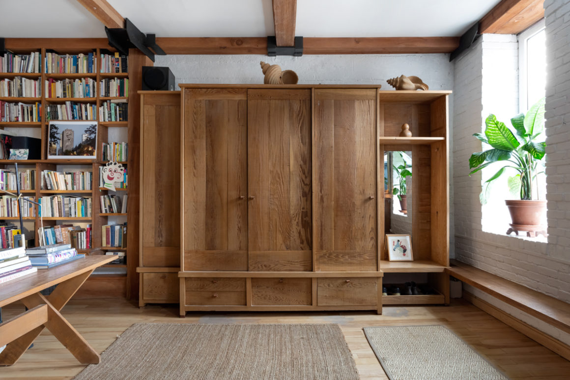
He also rediscovered woodworking, making key pieces of the furniture himself in his upstairs studio: in the main living space, he built the entry wardrobe, the sideboard and dining table in a range of wood types. “Sometimes I go to the lumberyard and they have wood on sale,” he says. I’m not a real cabinetmaker, so there’s a lot of waste. The last time I worked in a workshop was as a student in theatre school, so I’m relearning.”
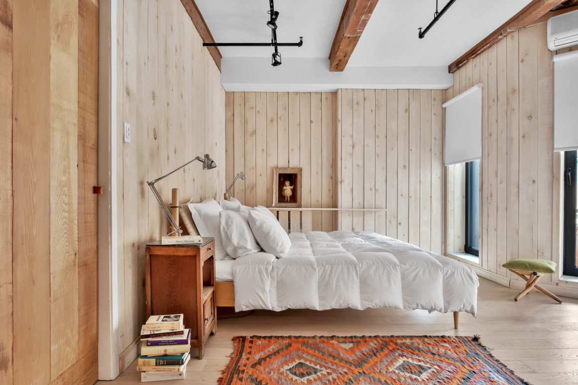
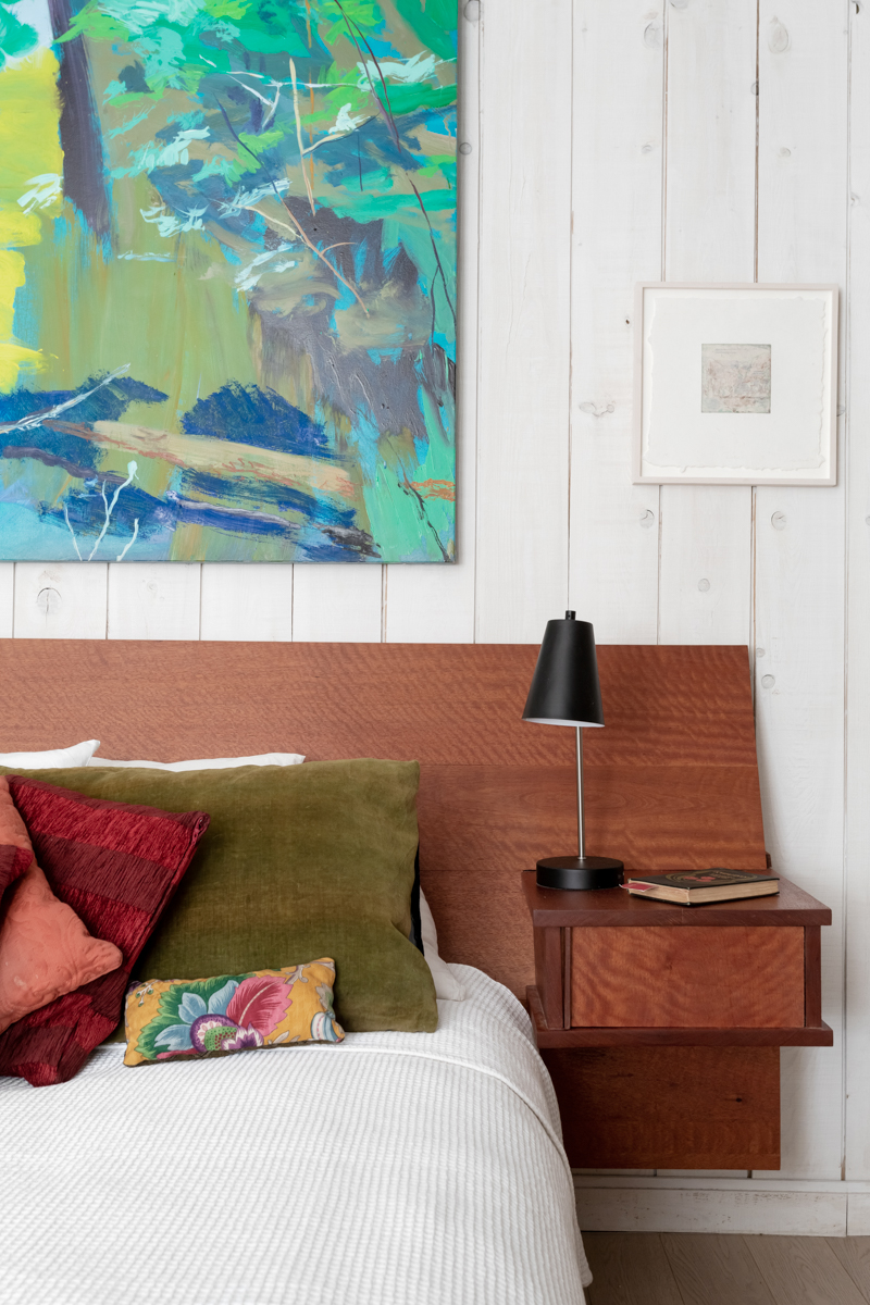
On some lower-budget productions, he’s been known to pay for a piece he wants to use out of his own pocket, use it on his sets, and then take it home: the coffee table was from a play, one of the chairs from a film set.
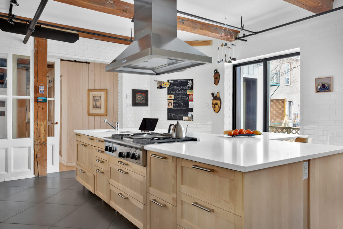
In the kitchen, François set out to create a functional space that would be easy to work in, one that would not have some of the little annoyances of their previous kitchen: insufficient counter space and storage. He created only a few cupboards, opting instead for drawers. Except for glassware, most things fit more practically into drawers, he says. “At the beginning there were six empty ones; now they’re all full.”
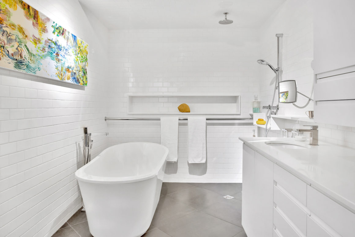
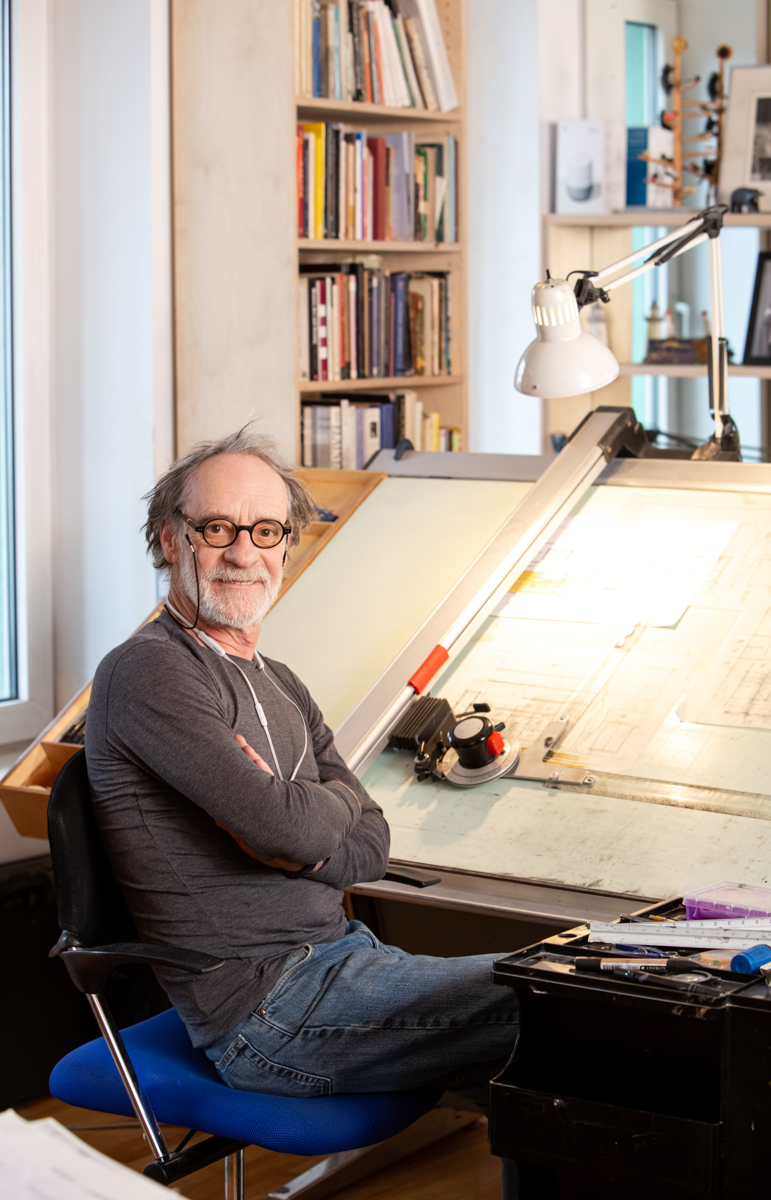
For the bathroom, he had many different layouts on his drafting table, all of them with glass enclosures around the shower. But none of them felt right until he removed that and left the shower open. It’s a look modelled after one of the hotels he stayed in while travelling for work. “Susan was worried about water being everywhere,” he says. “But it’s convenient; we like it.” Since the floor is heated, he says, any leftover water evaporates quickly.
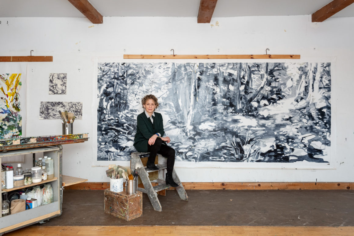
Susan loves the space François has created for them. “It’s just such a fabulous environment; it’s so big and yet so cozy,” she says.
As a painter, she adds, she focuses her vision within a relatively small rectangular space. In contrast, she says, her husband sees everything, from the space itself, to the doors, the cabinets, the furniture and every accent and accessory within that space. “My attention is so limited visually, compared to what he thinks about. He goes for the big swing, and the big feelings. That’s him.” •
