Photography: Virginia MacDonald
Styling: Emily Griffin
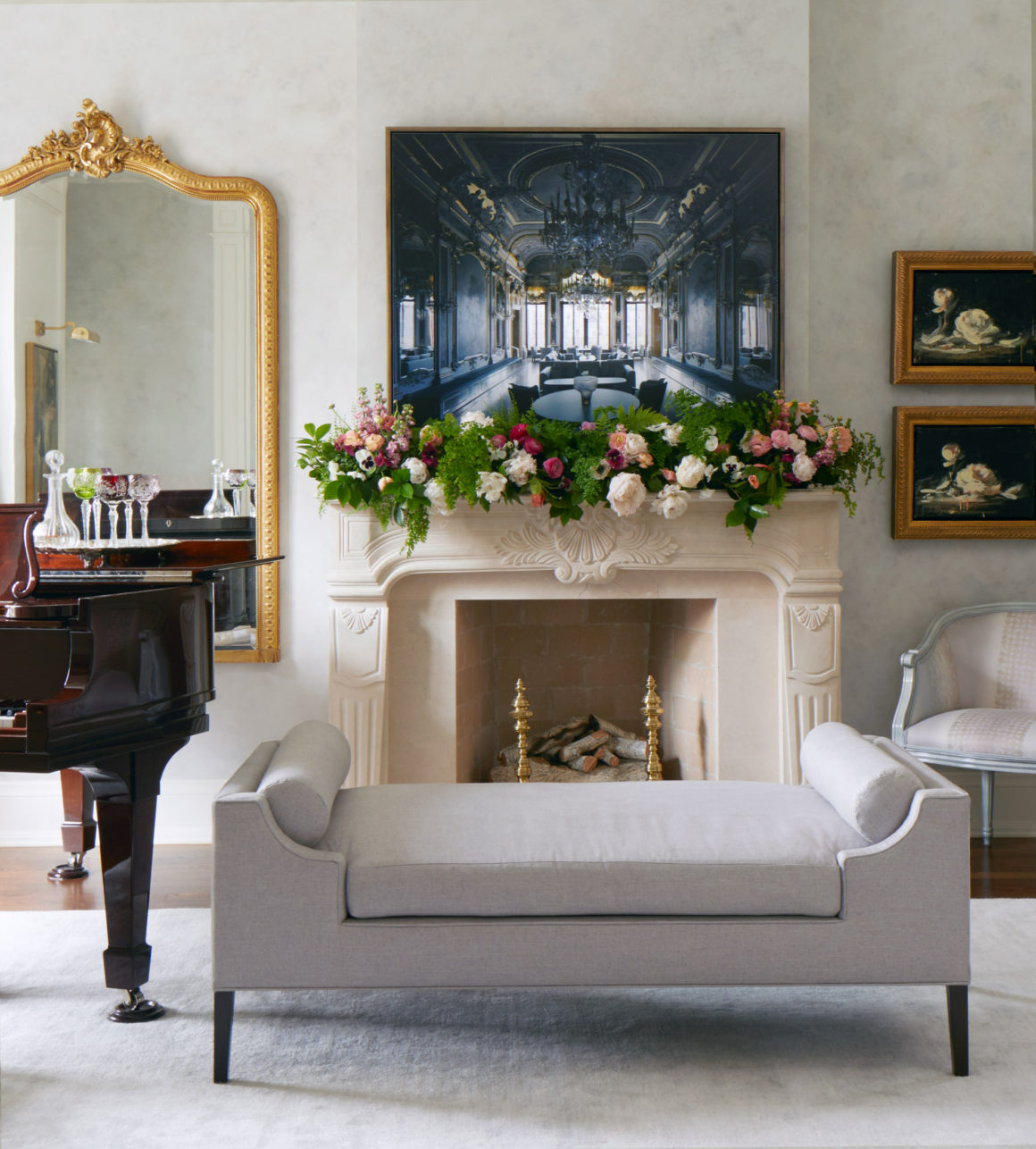
There were a few stipulations that the homeowner had when she called designer Emily Griffin in to transform her North Toronto house. The first was that her treasured piano had to have pride of place in the front room.
“Trying to do a furniture plan with a massive Steinway was a challenge,” says Griffin, founder of Emily Griffin Design. But it was a good one. “Everyone in the family plays. It’s not collecting dust; it gets used.”
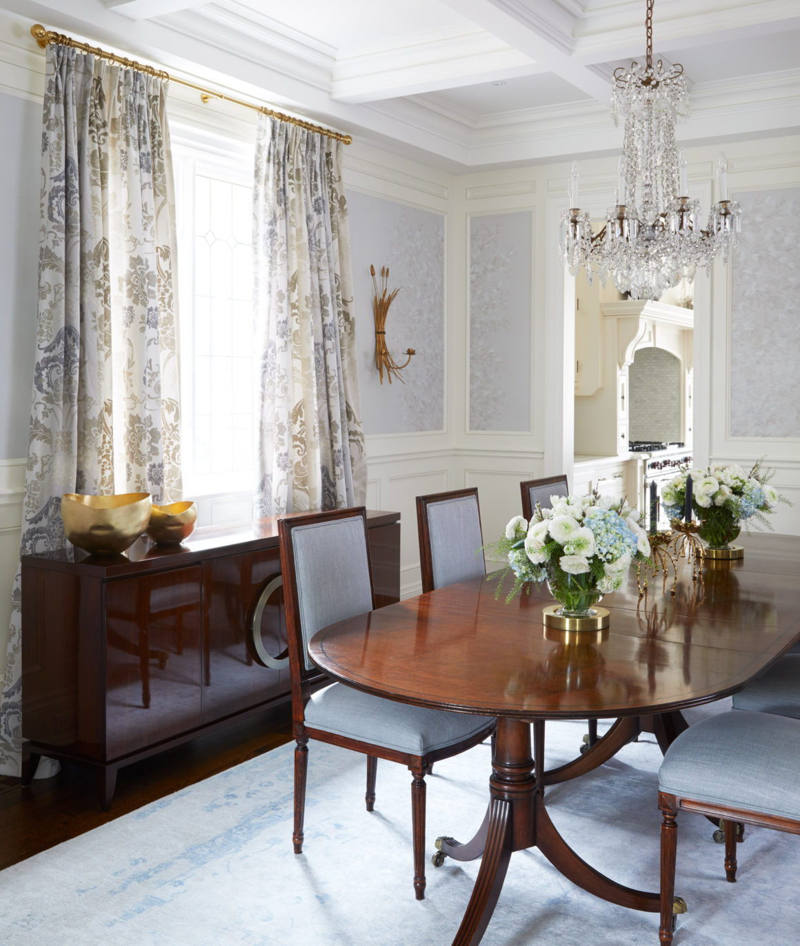
Another must-have: a classic English pedestal table for the dining room. Not many families with three school-aged children opt for traditional furniture and designs, Griffin says, but in this instance, it suited the house. A new build, the home has such architectural details as coffered ceilings and moldings that lend themselves to a classic look.
“She wanted really traditional, not old-fashioned,” says Griffin. Old-World, but definitely not stuffy. “Something that had youth and modernity.” For the designer, that meant she could mix antiques such as the pedestal table, which she found in an antiques shop in Paris, Ontario, with such new pieces as a walnut credenza that she describes as “uber-contemporary. It has, like 100 coats of high-gloss lacquer to give it that sheen, and very modern brass hardware.” Griffin loves juxtaposing old and new pieces, and the look it creates. “I love a room that feels as though it’s from a bunch of different eras. It feels collected rather than designed.” She added Italian chairs, reupholstered in blue linen.
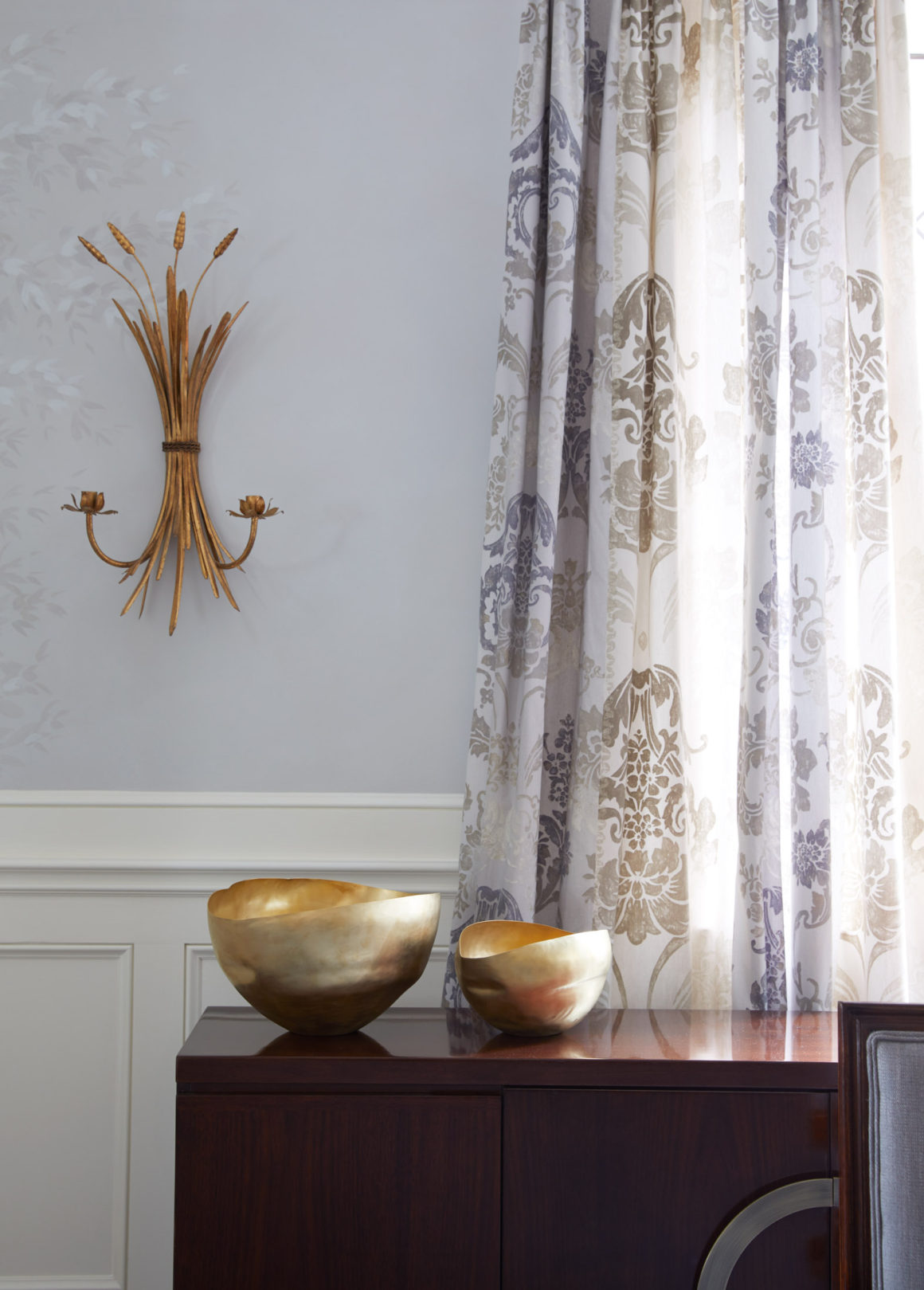
For the walls, Griffin called in painter Robert Sangster, who hand-painted the dining room in a shadowy leaf pattern, and did a cloud-like effect in the piano room. Using Designers Guild drapes as an inspiration, they chose tones of mauve, taupe, cream and grey for the walls. “It took him days,” Griffin says. “It’s a very specialized paint treatment that gives you the effect of Venetian plaster.” Having spent all that time and energy on the dining room walls, she chose to highlight them with brass wall sconces, rather than art. “Once Robert had taken all that time to paint the walls, putting big art there would have been tragic.”
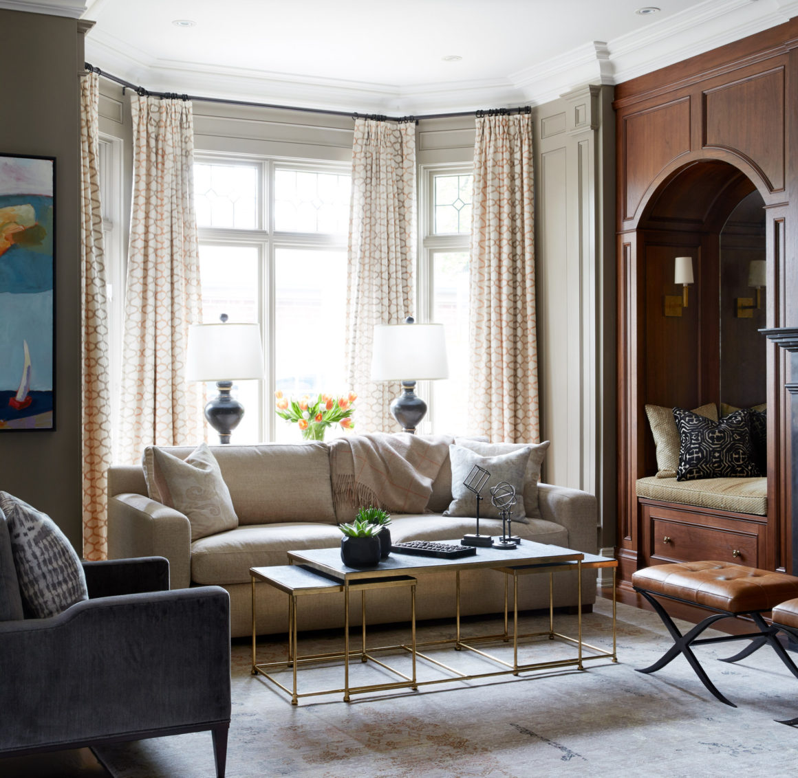
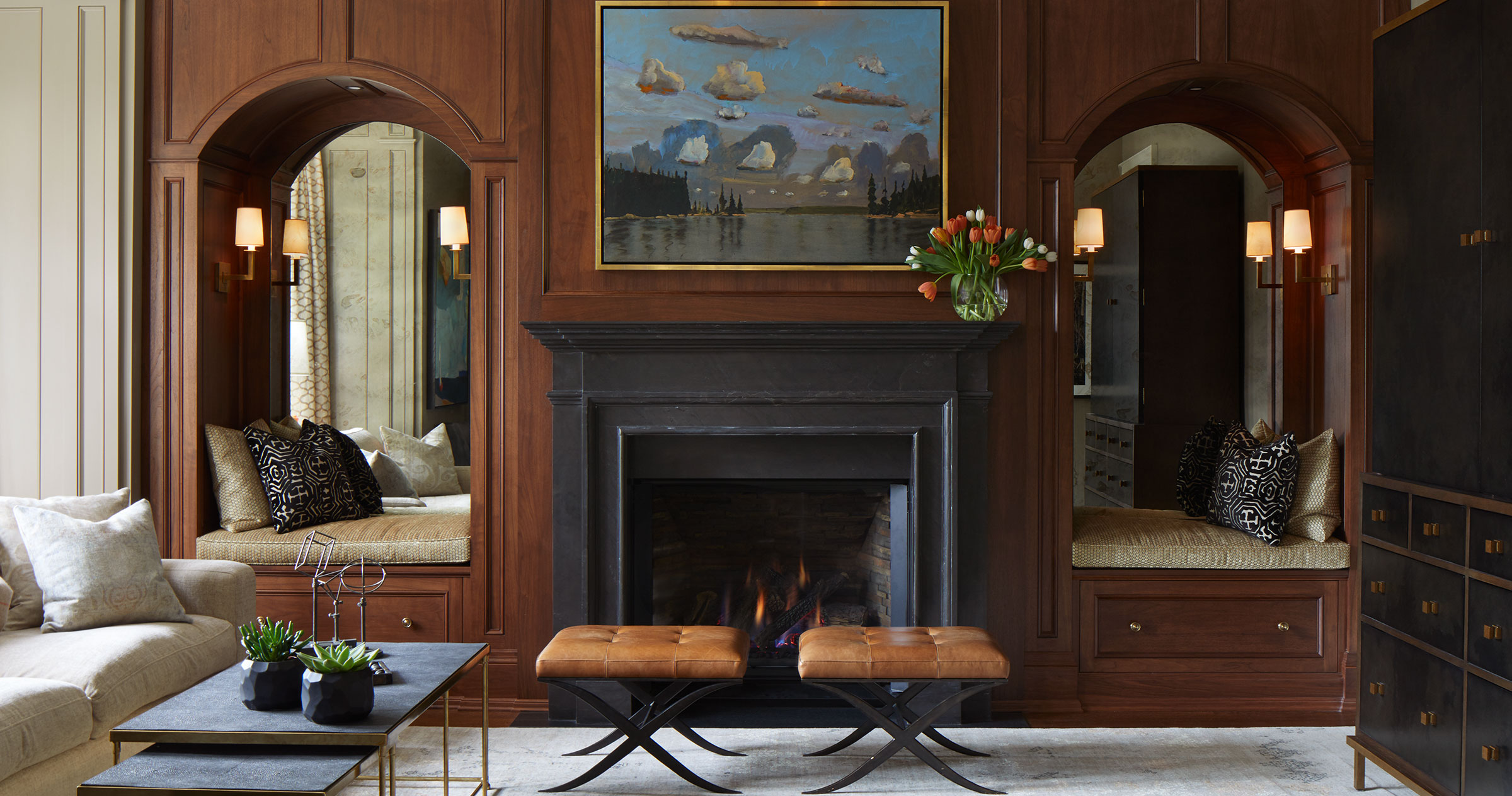
In the family room, Griffin chose a darker look, opting for walnut cabinetry. She removed the old entertainment unit and instead created seating nooks on each side of the fireplace. “The kids live in them,” she says. “They turn on the lights, read, curl up. They’re not only beautiful but they’re a handy spot where everyone can hang out.” She shifted the television into a Julian Chichester cabinet. “I abhor exposed TVs,” she says, laughing. The unit also has storage for toys.
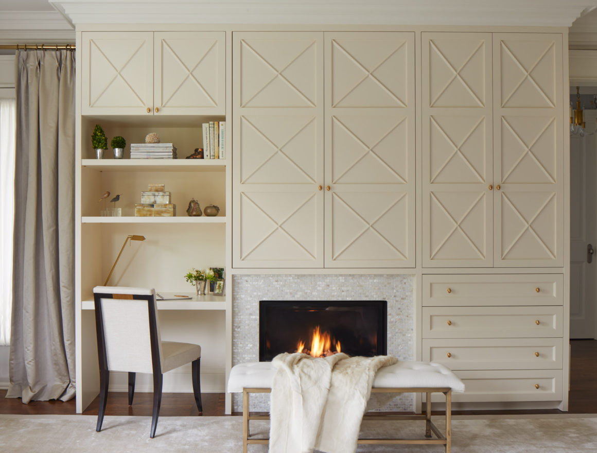
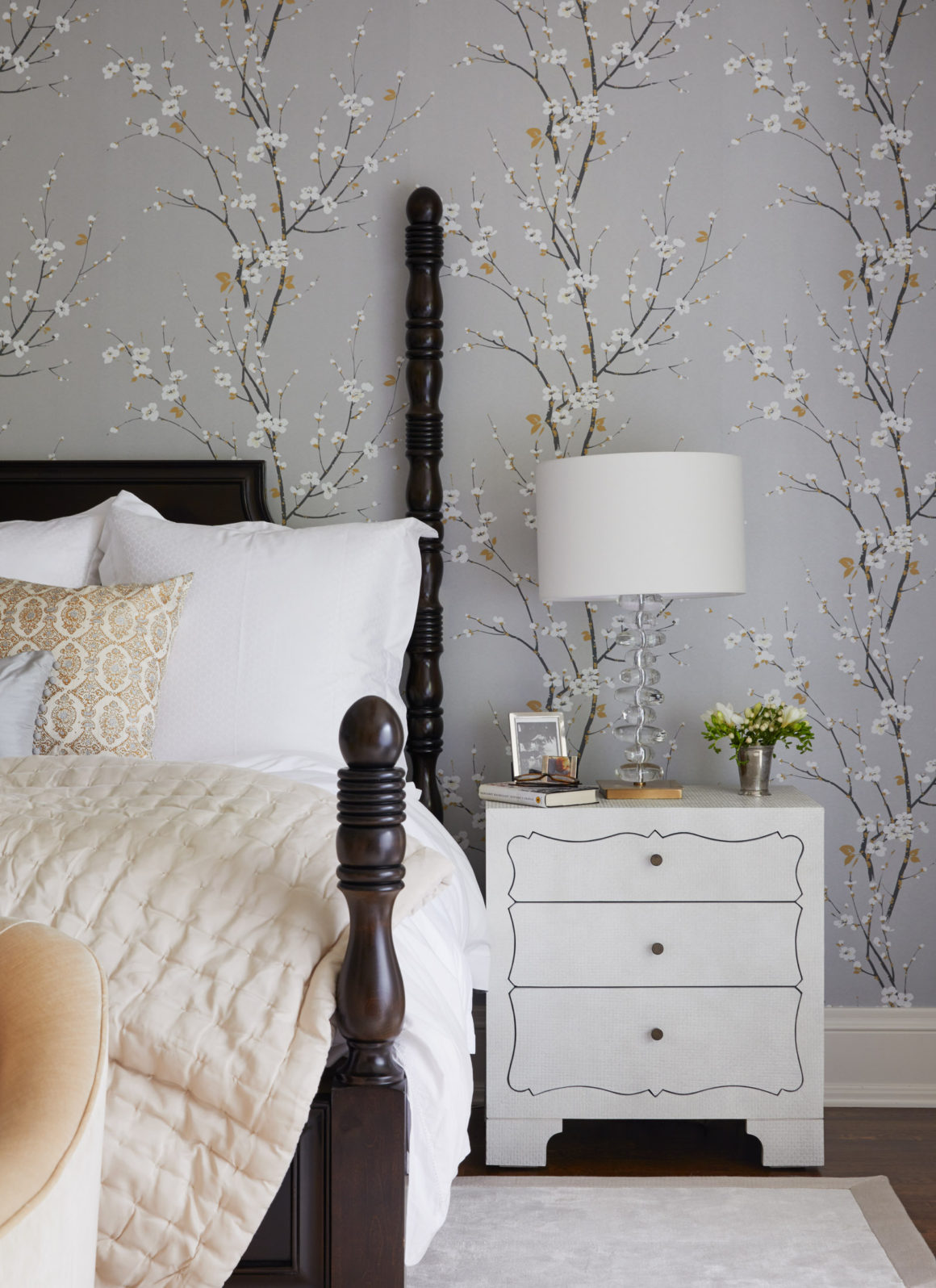
The biggest transformation, Griffin says, happened in the main bedroom. The space was massive and felt cavernous before the remodel. To create warmth, she started with a large, light-coloured silk carpet, and chose a cherry-blossom wallpaper. “It made it more cozy.” The room lacked storage, so she designed cabinetry around the fireplace that could also hide the television. A physician, the homeowner sometimes does paperwork at home at the end of the day, so the designer carved out a small desk area for her on that wall. She chose mother-of-pearl tile to get a jewel-like glow around the fireplace and created a separate seating area for reading and relaxing in front of the window.
Griffin says that after years of seeing a mid-century influence dominate interior design and in so many design publications, she’s developed a new appreciation for traditional styles, and says it seems poised for a comeback. “It’s time for a change, and this may very well be it.” •
Originally published in the Winter 2020 issue.
Emily Griffin Design
www.egdesign.ca
studio@egdesign.ca

