The inside of a typical Montreal duplex is modernized and lightened up
BY SUSAN SEMENAK
PHOTOGRAPHY: ADRIEN WILLIAMS
The house in Villeray that Catherine Villeneuve remembers from her childhood was a classic Montreal duplex with a long corridor that ran all the way from the front entrance to the little kitchen at the back. It was a house her great grandfather had built, a place infused with warm memories where four generations of her family had lived.
As a child, she’d hardly noticed that the hallway was dark and cramped, with small bedrooms squeezed along one side. Or that the only natural light came from windows at the front and back of the house, leaving a whole swath of interior cast in shadow.
But when Catherine and her partner, Alexandre Larocque (she’s a teacher and he’s an emergency-room physician) moved in, they began to re-imagine the old house. “It was a traditional house with ogee moldings and carpeting everywhere. And it was so dark, especially in winter,” says Catherine. “We wanted something bright and modern.”
They hired NatureHumaine because they loved the young Montreal architecture and design firm’s way of interplaying edgy modernism with warm wood, whimsical shapes and bold colour.
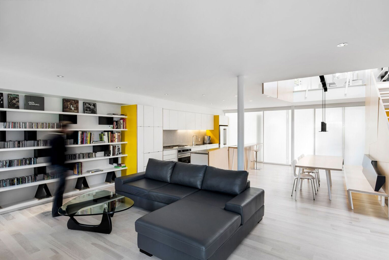
Under the supervision of general contractor Sienna Construction, the interior was gutted to turn two existing flats into a single two-storey dwelling with a large open kitchen, living room and dining room on the main floor and three bedrooms, an open office and large bathroom on the second floor.
NatureHumaine’s owner-architect,Stéphane Rasselet, says bringing sunshine into the middle of the house proved to be the biggest challenge. Direct light came in only from the front and back. But the front façade looks out onto a busy street. And the rear of the house faces north – so the light is not particularly bright.
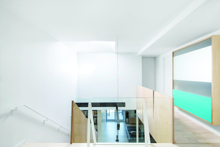
To shield the homeowners from the street without blocking the light, Rasselet designed opaque sliding interior doors, which run the full width of the house, separating the living area from the entrance. Then he added a double-height light well topped with a skylight that floods the middle of the house with bright, glorious light.
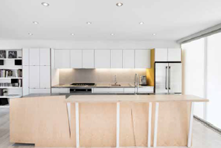
 Tearing down the walls throughout the main floor changed the way the family lives and entertains. Before, when the small kitchen and dining room were separate, Catherine often felt isolated while she cooked. Friends would be clustered in different rooms. But now everyone mingles, and conversation flows freely while Catherine, a passionate home cook, does her thing. The new kitchen boasts ample cabinets and counter space, including a long stainless-steel-clad island counter that features two heights – one for work preparation on the kitchen side and another higher one with bar stools on the dining room side, where guests perch to watch while she cooks.
From the start, Catherine says, one of her fears was that the house would feel too cool and static. “We didn’t want everything to be white or lines that were too straight or symmetrical,” she says.
Rasselet devised a theme of diagonal lines in a restrained palette of white, black and blonde-wood tones. All the kitchen cabinets are white, as are the walls throughout the house. But the shelving and living room furniture is black and there are a few strategically placed punches of colour – yellow on the first floor and turquoise on the second floor.
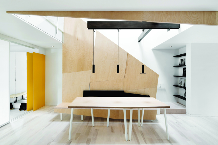
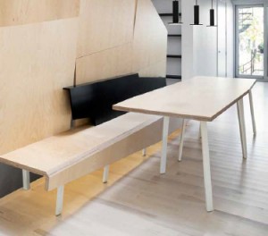
To create a feeling of movement, Rasselet worked with woodworkers at Aux Bois D’Oeuvres in Delson to create elements with irregular shapes. For example, the wall separating the stairway from the main floor is a series of birch plywood panels cut into oblique shapes with notched v-grooves. It folds over at its base to become a long bench at the dining room table, which is itself a long, irregular rectangle that seats up to 12 people.
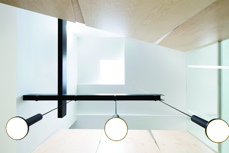
Above the dining area, Rasselet installed a dramatic x-shaped support in black metal, which holds a trio of pendant lights that seem to hover in midair.
“All of this creates a certain dynamic connection between the skylight and the two floors of the house,” Rasselet explains. ”There’s something very theatrical about the way this space opens up.”
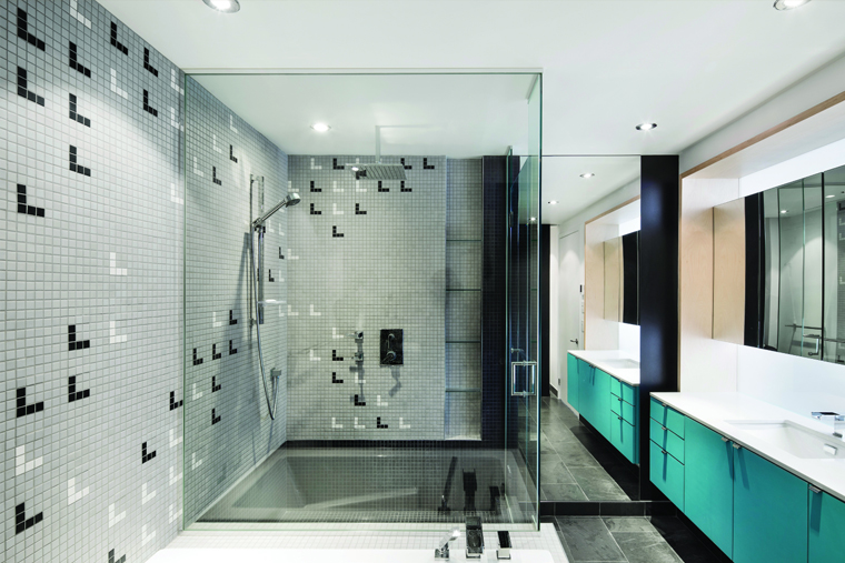
There’s drama, too, in the angles at which the white metal table legs, counter supports and stair rails are set, evoking the asymmetry of a stand of birch trees in the forest. Carrying the diagonal theme upstairs, the bathroom’s grey porcelain tiles are marked with a pattern of black and white chevrons.
Catherine says everyone who rings the doorbell, whether it’s first-time guests or the pizza delivery guys, is surprised by what’s inside. “It’s a traditional house that got a bright, new personality,” she says.
- Cutlines:
On the main floor, the living room, dining room and kitchen share an open space infused with light from the skylight. Bleached hardwood floors and pale birch plywood panels lend warmth to the all-white walls and cabinetry. - Birch plywood panels are layered, laminated and cut into oblique shapes by the South Shore firm Aux Bois d’Oeuvres to inject “movement” into the overall design.
- The dining table is made of laminated birch plywood set atop metal legs, which echo the diagonal lines.
- Above the dining table hangs a trio of black metal pendant lamps from Pablo Designs, which are suspended from a sculptural bracket designed byNatureHumaine using two black-painted steel beams. Their position below the skylight offers what the architect calls “multiple layers of light.”
- The wall that separates the stairway from the dining room folds into a bench outfitted with a folded metal insert painted black. It serves as a design element and back rest.
- Rasselet says a large portion of the budget was directed toward the detailed woodworking that recurs throughout the house. The kitchen cabinets are made of matte-finished lacquered panels and the sides of the island counter are faced with birch plywood cut to exacting specifications. “It took many cuts and re-cuts to get it just right,” Rasselet says. “We took the angles very seriously.”
- The kitchen backsplash is tiled with pale grey mosaic tiles. An end wall painted canary yellow adds what the architect calls “sparkle.” All the countertops are clad in stainless steel. Fridge and stove: Viking; kitchen and bathroom sink and bath fixtures: Ramacieri Soligo
- Black is the secondary colour in this neutral palette. Here it is in the living room in a leather sectional sofa and a Noguchi table, as well as in the custom-made folded metal dividers on the bookshelves, which display homeowner Alexandre’s vintage vinyl collection.
- Upstairs, clear panels let the light through. A few hits of turquoise offer strategically placed shots of colour on the second floor. “We limit the choice of materials and stick to a simple palette,” Rasselet says. “Then we add a touch of colour.”
- A turquoise vanity creates an aquatic ambience, the homeowner says. The bath and shower are tiled in grey mosaic tiles (from Ceragrès) inlaid with a geometric pattern). The floor is slate.

