Photography: Kelly Horkoff
Styling: Darlene Shaw
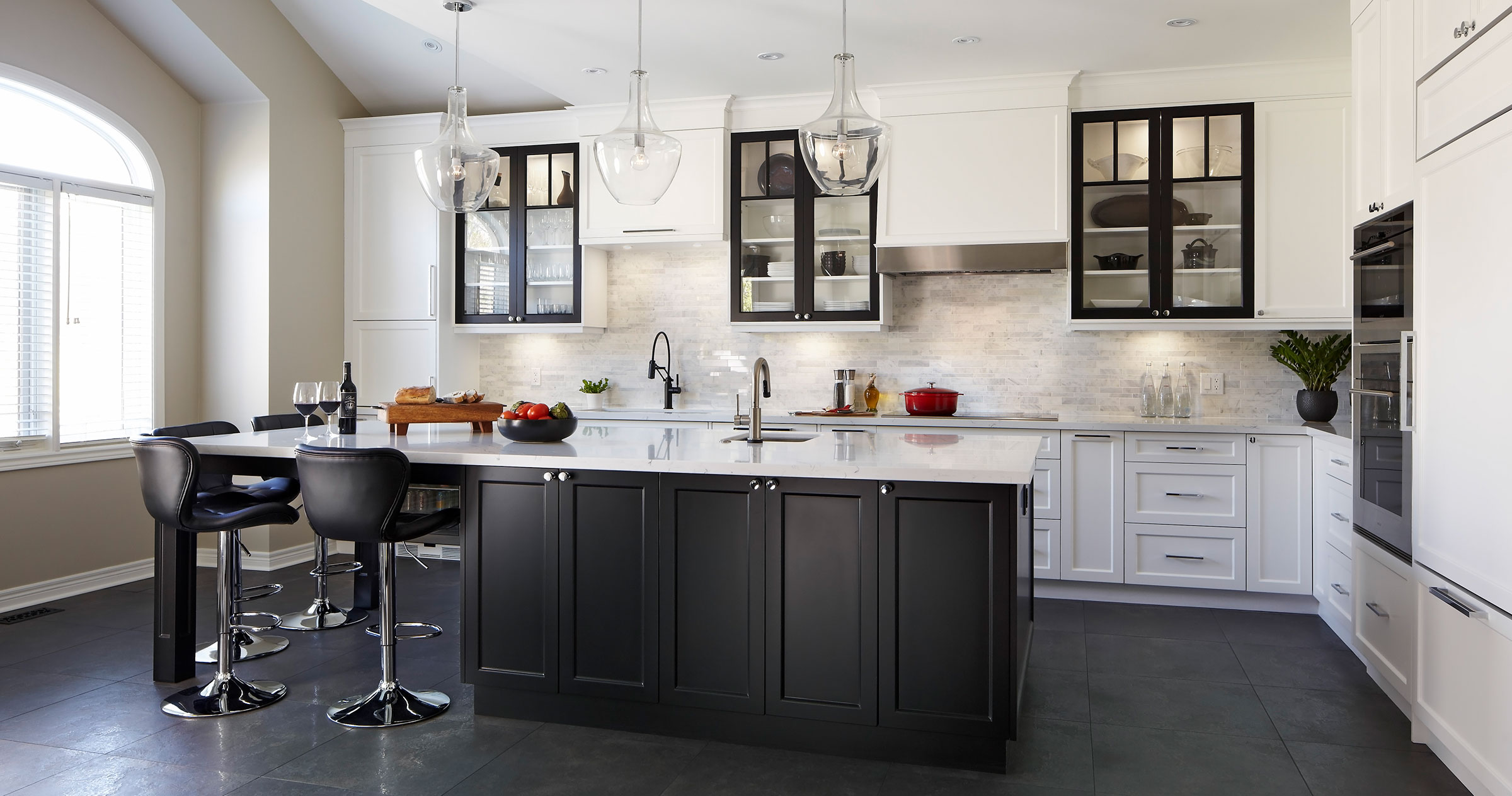
Brenda and Russ Andrew recall getting ready for breakfast, along with their adult daughter, in their newly renovated kitchen. “We could all be in there, doing whatever we needed to do, without tripping on each other. It was perfect,” Brenda says.
Before the renovation, the family had a small, u-shaped kitchen outfitted with bleached oak cabinetry, which had faded to salmon-pink. One end of the counter had a raised serving area but no stools. The kitchen opened onto a dinette that had a window seat.
Brenda, an executive recruiter and trainer, and Russ, a recently retired banking executive, love to entertain. They routinely host groups of between 19 and 24 family members and friends. Brenda loves to cook; Russ serves beverages.
The previous kitchen had no room for maneuvering. If Russ walked in to fetch wine glasses while Brenda was transferring pots from stove to counter, they would inevitably collide. The workable space totalled about three feet. There was limited storage and no good lighting.
“The space was not functional. Russ and I could not operate in the kitchen together,” Brenda says. “It drove me nuts.”
An Internet search led Brenda to designer Darlene Shaw at Concept Kitchen & Bath, a one-stop shop that manages projects: designing, building, supplying, and installing what clients need.
“She really understood what I needed for space and how I wanted to move around the kitchen,” Brenda says.
Says Shaw: “It’s really important, as a designer, to listen to your client, impart your advice and give them the benefit of your experience, but work with what they want, because, at the end of the day, it’s their home. As beautiful as it may be, if it isn’t functional, they’re not going to be happy.”
The designer elongated the kitchen, extending cabinetry along the length of the room. She eliminated a window on the back wall and removed the dinette and window seat.
“You gain a lot of storage within the same footprint, when a kitchen is designed correctly,” she says.
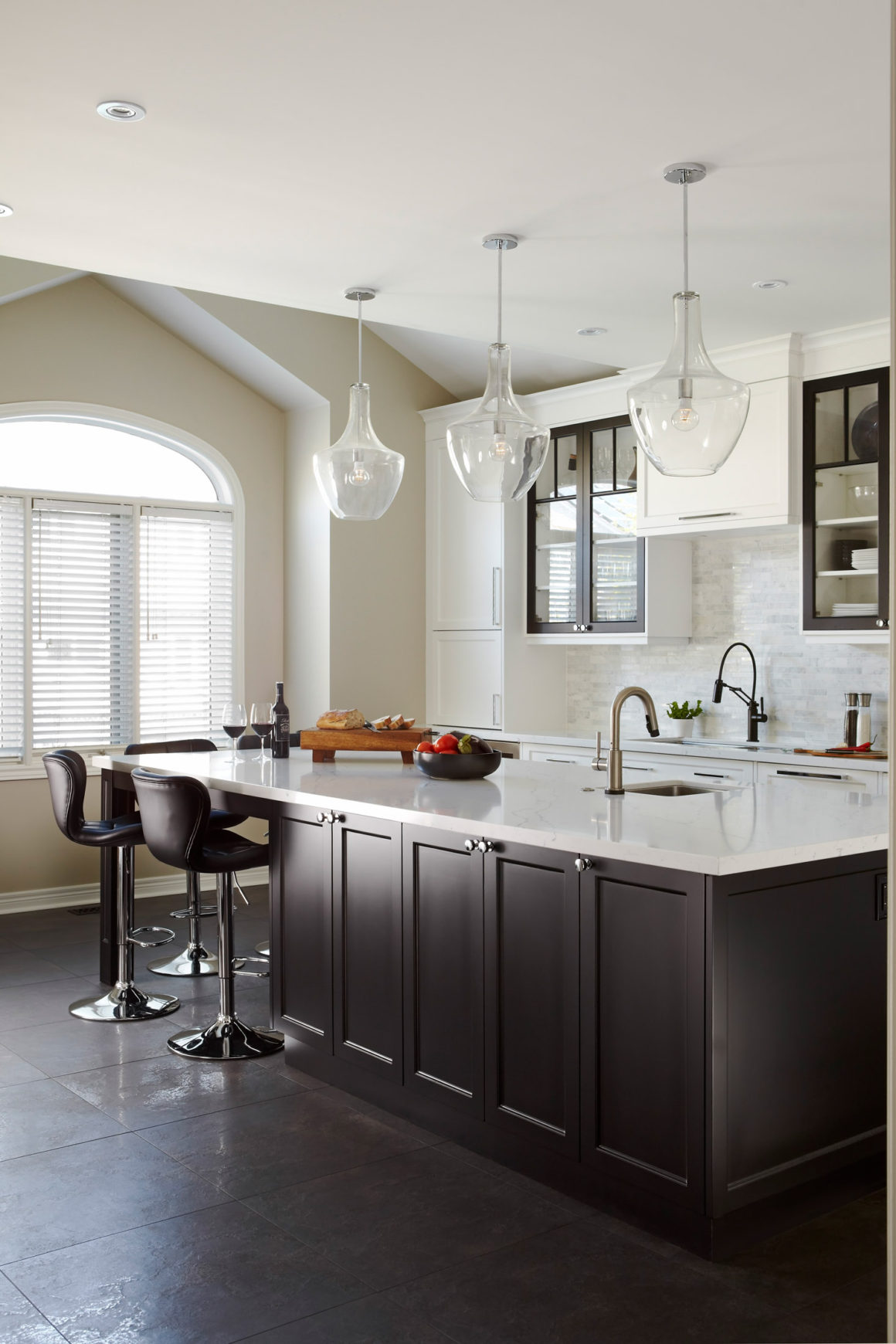
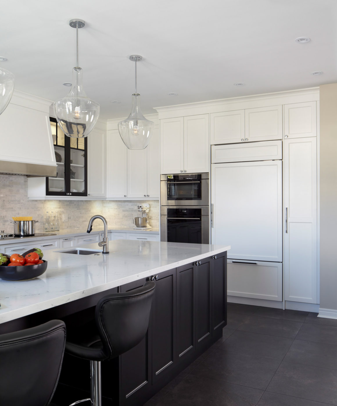
Shaw’s goal was to create separate work zones in which Brenda and Russ could peacefully coexist while entertaining. For Russ, a beverage service zone at one end of the kitchen contains a wine fridge, slide-out drawers for liquor storage, and cupboards to hold glasses, corkscrews and sundries. Brenda’s food prep, cooking and clean-up zones are at the opposite end.
The island extends into the freed-up dining space. It has seating for six guests, perfect for family meals or playing cards.
“People hesitate to remove a table and chairs,” Shaw says. “In my experience, when you’ve got an island, that’s where people want to sit, because it’s closer to whoever is cooking.”
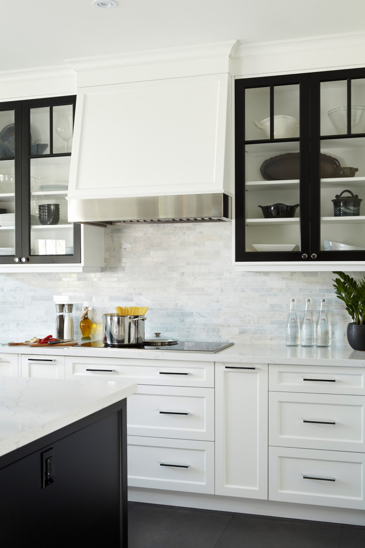
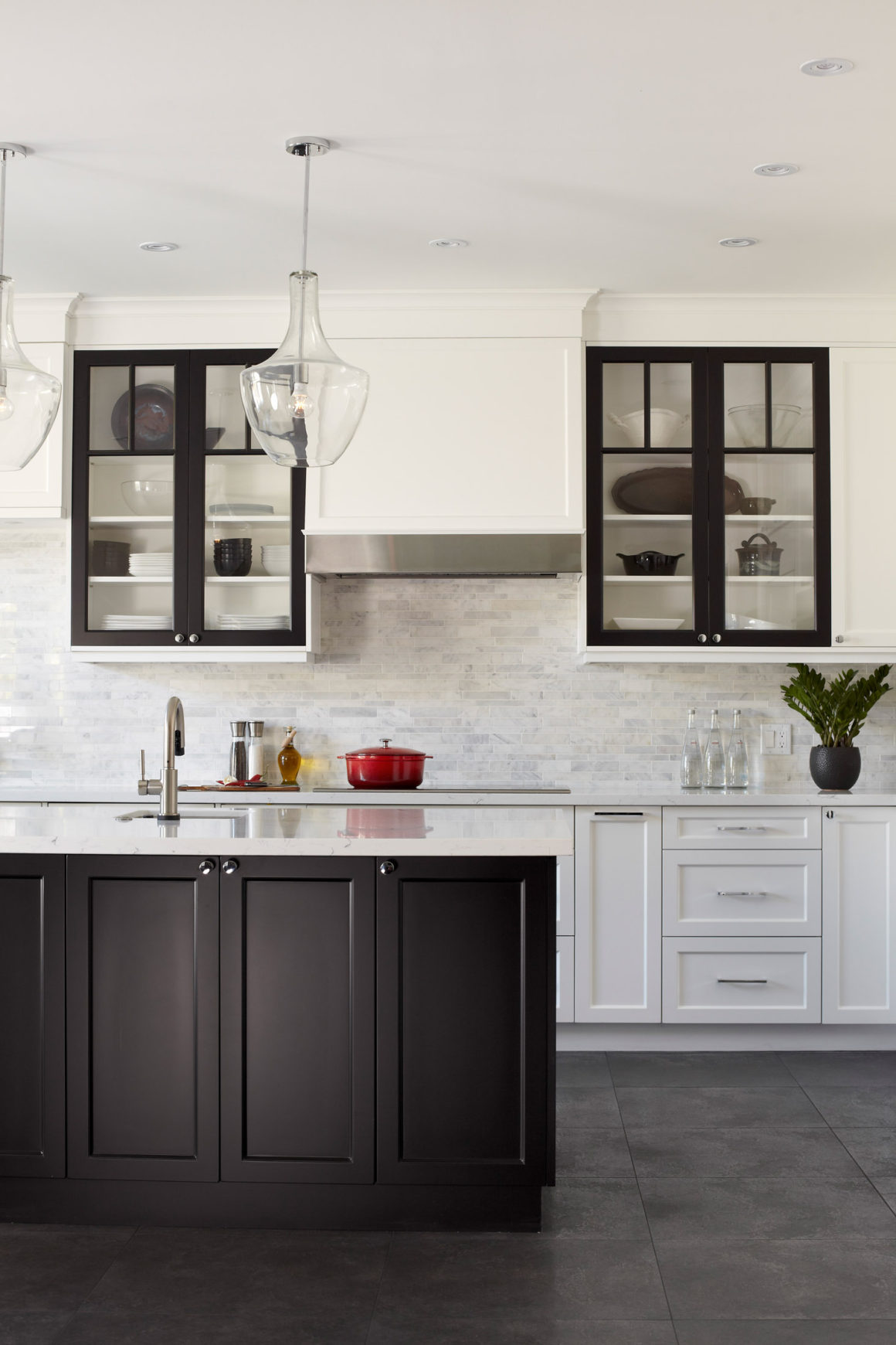
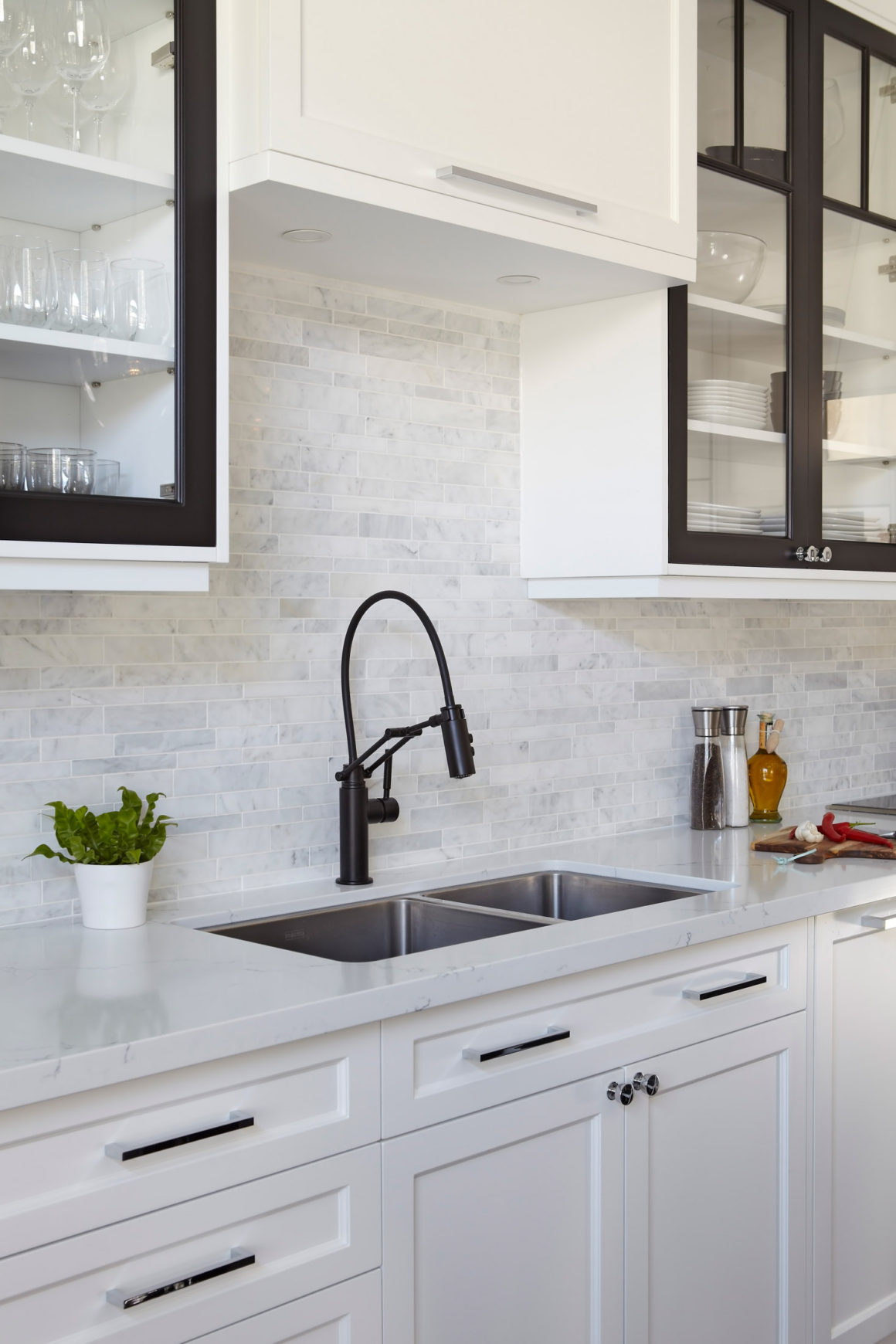
Brenda wanted a black-and-white kitchen with clean, sleek lines. Matte black on the island, a touchless faucet, and glass-fronted upper cupboards break up the sterility of white cabinetry. Dark porcelain floor tiles, warmed by under-floor heating, unify the space. “Matte black is gaining in popularity,” Shaw says. “We’re at the beginning of the trend.”
And given the ease of movement that the space now permits, “it’s exactly what we wanted,” says Brenda. •
Originally published in the Kitchens 2018 issue.
Concept Kitchen & Bath
www.conceptkandb.com
905-335-0808
Vicostone Canada
www.vicostone.ca
905-760-7888

