PHOTOGRAPHY: EMA PETER STYLING: KELLY REYNOLDS
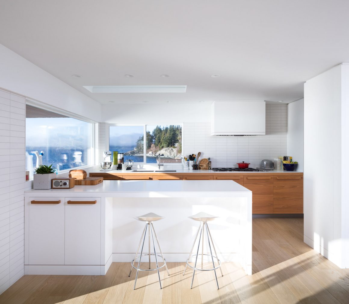
Andrew and Laura Barnes love to look out at Merry Island. Located off the shores of British Columbia’s Sunshine Coast, the island lays claim to one of the few remaining manned lighthouses in the province, which is well within view through the couple’s newly expanded kitchen windows.
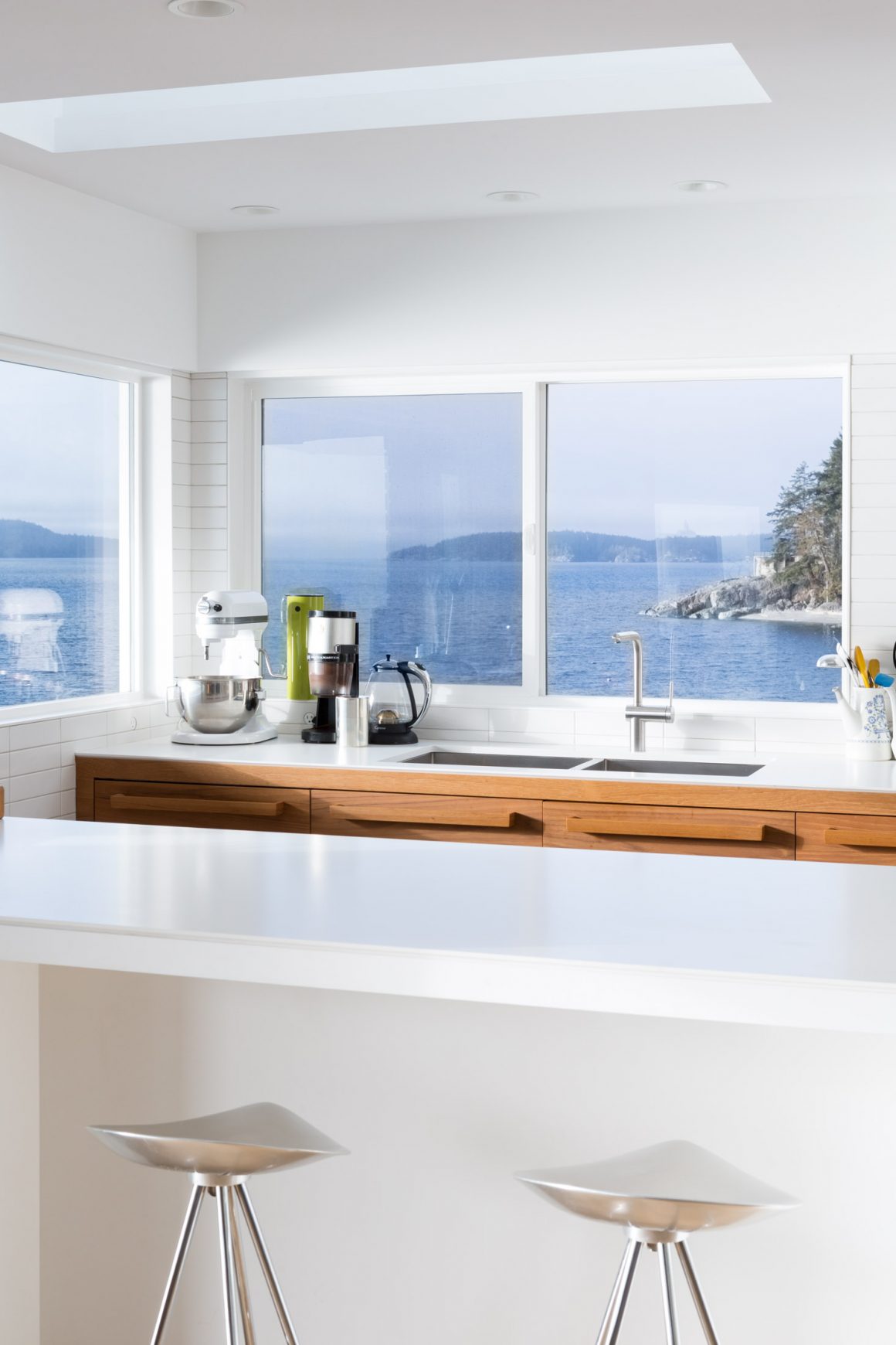
Since renovating their two-storey home in the Halfmoon Bay area north of Vancouver, Andrew and Laura and their two children have sweeping 180-degree views of the waters of Georgia Strait. “It’s a huge hub of activity,” Andrew says, explaining how the Coast Guard regularly conducts exercises in the area.
Andrew and Laura have owned the house for about a decade, using it as a weekend and summer getaway place. Then, about three and a half years ago, they decided to make it their full-time residence. With that move came the decision to update the home, which was built in the 1980s. “The house was very dated,” Andrew explains. “The kitchen was sort of old-person style.”
Not anymore.
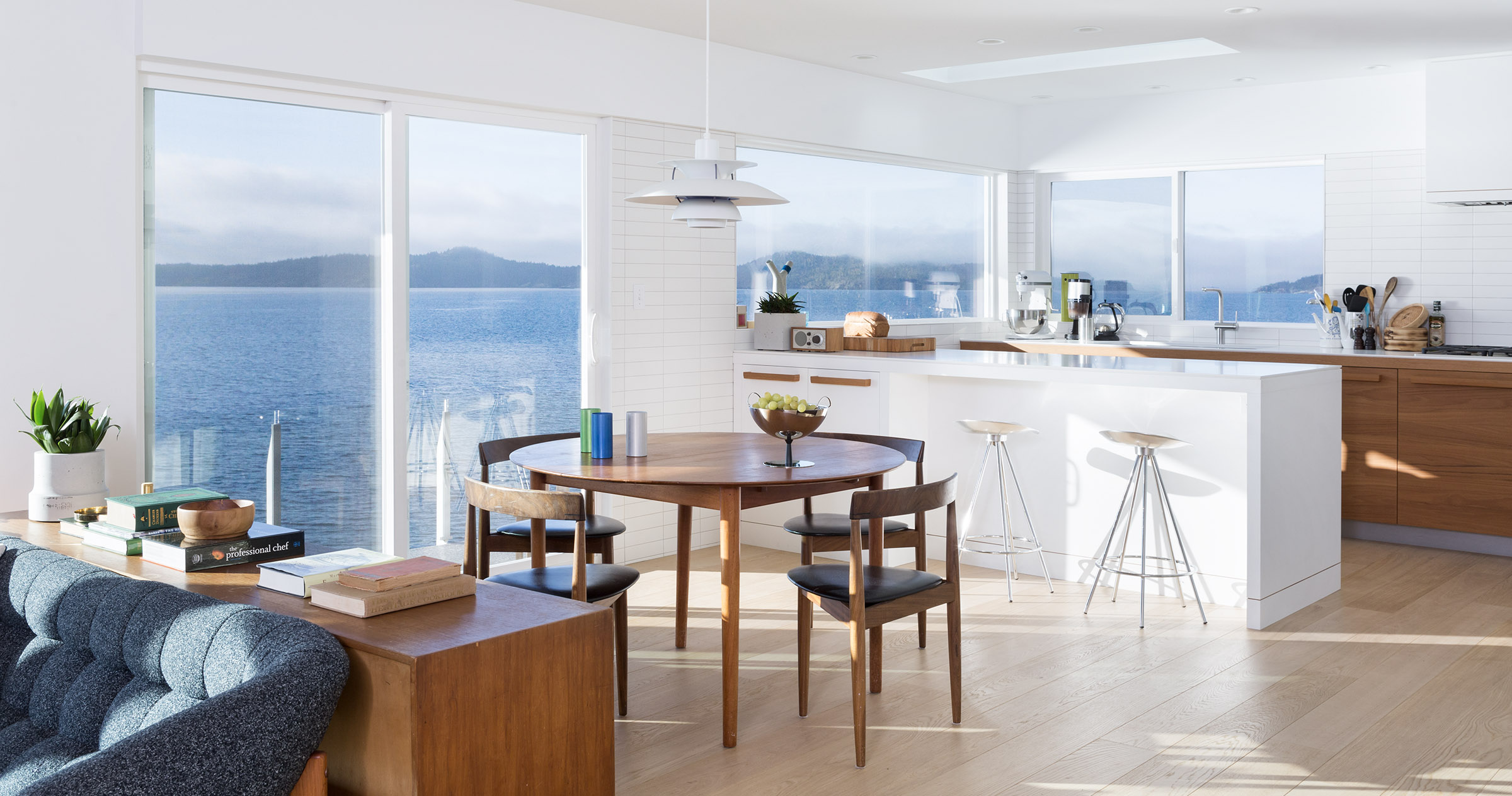
Now, it’s open and light, with an understated air of sophistication – and, of course, that mesmerizing view. But to get the view – or, more precisely, the large windows – to be able to fully appreciate it, the owners had to give up almost all of their upper cabinets. It was a move that Andrew admits made him a little nervous. He was concerned they would not have enough storage space in what is not a large kitchen in a 2,200-square-foot home.
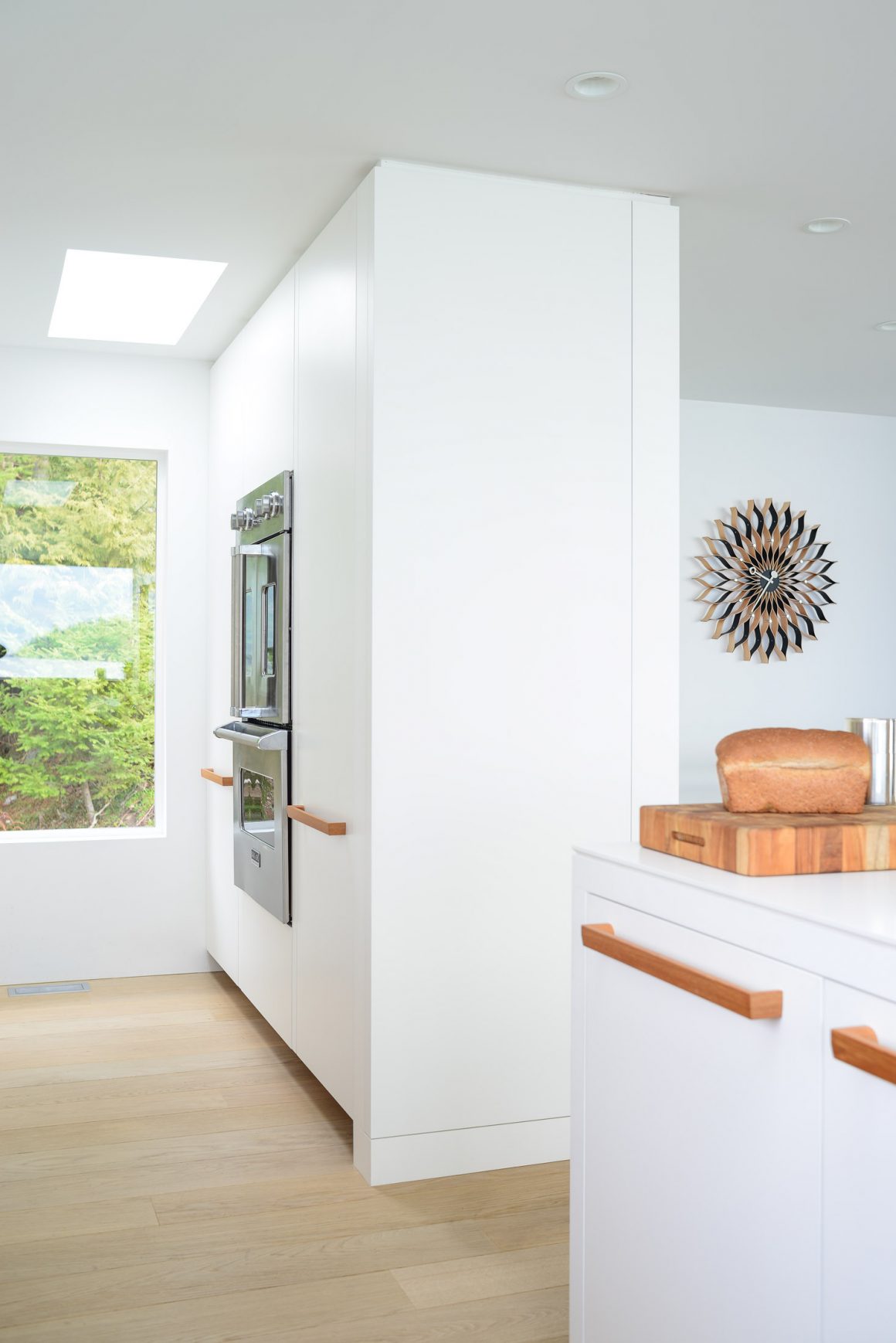
“I love the openness of it. I love how the designer made the kitchen feel spacious, both in terms of space and storage. The windows added a sense of spaciousness.”
Andrew also admits he wasn’t too keen about working with designers, either. “I was hesitant to do the job using a designer. I thought it would be a waste of money,” he says.
Today, he admits, he was wrong about that, too.
“Our experience with these guys was just phenomenal,” he says, referring to the designers at Falken Reynolds Interiors, which included Kelly Reynolds. “Kelly knew how to work with space, work with the materials. We certainly would not have got the results we got if not for the work of the designers.”
Reynolds redesigned the entire home, but for Andrew, who modestly says he loves to cook, the kitchen needed to be just right. “The kitchen, for me, is a real highlight,” he says before beginning to list the features he likes the most.
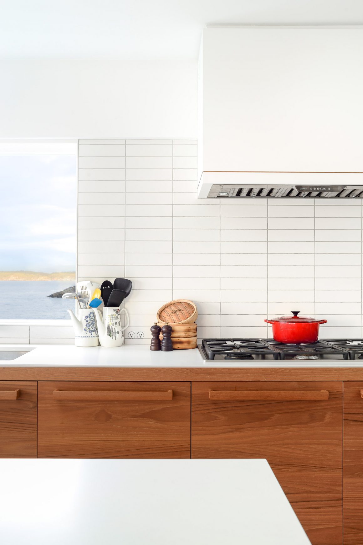
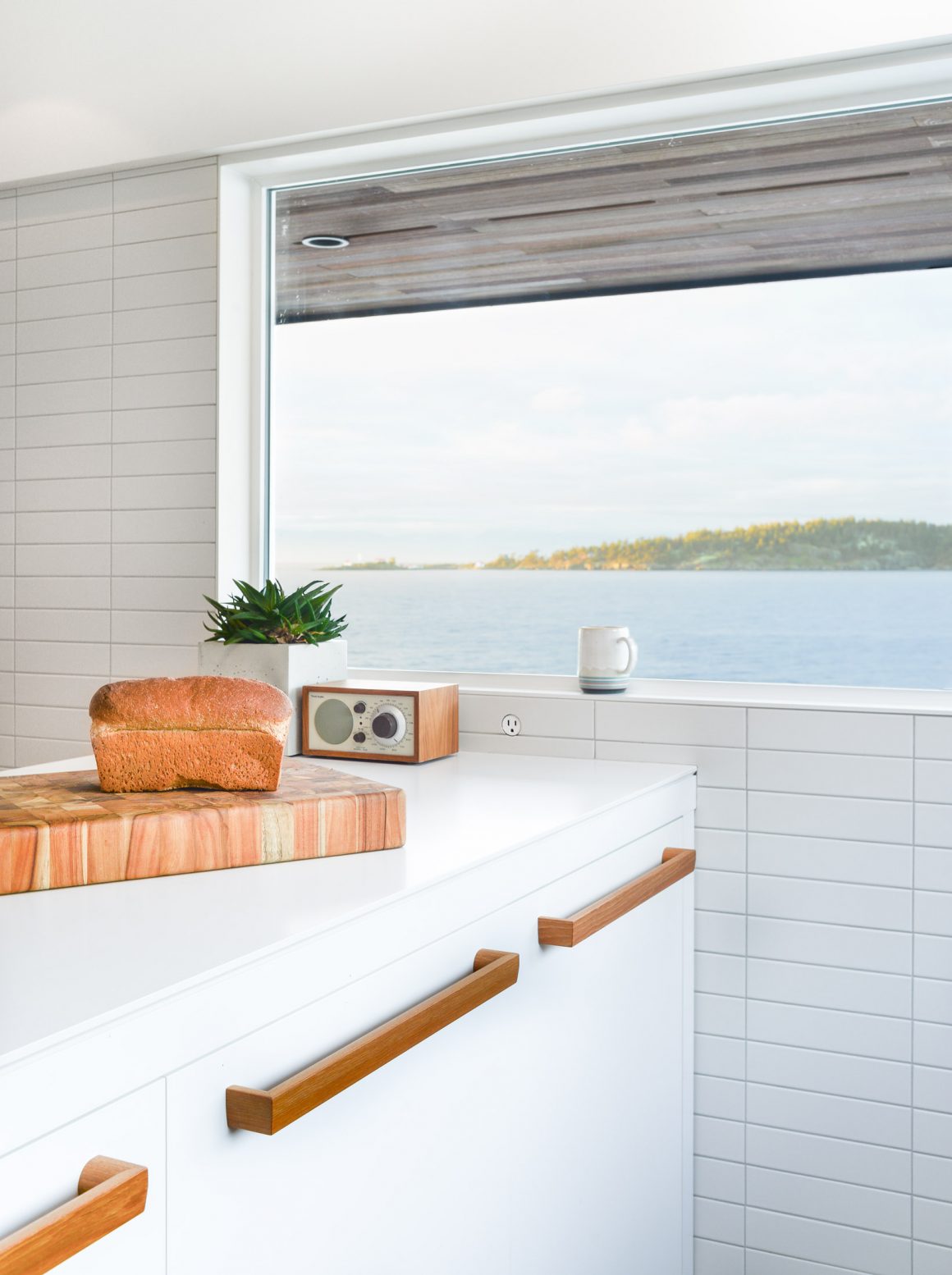
“I love the teak,” he begins, referring to the natural wood highlights in the cabinets, and the custom-made handles. “It gives it a vintage look without the actual vintage.”
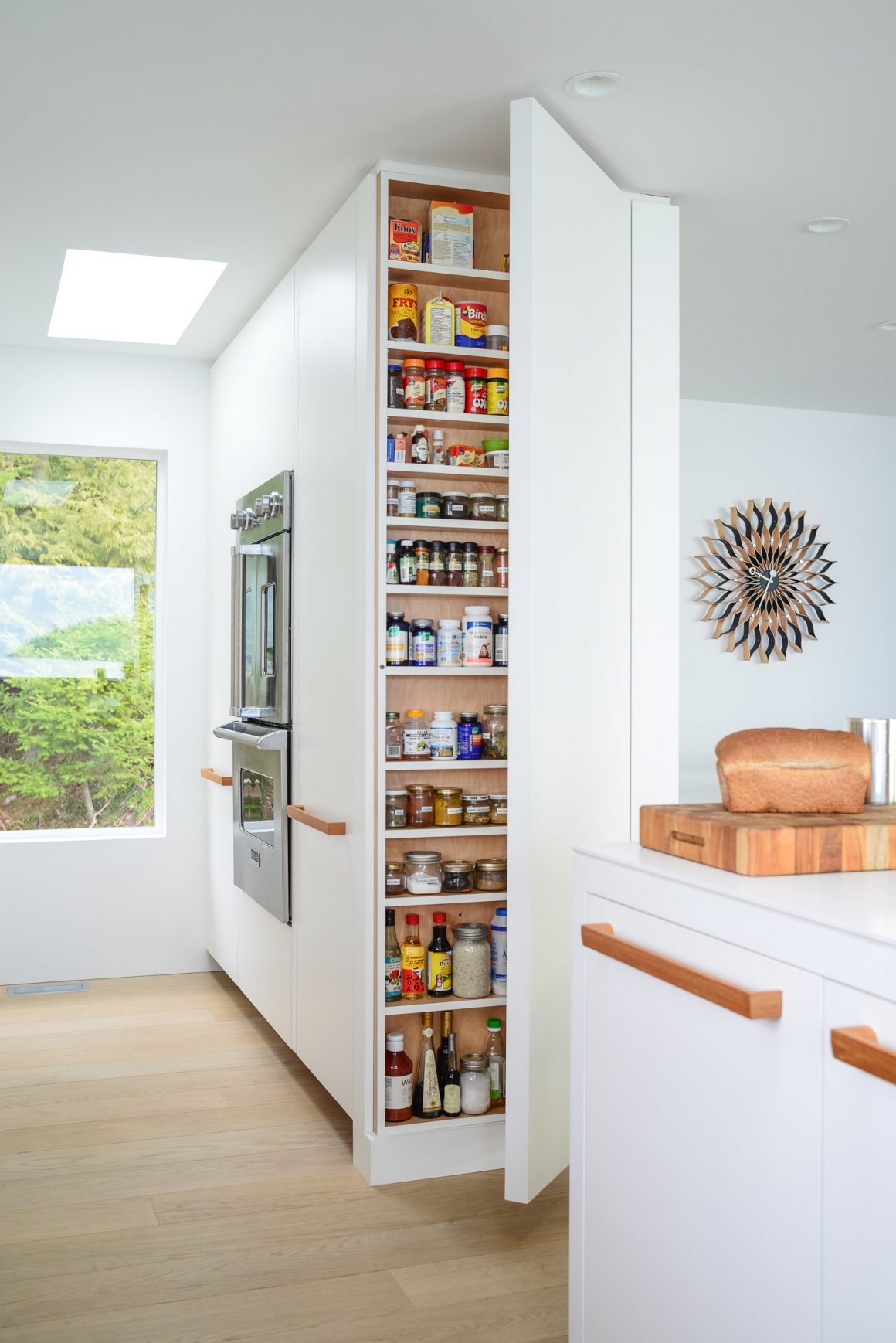
He loves how the refrigerator is incorporated into the cabinetry, how Reynolds opted to run the ceramic tile high on the walls, to the level that is even with the top of the windows in some areas and to the ceiling in another. He loves the detailing, such as the edging of the peninsula’s Caesarstone quartz counter and a thin line of teak that runs the length of the counter a few inches from the floor. And he especially appreciates the large, shallow floor-to-ceiling spice cupboard that is incorporated into a column of cabinets. “It gives you such great access,” he says, explaining how, while he’s cooking, it offers him a complete visual of all his spices. “It really is a fabulous feature.”
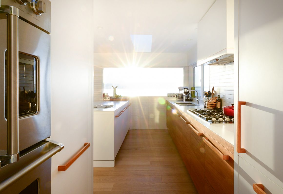
The end result is summed up by Andrew: “It takes all these simple but good-quality materials and puts them together in an interesting way.”
“Nothing was really over-designed or over-decorated,” Reynolds says, as he explains the concept behind the kitchen. He used the family’s Scandinavian-style furniture as an inspiration for the overall look, and spent about 10 hours with them at the beginning of the process to see how they lived and to familiarize himself with what they were looking for.
“On a sunny day, this house just shines,” Reynolds says. “It’s so welcoming when you walk through the door.” •
Falken Reynolds Interiors
www.falkenreynolds.com
604-568-9487

