Photography: Ariana Tennyson
Styling: Jaclyn Peters
The kitchen of the 1970s bungalow was cramped, small and dark, with an impractical layout and upper cabinets obscuring the natural light and the view.
An adjoining dining nook had been used by the previous owner “as a sort of TV room” and, to interior designer Jaclyn Peters of Jaclyn Peters Design, it was “just a really poor use of space.”
Homeowners Andrea and Cameron Bergen told the designer that they wanted “more light, better functionality and beautiful finishes” for the kitchen of the Steinbach, Manitoba home they’d moved into with their young children, Hudson and Aliya. Steinbach is a city about 60 kilometres southeast of Winnipeg. “We wanted something that was easy to entertain in,” says Andrea. “We love to cook and have people over. We wanted a bigger space, one that was functional and bold in colour and contrast.”
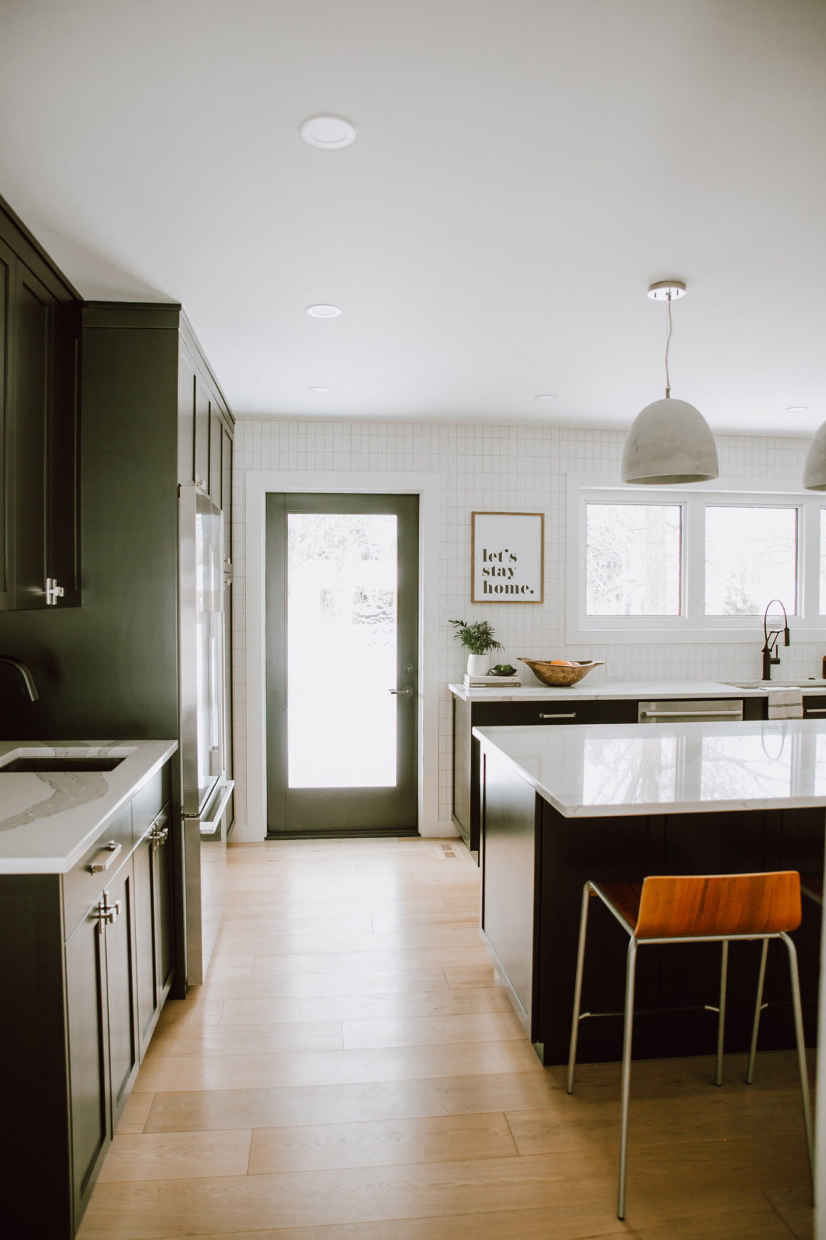
The tiny U-shaped kitchen was original to the house, and the adjoining dining nook had a sliding glass door leading to a patio. Peters’s design called for all the millwork to be removed and the two areas combined into one space measuring about 18 feet by 13 feet. The sliding door would be replaced by a simple door to make room for counter and drawer space beside it.
“And when we reconfigured the space, we decided to add in a large new nine-foot-long window to bring in more light” along that wall, says Peters. The three-paned horizontal window replaced the single window over the kitchen sink, permitting daylight to stream in.
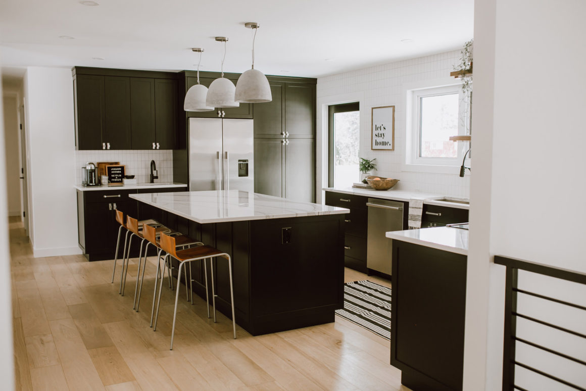
Vinyl sheet flooring in the kitchen was replaced by seven-inch-wide planks of white oak hardwood, the same wood installed throughout the main floor. The oak is repeated in floating shelves flanking the stove.
The light wood flooring contrasts with the custom-made solid-core MDF cabinets, which are painted in Benjamin Moore’s Onyx (2133-10).
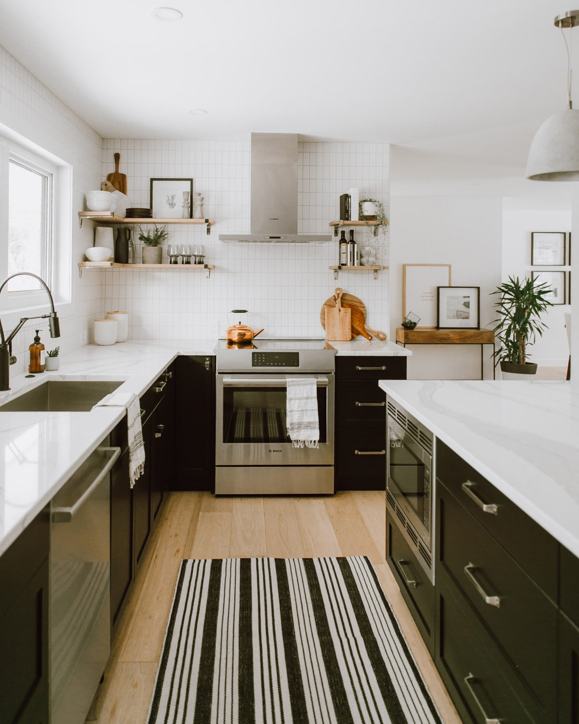
The space has a quiet sleekness, with matte finishes predominating. The appliances are stainless steel; the cabinet and drawer hardware has a satin nickel finish; and the faucets are a matte black.
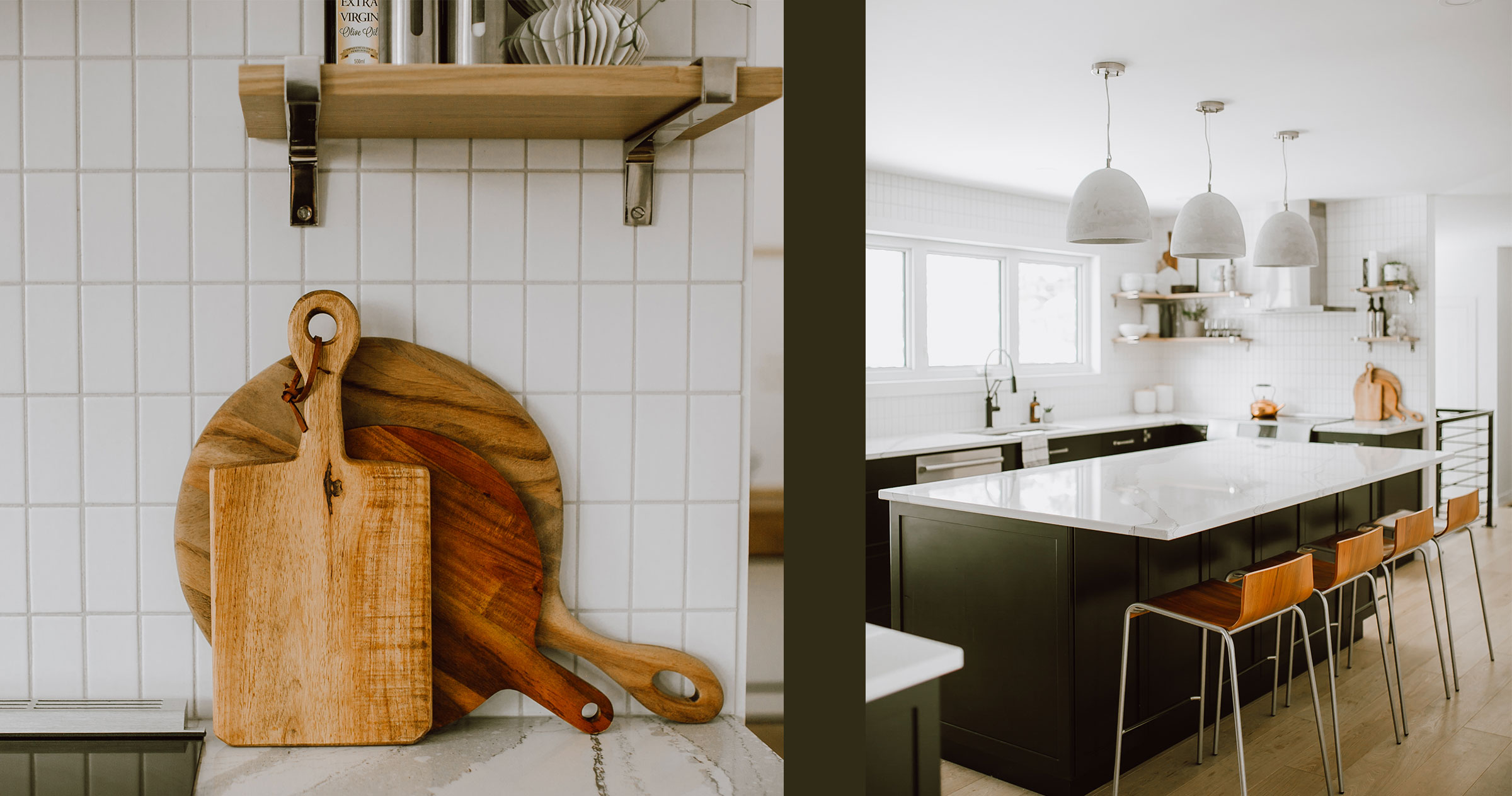
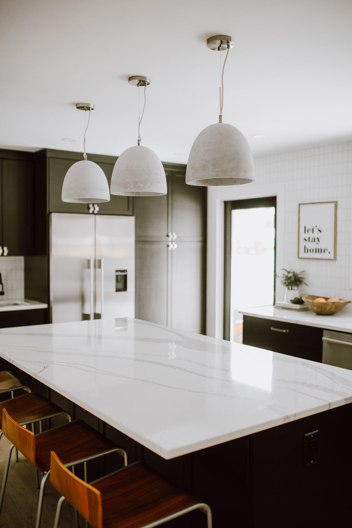
The room is painted in Benjamin Moore’s Simple White (OC-117) – a flat finish on the ceiling, eggshell on the walls. The white is a fine canvas for the room’s stunning countertops and island of white quartz with rich grey veining. The island, which measures about eight by five feet, has space for seating.
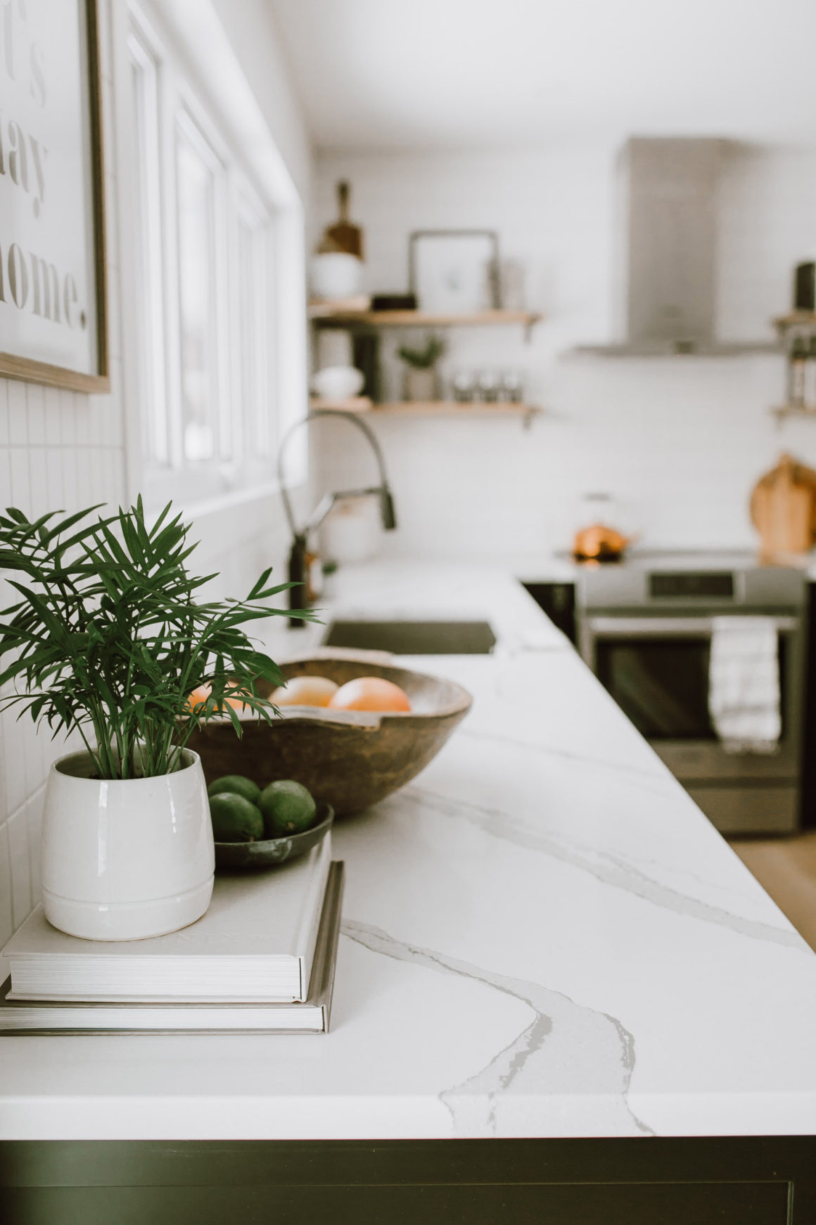
Andrea says she is thrilled each time she enters the kitchen. “The countertop makes such a huge statement and we love it,” she says. She also loves that the material is easy to clean and not too shiny. “You need a bit of shine for it to be wipeable, but I didn’t want it glossy.”
Pendant light fixtures over the island have a concrete look, although they are made of a composite. Their pale grey is picked up in the grout of white two-by-three-inch tile, which is used on two walls in a fresh, novel way. “I wanted a classic look that wasn’t too expensive – so I decided to do a different take on subway tile,” says Peters. “We stacked the tiles vertically and used a really light grey grout. Bringing the tiles up to the ceiling and around the door and window provided some extra interest.”
The family is very satisfied with the result, and Andrea has high praise for her designer’s skill. “I just love how she took our vision of what we wanted and was able to do it in our space.” •
Originally published in the Kitchens 2020 issue.
Jaclyn Peters Design
www.jaclynpetersdesign.com
Steinbach’s Flooring Canada
www.steinbachsflooringcanada.ca
204-326-7624.
Kroeker Cabinets
www.kroekercabinets.ca
204-392-5038
Cambria
www.cambriausa.com
Robinson Lighting
www.robinsonco.ca
McGee & Co.
www.mcgeeandco.com
Top Knobs
www.topknobs.com
Blanco
www.blanco.com
Brizo
www.brizo.com.

