PHOTOGRAPHY: MAXIME BROUILLET
There are renovation stories and then there are renovation stories. The latter are not characterized merely by upgrades and dramatic transformations, but by complete architectural renaissances, in which old buildings are re-imagined and restructured. The process takes a clear concept, plenty of planning, a dash of daring and bit of a budget. But the result is singularly spectacular. It’s almost magic.
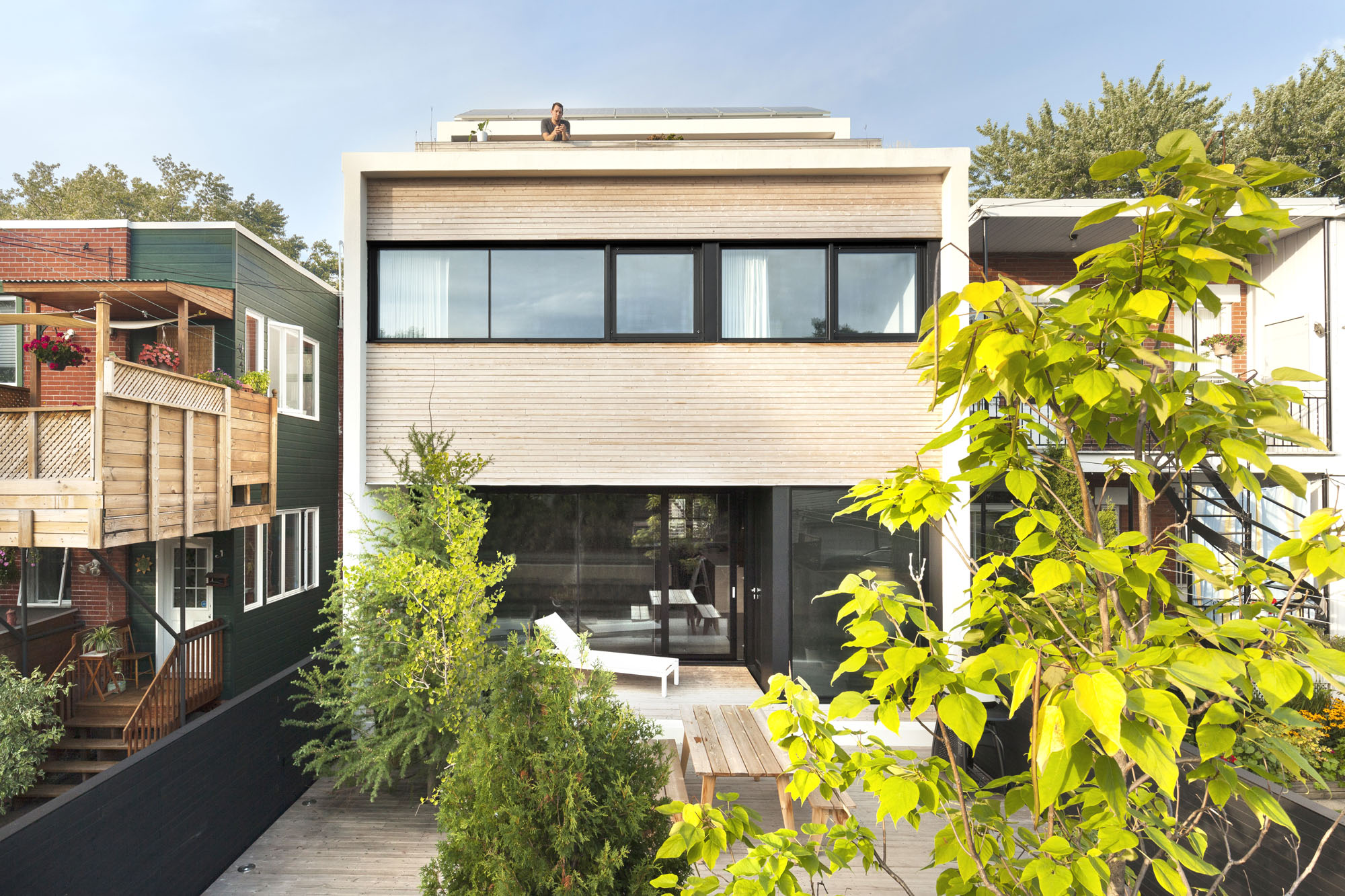
The story of the complete transformation of a former duplex in Montreal’s Petite-Patrie district, just east of Papineau Avenue, north of Plateau Mont Royal, is such a tale. Where the address once identified an old rundown two-storey two-unit building, has – as if with the wave of a wand – disappeared. The civic numbers now belong to a three-storey single-family home that is modular and highly functional, suiting the needs of a single father and his three children.
The owner also excavated the area under the building to create a full basement, adding a fourth level of living space that is designed for his children – two young adults and one teenager. An extension was also added to the rear of the building. The total effect: about 4,000 square feet of contemporary-style space.

The re-conception of this dwelling was pulled together by the architects at the
Montreal boutique firm La Shed. Sébastien Parent is one of the architects who worked on the project.
“It has the appearance of being very, very big with the light,” Parent says. “It absolutely responds to what (the owner) wanted. It functions well with his lifestyle.”

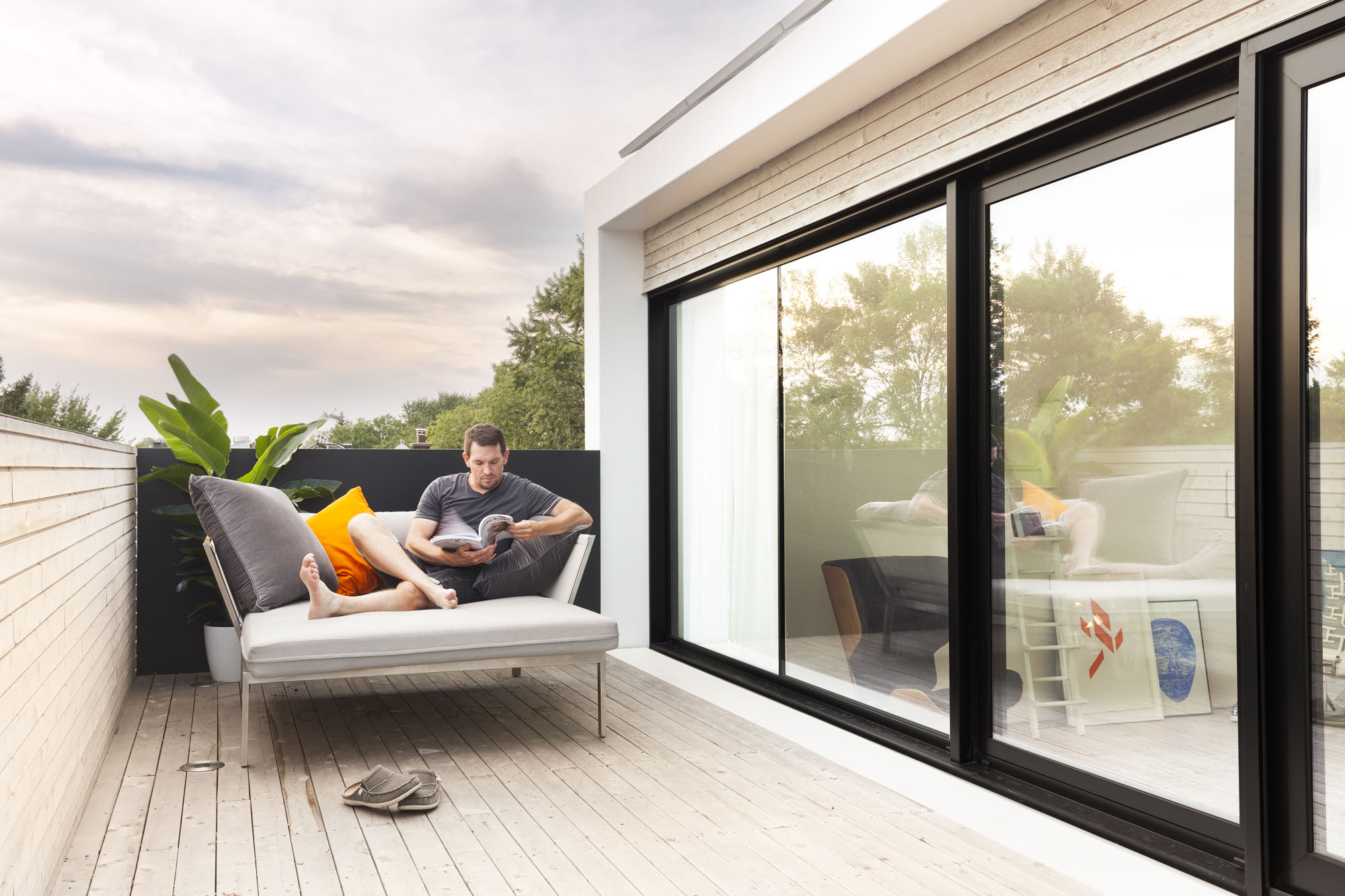
In some ways, this building is now almost ahead of its time, with a section of the second-floor roof supporting a garden, and solar panels on the third floor supplying energy to power some of the building’s needs.

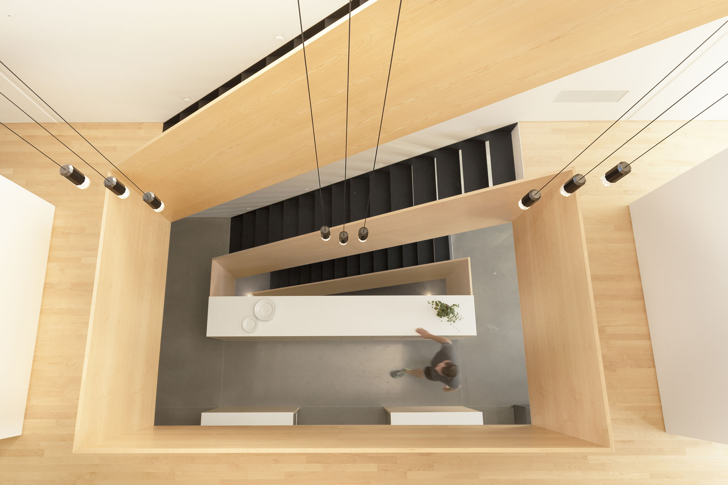
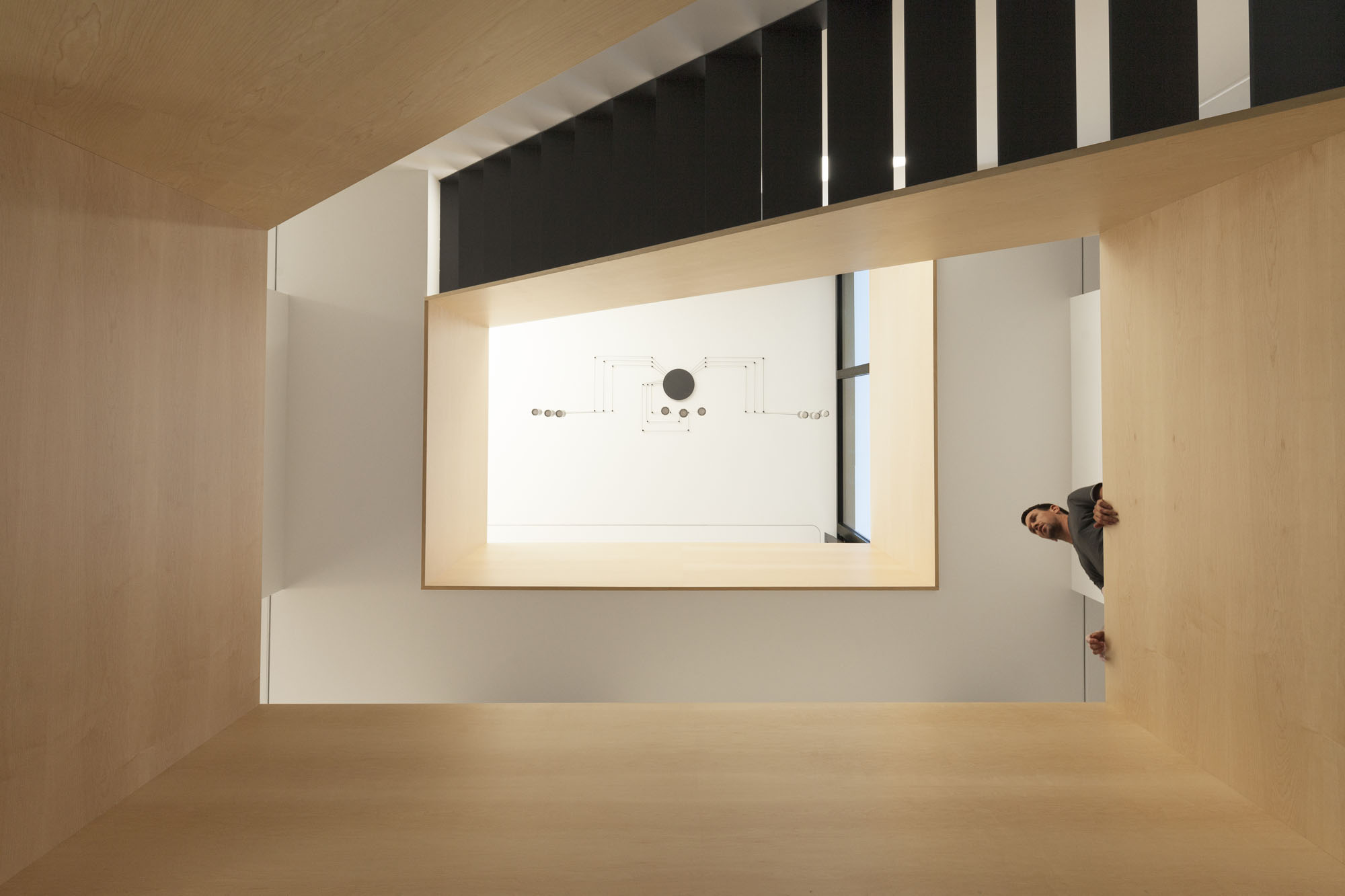
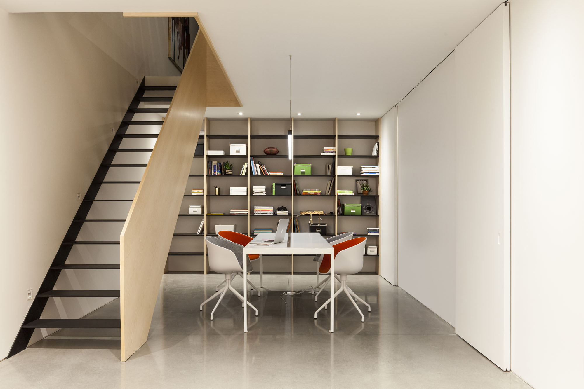
To begin to understand the extent of the re-invention of this home, visitors simply have to open the door. “When you walk in, the most striking element is the stairs,” Parent says. “The stairs set the ambience, drawing a lot of light from the third floor.”
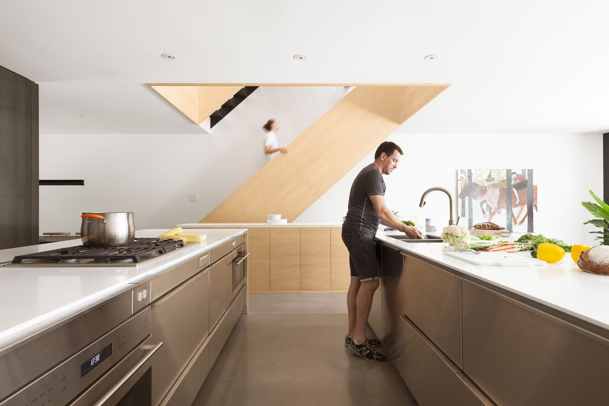
The single stairwell, which runs from the basement to the main floor and up to the two higher levels, offers a stunning visual spiral. Its full-panel banisters, made of Canadian maple and steel treads with open risers, are a definite wow factor, adding a dynamic edge to all levels.

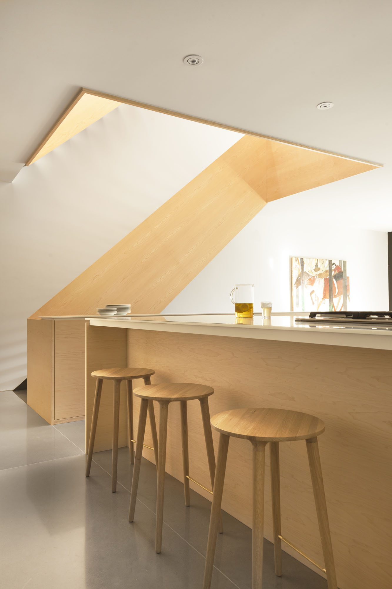
Then, there’s the kitchen. Its three islands – which eliminate the need for upper cabinets, creating an open-concept space – are positioned next to a massive black cube. This structural element, with walls covered by dark steel panels, helps create a striking industrial vibe. “The cube offers a hierarchy to the space without closing off areas with walls,” Parent explains. It also encloses a number of features: a closet off the main entrance on one side; a powder room on another; a large pantry area; a coffee area, which includes a sink and space for all the small kitchen appliances, such as the coffee maker, toaster and blender; and a gas fireplace.
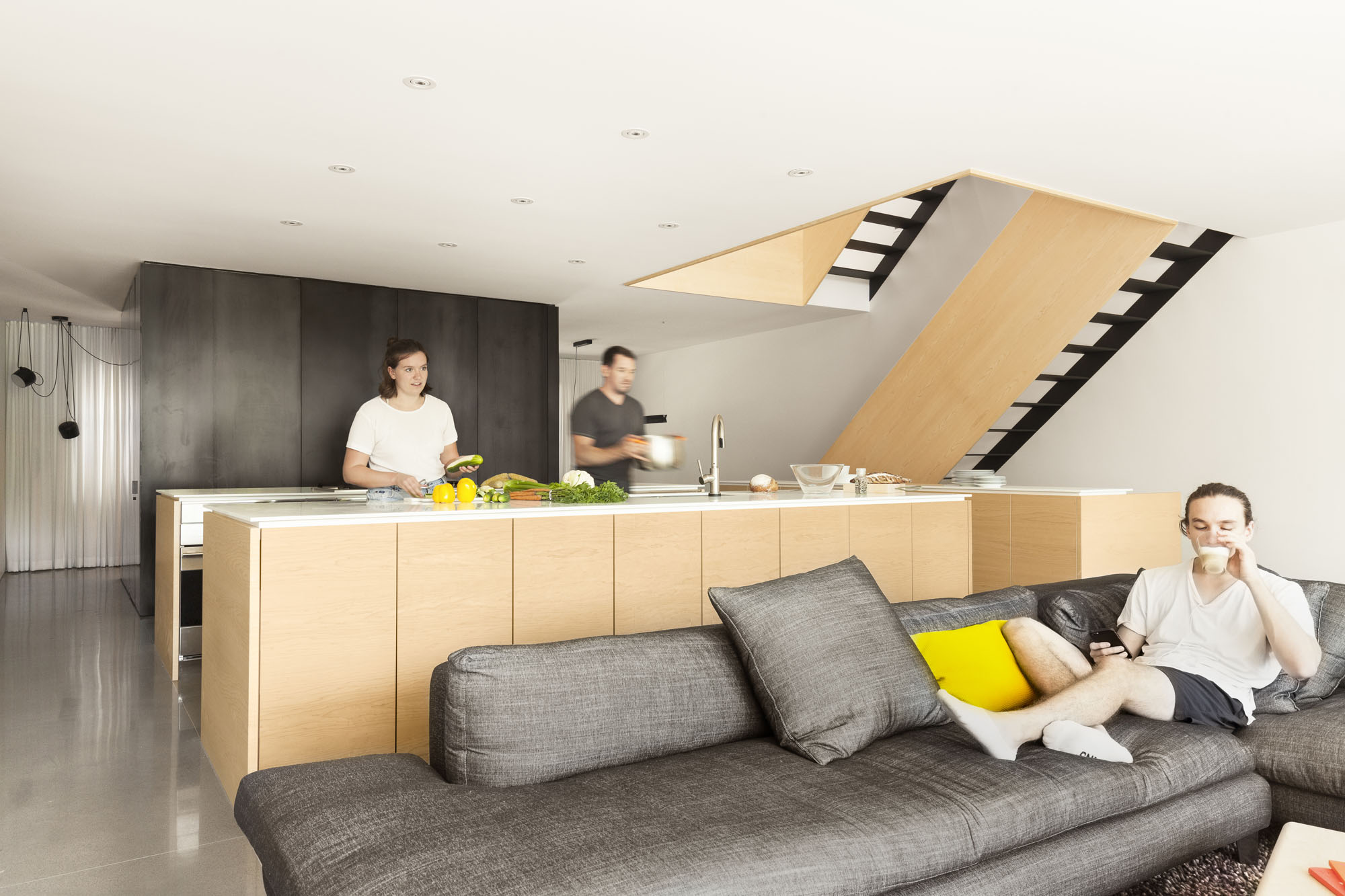
“When you are cooking, you are always facing out, not looking at a wall,” Parent says, adding that anyone working in the kitchen can maintain visual contact with others in the living room, which opens onto the courtyard area at the back of the home.

The living room has a wall of floor-to-ceiling windows and a sliding patio door, flooding the first floor with natural light. A 12-foot-wide full-length corrugated glass panel that runs along a track can be positioned to provide privacy from the outdoors without blocking the light. And a second entrance was built just off the living room, complete with a glass vestibule to facilitate access to the home by anyone who parks a vehicle or bicycle in the back alley adjacent to the property. The vestibule is a practical feature, especially in winter. It prevents a direct walk into the living room, Parent says.
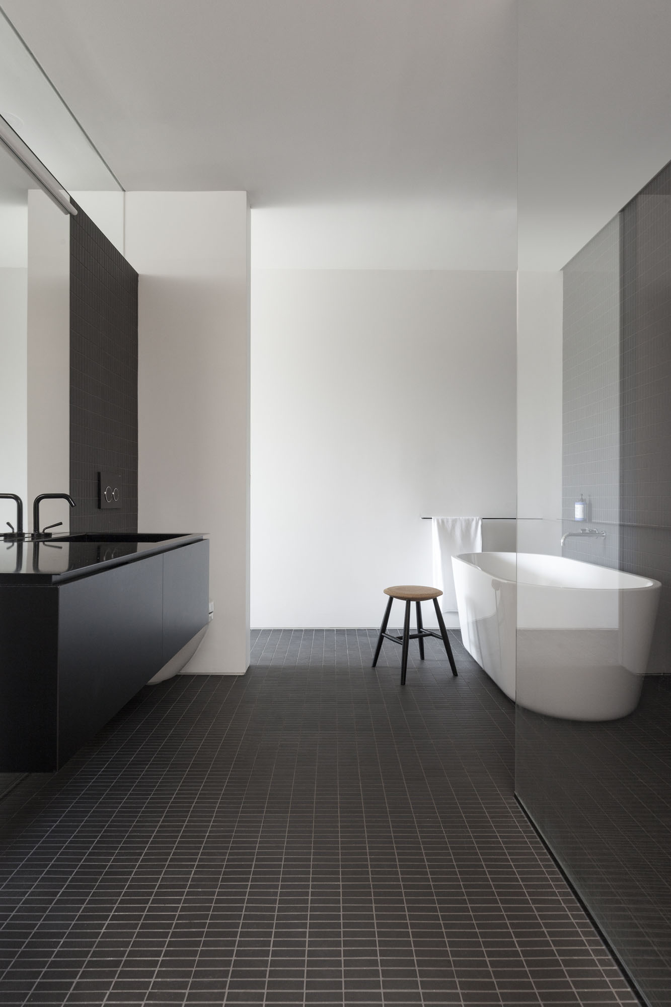
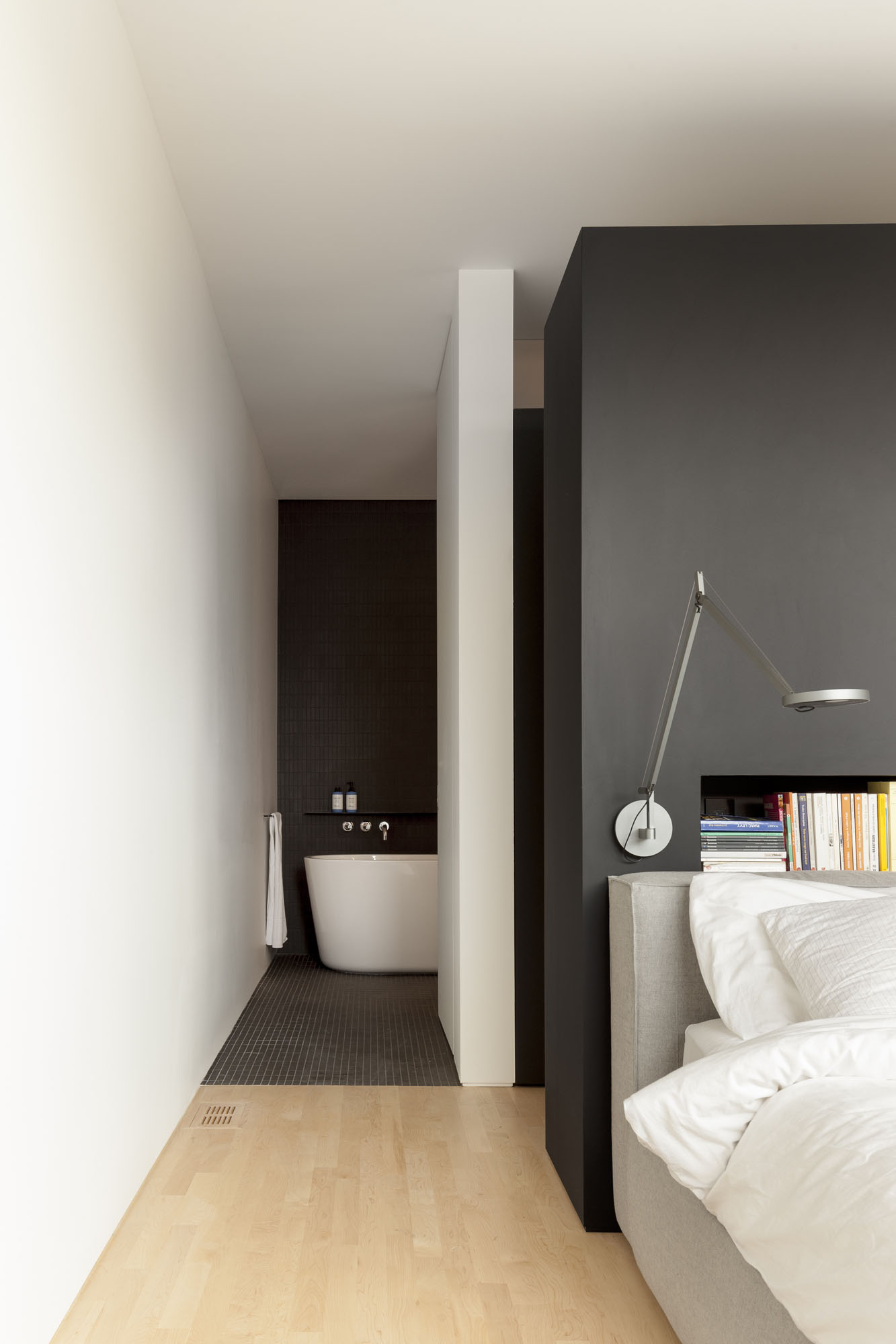
The bedrooms are on the second floor, while the third floor provides space for an office that features many windows. They flood the upper level with natural light that also illuminates the stairwell. The space, which has a small outdoor terrace, is used daily by the owner, who works from home. He wanted a functional business area, separate from the rest of the house, Parent says.
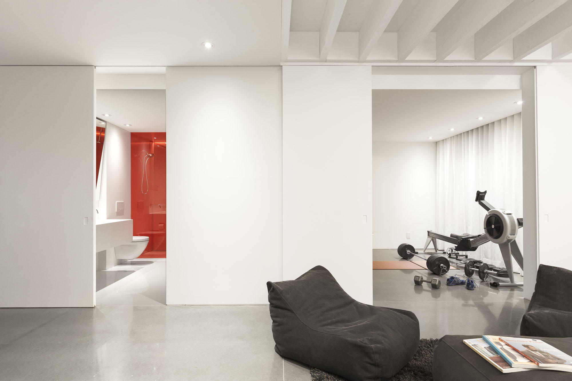
And then there is the basement. This level, Parent explains, was entirely designed for the children. It is sleek, with heated polished concrete floors in its bathroom, and an area in which to watch television, a work space, a gym and a bathroom that offers a wild punch of colour, a request from the owner that aims to give the space a youthful ambience.
Overall, Parent says, the project turned out exactly as the owner wanted. “It offers contrast. It’s masculine, with a lot of light.”
And although it took six months to develop and plan, and eight months to execute the renovation work, the final result is amazing. Maybe there was a little magic? •


