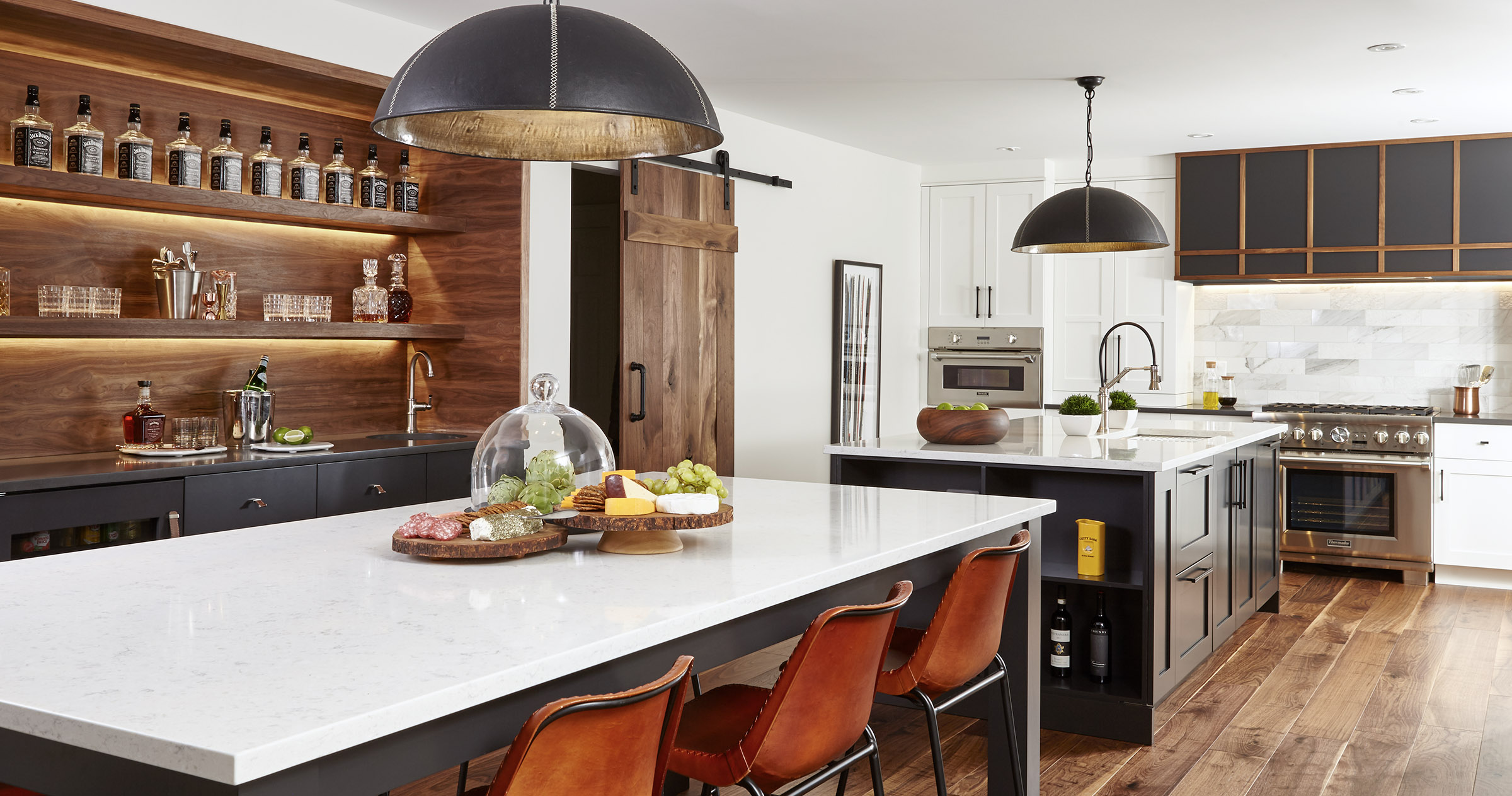
PHOTOGRAPHY: VALERIE WILCOX
STYLING: LAURA GOARD
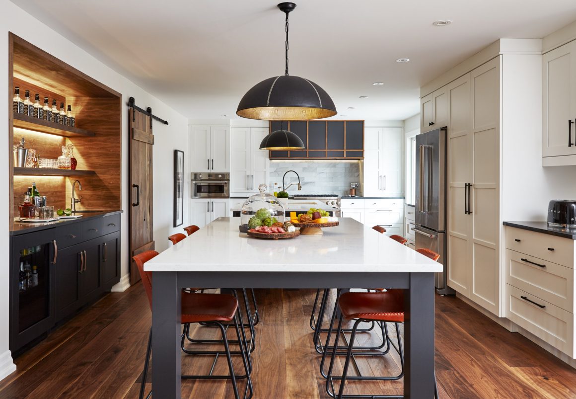
White kitchens can look sterile, even clinical.
“But there’s none of that sterility in this kitchen,” says Frankie Castro of a kitchen in Oshawa that she designed.
“Frankie knocked it out of the park by incorporating the warmth of wood and the clean, modern style that we like,” says homeowner Steve Brain. “We had a small, cramped, classic 80s-style kitchen. It was dark and closed off. We really wanted to open it up and make it brighter.”
The former kitchen had laminated countertops, whitewashed cabinets, vinyl flooring and no windows. There was a three-by-three-foot food pass-through in the back wall to a long, narrow dining room so isolated from other living areas that the owners had converted it into a music room. A large pantry was located in a long hallway outside the kitchen. “It just wasn’t working for us,” says Steve.
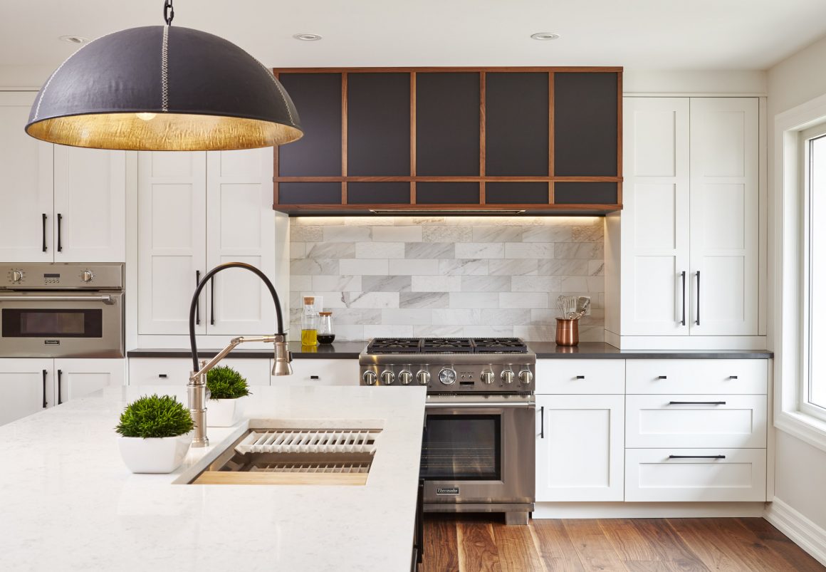
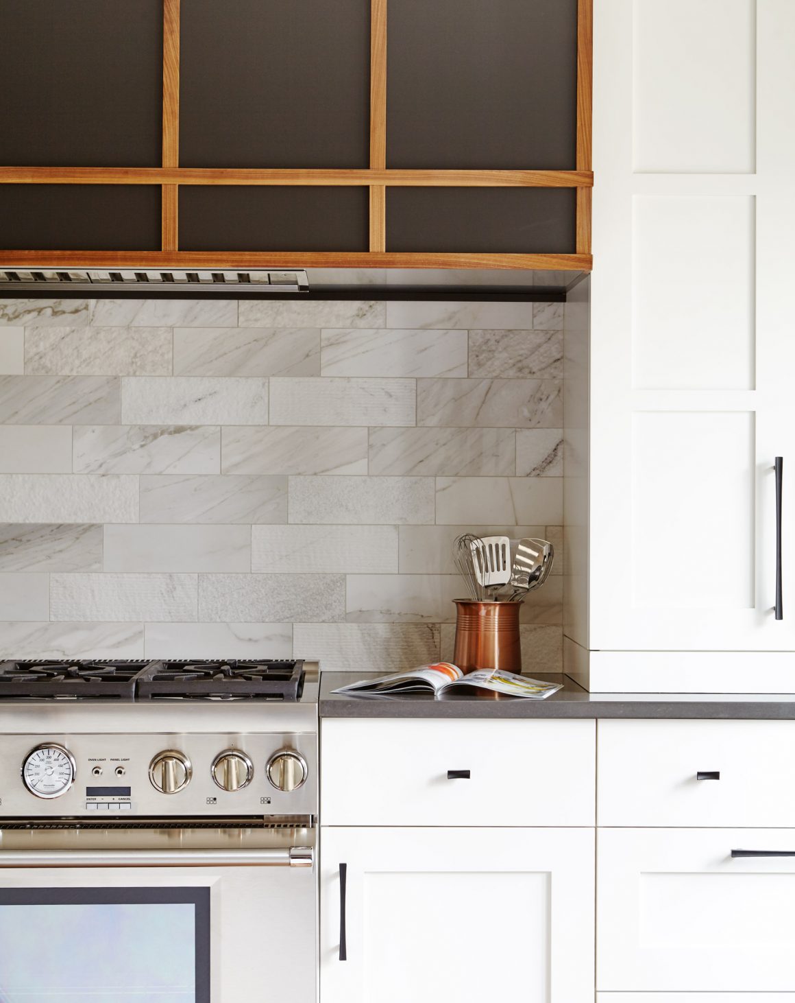
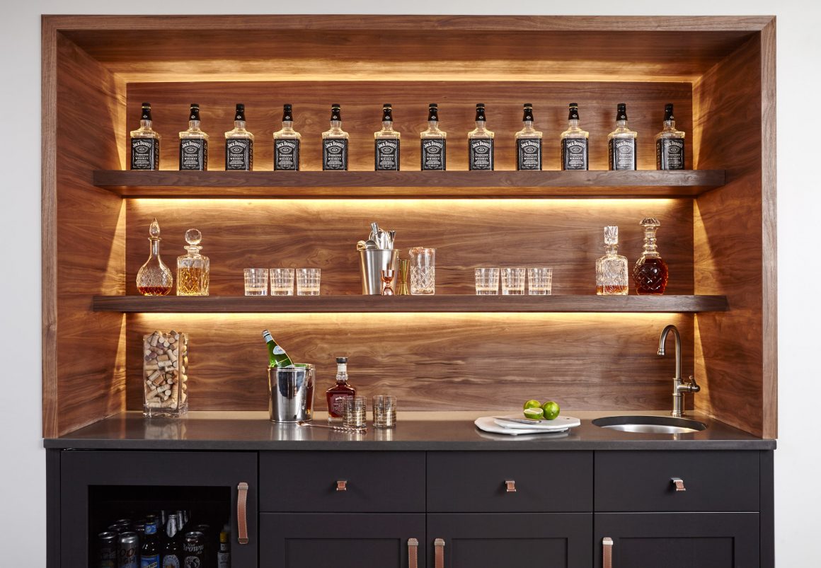
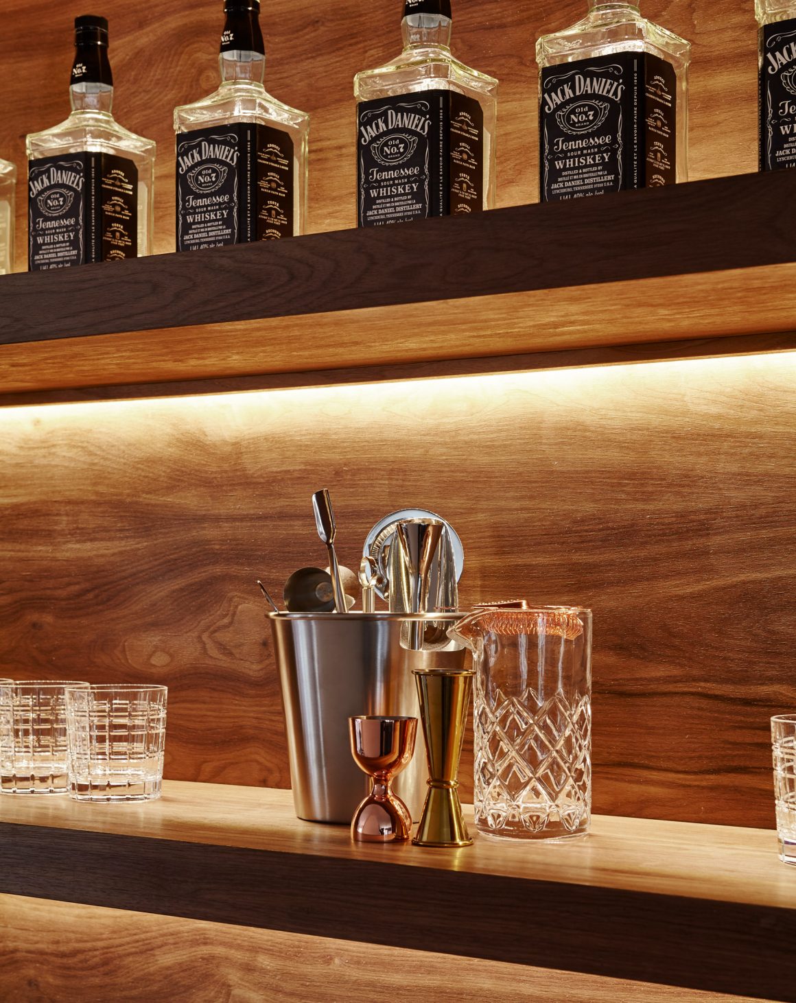
Castro, the creative director of Square Footage Custom Kitchens & Bath Inc., added warmth to the kitchen, which won her a National Kitchen and Bath Association award, by choosing walnut wide-plank flooring, a barn door, a behind-the-bar feature wall, and accent strips on a colossal range hood.
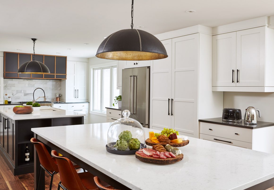
“Multi-panelling adds richness,” Castro says. Shaker-style cabinetry was custom-designed with three panels in the uppers and flat or extra-wide panels in the lowers.
The white ceramic backsplash incorporates four textures, and two colours of quartz countertops were used.
“For me, it is really about functionality and ergonomics, and then the beauty of the space,” Castro says. “In a super-large kitchen, are you going to walk a mile from your fridge to your cooktop? Design is a practical process. How it’s going to look is the last thing to consider.”
But adding some colour and texture to a white kitchen makes it “a bit more interesting,” she admits.
Square Footage removed two walls to expand the kitchen to 460 square feet from 215. A three-panel window introduced plenty of natural light. Castro brightened the space further by adding recessed ceiling lights, pendants, and under-cabinetry lighting.
The Brains love to entertain. Steve, who collects vintage crystal decanters, wanted a bar. So Castro recommended dark cabinetry on the bar and islands to contrast with the white storage cabinets.
The couple had requested two large islands: a functional workspace and an entertainment area to seat at least six. During installation, it became apparent that the slender legs and metal underbracing on the entertainment island weren’t sturdy enough to hold the large, one-and-a-quarter-inch-thick quartz slab. Square Footage re-engineered the table, attaching the legs directly to under-floor joists for additional support.
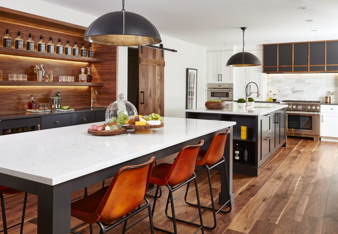
Steve, Rebecca and their 16-year-old daughter love the bright, spacious kitchen. While Steve mixes a cocktail, Rebecca and their daughter sit at the island, finishing business and schoolwork. Their daughter has embraced baking with a passion.
Visiting guests gather around the counter-height table or lean on the island to chat with family chefs, busily preparing meals.
“The kitchen has always been the hub but even more so now,” Steve says. “Even if it’s just the three of us, it’s a warm, super comfortable, happy place to be.” •
Square Footage Inc.
www.squarefootageinc.com
905-427-4441

