
PHOTOGRAPHY: RAPHAËL THIBODEAU
STYLING: TRACEY MacKENZIE
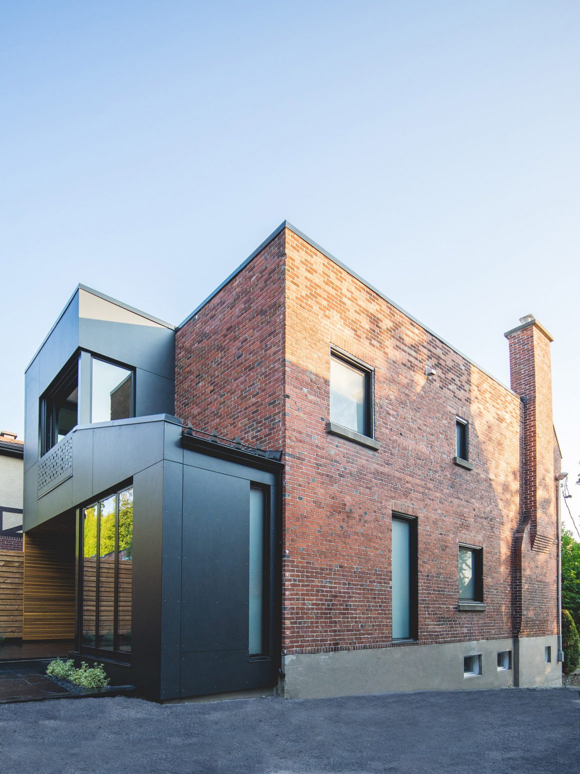
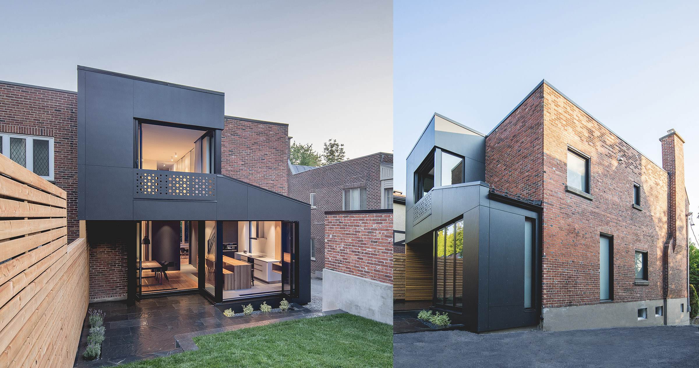
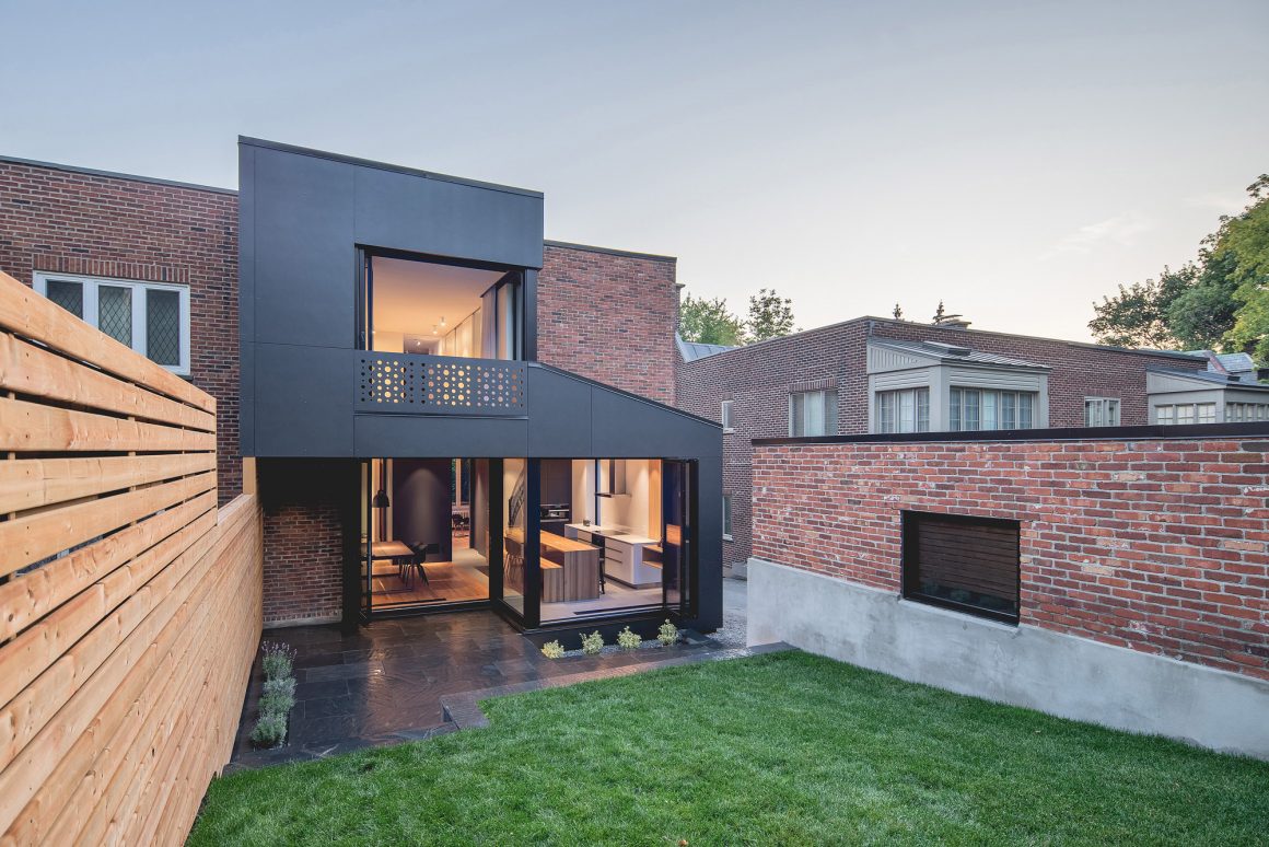
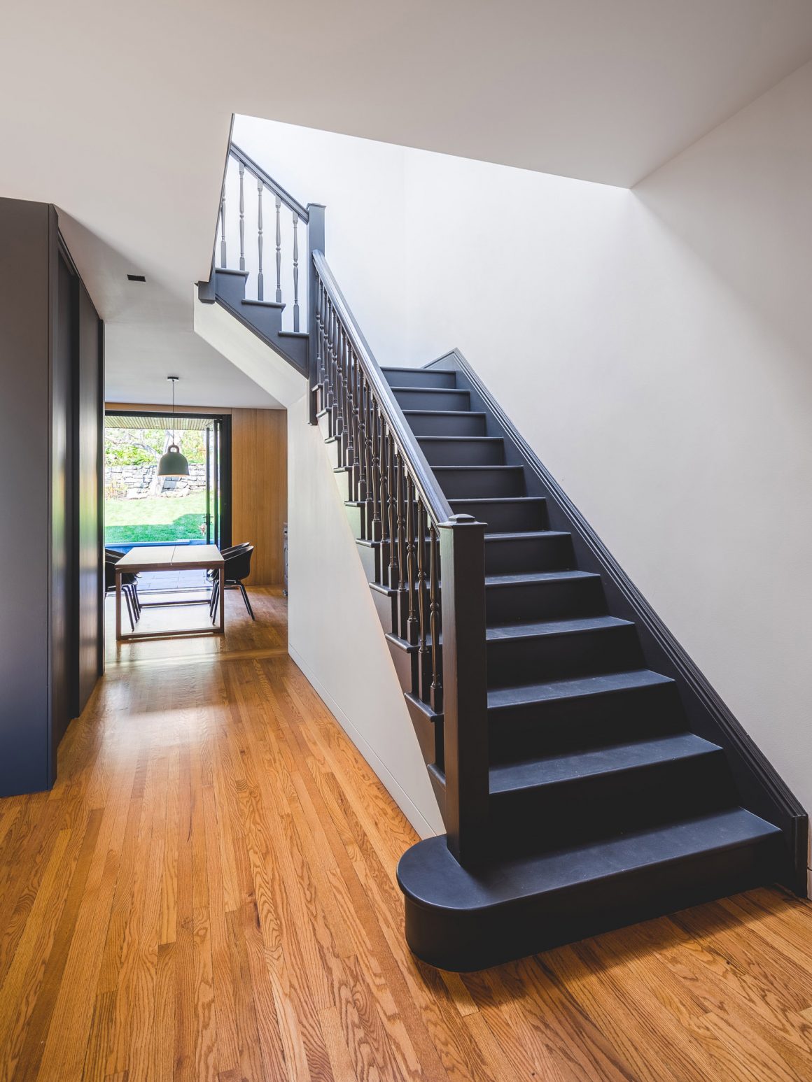
They call it “the Black Box II.” It’s a rear extension, in two asymmetrical cubes, attached to a classic semi-detached home on the border between Westmount and Montreal.
It’s the second time architect Natalie Dionne has played with adding smaller, contrasting-colour extensions to traditional homes. The first one, in Notre Dame de Grace, was nicknamed the Black Box (la Boîte Noire) in reference to the homeowner’s work as a photographer. The name, and theme, stuck.
This latest project came about when this home’s owners returned to Montreal after living abroad for about 15 years. They had rented out their house as they relocated for business, living across Europe in such cities as Oslo and Barcelona. When it was time to return and settle down, they wanted their century-old home to have more than just a basic renovation – they wanted to give it a contemporary makeover. As well, they wanted a little more space on both the main and second floors.
Dionne, owner of Natalie Dionne Architecture, says she discussed several options with the owners on where to place the extensions. “On each floor, we said, ‘Do we put it on the left or the right of the house?’ ” Dionne says. They settled on enlarging the kitchen on one side, and the upstairs bedroom floor on the other.
“It transformed everything. It’s more interesting,” she says. “When you build something that is clean and neutral, it leaves space for the original architecture. It doesn’t compete with it.”
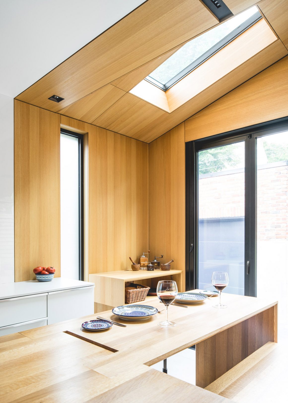
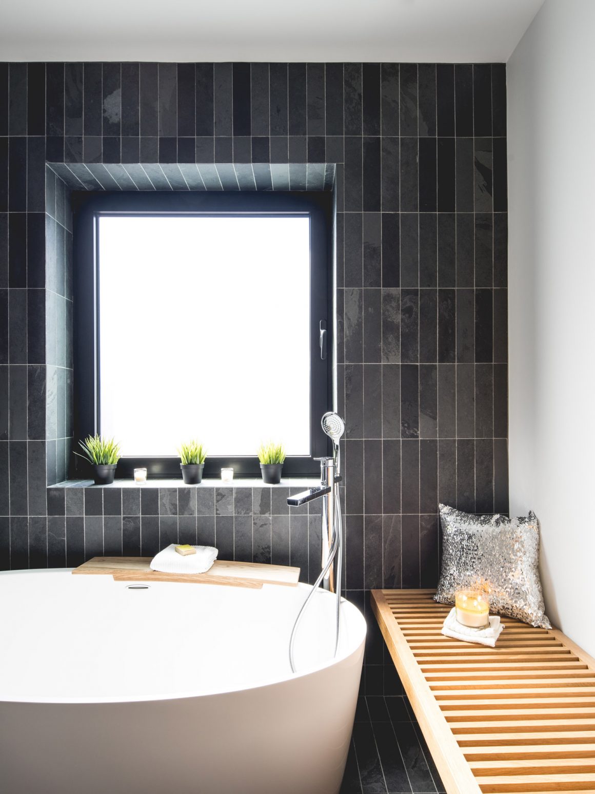
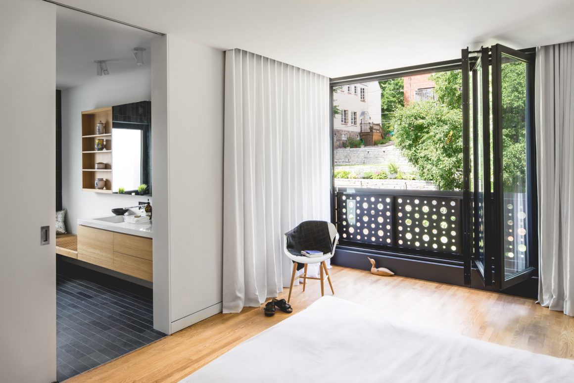
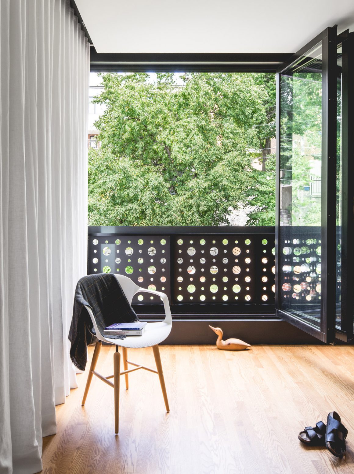
Together, the extensions add 180 square feet of living space. Downstairs, it allows for an eating area in the kitchen; upstairs it creates a larger master bedroom with a loggia, a gallery that’s open to the garden. The overhang creates a covered, outdoor eating area lined with cedar next to the kitchen. Floor-to-ceiling three-panel folding windows on both the upper and lower storeys are meant to extend the living space into the backyard. “People want to be able to enjoy their gardens and the outdoors,” Dionne says. “To bring them in as part of their home.”
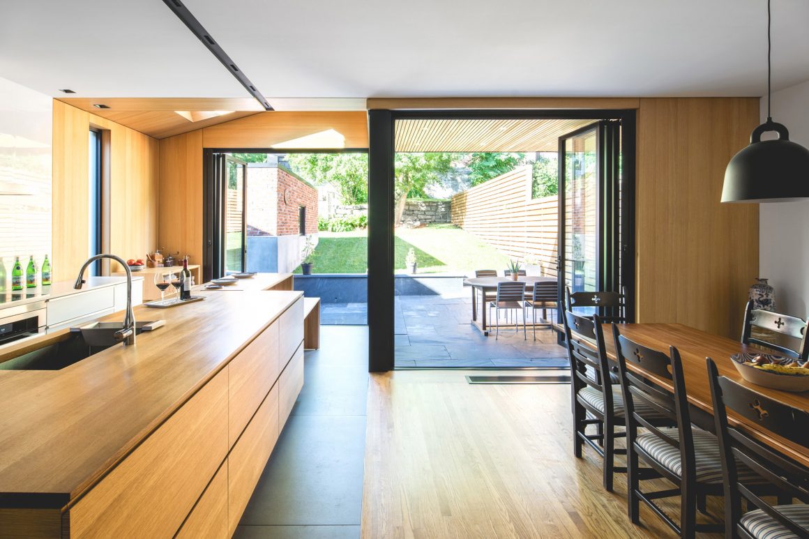
The large open windows are meant to extend the living space out into the garden.
They’re very different from the typical NDG or Westmount rear extensions, both in terms of design and construction. “You can see extensions in the neighbourhood that were built in the 1980s,” Dionne says. “They’re clad in PVC or aluminum, have small windows; many are badly built and badly insulated.”
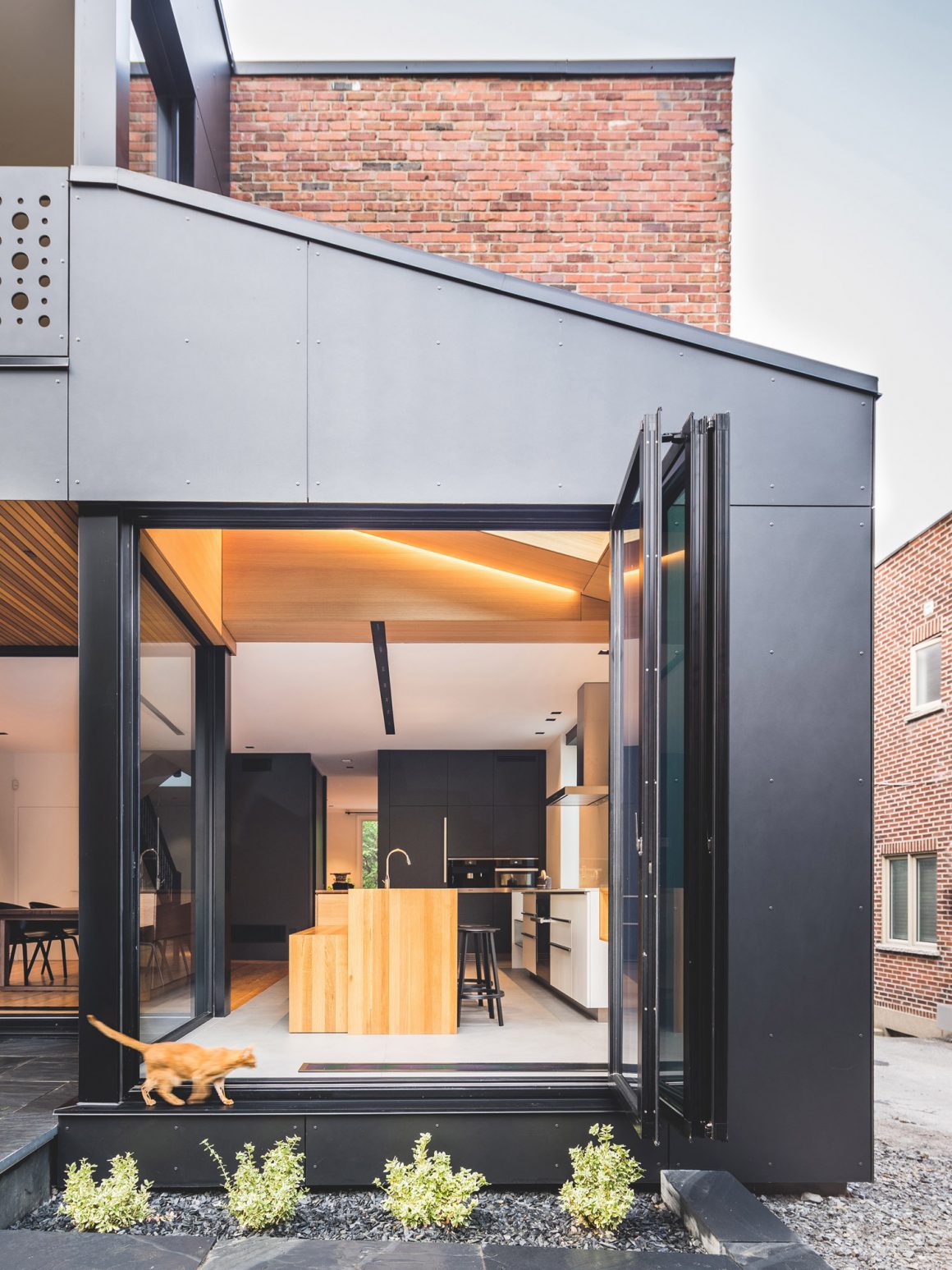
Creating the large openings did require some engineering work and steel reinforcements. Once built, the extensions were clad with fibre cement board. That same board, perforated with large and small holes, was used to create a railing around the upstairs loggia, an extension of the walls. The owners could have opted for a less expensive railing, Dionne says, but this one adds more to the final look.
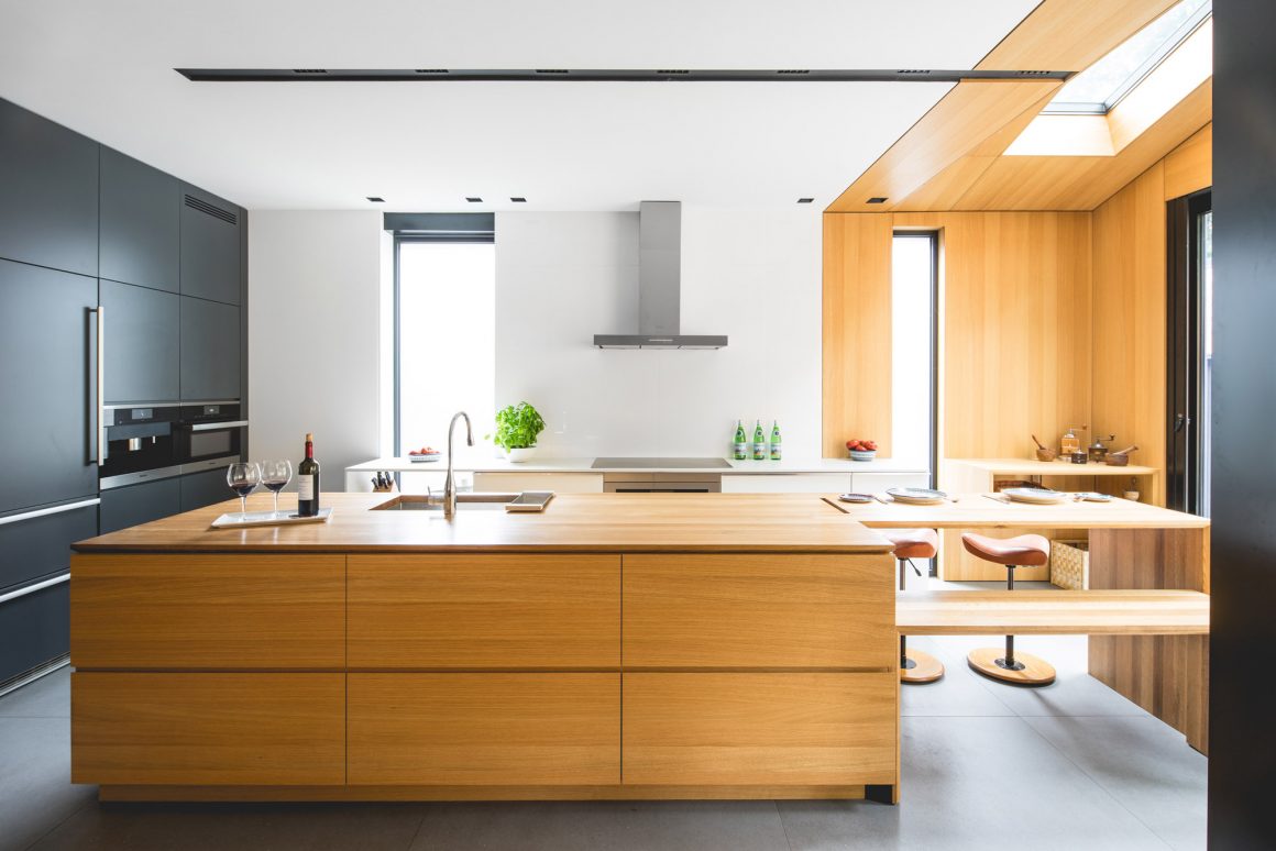
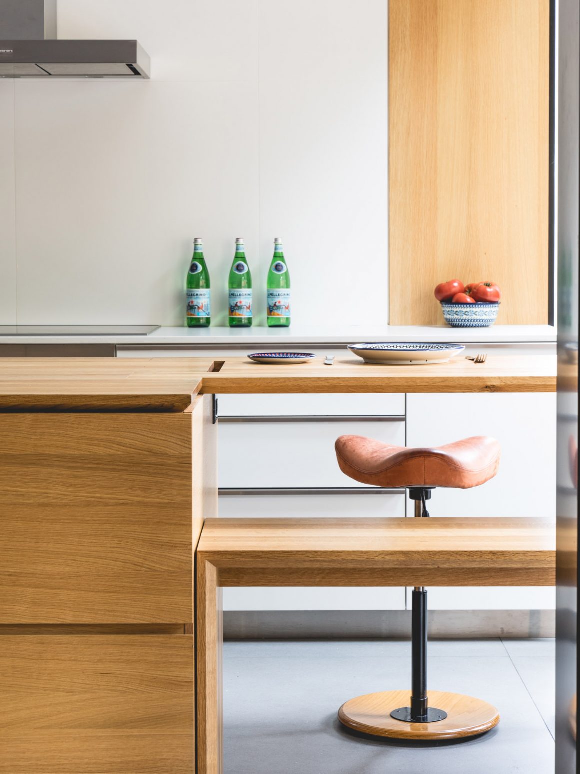
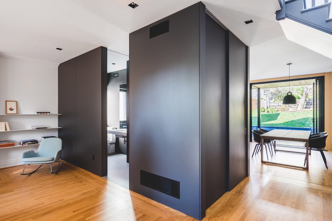
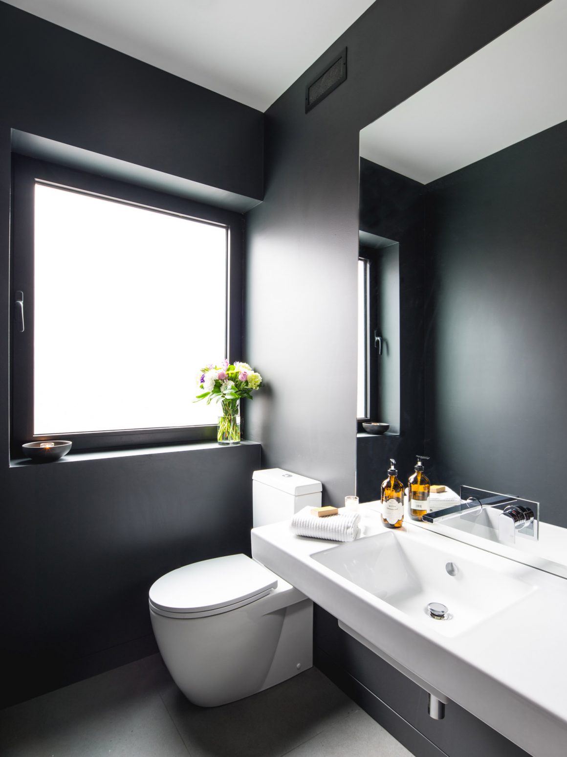
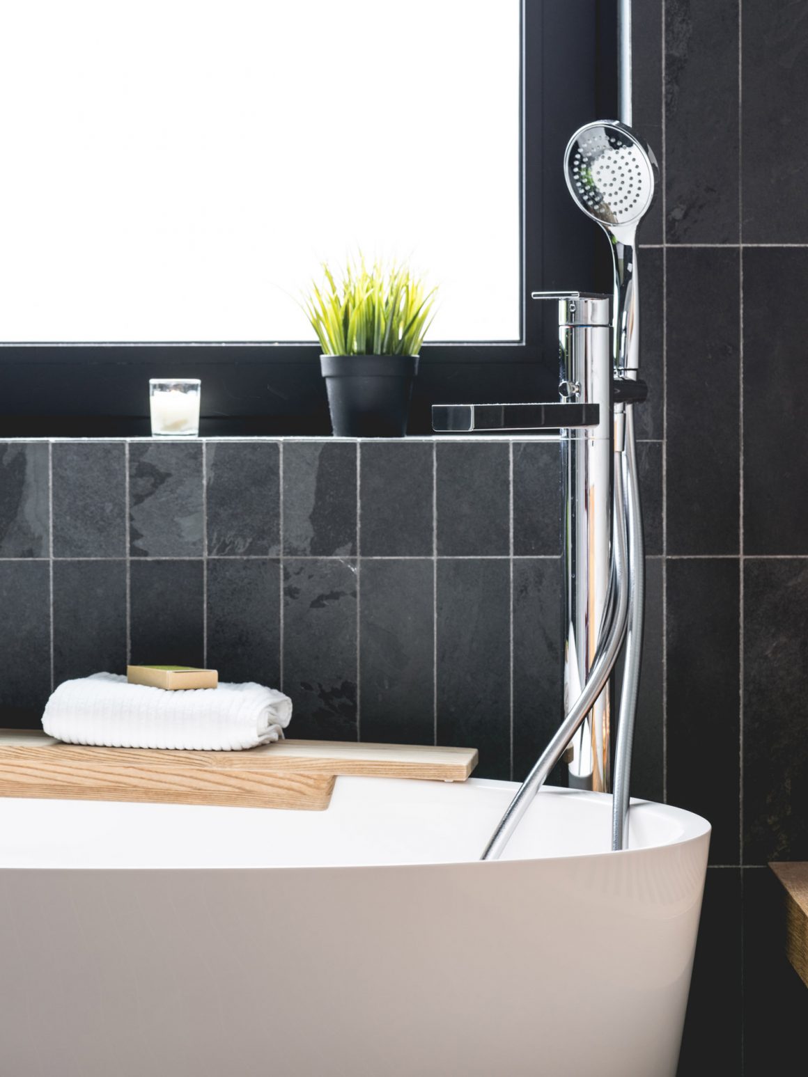
The architect added two dark cubes inside the house, dividing the kitchen from the living room area. One has kitchen cabinetry on one side and a powder room on the other; the second houses the kitchen pantry on one side and a hall closet on the other. The rest of the kitchen is finished in contrasting white oak, including a centre island and eating area. The upstairs master bathroom also has solid oak cabinetry.
Dionne left space between the indoor cubes to allow some of the light from the front of the house into the kitchen. Because most urban architecture wasn’t built to maximize natural light, she says, it’s a creative way to get around that. She added a skylight in the kitchen, as well as a tall narrow window that catches late afternoon/early evening sun.
Yes, there will be a Black Box III. Dionne is already working on another project in the neighbourhood. “It’s become an approach that pleases a lot of people,” she says. •
Natalie Dionne Architecture
www.ndarchitecture.net
514-525-1265


