Photography: Tracey Ayton
Styling: Paulie Dhillon
Effective communication does not need to be loud. Just as beauty need not be bold. But effective and beautiful design should be purposeful; and it should be scripted using subtlety, lighting and layers.
This is the philosophy Paulie Dhillon employed to design the look for the kitchen in this two-storey house in the Kerrisdale neighbourhood on Vancouver’s west side.
“I like to layer details and see how the design progresses,” she explains.
Dhillon is the owner of Design Therapy, the firm hired by the contractor who built this new home. “This house was built by a developer specifically to be put on the market. I got involved in the project very early in, on the floor plan,” she says.
Not having a specific client to cater the look and functionality of the space to, Dhillon had to improvise. “I created a client in my mind based on a demographic.” She also relied on her experience of having completed other successful turnkey projects.
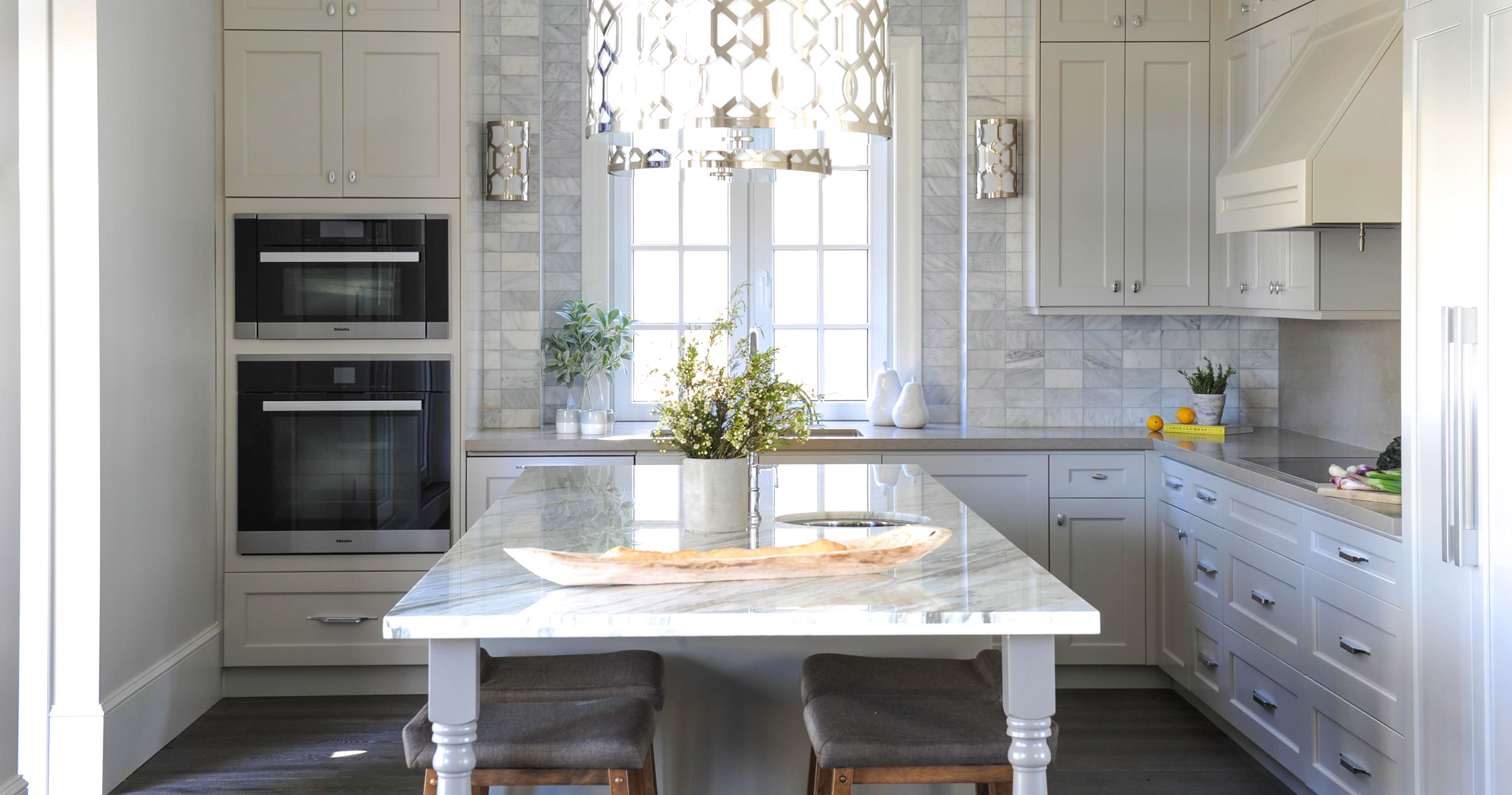
She describes the final result as being “modern-chic with rustic elements.” But the words – “chic,” “modern” and “rustic” – are not just descriptors. They are parts of a distinctive whole. They come together magically to create an exponential factor, making this kitchen greater than the sum of its three elements.
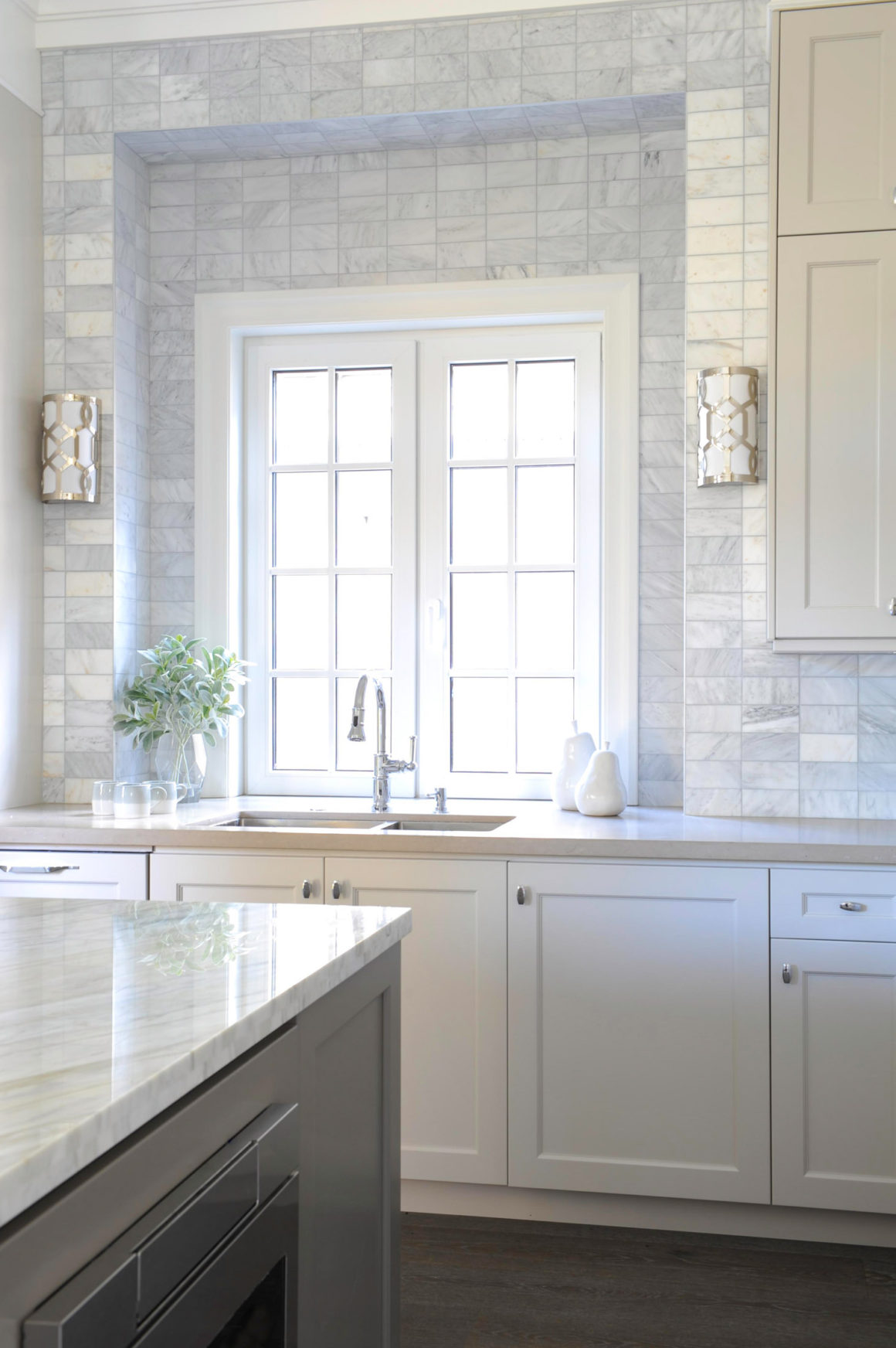
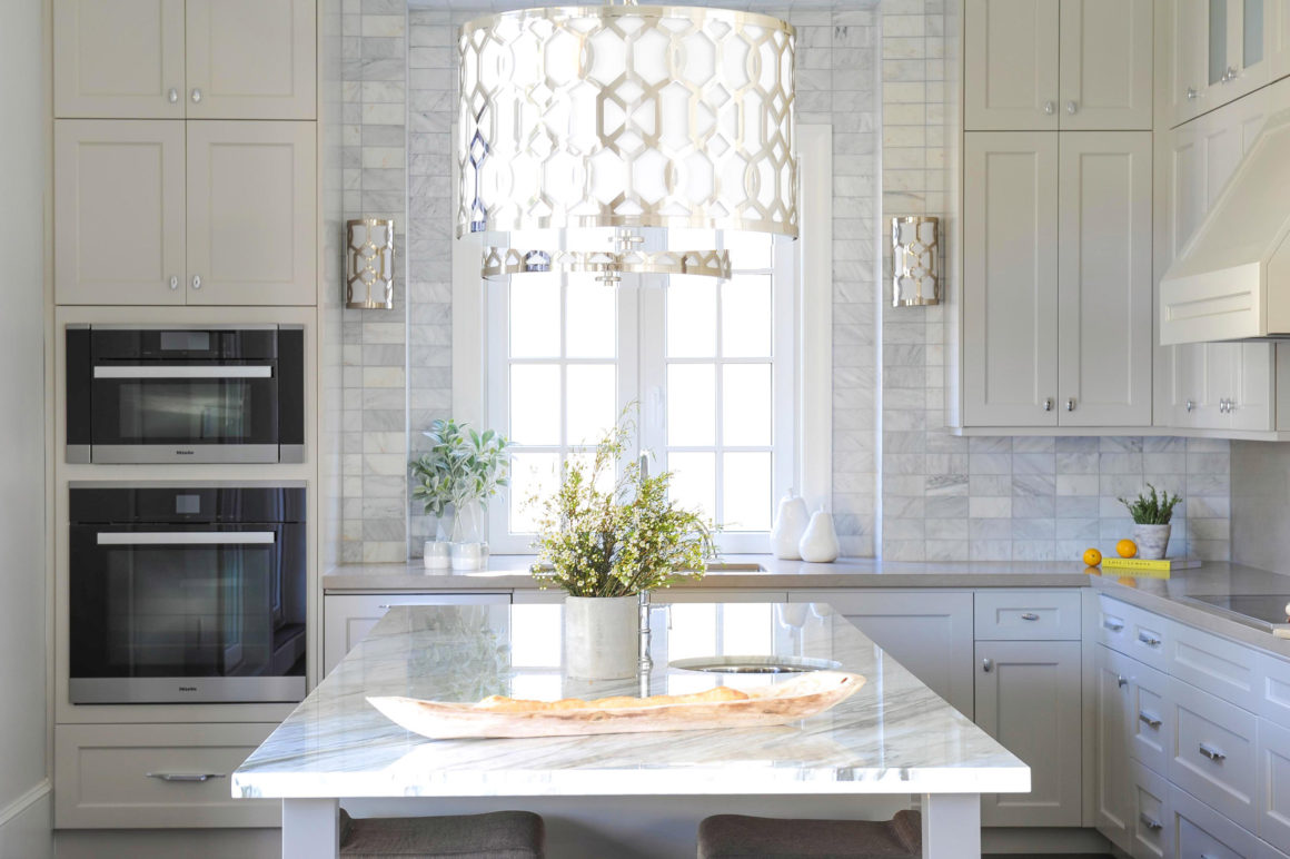
Take Dhillon’s favourite feature of the kitchen, the window wall, as an example. The window was imported from Europe and features divided panes. It is set in a white frame at the centre of a wall clad in iridescent Oriental White subway tiles in a stacked pattern. “By stacking the tile, it really adds to the quality of the height in that kitchen,” Dhillon says, pointing to the 11-foot ceilings.
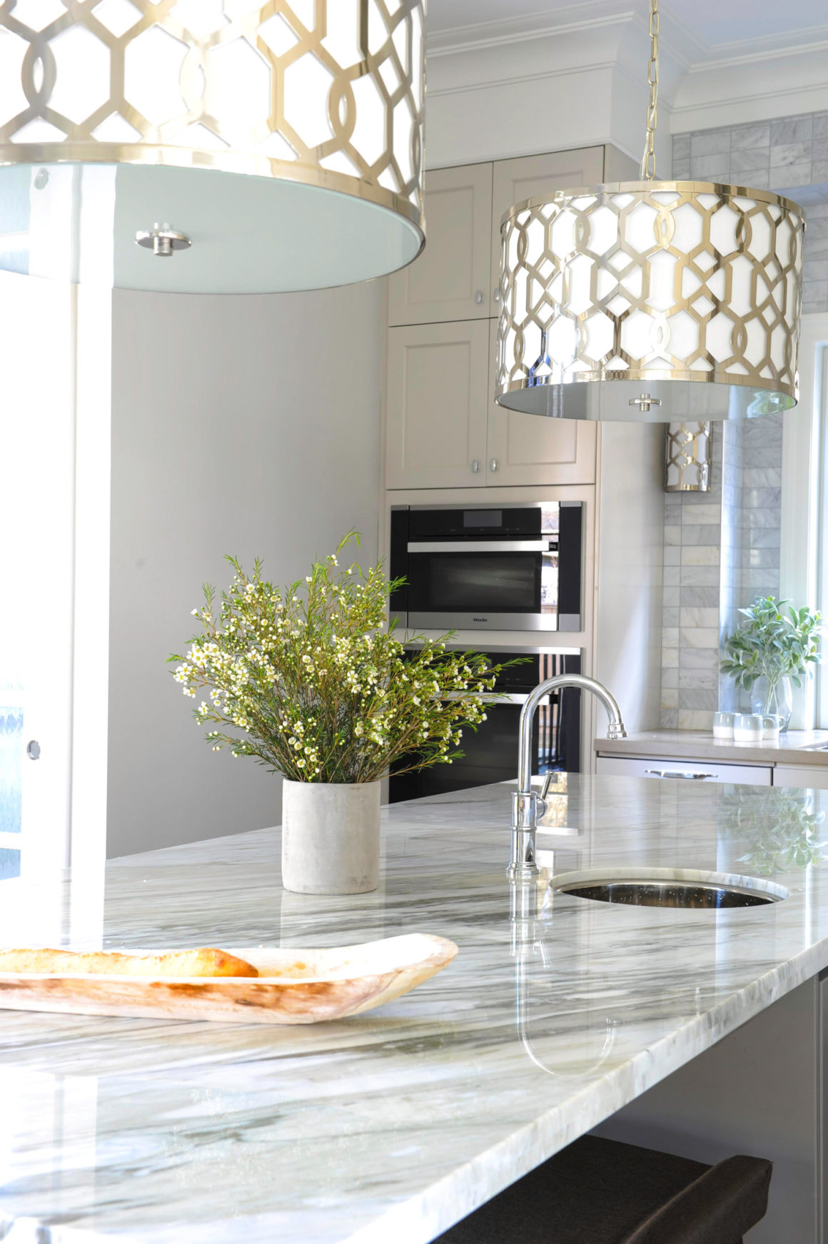
The silvery pearl finish of the tiles, combined with the tiered setting play off the styling of the sconces on each side, which, in turn, complement the large chrome pendant lights above the island. The combination is the definition of chic.
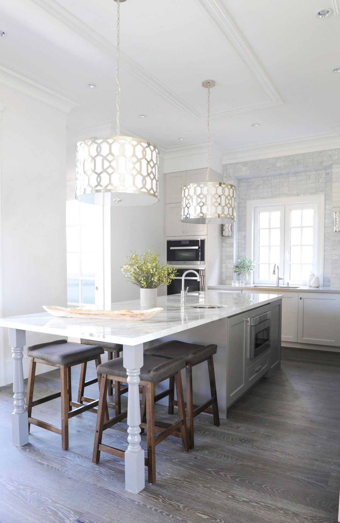
The detailing on the ceiling above the island and the added elements attached to the crown moldings add a sophisticated flair.
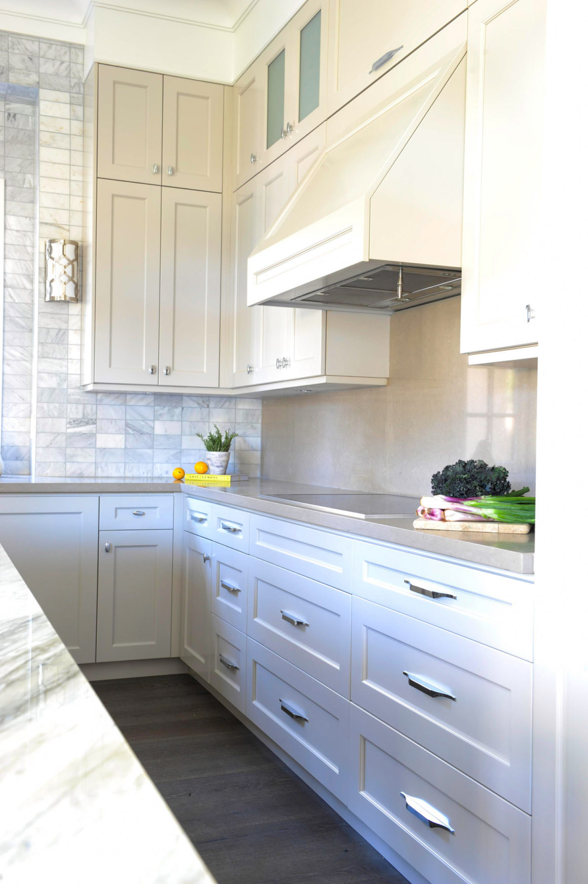
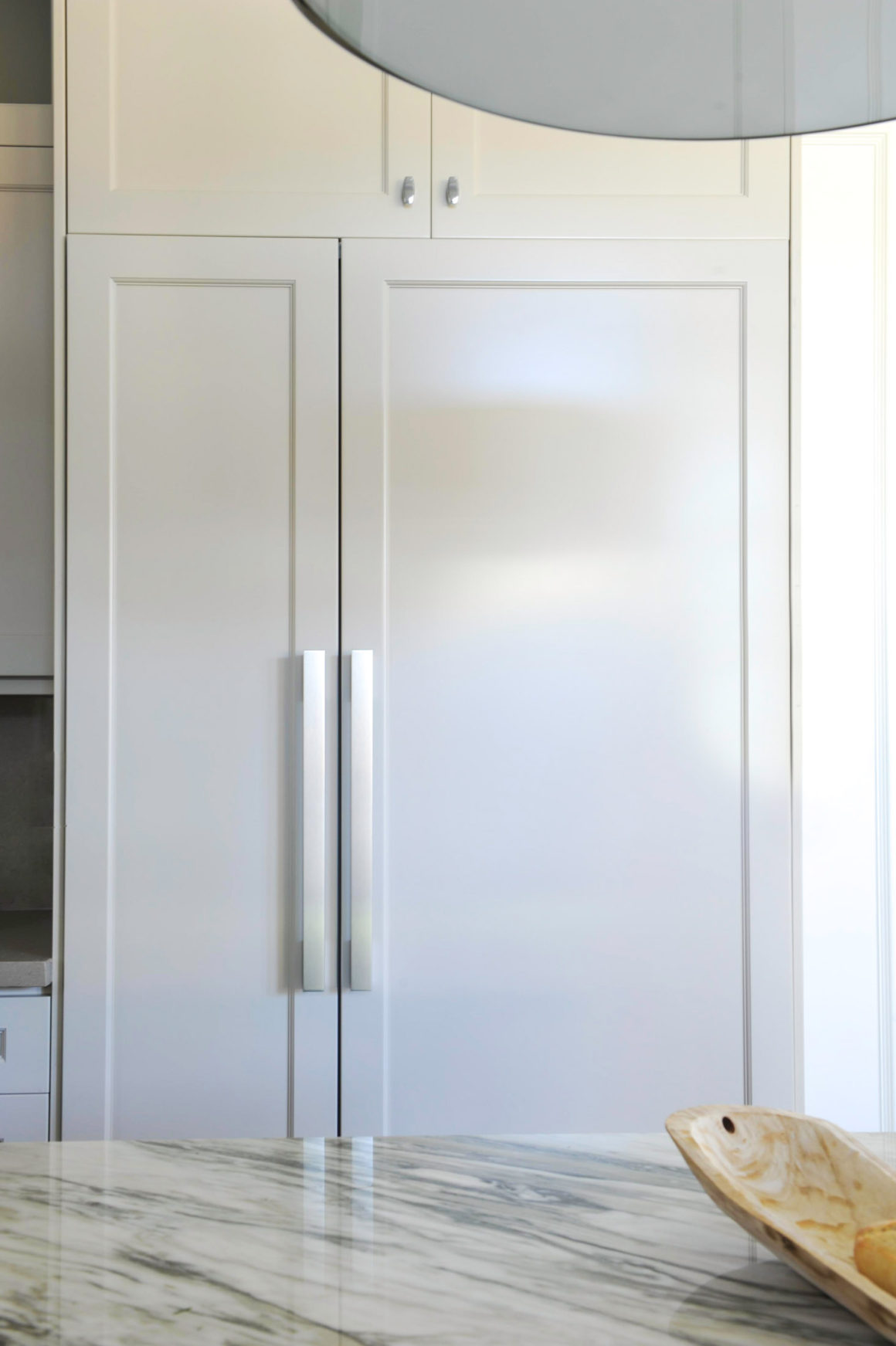
The island and the cabinetry provide the contemporary element. The Shaker-style cabinets have a subtle detailed profile. The upper and lower cabinets are finished in a soft grey taupe. This colour scheme provides a hint of warmth, she adds. The countertops are a resilient quartz, also in a tonal grey-taupe, while the island top is finished in marble above a darker shade of cabinetry to provide contrast and interest. The same marble is used in the adjoining living room space to give the fireplace surround an upscale finish.
Look no further than the floors for the rustic. The engineered oak planks have been given a hint of a whitewashed finish in the crevices to accentuate the grain and produce a vintage look. The turned posts that support one end of the island, which are painted in the same hue as the lower cabinets, and the square-seated stools add to the rustic theme.

These elements give the space the feel of “a well-done renovation,” Dhillon says. They add what she calls a sense of history and they minimize the new-build feel. “The modern elements carry the home,” she says. “It’s not trend-driven. I prefer using trends in other forms, through throw pillows and accessories. This kitchen very much has a timeless quality to it.”
So what is the secret to drawing three distinctive looks together?
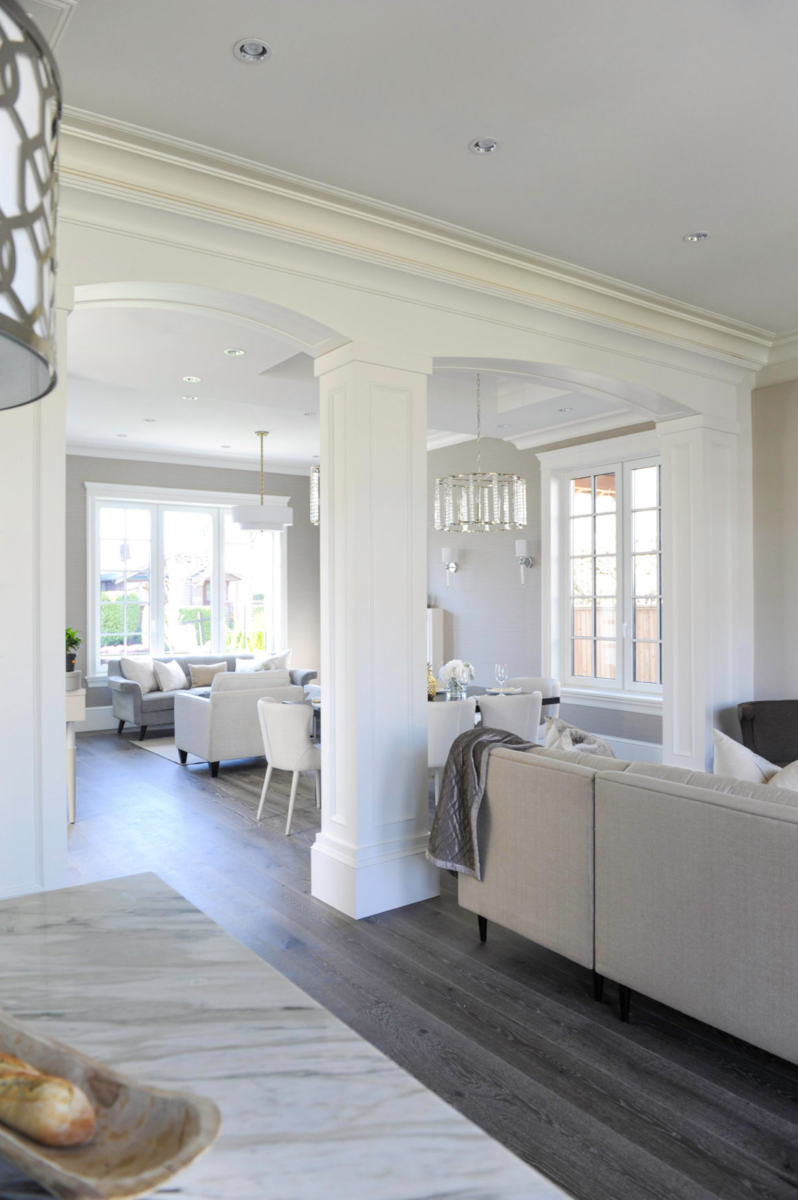
“The reason it works in this kitchen is because no one particular element was overused,” Dhillon explains. It’s effective, beautiful, subtle and layered – all by design. •
Originally published in the Vancouver Kitchens 2018 issue.
Design Therapy
www.idtherapy.ca
604-838-4311

