PHOTOGRAPHY: LARRY ARNAL
STYLING: KRISTA FLASCHNER
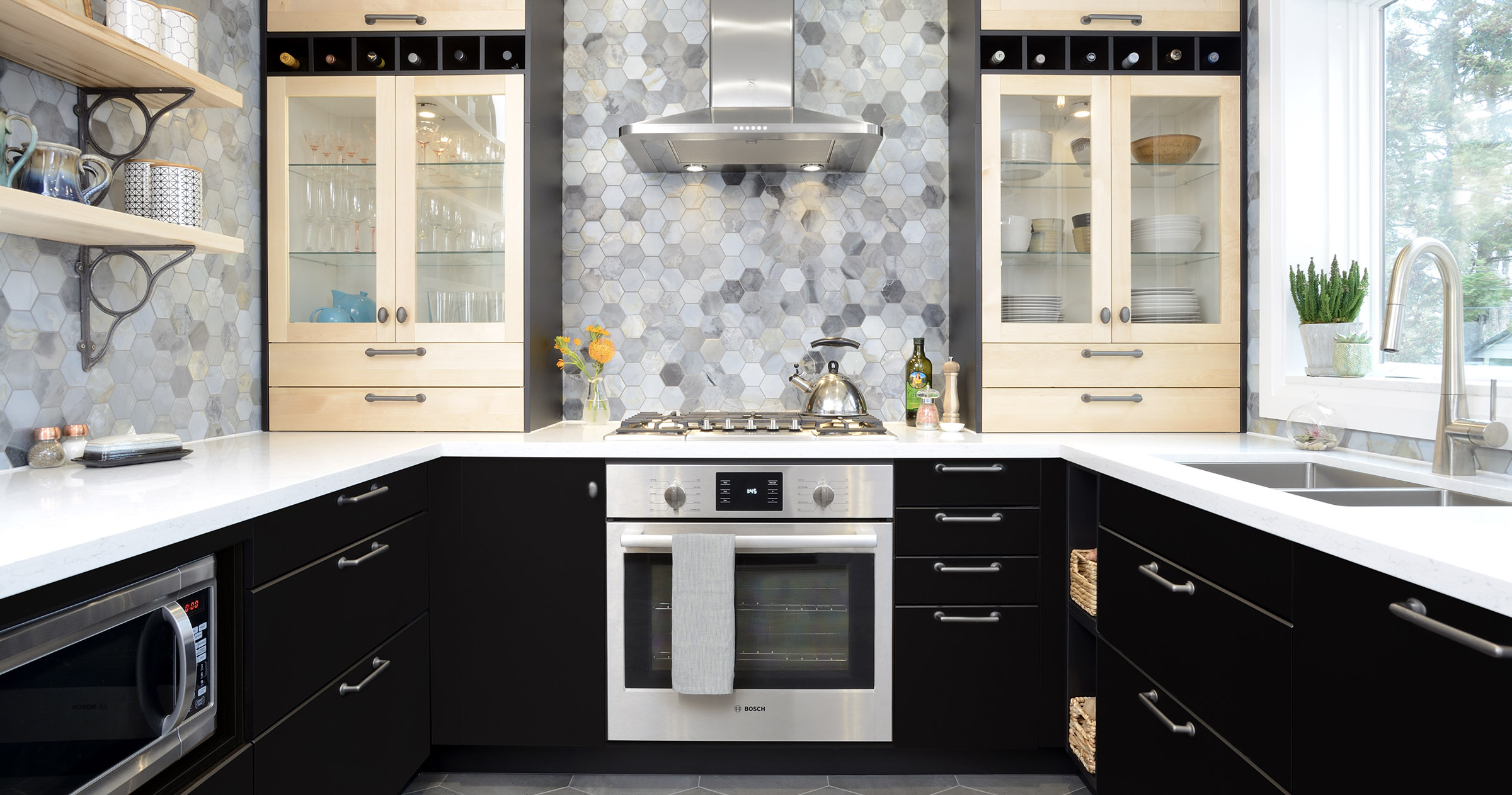
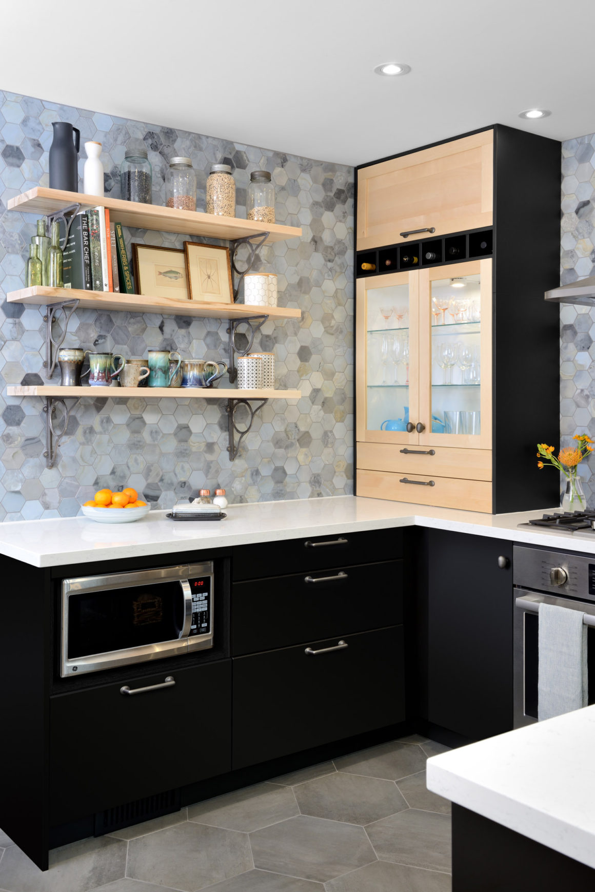
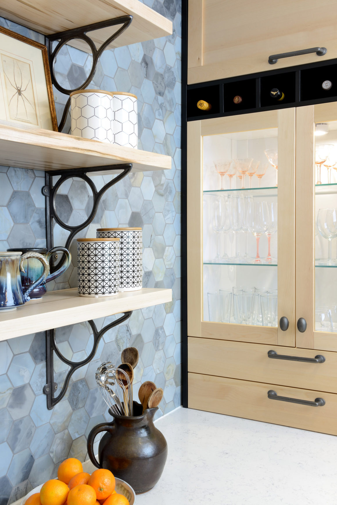
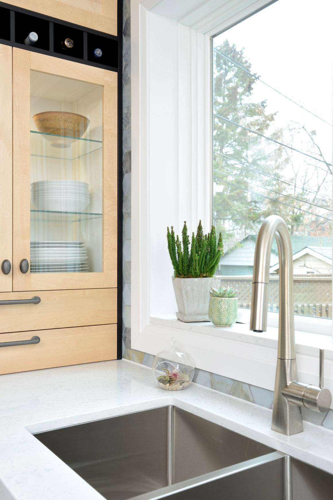
Serendipity was at work in this kitchen renovation, according to designer Krista Flaschner. Her design incorporated birch cabinetry from Ikea; she discovered that the style had been discontinued, but she was “just able” to get all the pieces she needed by visiting four stores in the GTA. The ceiling height was such that there was “just enough” room to slide custom-made wine racks between two vertical elements of the countertop cabinets.
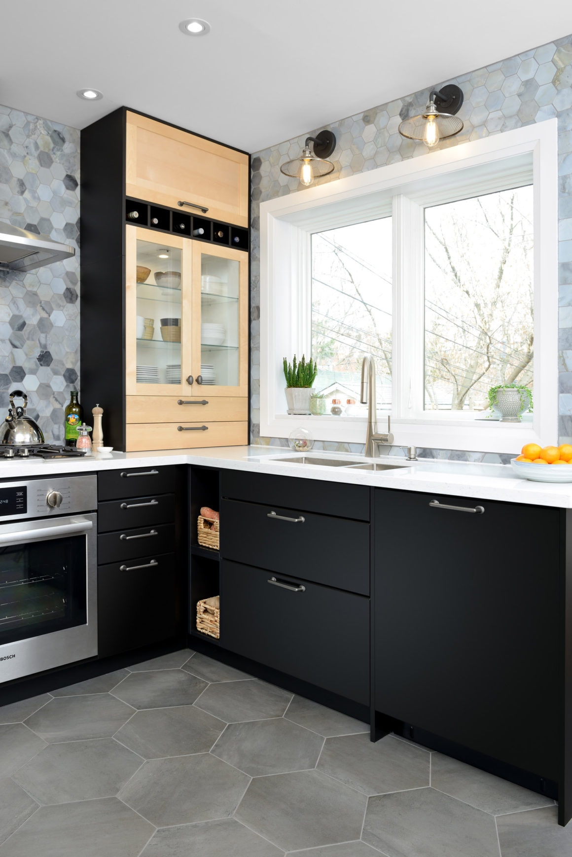
The window was enlarged and left “just enough” clearance for the lift-up top door in one cabinetry stack to clear the lights over the sink. The drawers atop the counter “just miss” the windowsill.
“It was nice that these tight-fitting things just worked out, Flaschner says. “We had just enough space to make all those decisions.”
But, of course, there was more to it than “just” chance. Flaschner, who is the principal of KF Design, didn’t simply use ready-made parts that just happened to fit nicely in the space. She spent several months with her client, Lori-Anne Keith, discussing the design, and figuring out functionality and aesthetics.
Lori-Anne, her husband and their two adolescent children live in a century-old home in the Upper Beach neighbourhood. “When we purchased the house, we knew we would need to overhaul the kitchen,” Lori-Anne says. “It was very dated.” She characterizes the room’s style as “a lovely blend, a tribute to four decades” of untouched decor.
Lori-Anne had very definite ideas for the makeover. She and her husband “did not want a room that looked like a model kitchen,” she says. “We wanted something that felt organic in terms of materials. We wanted something different but not so different that people would be aghast. We didn’t want it to look dated in 10 years.”
The new room also had to fit exactly in the original footprint of the old kitchen (9.5 feet wide and 12.25 feet long) and its adjoining mudroom (6.3 feet by 9.0 feet). The existing kitchen wall was left intact. “If we were to remove the main wall that separates the kitchen from the living and dining space, we would have a difficult time placing our furniture with regard to any future project,” Lori-Anne says. “Another reason we chose not to go for the ever-popular open-concept kitchen is because we plan to have large banquette-style seating against the wall that separates the dining room from the kitchen. The wall will be useful as it will support the banquette, bookshelves and art, and it will create a wonderfully intimate dining nook. This is our next project.”
Lori-Anne felt quite comfortable leaving the project in Flaschner’s hands, as the two had been friends for some time before the project began. “I chose Krista because I love her sense of style and sense of design,” she says. “Everything she’s done incorporates elements I like that use her design savvy.”
Flaschner says, “Lori-Anne has a funky, playful, whimsical style, and something super-familiar was not going to work for her. I thought ‘How do I hold the essence of the people using the kitchen?’ The kitchen layout lent itself to two different colours, and they like wood.”
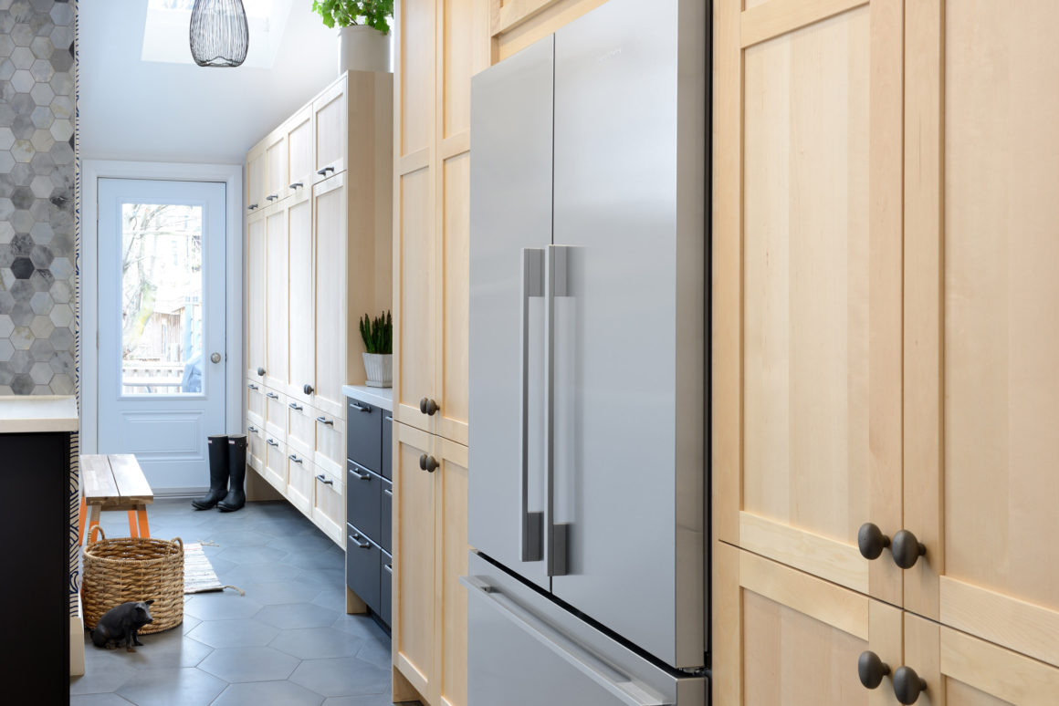
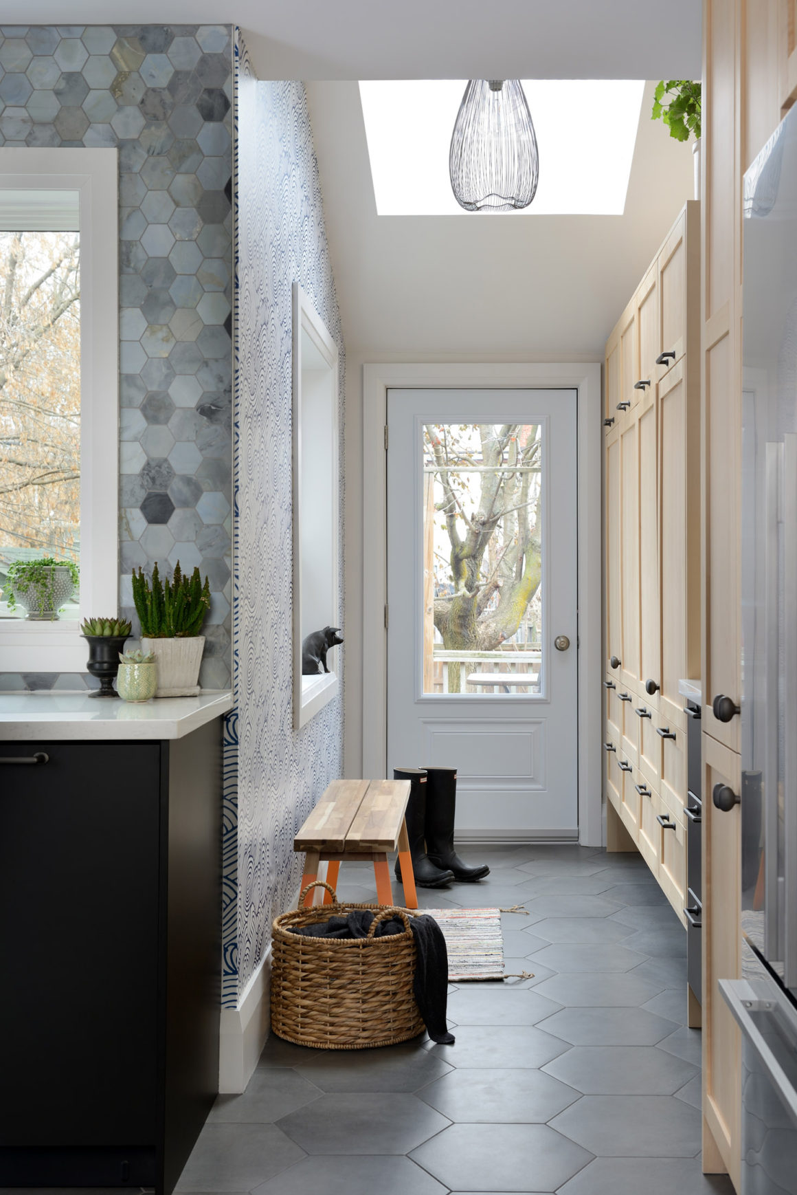
With her contractor, Rena Swartz, Flaschner has produced a striking kitchen and adjoining mudroom that use two colours and styles of elements for the basic cabinetry, with many custom touches. The pale lacquered cabinets are in the classic Shaker style, and the smooth-faced lower cabinets are a matte black that is also used to frame the lacquered birch cabinets.
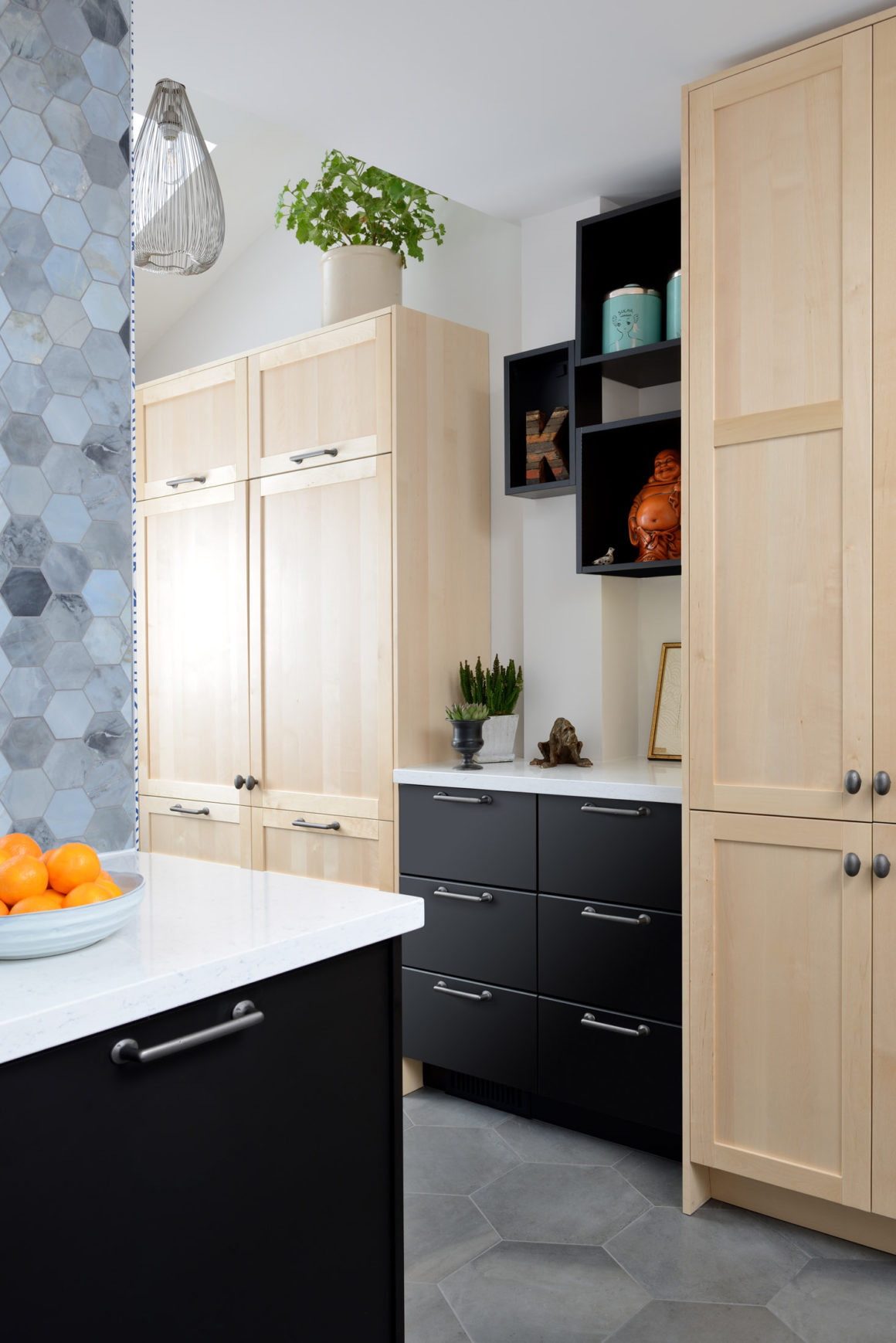
Quartz countertops have subtle veining that complements the grey hexagonal porcelain floor tiles, whose pattern is echoed in the smaller Moonstone marble tiles of the backsplash, which goes all the way to the ceiling. The faucet by Aquabrass and the pewter-finish brass hardware from Lee Valley are sleek.
The style carries into the mudroom, formerly a closed-off unheated space between the kitchen and back door. The door connecting to the kitchen was removed, the space was insulated, and now each of the four family members has a locker.
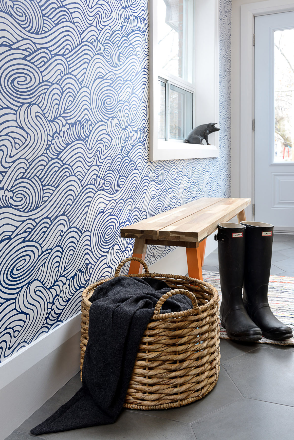
Several of the mudroom and kitchen features give Lori-Anne particular pleasure. “I adore my Japanese blue-wave wallpaper,” she says. “I love how the light from the skylight floods the entire kitchen. The two-tone cabinetry is sophisticated-looking. The hardware choices are spot on.”
In short, she adds, “I wouldn’t change anything about it.” •
KF Design
www.kfdesign.ca
416-602-9492
Swartz & Co.
www.swartzandco.ca
647-637-3894 ~ 416-859-4280

