PHOTOGRAPHY: LARRY ARNAL
Give and take was the key to the successful and stylish renovation of the main floor of this four-bedroom home in Oakville.
“My wife Diana and I pretty much acted as our own designers,” says homeowner Nick Karadza, who owns a real estate brokerage firm and acquired some decorating chops revamping rental properties. “There were some things I was more adamant about and others that my wife insisted upon. But we have similar tastes and always worked it out.”
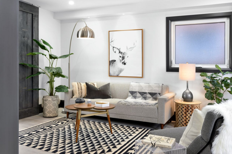
Five years ago, the couple had purchased the property on a well-situated lot, intending to make it their family home. The two-storey house had good bones and lots of square footage: 1,800 on the main floor alone. Daughter Ella, now seven, was then a toddler and soon second daughter Ava, now three, was on the way.
To shelter the children from renovation chaos, the homeowners made do with the 1980s-era outdated decor for four years. They did, however, dream and research design ideas on Internet sites. The couple’s tastes lean toward the modern side, but not so far that it becomes too minimalist and cold, according to Nick.
When they were ready to get underway, they received a big assist from Dave Jurinic, owner of renovation company Toronto Custom Concepts, who acted as general contractor for the project. “The rooms were very closed off, and they wanted to remove virtually all walls and create a completely open concept,” Jurinic says. “That required a lot of engineering.” Five new beams, two of which were steel, had to be installed to support the upper floors. All plumbing and wiring also needed to be redone.
The Karadzas did retain one original feature: the front staircase. They liked its grand scale, but not the tired, dark-brown oak finish typical of the time period. After they’d reviewed many options, the treads were painted black to coordinate with the home’s black windows and doors, and the risers are white to harmonize with the palest gray walls. “I usually don’t advise painting hardwood,” says Jurinic, “but no stain would give the right effect here.” To complete the update, a new railing was installed along with more modern squared-off spindles to replace the more traditional round ones.
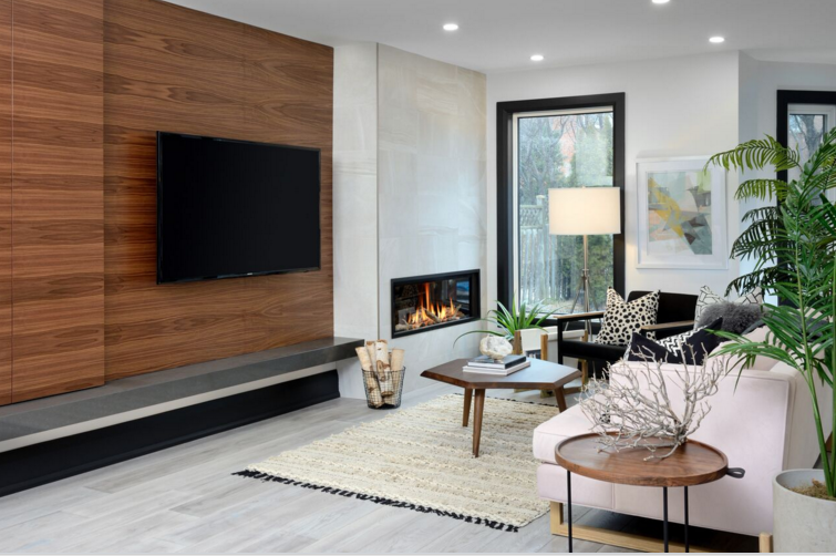
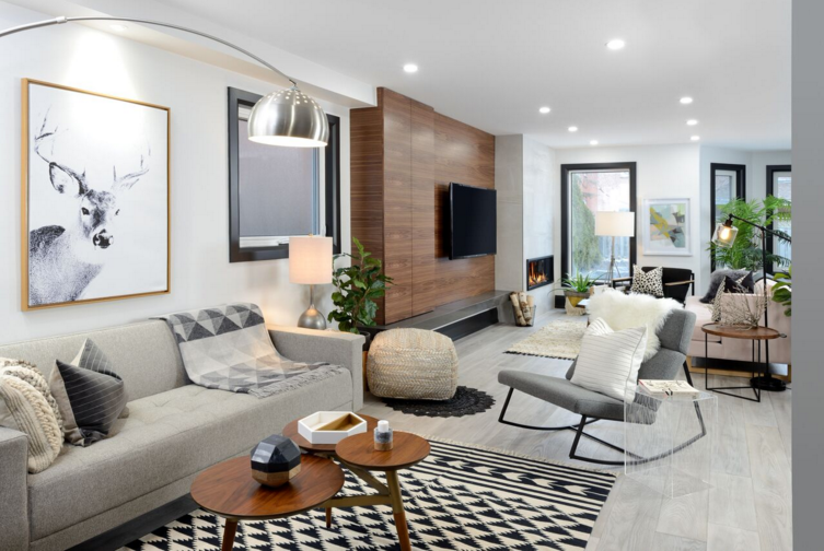
Because it would extend across the entire main storey, flooring was a major design decision for the couple. They scoured the city, collecting samples before deciding on hand-scraped and bleached-finish engineered oak flooring in seven-inch-wide planks.
They next added some warmth to the colour scheme while also creating a focal point: A spectacular feature wall of book-matched walnut millwork grabs the eye and serves as a backdrop for the television. It also houses a virtually invisible closet with touch-open doors, perfect for concealing the children’s DVDs and toys. Beside it, the linear gas fireplace that Diana, a writer, loves to curl up in front of adds literal warmth.
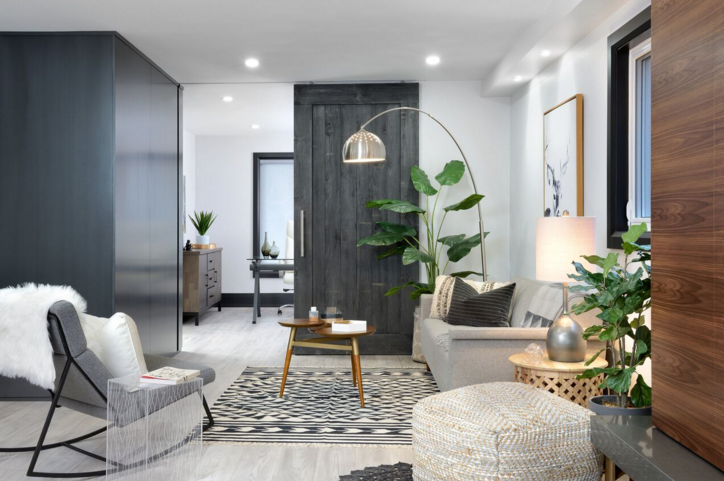
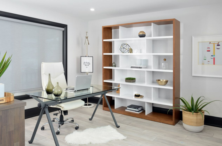
Another striking feature was Nick’s brainchild. A bank of dark gray floor-to-ceiling cabinetry, solidly in place despite the almost-floating look, stands at the bottom of the main stairs. “The space needed definition, plus there was a vertical post I wanted to cover,” he says. It also provides a niche in which to place decorative objects and a large closet to supplement the inadequate one by the front door. Behind the bank of cabinetry lies a room that is Nick’s alone, the study. He works from home half the time and needed a place where he could shut the door to do so.
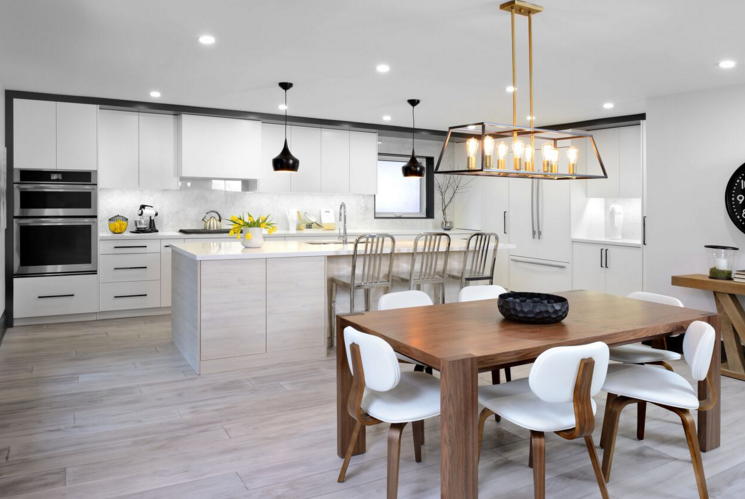
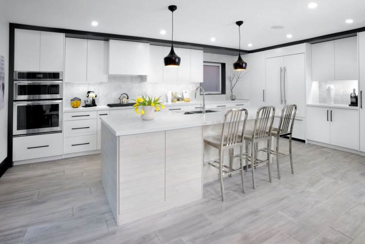
The door in question — a barn door leading to the family room — is what topped Diana’s must-have list. She has always loved the look, and this was one item she wasn’t willing to compromise on. The couple were united in wanting it to slide along an unobtrusive track recessed in the ceiling rather than the usual exposed, clunky hardware. Although doing so posed some challenges for the installers, the homeowners feel it was worth it. While they both agreed that white quartz was ideal to top the 11-foot-long kitchen island, Nick had trouble seeing Diana’s vision for what lay underneath. She wanted cabinets covered in a quirky textured thermofoil product that emulates the look of bleached oak; he thought the island should match the rest of the pure-white, flat-front painted cabinets. She won out. “And now that it’s finished, I have to agree it was the right decision,” Nick says.
Today, the kitchen has become the heart of the home, he says. He likes nothing better than making use of its integrated sound system — one of the least expensive amenities and almost an afterthought — while making brunch for his wife and daughters on a Sunday morning. The little girls love to perch by the island to wait to be served. And, because it’s so open to the rest of the main floor, the kitchen is also party central. “The house seems to absorb people,” Nick says. “At our first party we had 24 guests, and there was room for plenty more.”
