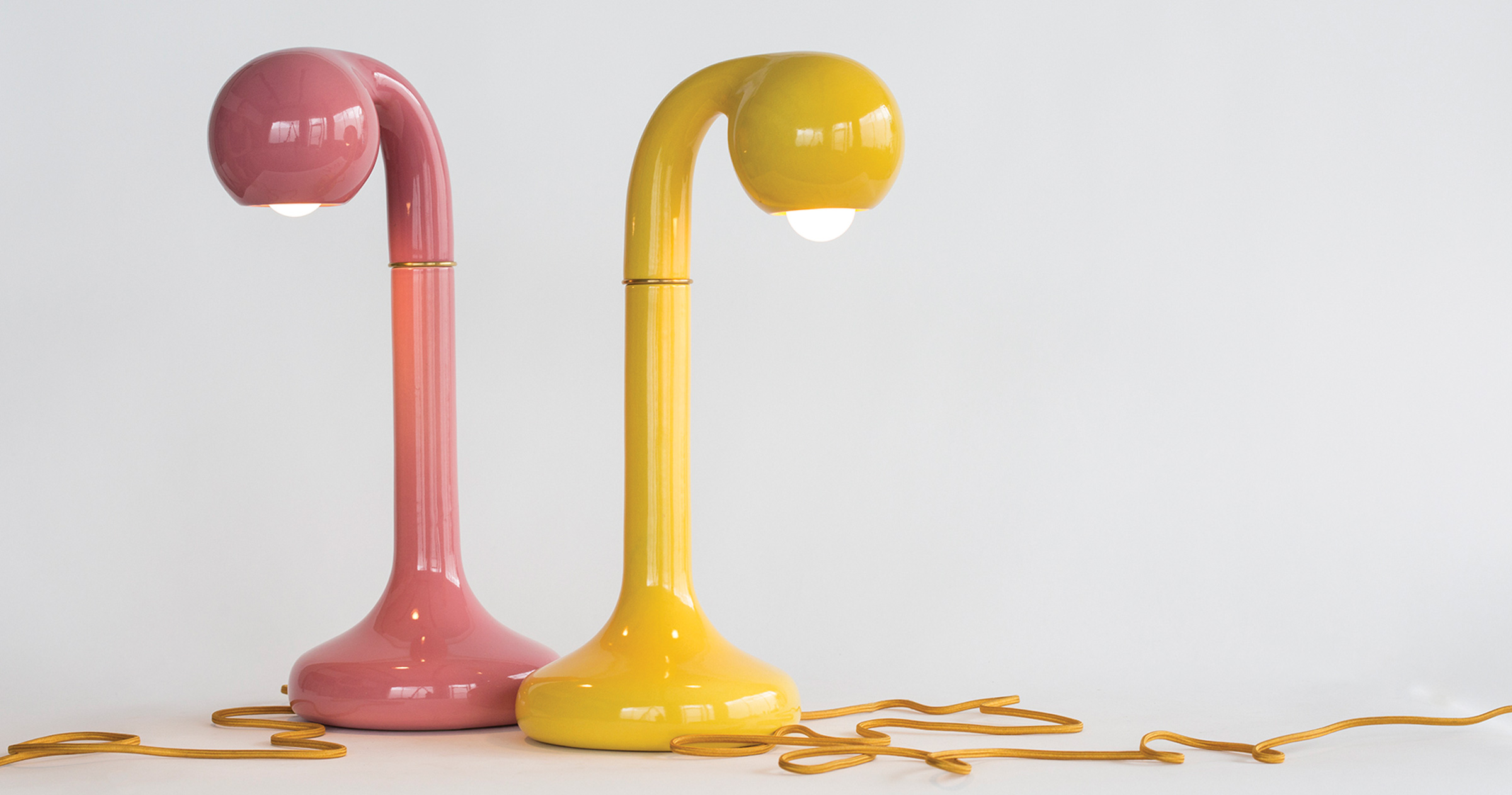
Burgers or beef bourguignon? Potato chips or crisps? There is a clear distinction between what North Americans and Europeans find appetizing. Distinct tastes exist on each side of the pond when it comes to just about anything, including interior design. Nowhere has this distinction been more apparent than with the use of colour.
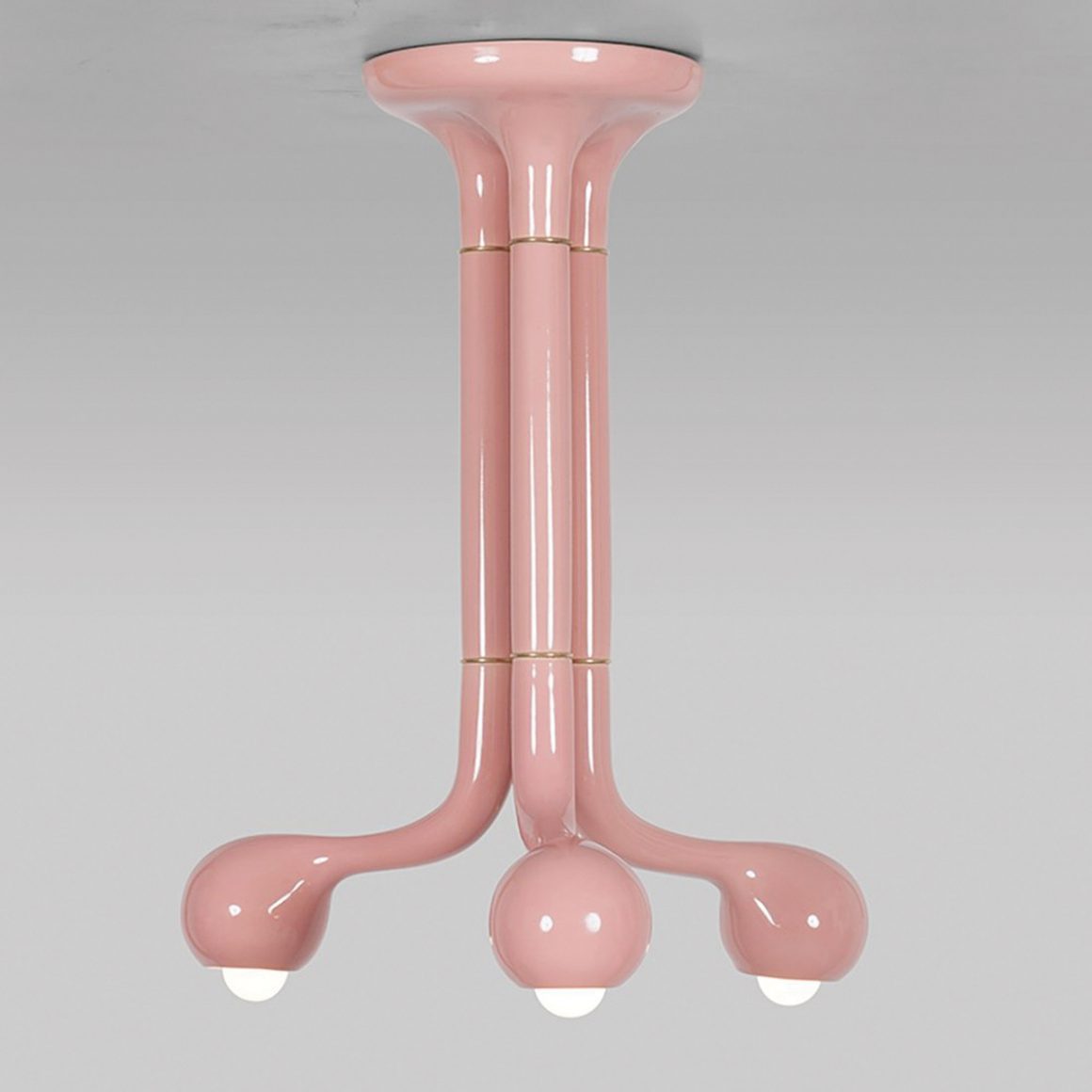
From the bold rooms of the Palace of Versailles to the vibrant storefronts on London’s Portobello Road, Europeans have traditionally embraced colour as critical to their environment. This is reflected in the use of eye-popping palettes by modern European designers, which contrast significantly with North America’s traditionally more conservative aesthetic, often devoid of colour.
So why, despite its abundance of brilliant landscapes and richly toned forests (about 40 per cent of all land), did colour get the axe in North America?
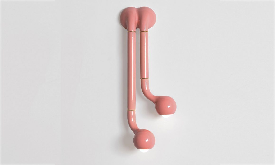
Be it boring or beautiful, the rise of beige in North America was all about business. The economics of the mortgage crisis in 2008 coupled with the rise of television shows about home improvement shifted the North American perception of a house from a home to a commodity. Real estate reality TV shows gave birth to the fascination with flipping. The focus of interior decorating became less about the homeowner’s personal taste and more about appealing to potential buyers. Decorating with neutrals became associated with adding value to a home, whereas bold colour choices were deemed “unsafe” or a bad investment. Perhaps if Marie Antoinette had been concerned about flipping the palace, she may not have thrown caution to the wind, but that is debatable.
It is said that the comeback is always stronger than the setback, and that seems to be the spirit that’s encapsulating the return of colour to the North American design palette.
The digital revolution and the political climate are turning us away from the subtlety of neutrals in favour of a more arresting and bold aesthetic. Playing it safe has become boring, and homeowners are reclaiming their homes as an extension of their expression and taste, essentially evolving our perception of home from commodity to personal brand.
Influential social media platforms have bridged the gap between European and North American design with endless, 24-hour, global online inspiration.
With more than 250 million visitors per month, Pinterest tracks trends in various areas of lifestyle, from food to design and everything in between. The app’s top 100 trends in 2019 indicate there is a growing thirst worldwide for colour. According to Pinterest, people are embracing vivid mustard yellow walls (searches up by 45 per cent between January and September of 2018 compared with the same period the previous year), painting their parquet floors with vibrant colours and mosaic patterns (searches up by 1,276 per cent), searching for bold-print wallpaper patterns (searches up by 401 per cent) and seeking to refresh their walls by painting colourful geometric shapes on rooms big and small (searches up by 225 per cent).
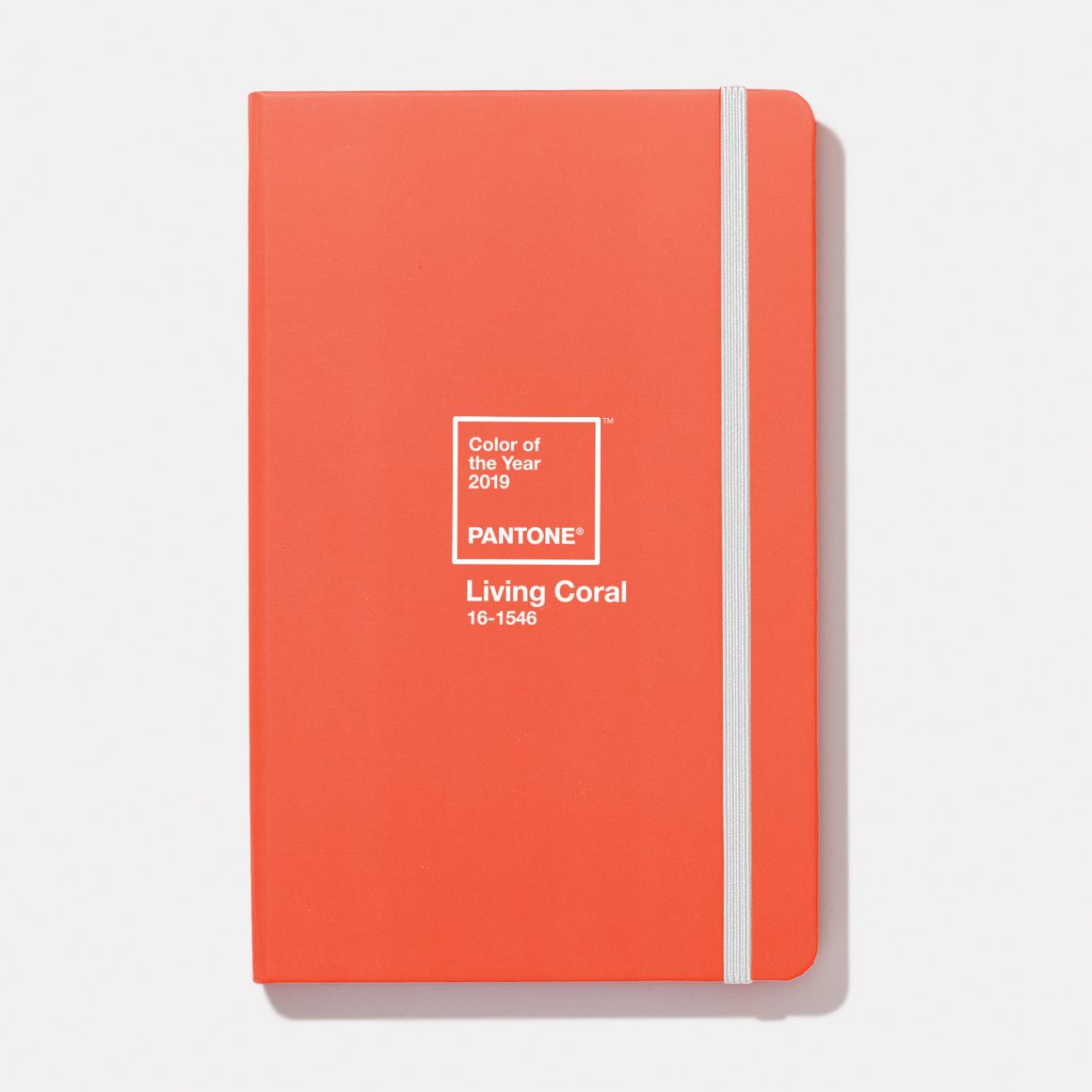
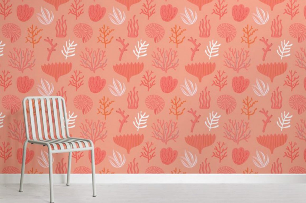
Pantone claims that its 2019 Color of the Year, called Living Coral, is also hugely popular on social media. The shade is described by Pantone as symbolizing our innate need for optimism, lighthearted activity, and playful expression.
That’s no secret to Robyn Blair Davidson, named The Most In-Demand Instagram Artist of 2018. Her tremendously popular line of candy art is infused with a kaleidoscope of colour that’s designed to sweeten up a space and make people smile. The demand for Davidson on Instagram continues to grow, with the 2019 title predicted to be well within her reach.
Shutterstock, a leading global tech company that licenses images, video, music, and editorial assets, examines pixel data from billions of searches on a yearly basis to reveal the world’s most popular colours and creative trends. According to the Shutterstock Colour Trends of 2019, the world’s fastest growing hues are UFO Green, Plastic Pink and Proton Purple. Precisely the powerful palette recently unveiled in a new rug collection by Canadian designer and long-time purveyor of pink, Karim Rashid. These new pieces, part of W Studio’s Artistic Series, pack a digital punch that are sure to light up any room.
Gone is the humdrum period of creative restraint. North Americans are returning to colour and embracing it as a powerful design tool that can bring life, meaning and emotion to a space. While Marie Antoinette may have set the stage, it is RuPaul who said it best: “Life is about using the whole box of crayons.” •
