Photography: Lauren Miller
Styling: Ashley Montgomery
Choosing the right designer to redesign and decorate their three-storey home in Toronto’s Rosedale neighbourhood was easy for Tom Cheung and Blair Myers. The couple had been following Ashley Montgomery on Instagram and they loved the eclectic interiors that the Toronto designer had posted featuring a mix of vintage objects and contemporary furnishings.
The couple’s four-bedroom, four-bathroom property had been totally renovated just before they bought it in 2018. Now that it was theirs, they wanted Montgomery and her team at Toronto-based Ashley Montgomery Design to personalize their space by injecting some of the same magic they had seen online.
“She went to our gym … she was super nice,” says Tom. Their comfortable working relationship made it all easier when it came to creating a unique style that incorporated personal objects, such as Tom’s father’s “old doctor bag,” or the collection of vintage books that the couple had used as table centrepieces at their reception when they married in 2016.
Montgomery says she loved the job. The 3,000-square-foot house was “a builder-grade renovation,” meaning “it was all very beige.” The idea was to personalize the home with an eclectic mix of furniture, carpets, lamps, mirrors, curios and artwork sourced from Toronto-area vintage shops, modern design studios and the couple’s own world travels.
The main floor consists of an open-concept space with a kitchen, adjoining dining area, living room and spacious hallway. The couple decided to keep the existing neutral colour palette, and then start from there. The creamy-white colour helped to harmonize the home’s overall design and acted as the perfect backdrop.
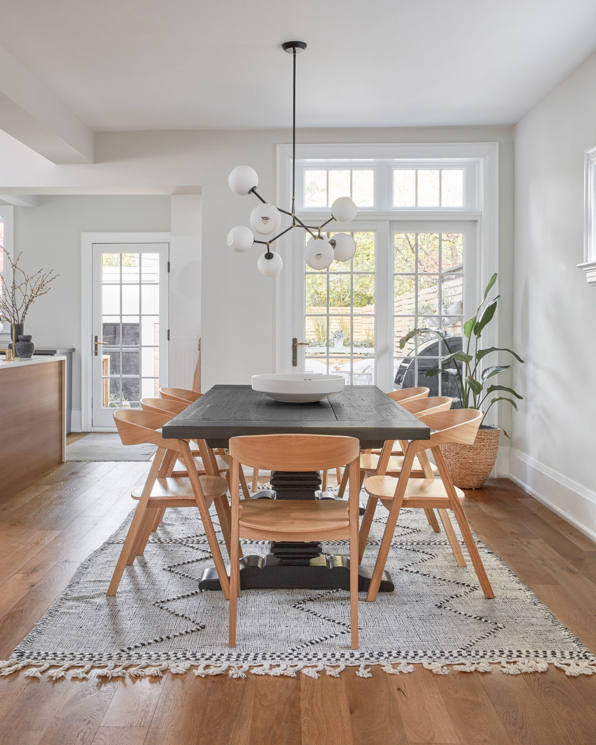
Montgomery likes to blend not just contemporary and vintage pieces, but also high-price-point and lower-price-point objects. In the dining room, for example, the black wood dining table that seats 12 people is from Restoration Hardware, and the less-expensive Scandinavian-style light wood chairs are from Wayfair. The mix of the two looks elegant and unique atop a vintage Moroccan wool rug and under modern multi-orb pendulum lighting.
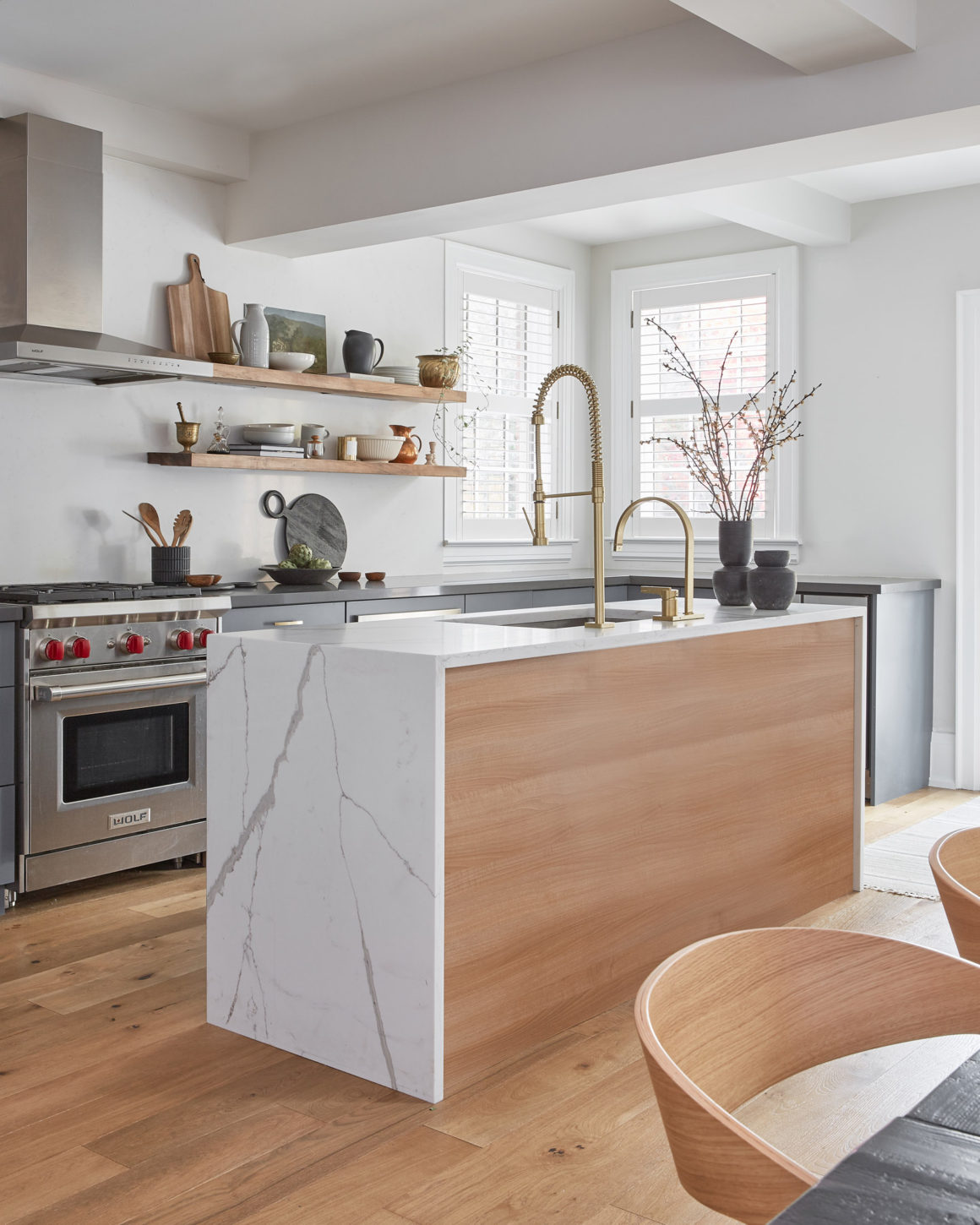
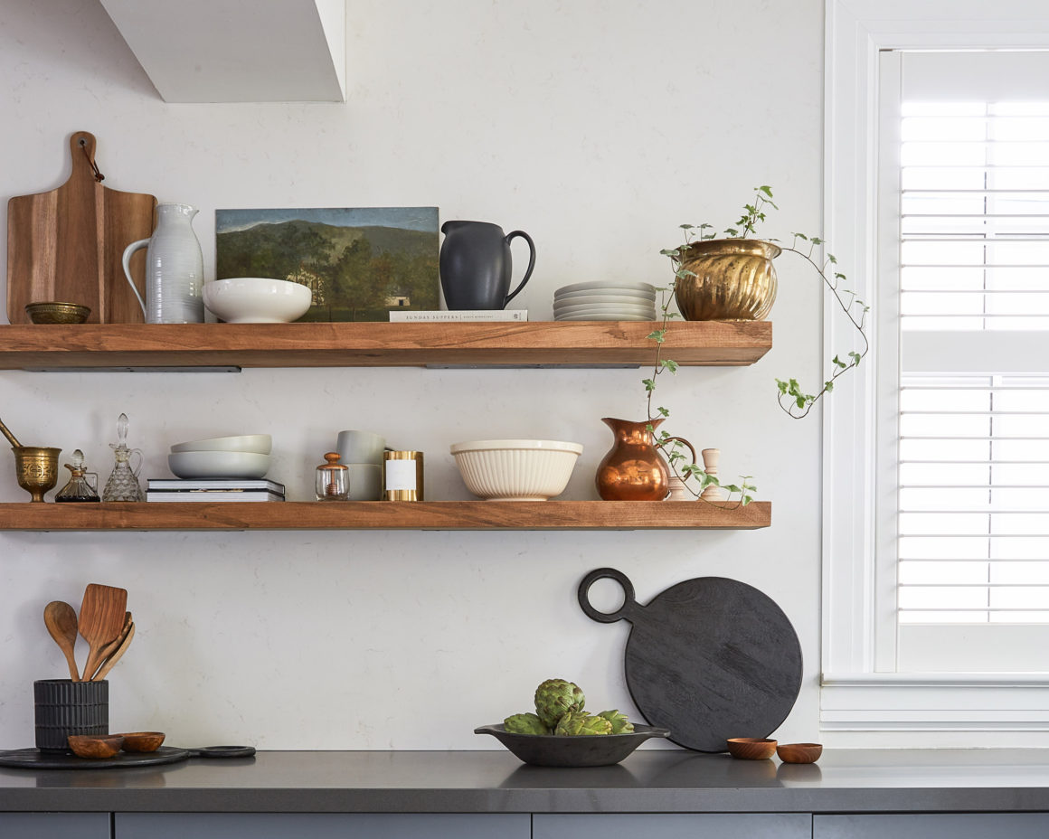
In the kitchen, floating wood shelves were installed on the quartz backsplash behind the stove to provide a place to display interesting jugs and crockery. “That was nerve-wracking,” Montgomery says, recalling her fear the quartz would crack. “It’s all about styling,” she adds, citing the placement of an extra tall vase on the peninsula to balance out the tall kitchen faucet.
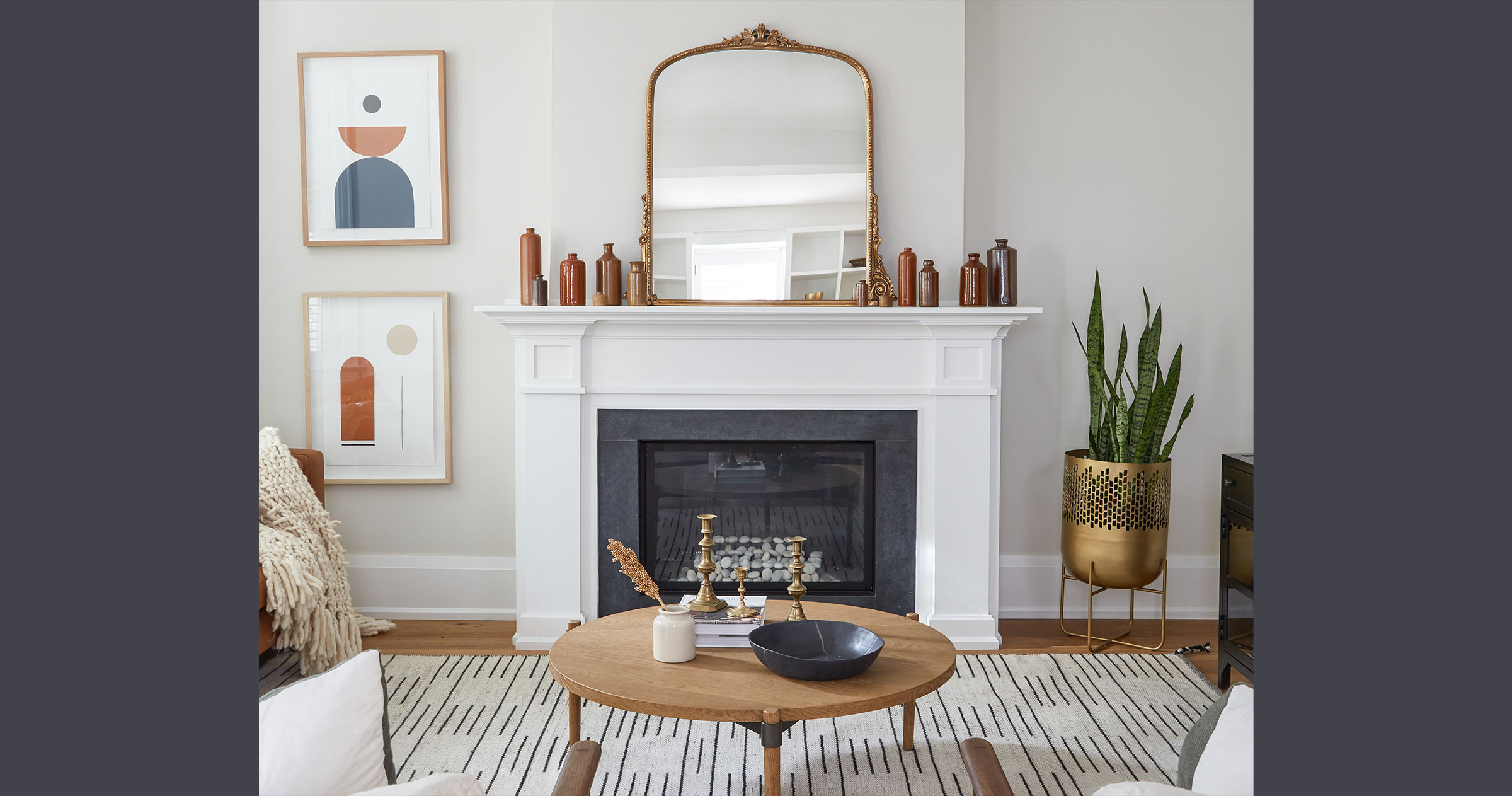
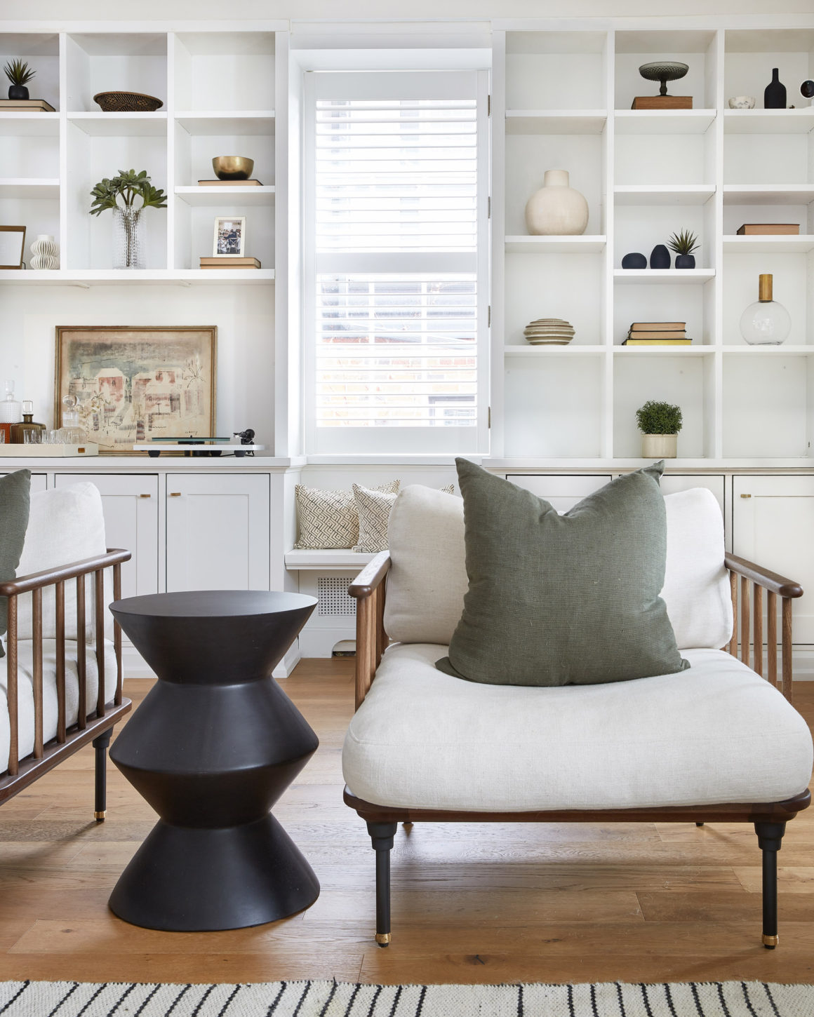
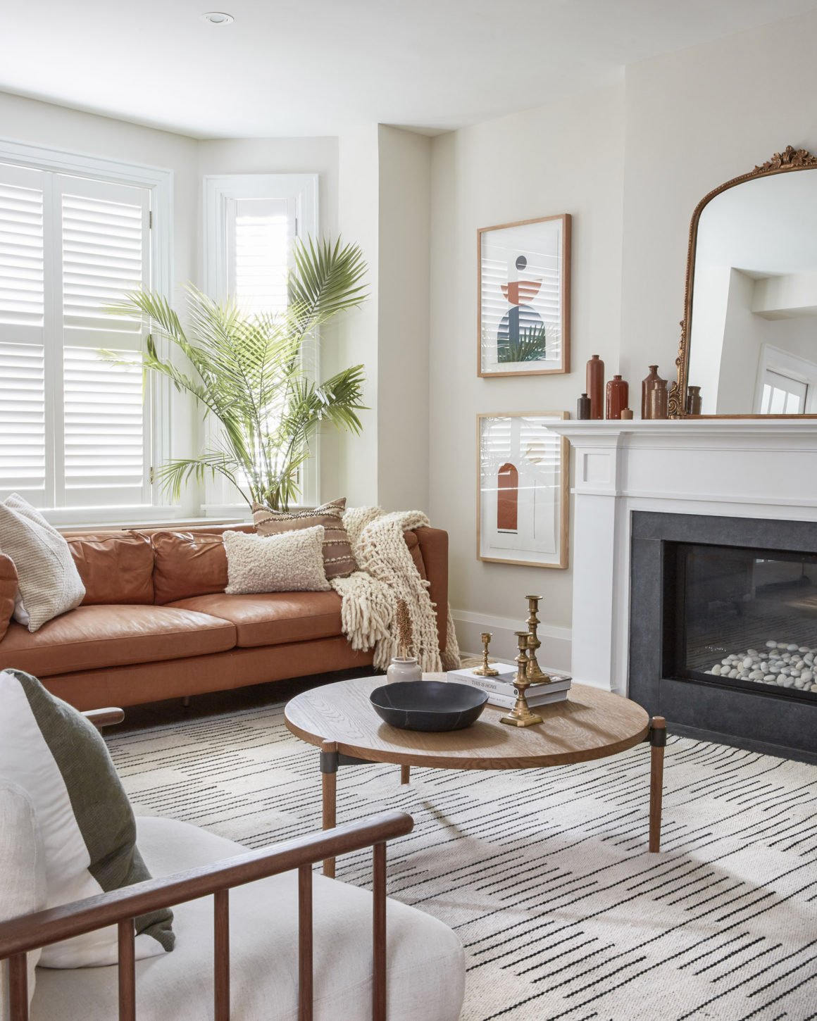
The main living room is an inviting and exotic-looking space defined by Mid-century Modern furnishings, plants, Australian block prints, a nubby area rug, a new gas fireplace and a collection of antique ceramic-glazed ink wells on the mantle. The built-in white cabinetry on the wall opposite the fireplace and behind two walnut club chairs needed to be styled. Interestingly, some of the open shelves have been left empty to balance the space and create interest.
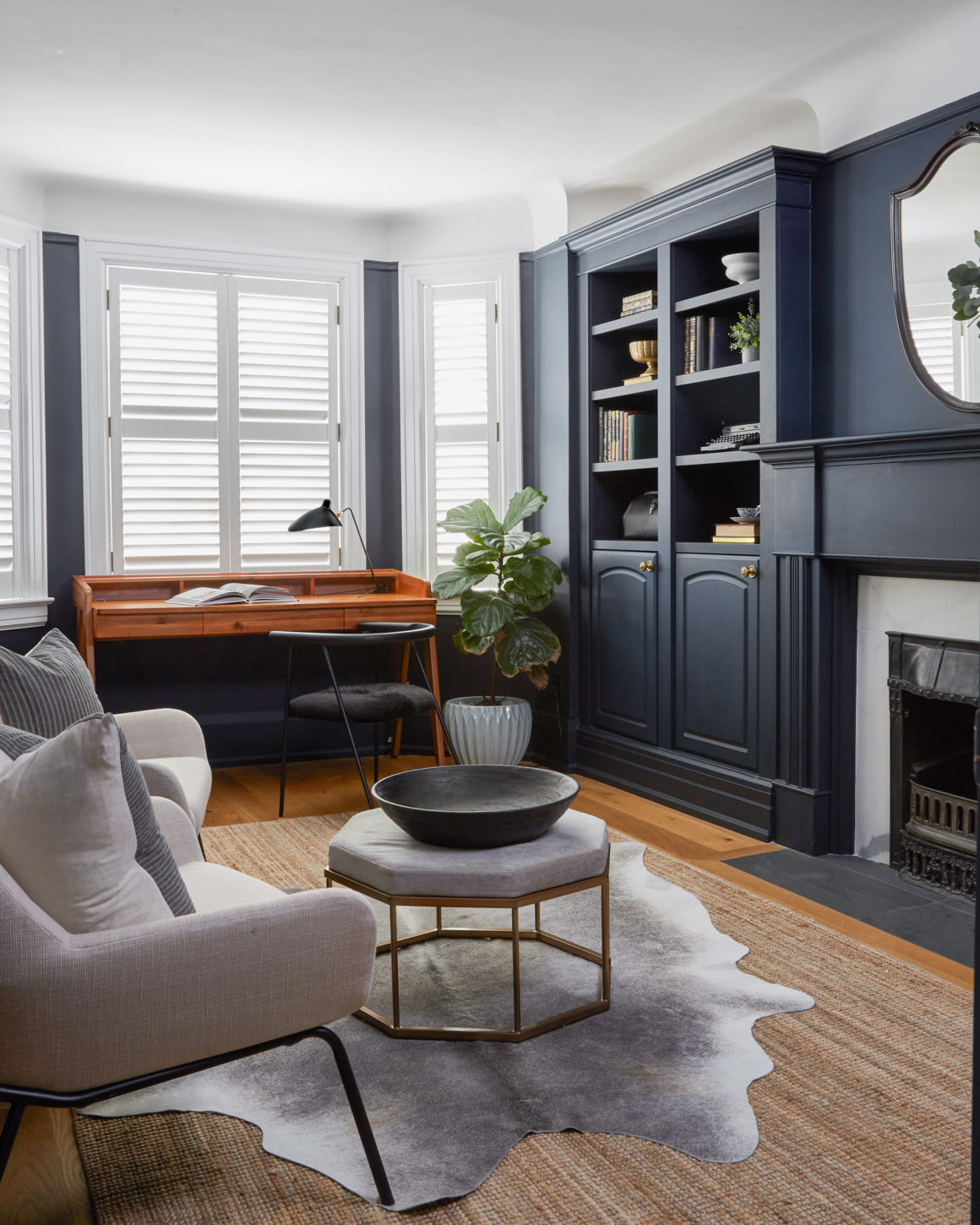
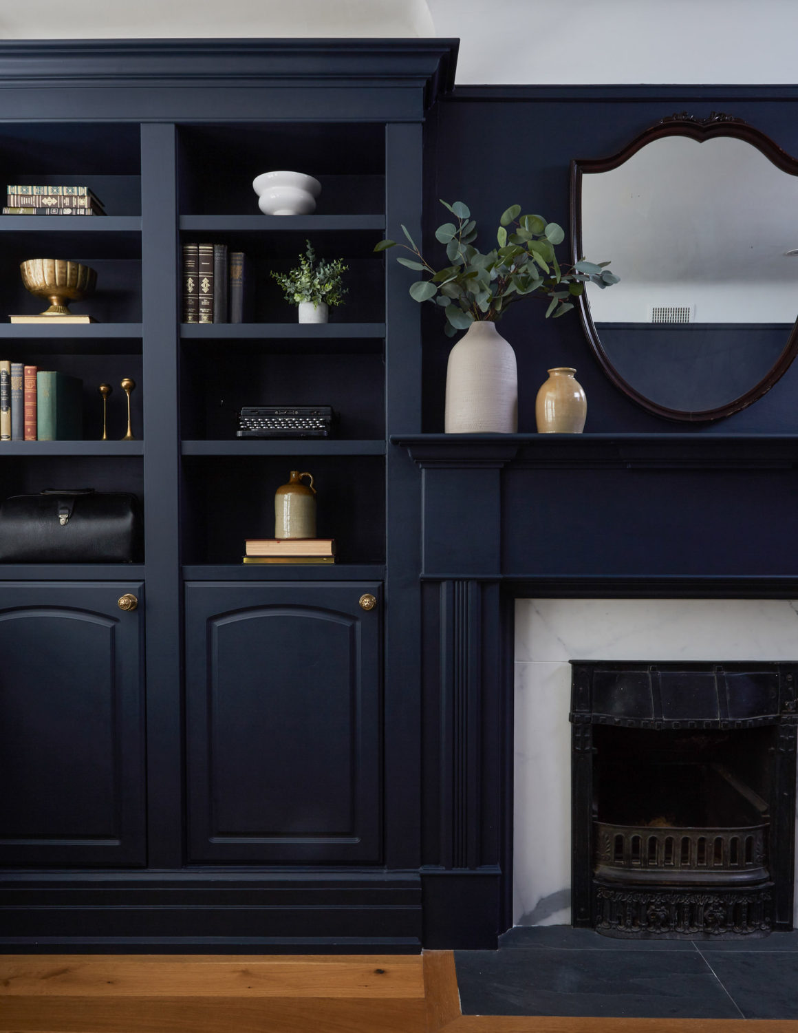
Up one floor is the office/den and bedrooms. Here, drama was added to the space through the addition of colour: Benjamin Moore’s Polo Blue (2062-10), a rich blue matte finish. The colour was applied to walls around the office’s bay window, and on the existing millwork that was formerly white. The blue cabinetry accentuates the white marble and black cast-iron hearth of the home’s old fireplace, as well as the gilded mirror above the mantle.
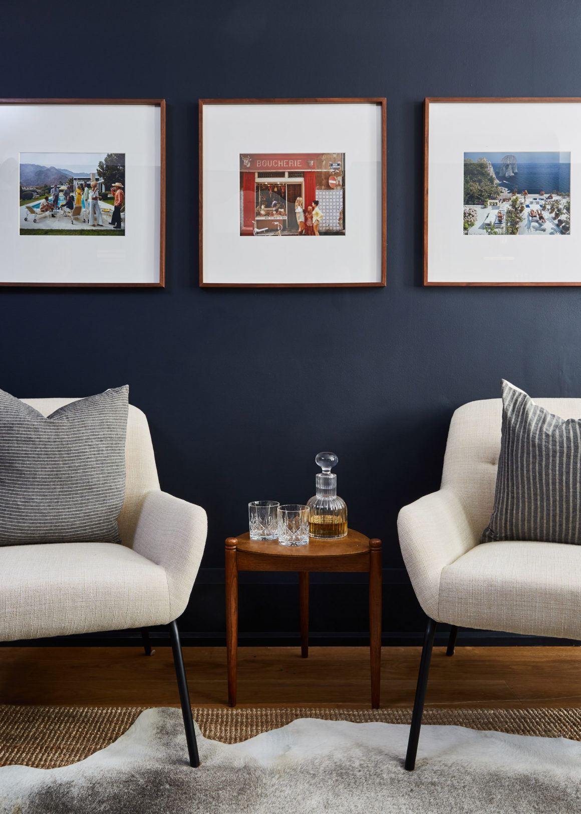
A set of Slim Aarons retro prints stand out on the rich blue matte finish.
Brass hardware embossed with a classic lion’s head adds interest to the room’s built-in cabinetry. A grey cowhide has been placed atop an area rug to create textured warmth. The room’s vintage elements include a 1950s-style ‘flytrap’ desk lamp, Tom’s father’s old medical bag, and a 1940s typewriter.
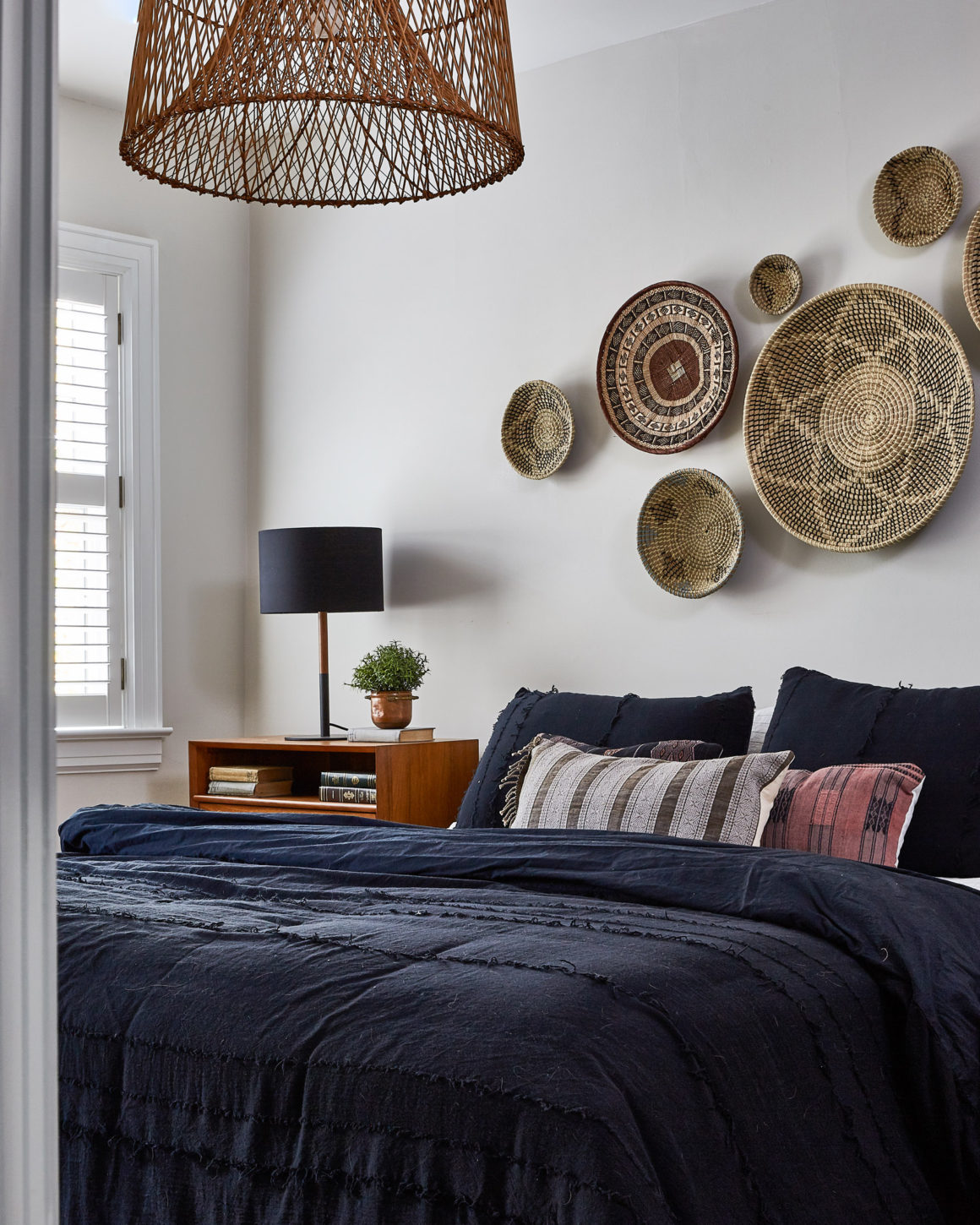
So as not to break the mood of the floor, the nearby guest room picks up the same colour scheme. Here, rich-blue bed linens and throw pillows are paired with a sisal rug, mid-century bedside tables and a wall display of baskets from Bali and Indonesia.
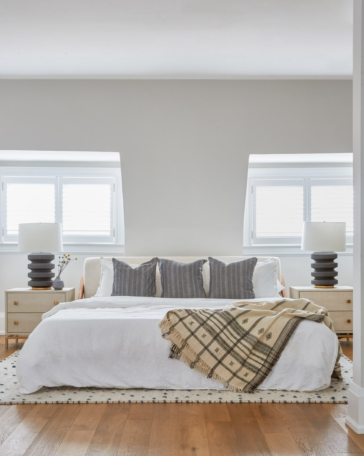
Up one more floor to the third-floor master bedroom and ensuite, we see another version of the same aesthetic. Here the king-sized bed is covered with a white cotton/linen bedspread and highlighted with a vintage cream and black Moroccan throw. A nubby cream wool carpet with knots picks up the colour scheme, adds warmth and grounds the space.
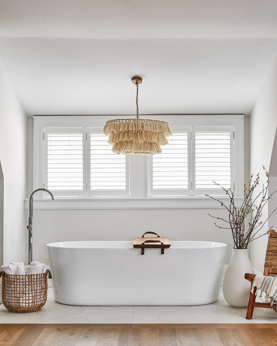
Finally, special attention had to be paid to the ensuite’s glass shower and standalone tub, both of which are open to the bedroom. A woven-rope slipper chair was placed next to the tub to make the space more inviting. And a tall floor vase holding twigs and dried flowers softens the space. The highlight, though, is a three-tiered chandelier made of strings that hangs above the tub. It generates warm, ambient lighting and it catches the eye.
Montgomery says the entire home redesign took one year to complete, with a big part of the time spent finding just the perfect piece for this spot or that one. The perfect piece can make all the difference. The show-stopping ensuite bathroom light fixture is a case in point. •
Originally published in the Autumn 2020 issue.
Ashley Montgomery Design
www.ashleymontgomerydesign.com

