
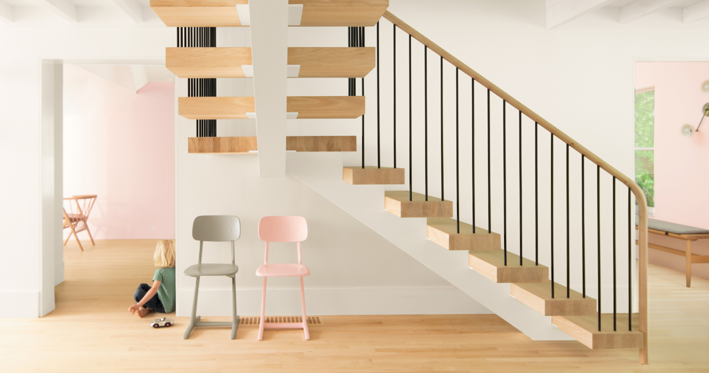
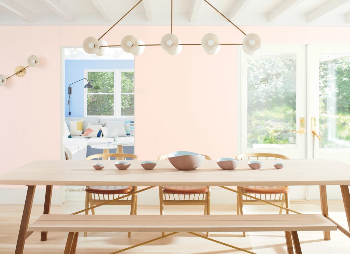
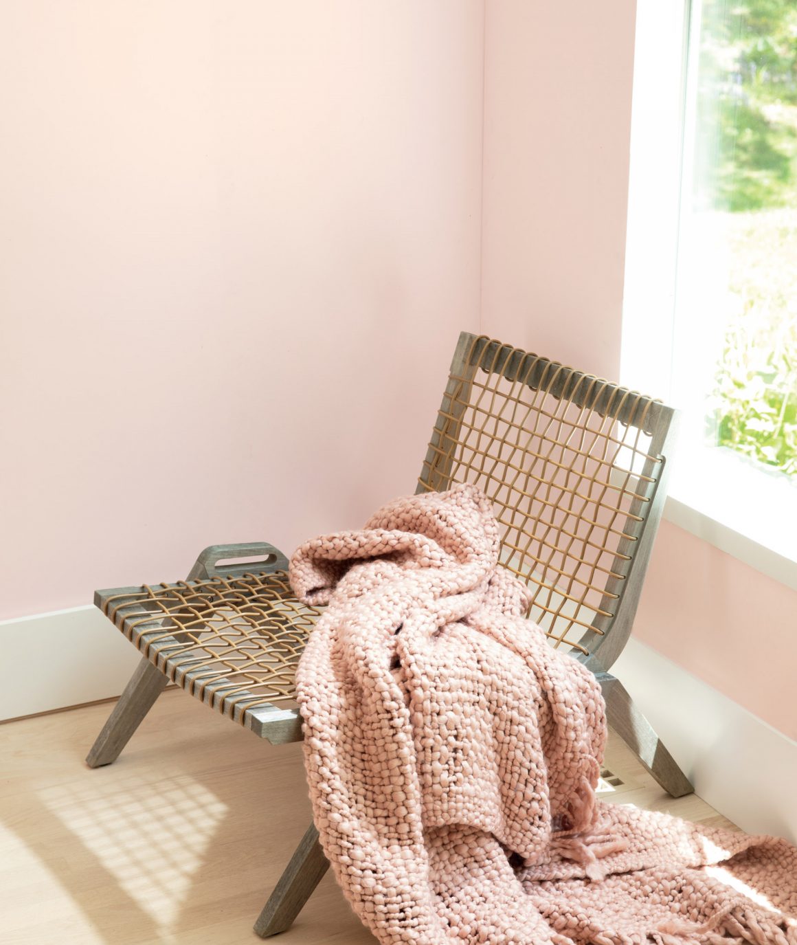
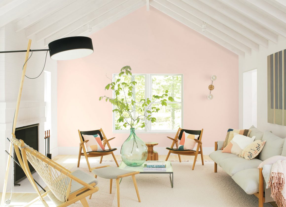
“Soft and rosy.” These are the words that describe Benjamin Moore’s Colour of the Year 2020. First Light (2102-70) is the hue chosen to begin the new decade. “We selected First Light 2102-70 as our Colour of the Year to represent a new dawn of idealism, design and living,” says Andrea Magno, Benjamin Moore’s director of colour marketing and development. “First Light 2102-70 reflects a new definition of the home – a shift in mindset from the material to satisfying the core needs in life: community, comfort, security, self-expression, authenticity and ultimately, optimism. The Colour Trends 2020 palette plays an integral role in supporting these core human ideals.”
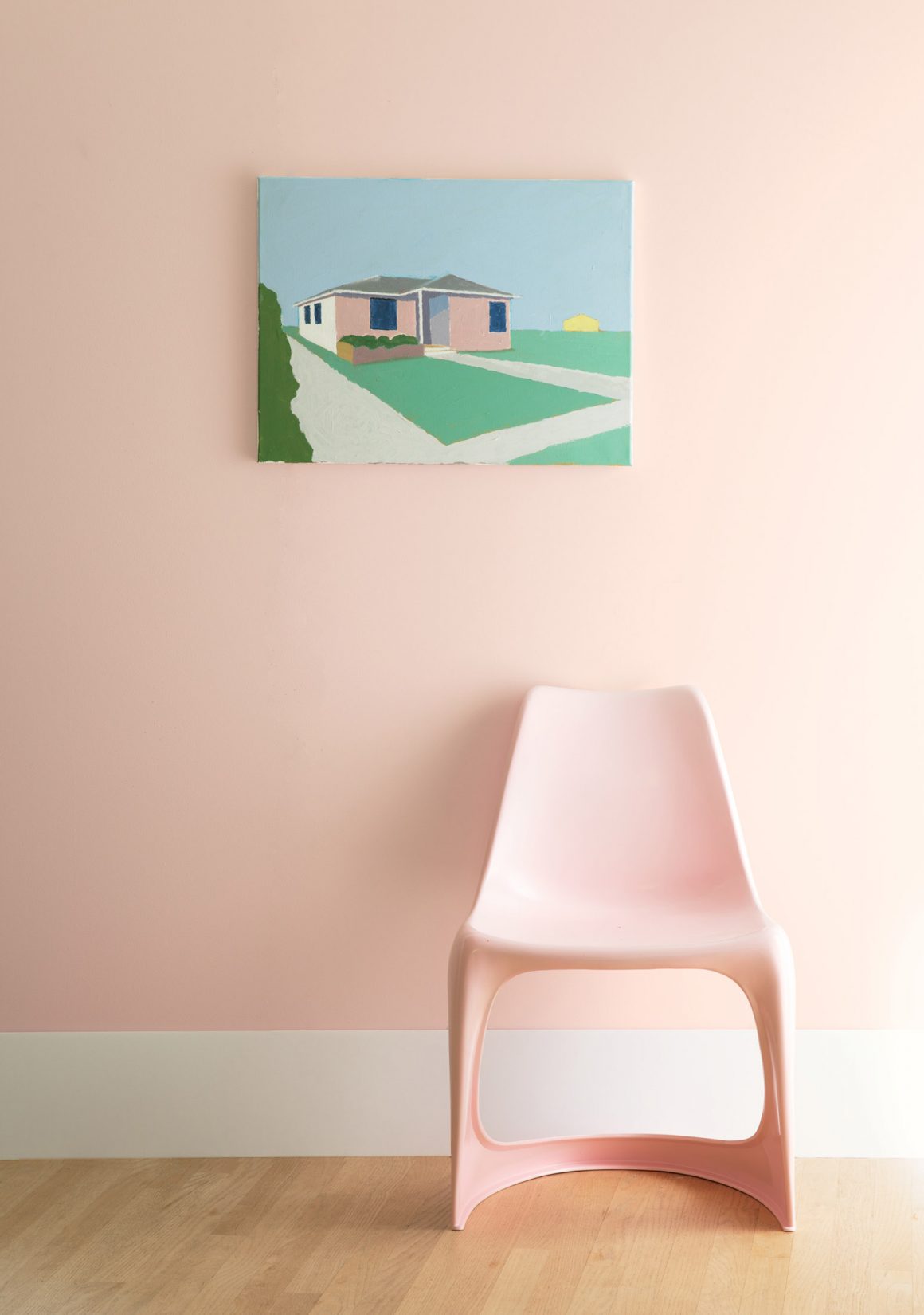
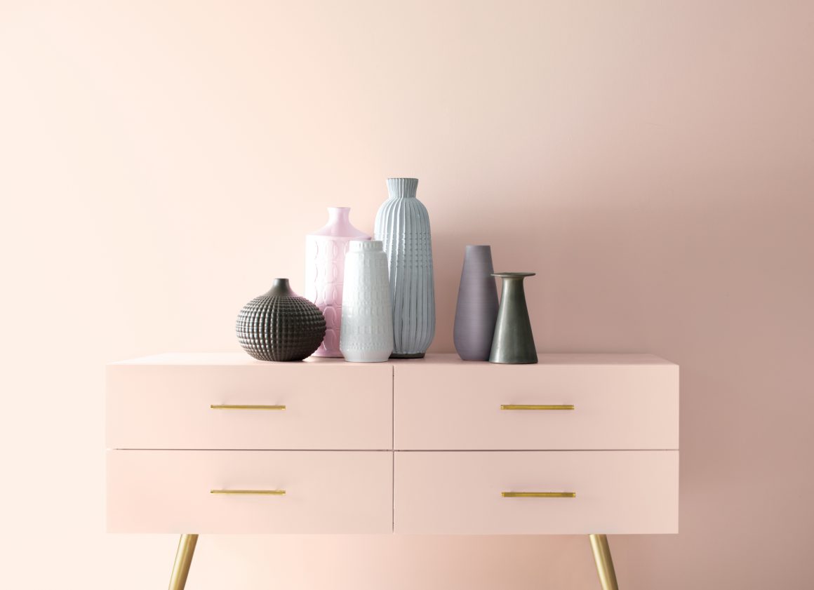
In fact, the Colour of the Year is rosy, described by the company as: “a refreshing alternative to white or beige, First Light 2102-70 is a soft, airy pink that flatters any space and plays well with other colours.”
With a new decade on the horizon, Benjamin Moore took a fresh approach to mark this milestone. It both embraces and transcends colour to re-examine the concept of the home, while exploring how it will continue to evolve over the next 10 years. With celebrations in both New York City and Toronto, the company’s announcement drew leading interior designers, architects, painting contractors, media and influencers to experience the unveiling of the colour.
“Colour is powerful but highly subjective, especially through the lens of different generations, relationships and moods,” says Magno. “But from the saturated to bright and airy, all are easy to live with and easy to love – whether they stand alone, in a strong pair, or all cohabitate.”
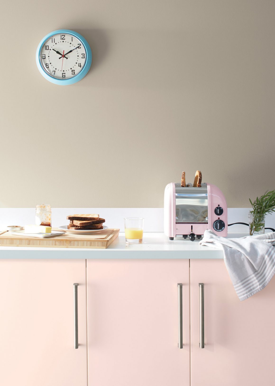
This modern definition of dwelling replaces long-standing post-war ideals, shining light on a new era of design rooted in fluidity for the multigenerational, multifunctional and different states of mind now found under one roof. Ten harmonious hues have been selected to take us into the next 10 years and beyond. The Benjamin Moore Colour Trends 2020 palette features:
● First Light 2102-70 (Colour of the Year)
● White Heron OC-57
● Crystalline AF-485
● Windmill Wings 2067-60
● Buxton Blue HC-149
● Golden Straw 2152-50
● Thunder AF-685
● Cushing Green HC-125
● Oxford Gray 2128-40
● Blue Danube 2062-30
The Colour of the Year and Colour Trends 2020 palette can be achieved with these Benjamin Moore products: Aura®, Aura® Bath & Spa, Regal® Select, Ultra Spec®, Natura® ben®, ADVANCE®, ARBORCOAT® and Aura® Grand Entrance®. All 3,500 Benjamin Moore colours are available in pint samples at local retailers along with Colour Trends 2020-curated palette cards. Benjamin Moore products are exclusively found at more than 5,000 Benjamin Moore independently owned paint and decorating retailers across the U.S. and Canada.
To learn more about the Benjamin Moore Colour of the Year and Colour Trends 2020 palette, visit benjaminmoore.com. Search also #ColourTrends2020 on social media channels including Facebook (Benjamin Moore Quebec), Instagram @benjaminmoore, Twitter @BenjaminMooreCA, Pinterest (Benjamin Moore) and YouTube (BenjaminMoorePaints).


