Photography: Drew Hadley
Styling: Érik Maillé
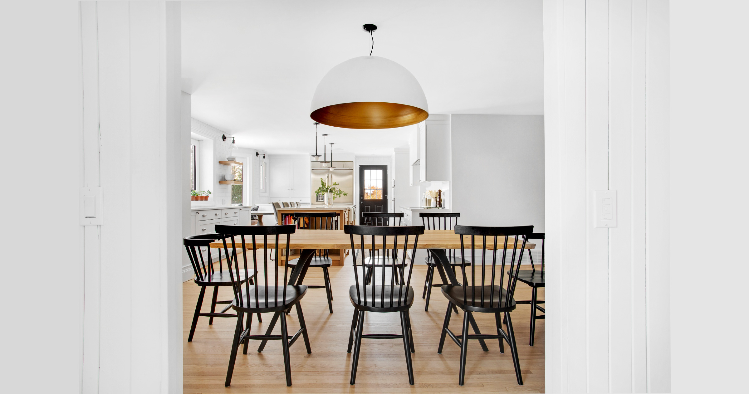
Look closely. You’ll see that in almost every tableau, Érik Maillé has injected a jot of black. “Une petite touche de noir,” is how he describes his signature design flourish.
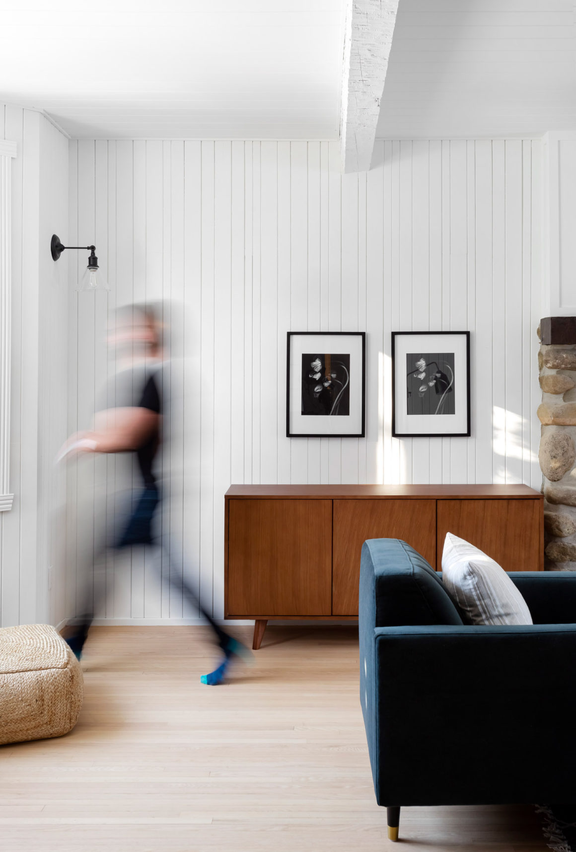
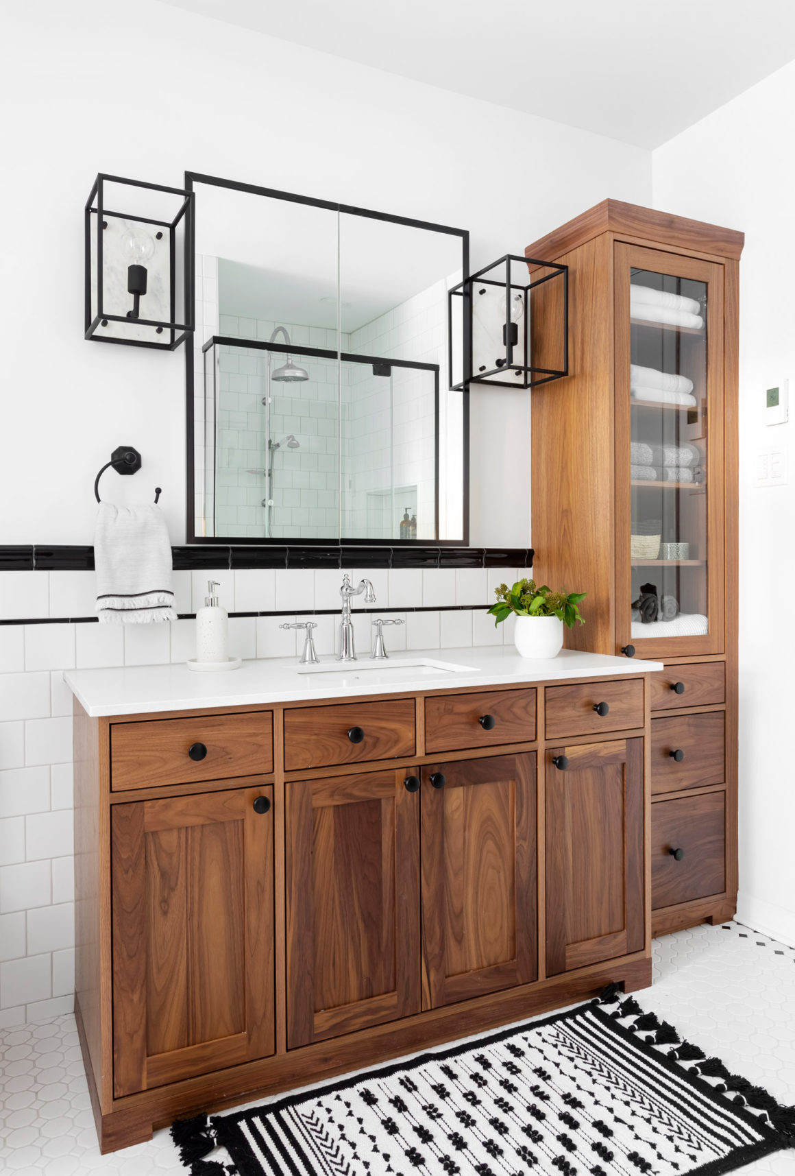
A horizontal line of black tile that runs across a white bathroom. A wall of black-framed family photos – black and white, of course. Doorknobs in inky black oiled bronze, light fixtures that are powder-coated matte black. These are the punctuation marks that appear and reappear throughout one of the Montreal interior designer’s recent projects: a warm and charming family home on Montreal’s South Shore community of St. Lambert, reimagined for a professional couple in their mid-30s and their two young children.
The couple had made a bold move, relocating to the suburbs from the city, lured by the dream of a backyard and a bigger house, and the opportunity for their children to grow up closer to their extended family.
At 35 years old, Maillé is an interior design veteran who began in the business at the age of 20 and now runs his own five-person eponymous firm. (He is also co-host of the popular Canal Vie television series Les héros de la réno in which he and his team perform “rescues” of projects after the owners have fallen upon hard times. (In one recent episode, they renovated a house in Ste. Marthe sur le lac that had been badly damaged by flooding.)
Maillé did what he always does before beginning the St. Lambert project: he invited his prospective clients over to his own house to talk. He wanted them to get a glimpse of his own eclectic style and to see if they all felt comfortable with each other.
He says the clients had done plenty of research before they visited him. And he understood immediately what they were after: A home with a traditional feel but streamlined, modern but warm – with a hint of rustic, “but not too much.” They preferred a muted colour scheme, white walls and pale wood. They wanted a minimalist aesthetic, but not a cold one. Nothing too shocking, but neither too plain.
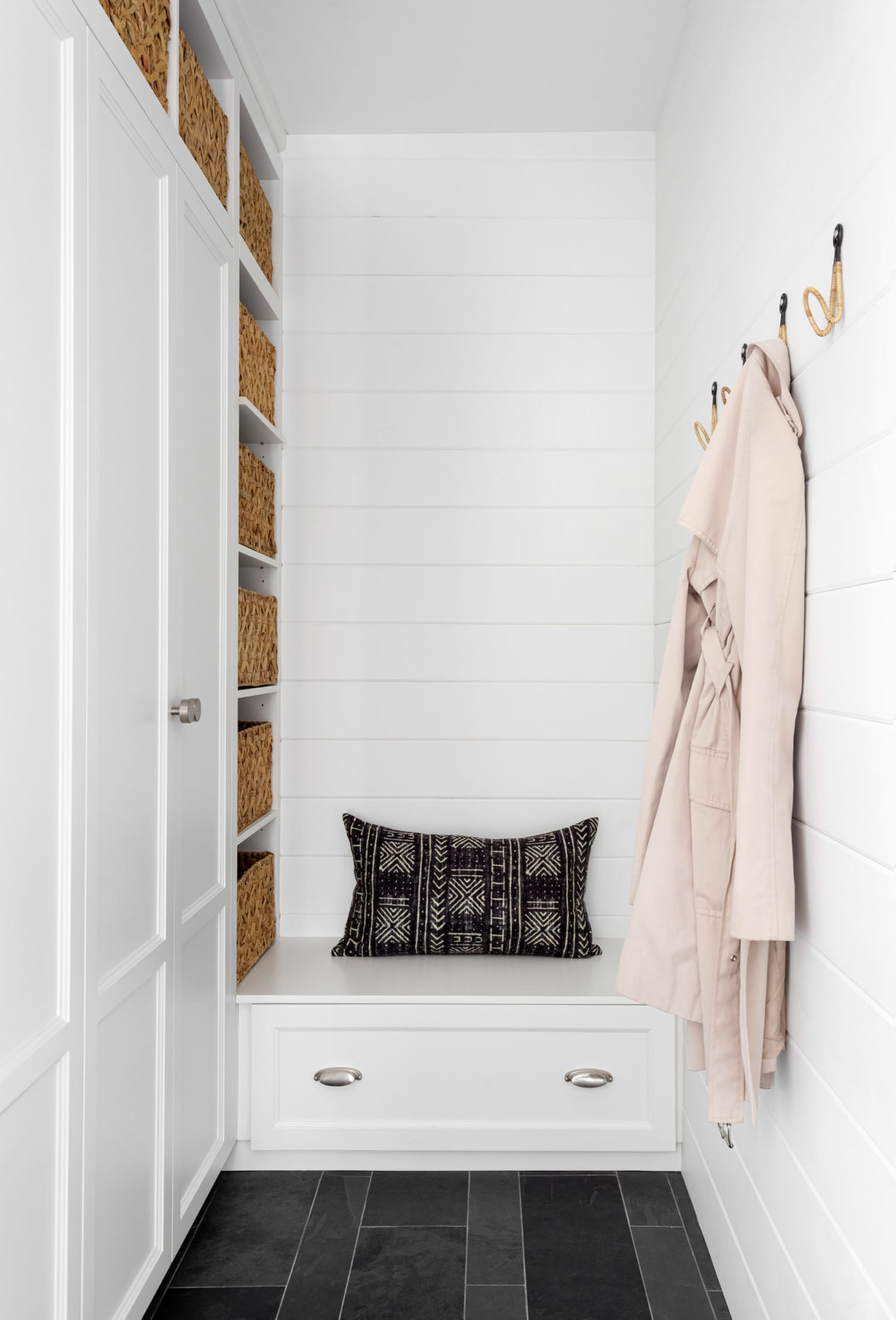
Also on their checklist: a mudroom for hiding boots and overcoats after family outings, a main-floor laundry room to avoid hauling clothes bins up and down the basement stairs; a big, luminous white, easy-to-clean kitchen, and a comfy, casual living room where everyone could gather around the fire.
The instructions might have come off as complicated, even contradictory. But not to Maillé, who is a master of melding styles. He accommodates, no embraces, ambiguity by hewing to a traditional aesthetic that incorporates modern materials. Or he’ll do the opposite: create a contemporary style, then soften it with traditional materials or finishes.
As it was, the 1960s cottage in St. Lambert was a warren of small rooms.
“We took down a supporting wall, re-divided the space and put in new floors and walls, Maillé says. “All to say, we rethought everything.”
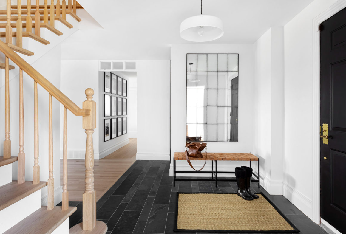
The black-and-white motif is evident right from the high-gloss black front door. The entrance floor is clad in textured Montauk slate tiles of varying sizes, and the space is dominated by an oversized rectangular mirror with smoky, distressed panels. In the adjacent hallway, the rectangles are repeated in a wall of black and white family photos that are at once aesthetic and sentimental. “If I could, everything would be a contrast between black and white, which is so, so timeless. You never get tired of it,” Maillé says. “But black and white isn’t just timeless. It’s also punchy. It has a bold, modern feeling, too.”
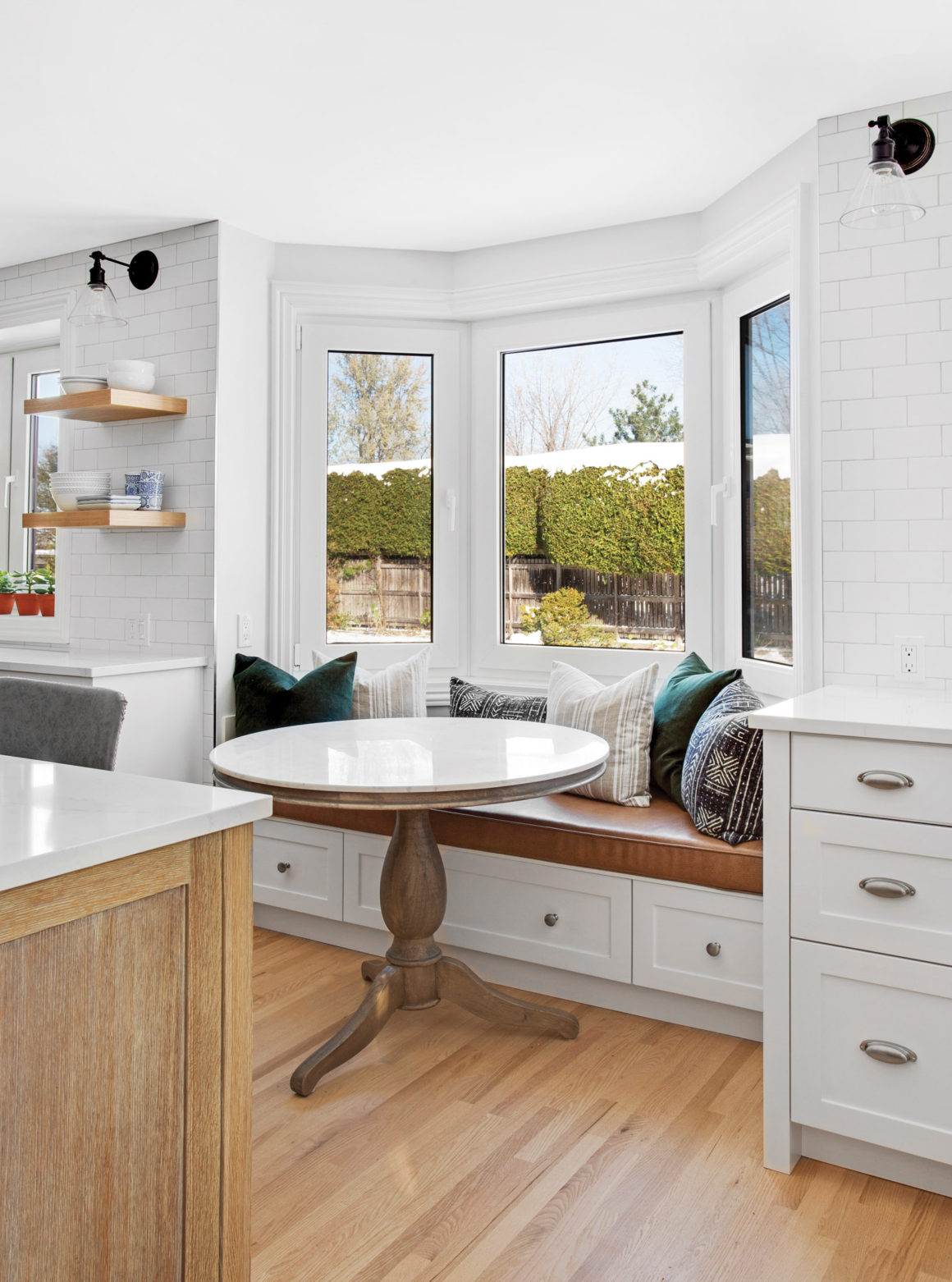
Much as he loves the pared-down look of black and white, Maillé says he never wants his spaces to appear “monotonous.” So he brings in warmth and texture by introducing accents in leather, wood, sisal or ruched fabric.
The spindles on the stairway leading to the second floor might seem old-school in another context. But Maillé bleached them to a pale tone and lent the staircase a fresh, Scandinavian look.
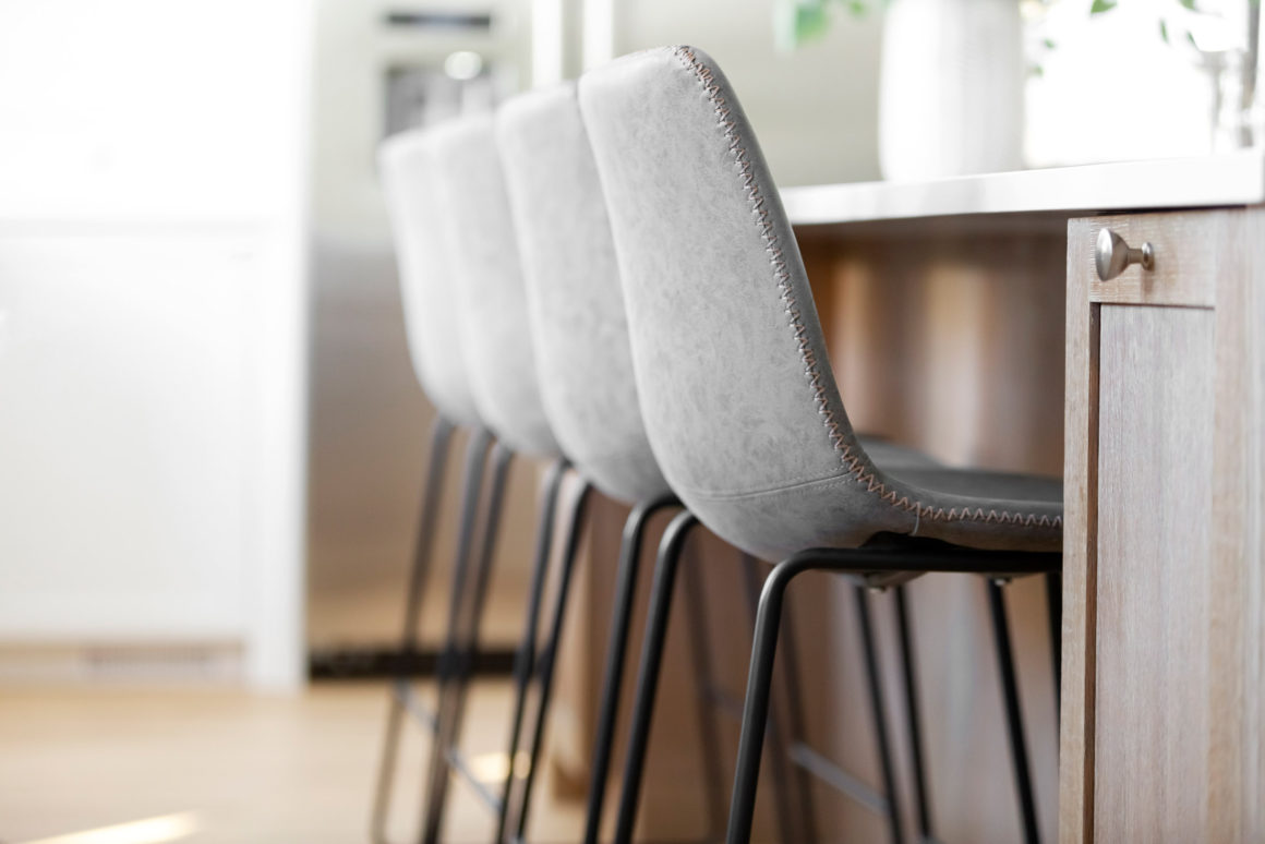
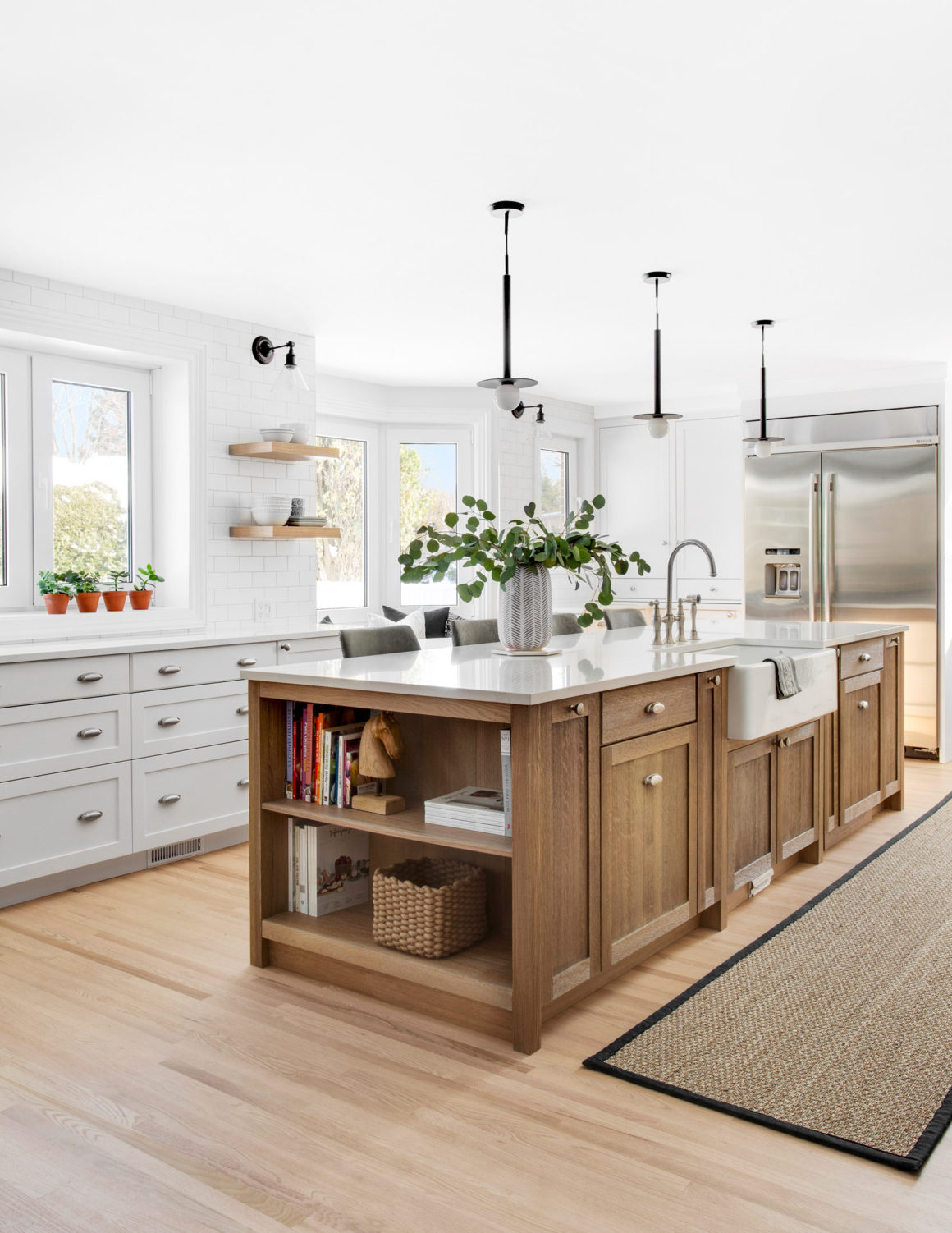
In the all-white kitchen, the island cabinets are built of rift-cut oak and the stools are upholstered in grey leather, which imbues the room with a modern-country sophistication.
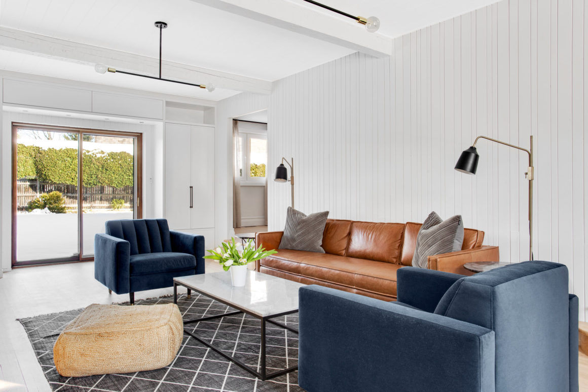
The designer does the same thing in the living room, by keeping the original fireplace, with modifications that reduce its stone surface to manageable proportions. The room’s original wall panelling and ceiling stay too – as a nod to the home’s 1960s origins, but they are painted white to lighten them up.
Upstairs, in the children’s bathroom, black-and-white tiling is juxtaposed with a vintage-look walnut vanity. “Throughout the house, you’ll see a mix of what’s practical and what’s beautiful, of timeless and contemporary, of rough and smooth,” says Maillé. “To me, this blending of styles and elements is everything. It’s what gives a space history and soul.” •
Érik Maillé Design
www.erikmailledesign.com

