PHOTOGRAPHY: MAXIME BROUILLET
STYLING: LAURENT GUEZ
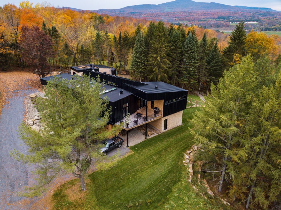
Laurent Guez used to get strange reactions when he told people his pet name for the country home he designed and built in Abercorn, Quebec. On the plans and in conversation he called it his “hangar à cochons,” or pig shed. It was an unusual inspiration and title, but it represented the ideas he wanted to evoke: a rural setting and a contemporary, industrial-style building made of basic construction materials in their natural form. “That was the vision,” Laurent says, “The idea behind the name was to create a strong image.”
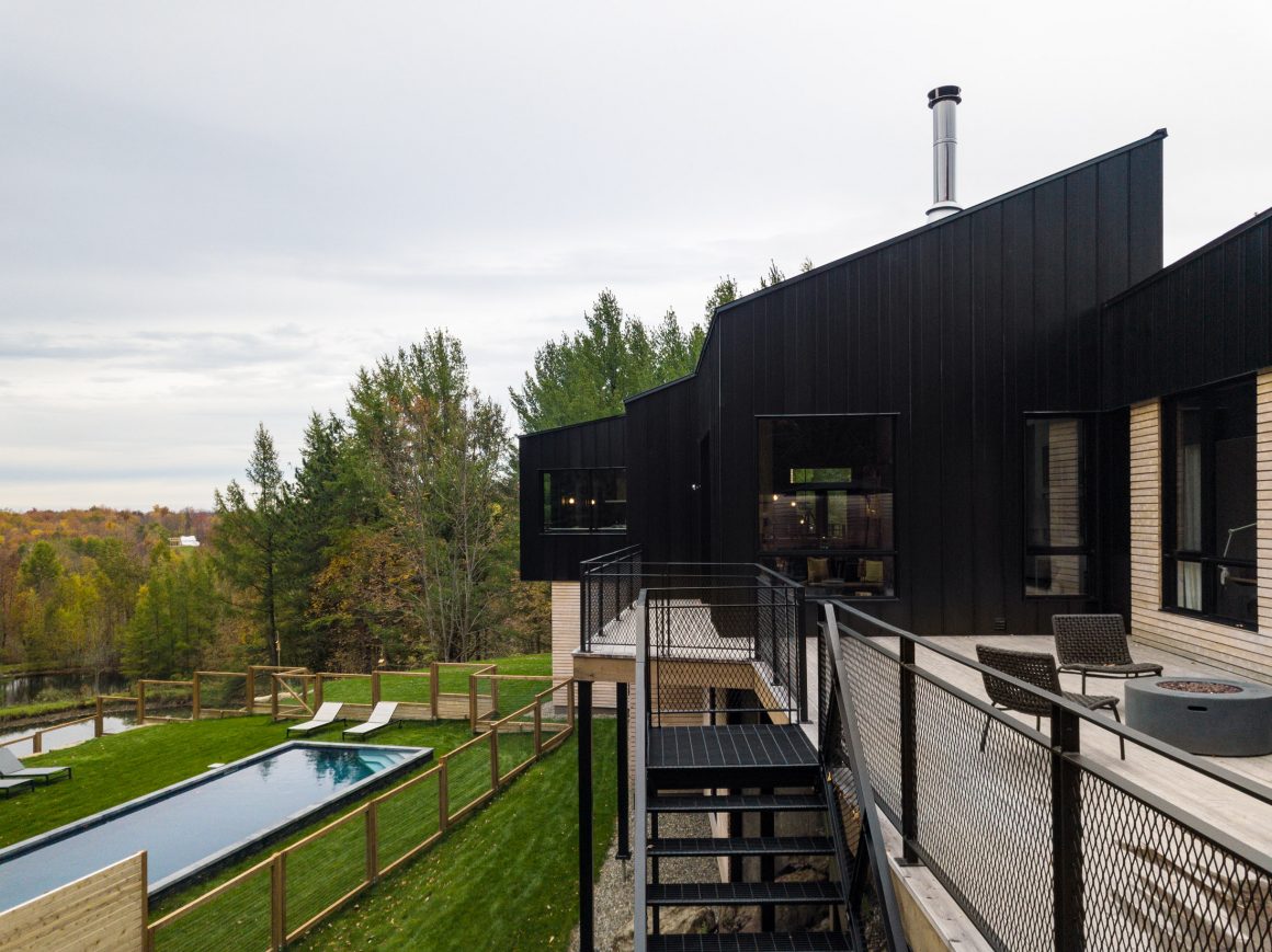
The two-storey, 5,000-square-foot house, in Quebec’s Eastern Townships region, has four interconnected modules, and Laurent describes moving through the home from one module to the next as travelling through “a succession of surprises.” He kept a spirit of playfulness as he designed the new space and wanted to create visual contrast. That starts with the approach to the house itself, which looks small and unassuming. “That was my intention, to look small, and then come inside and see that it’s really big,” he says.
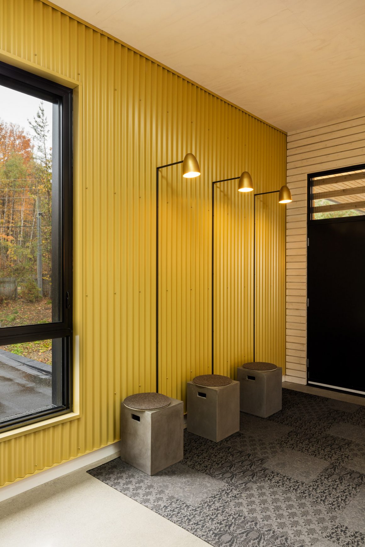
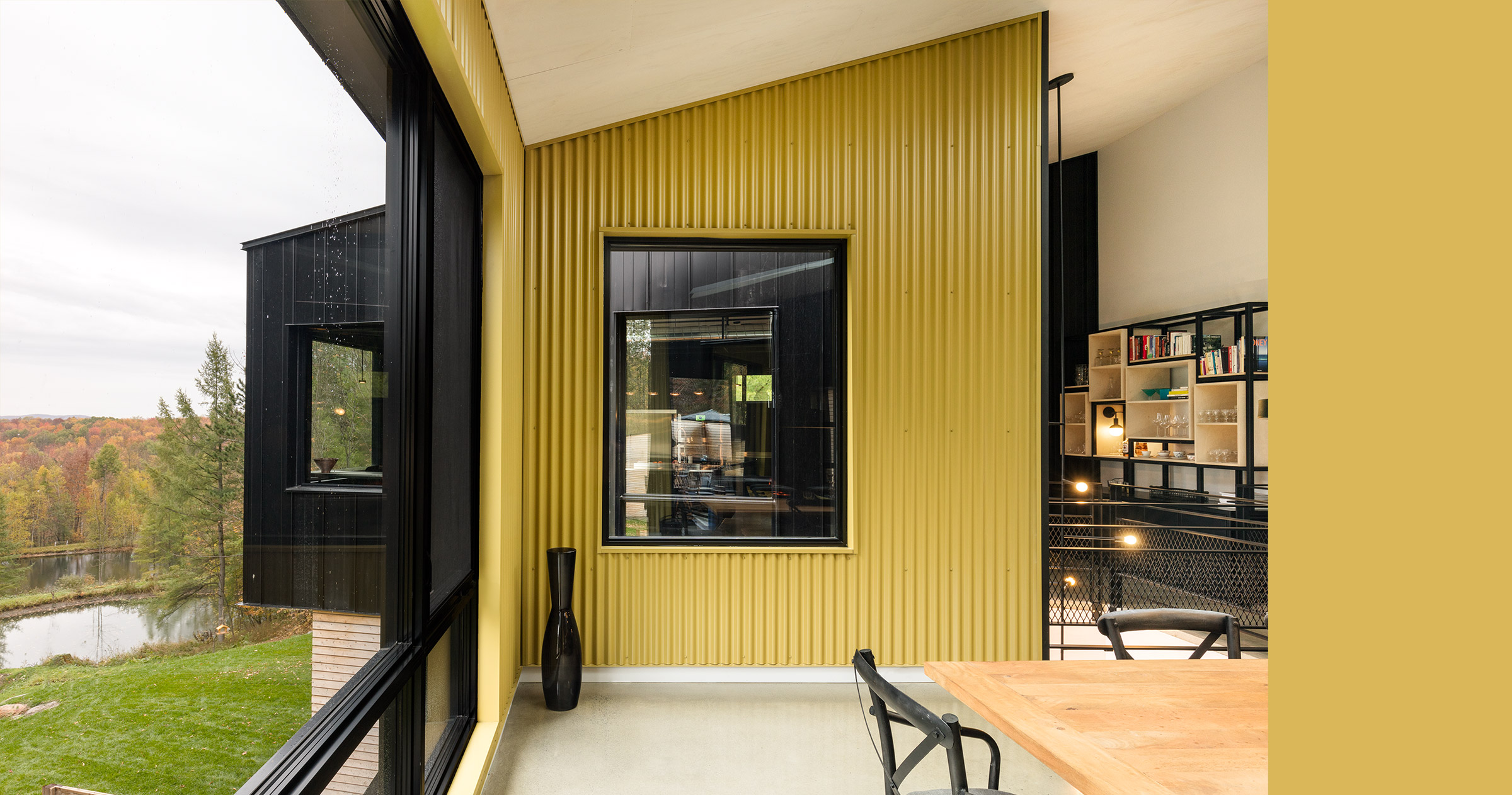
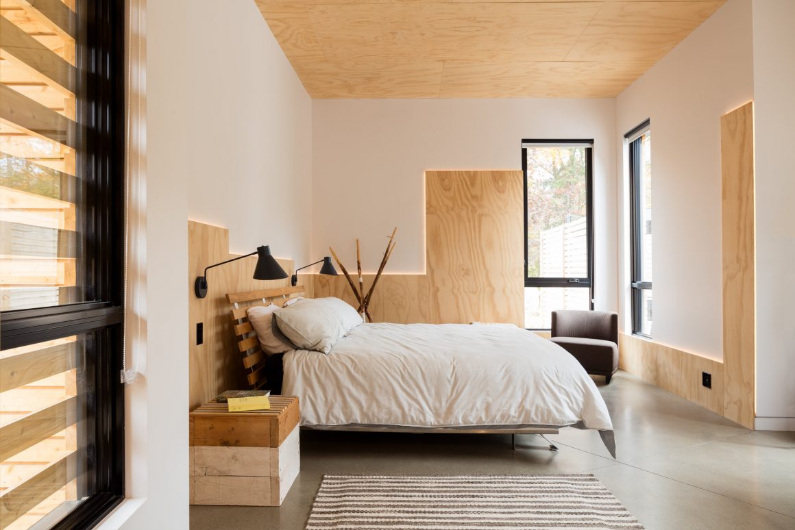
Inside, a variety of construction materials form the interior walls and give the space its industrial look. Many of them are often associated with building exteriors: exposed concrete, black and gold corrugated metal, plywood boards and cedar shingles. Laurent’s objective was to create a sense of being outside looking at the exterior of the building while inside. The black metal walls also recreate the sense of being surrounded by woods. “You have the impression of being in the forest,” he says.
Because the house is north-facing, getting light into the building was a challenge. Working with architect Guillaume Kukucka, Laurent says the goal was “to follow the sun. Wherever the sun would hit the wall, we wanted to create an opening.” The result is lots of large windows and skylights. Laurent also worked with Luminaire Authentik to create the indoor lighting. Some of it is from the company’s standard line; some he designed with them; and some, he created himself.
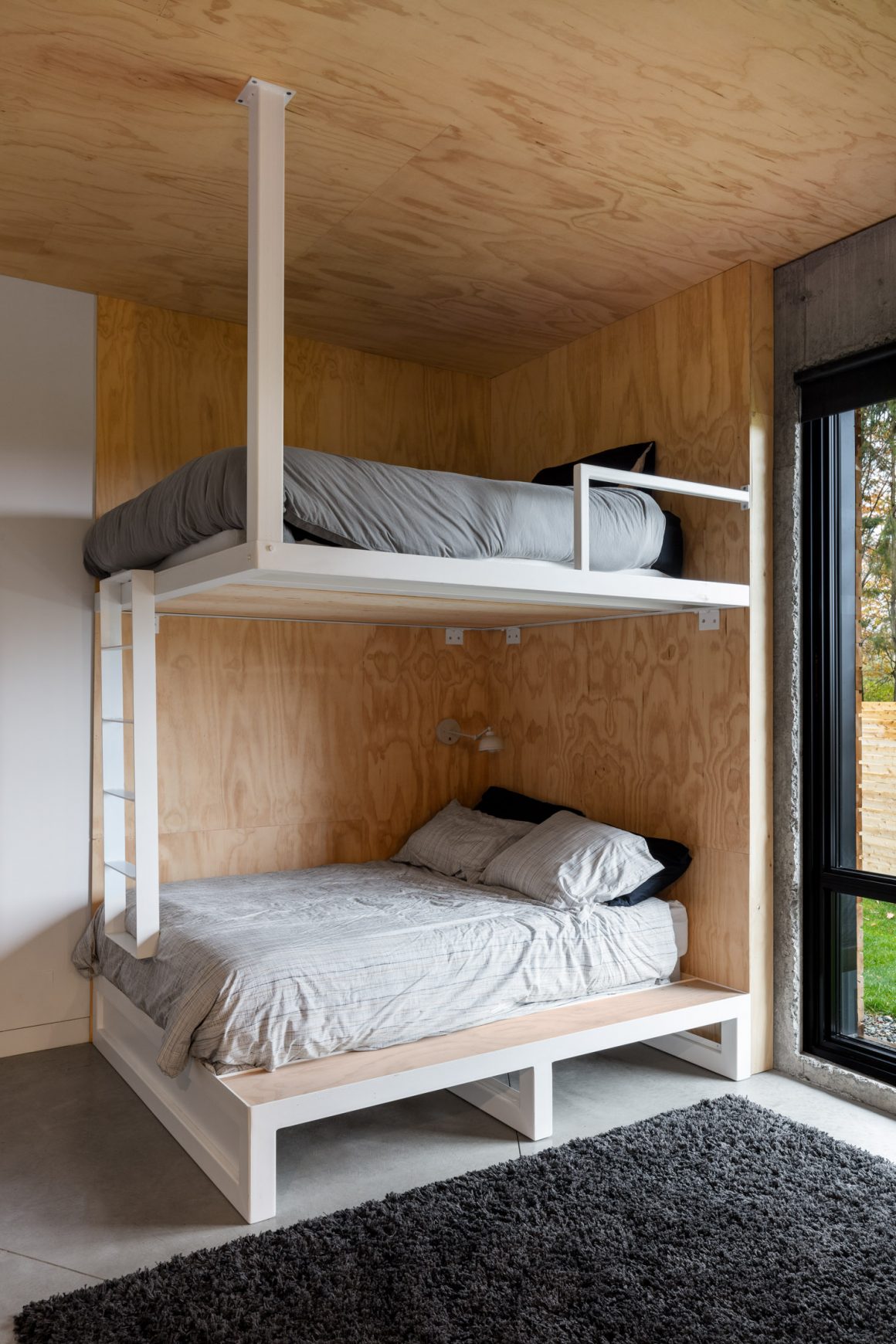
Though Laurent and his partner have a city home, the house in the country was designed as their principal residence, and it was built with family in mind. There are common areas, extra bedrooms for children and grandchildren to come for the weekend and longer stays, and a small outbuilding with a ceramics workshop and a pool. Even though he was doing it for himself, Laurent, an industrial designer by profession, says he approached the design more like a work project than as his own home. His day job is at TUX agency, where he is the chief of retail and experiential design, and spends his time creating spaces for clients.
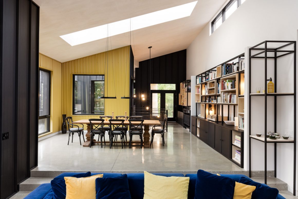
The main living space is on the upper floor. It includes living and dining rooms, a master suite, a second bedroom and – at the back, slightly separated from the rest of the house – a hallway bridge that straddles the lower level and leads to the kitchen.
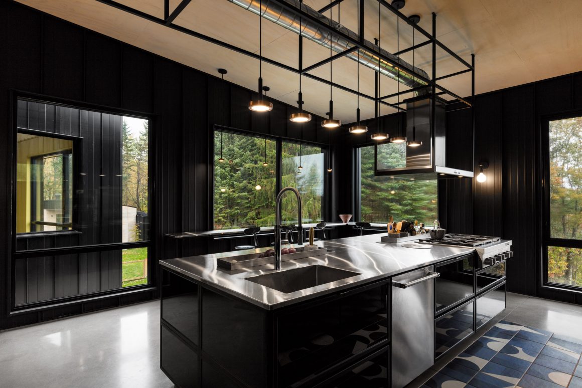
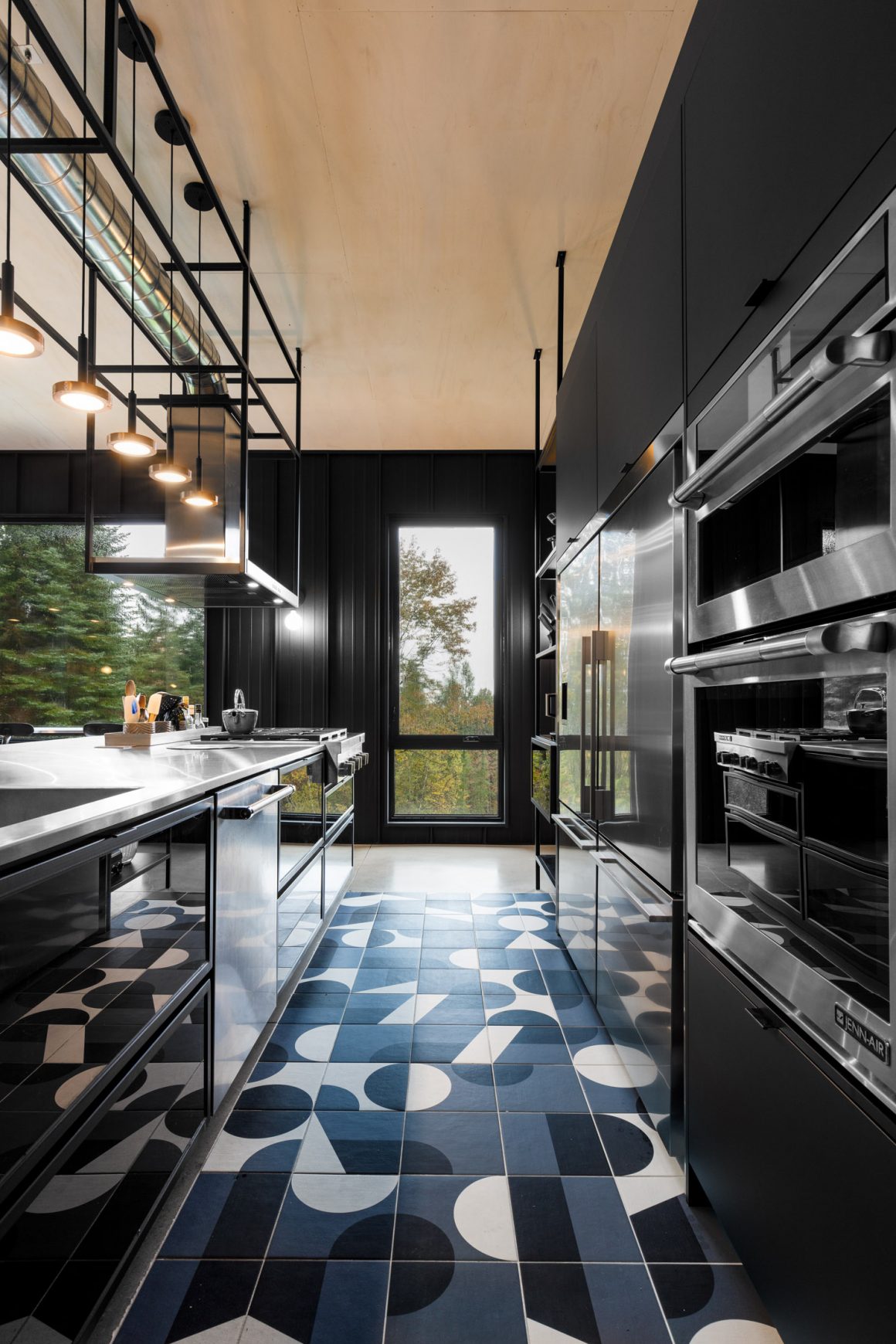
The kitchen features two main areas: food preparation on one side and an L-shaped eat-in counter that looks a bit like an upscale diner on the other. The counters face large windows that look out onto the trees. Because this module juts out at an angle, there’s a window that overlooks the outside and another that offers a view of the dining room, another of Laurent’s visual surprises.
In the master suite, he also challenged tradition. The hallway entrance doesn’t lead to the sleeping area, it opens into the bathroom and walk-in closet. A partial wall, lined with a long vanity, two sinks, mirrors and opaque glass separates this area from the actual bedroom.
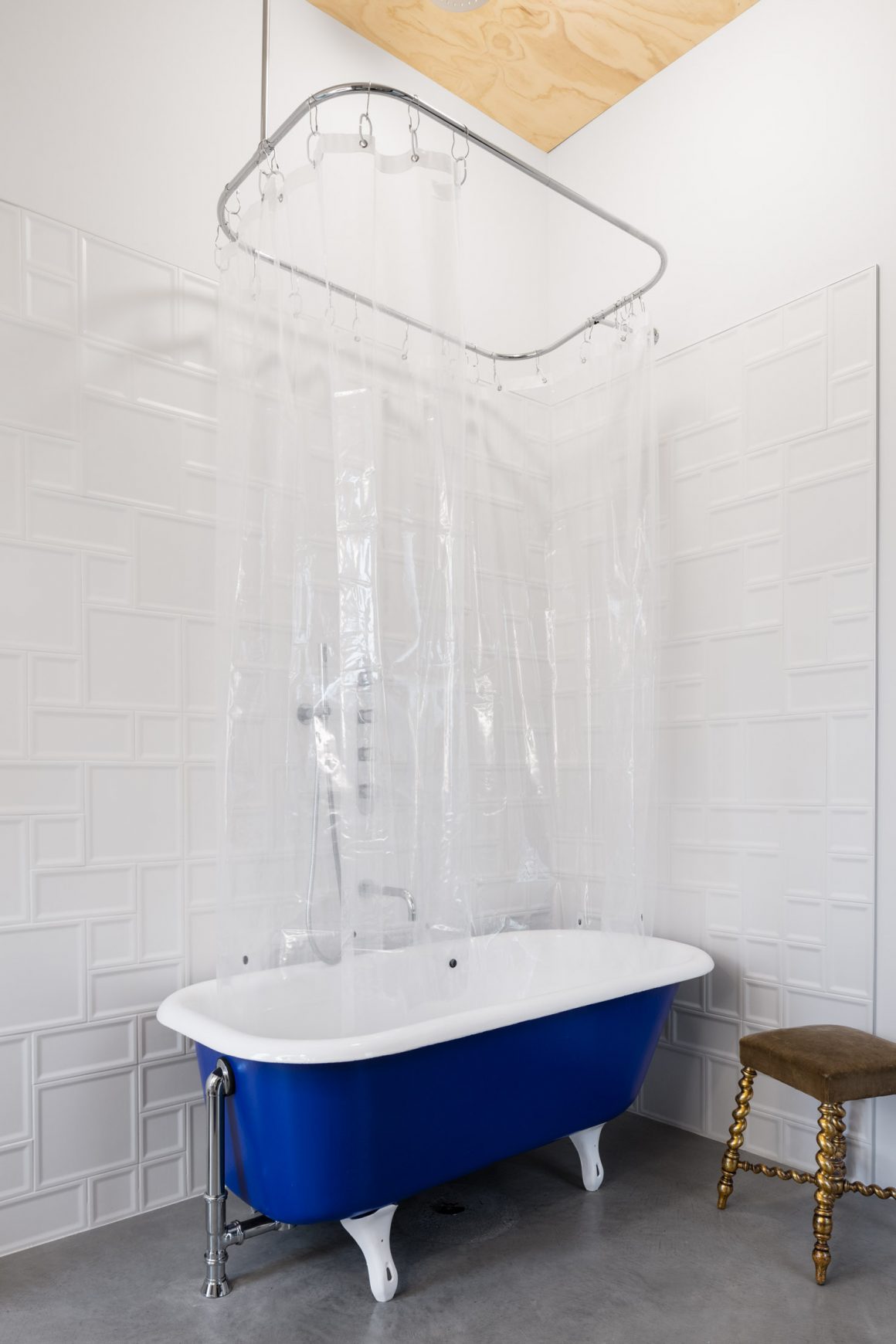
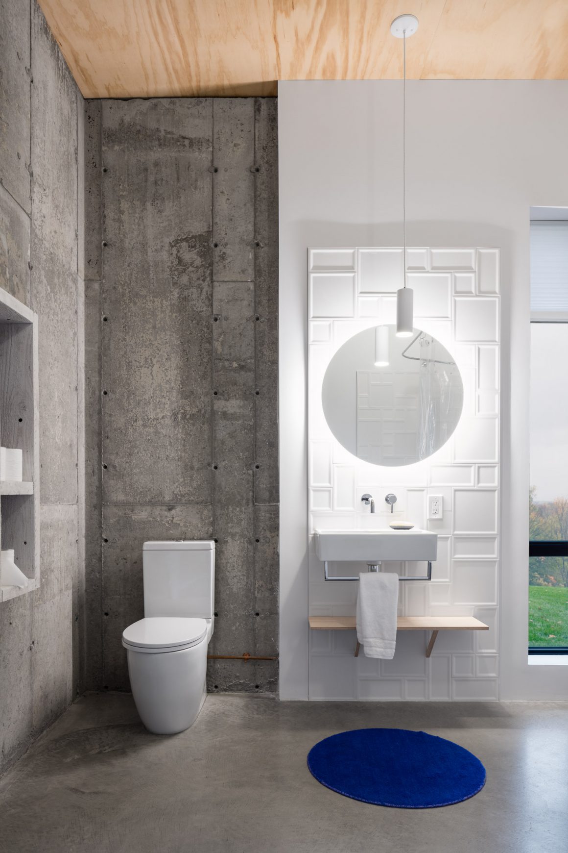
Tiles behind the sink in the guest bathroom: Stone Tile.
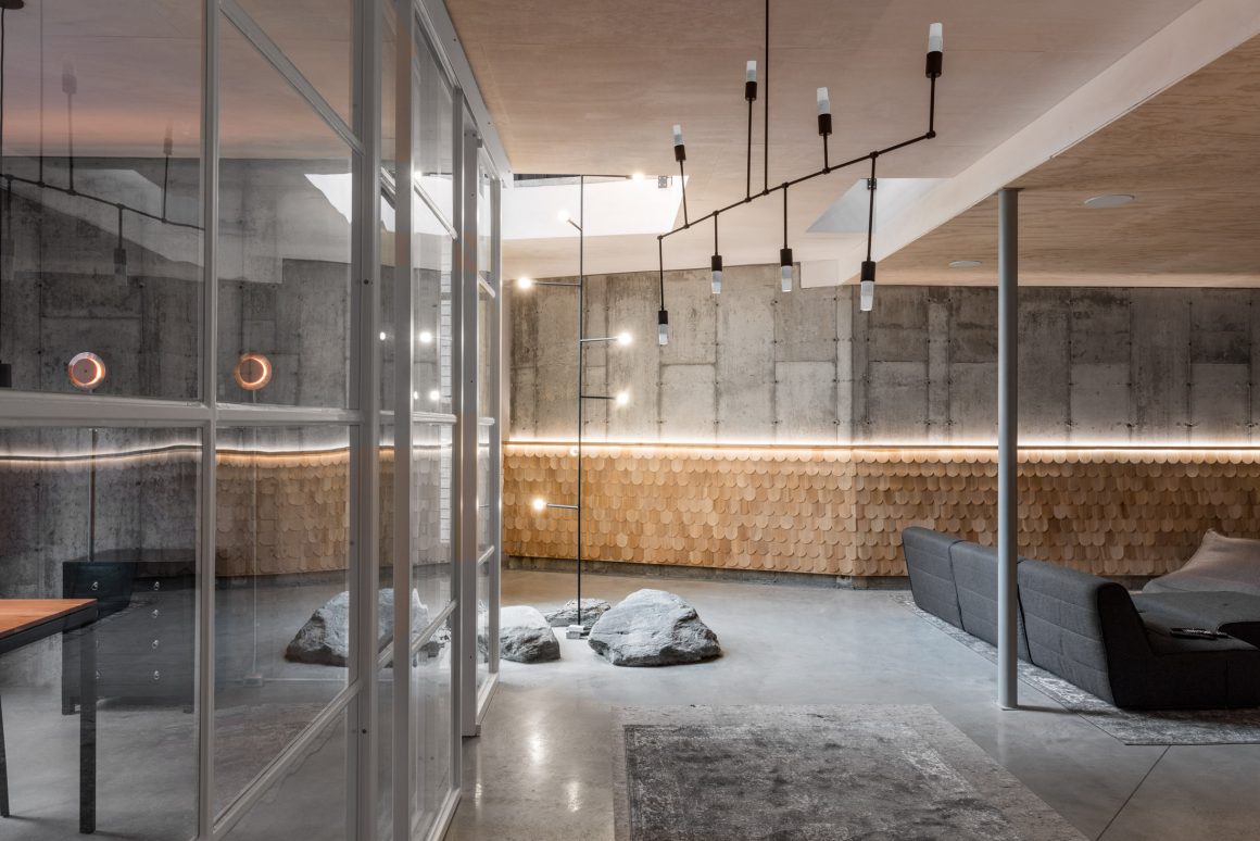
Downstairs, at garden level, there are two more bedrooms, an office, storage areas, and a big playroom and home theatre. Most of the walls here are exposed concrete with partial wood cladding: plywood in the bedrooms, cedar shingles halfway up the walls in the common areas. There are rocks, large ones, that poke up through the building’s footings, set into the polished concrete floors in the play area, again pulling the outdoors in.
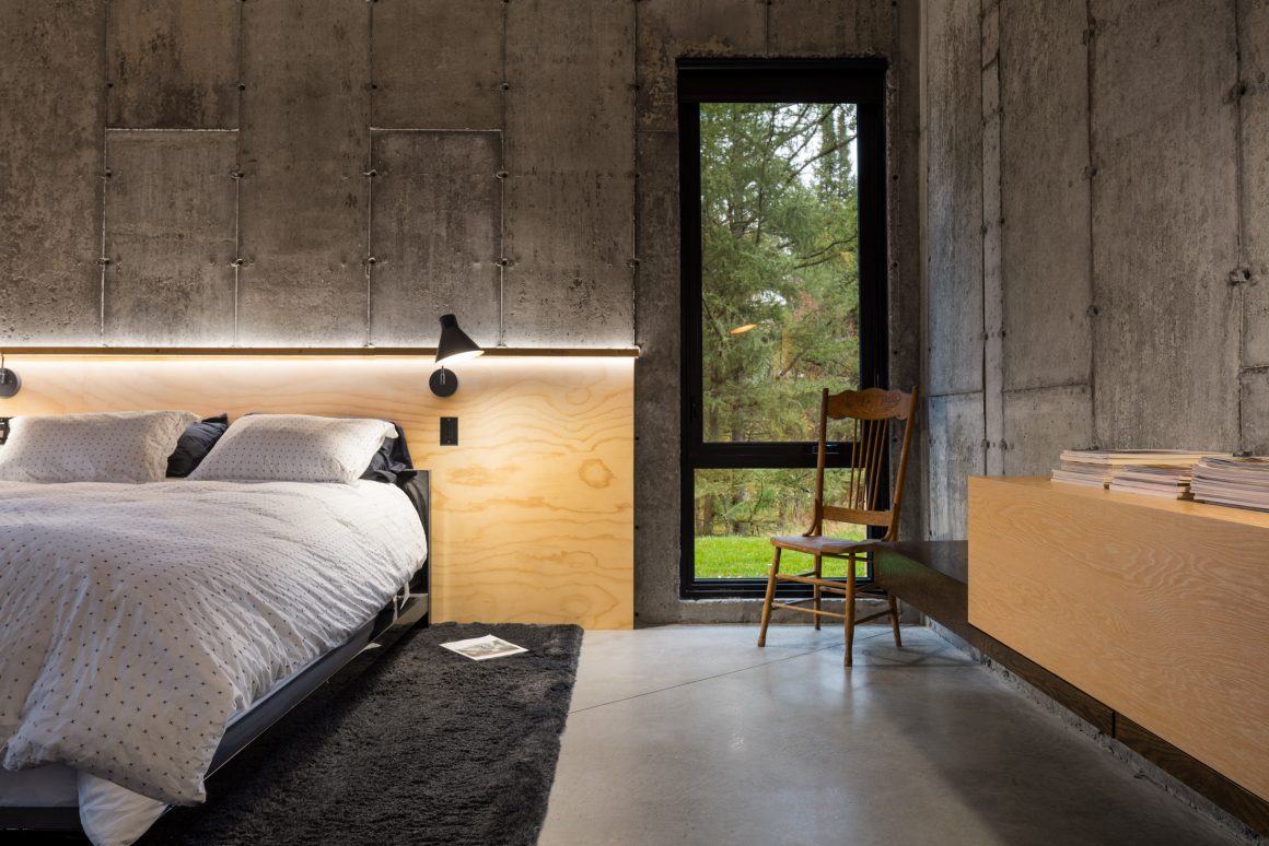
Because the bedrooms are for guests, there are no closets, and plywood has been applied to the walls in sections. “It’s done to have a look that’s unfinished, almost as though you’ve run out of boards,” Laurent says. “It’s accented by the light.” He also played with the doorframes, some of which are 11 feet high, some only six.
“The house is my reflection on habitat,” Laurent says. “It’s about creating experiences.” •
Guillaume Kukucka, Architect
www.guillaumekukucka.com
514-691-2829
Stone Tile
www.stone-tile.com
Ceragres
www.ceragreslesbains.ceragres.ca
Velux
www.velux.ca
Luminaire Authentik
www.luminaireauthentik.com

