Photography: Luisa G. González
BEFORE 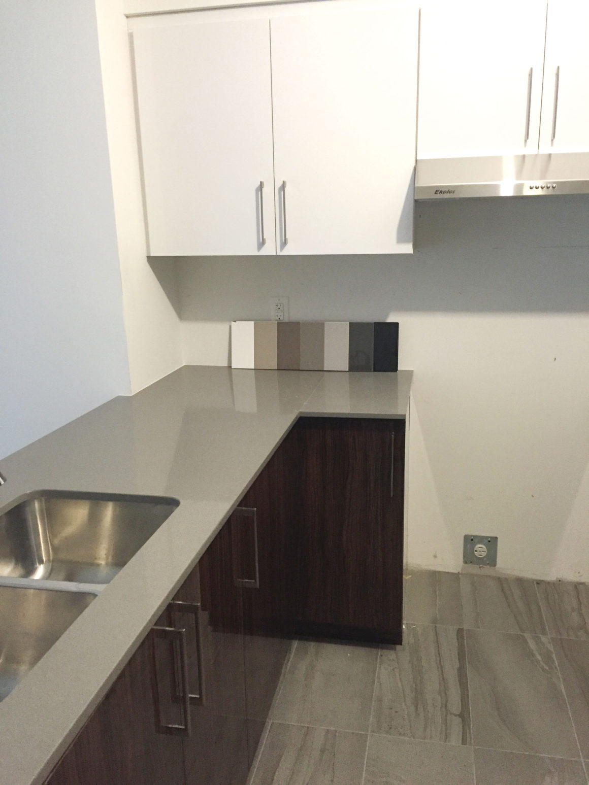
BEFORE
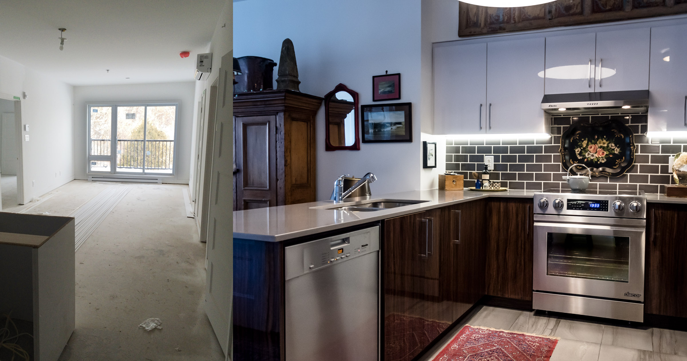
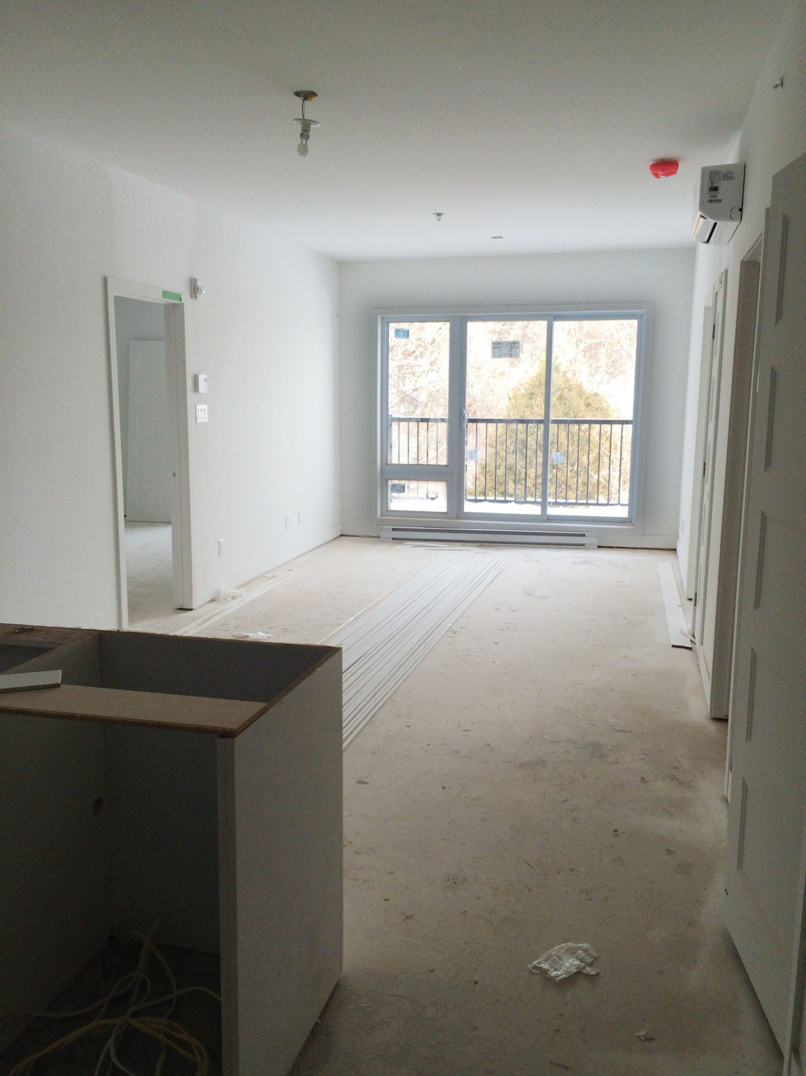
Canadians who move into condominiums find themselves with the daunting yet exciting task of designing their new space in collaboration with condo developers. A case in point is this Montrealer, a single mother of two who was downsizing for a second time. She came across a new development in a coveted, upscale neighbourhood on the Island of Montreal. The building was not exactly the high quality she was accustomed to and the dimensions were modest, but the neighbourhood and location were attractive. However, moving into a space that didn’t even have a floor or a base-coat of paint on the walls demanded great vision and a leap of faith. Could she make this small space (933 square feet) into a home?
Here are some of the decisions and elements that made the design of this condo such a success story.
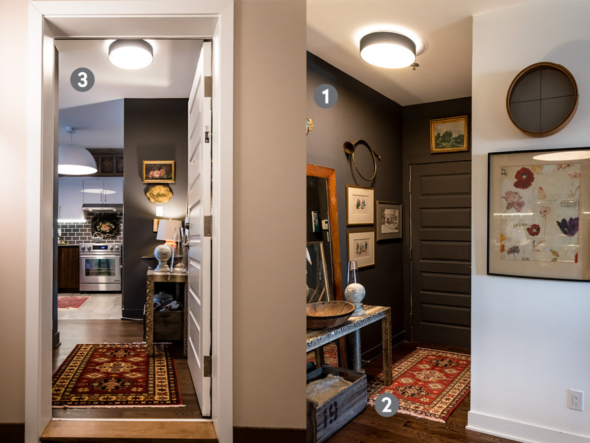
1. The entry area is critical because it is the first space that greets homeowners when they arrive home. Here, the entrance is a small L-shape. This led the homeowner to create a dramatic statement by choosing a dark colour on the walls (Iron Mountain 2134-30 by Benjamin Moore) and by adding an eclectic ensemble of furniture, artwork, mirror and mixed metals. They give the space personality and set the tone for the rest of the condo.
2. The homeowner had a choice of four colours for the hardwood floors and chose a dark brown for its richness, but also as a visually solid base from which to design the space. Most homeowners would steer clear of a dark floor for fear of crowding an already small space, but with light walls (Benjamin Moore’s Simply White OC-117), there is an airy feeling here. The visual strength of the floor permits a heavy and light contrast that extends to the patterns and colours of the furniture.
3. The oversized light fixture is white like the upper cabinets, and gives the kitchen an intimate feeling, especially for those under it, while providing functional LED light throughout.
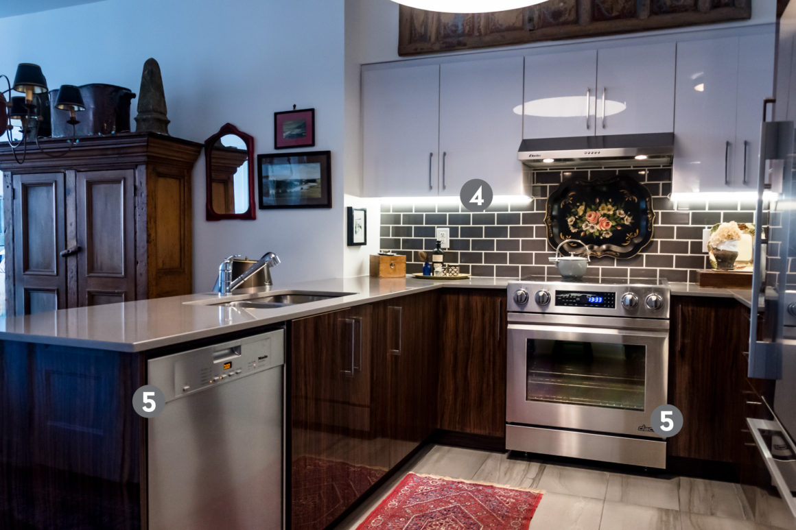
4. In most condo layouts, the kitchen is at the back of the unit, making the first primary space you see a dark one. My client dealt with this by bridging the gap between the entrance area and the rest of the space. We juxtaposed modern and classic design elements, and installed off-beat artifacts that tie the entry area to the kitchen. The grey walls of the entry nook are echoed in the kitchen’s backsplash tiles, which were installed with a wider than usual grout space. The grout colour and thickness is a design element; it creates a relaxed counterpoint to the more contemporary cabinetry and countertop.
5. High-end appliances and a slide-in range bestow a sense of luxury and quality.
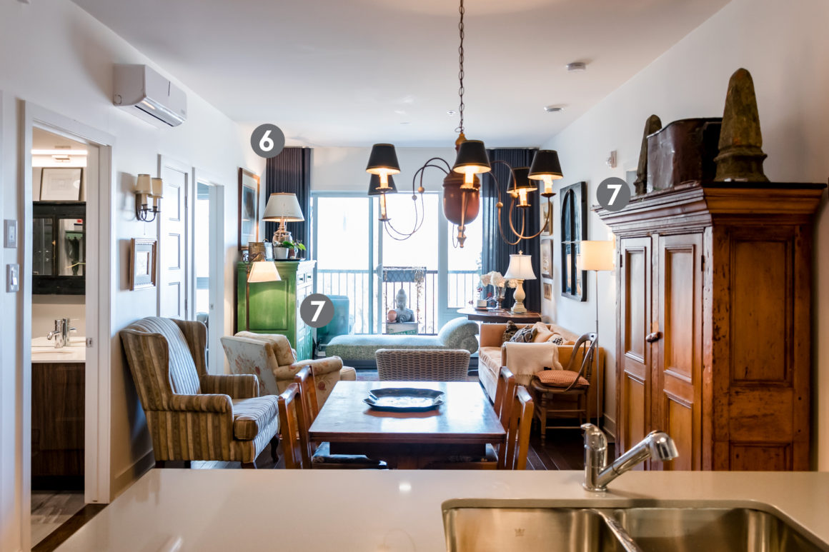
6. The living room’s curtains repeat the grey used in both the kitchen and entrance, giving the space continuity, which is the secret to good design when you’re working with many variations of colour and pattern in furniture. The ceiling-mounted ripple-fold curtains add sophistication to the otherwise ordinary and box-like feeling of a typical condo living room. The dark grey is also a neutral backdrop to strong colours.
7. Another design element that many condo owners veer away from is large-sized furniture. They fear that such pieces will overpower a space. However, large furnishings can add warmth. In this case, Québécois antiques add an element of local history. Most important, they also infuse the owner’s personality into the space.
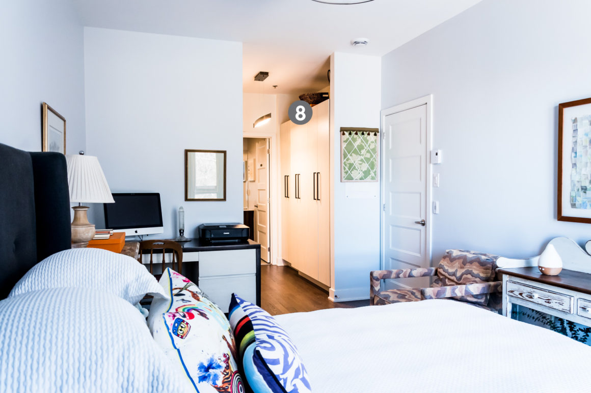
8. The master bedroom, its closet, and ensuite bathroom are reminiscent of a boutique hotel suite. Having all the rooms behind one door permits the homeowner to feel as if she has her own separate apartment. She removed the builder’s closet and added her own custom built-in unit in the hallway to create a little nook where the closet used to be. It is used by her daughter as a day room and adds another room for much-needed space. •
Originally published in the Summer 2020 issue.
Nadine Thomson Interior Design
www.nadinethomson.com
514-775-2259

