PHOTOGRAPHY: LARRY ARNAL
STYLING: SVETLANA TRYASKINA
The renovation of this seven-year-old Willowdale townhouse proved the best of times and the worst of times for the homeowners.
The darkest days came when the original contractors failed to meet deadlines, leaving the home strewn with uninstalled millwork for almost six months. To make matters worse, what was completed fell far short of expectations. It began to strain the couple’s relationship, and they were losing their usual exuberant good humour. “Hiring a new designer was one of the best moves we’ve ever made,” says Michel Shum, who lives there with her husband, Jean-Pierre Ung. She credits Svetlana Tryaskina, principal designer and founder of Estee Design Inc., with “working wonders” over the home’s 1,400 square feet.
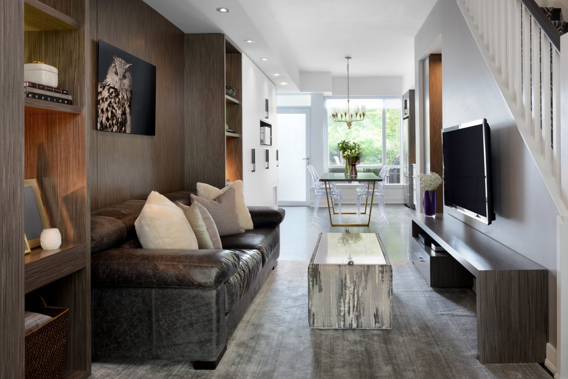
Michel and Tryaskina conspired to shield Jean-Pierre, a lawyer specializing in family law, from extra stress. The pair secretly drew up a whole new plan for the first floor. With its typical narrow townhouse layout, it needed a revamp. Storage was the biggest issue in the kitchen, entry and living room areas.
When the homeowners went away on vacation, the designer and her teams went to work. One week later, the couple returned to a completed project—which was a complete surprise for Jean-Pierre. “Once he got over the shock and realized the television was at the right height, he really liked what we did,” says Michel with a laugh.
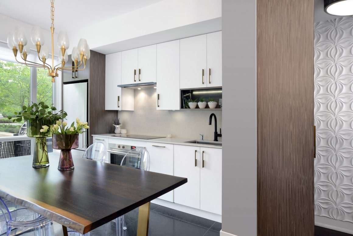
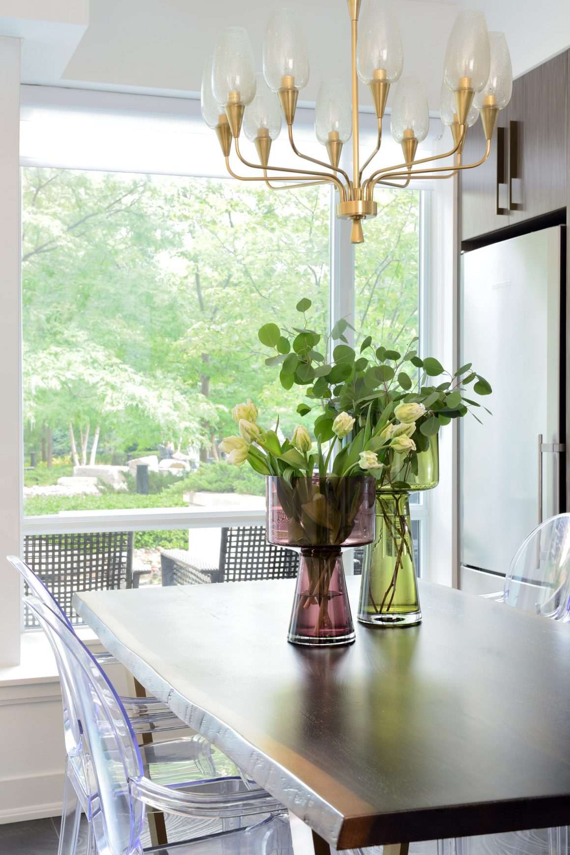
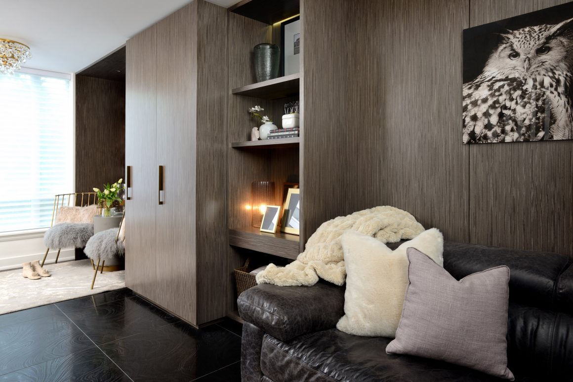
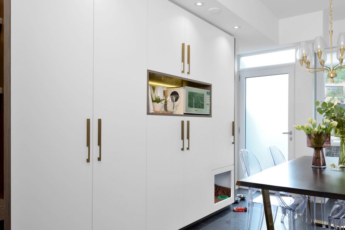
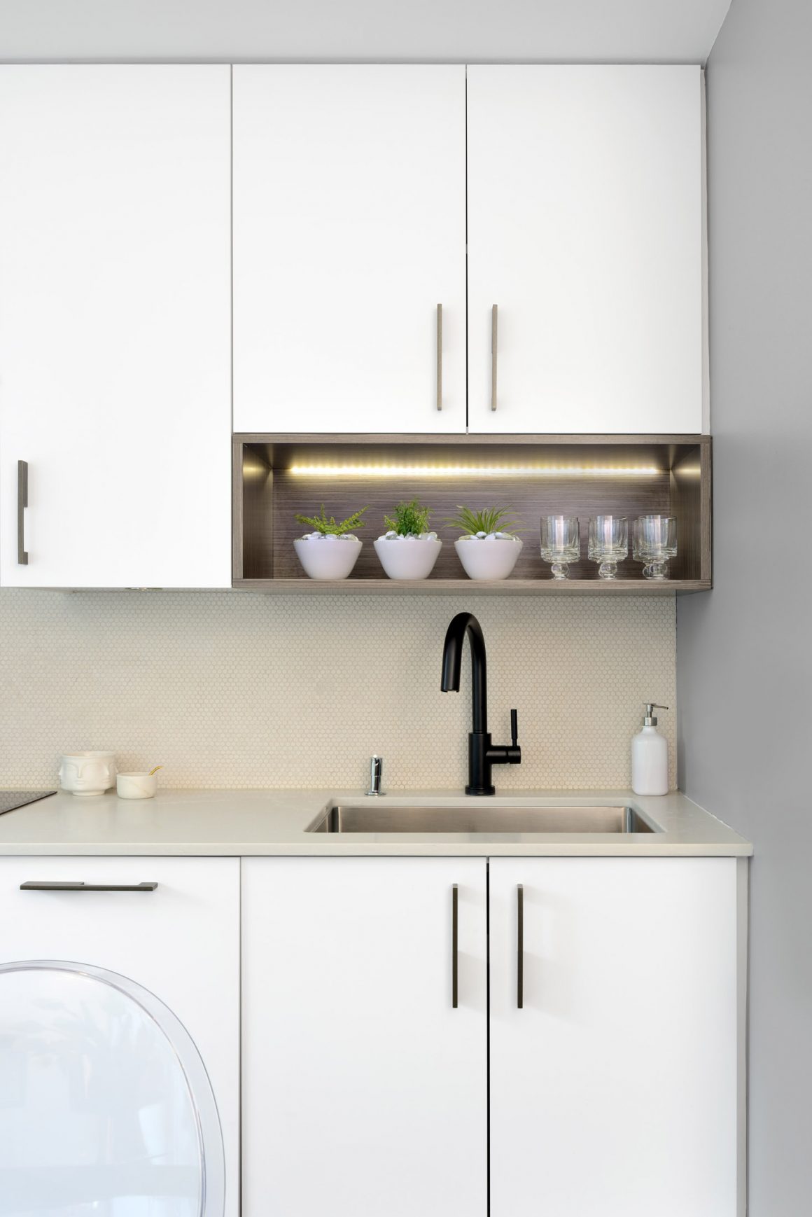
New custom cabinetry, including a closet by the front door, was chosen to coordinate with Michel’s choice of large-format black porcelain floor tiles. One of the couple’s favourite features was designed by Tryaskina: a built-in dog crate for their Yorkshire terriers: Pooh and Prada. Incorporated into a bank of white matte kitchen cabinetry that is fingerprint-resistant, its design makes stylish and unobtrusive that which is usually an eyesore. There are also hidden compartments specially configured to store food bowls, leashes and toys. More important for the homeowners, both dogs love it.
Another major surprise occurred during renovations when the couple discovered that baby Sebastien, now 11 months old, was on the way. That meant rethinking the second-floor layout that originally had a guest bedroom and bathroom, and a combined study and dressing room for Jean-Pierre. “I had to give up my home office for the little guy,” says the doting dad, who now takes his laptop to the living room, “but I still get to store my clothes there.” The designer reconfigured a wall-to-wall bank of mirrored-door cabinets to house his wardrobe, which Michel jokes is the “most extensive known to man.” There is even room for his 160 ties, all colour-coordinated and accessible, as are his myriad socks and belts.
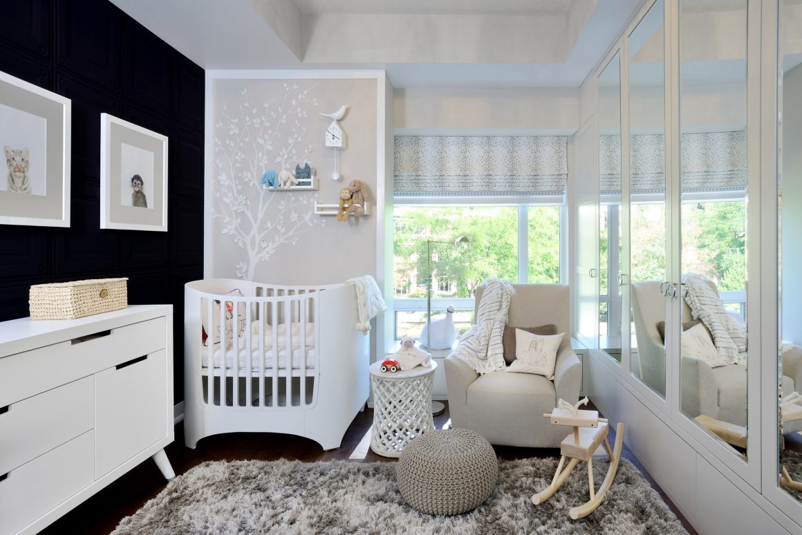
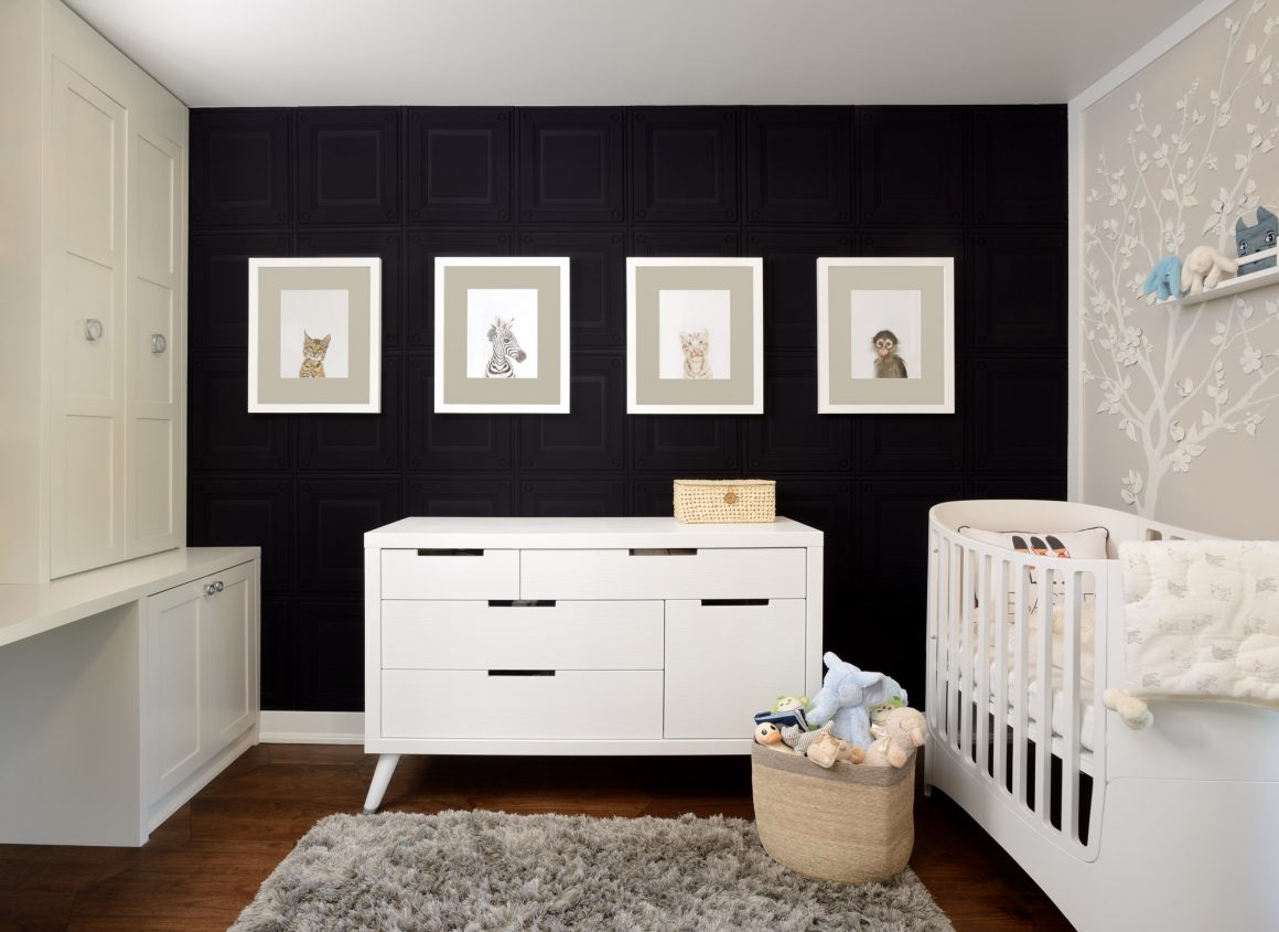
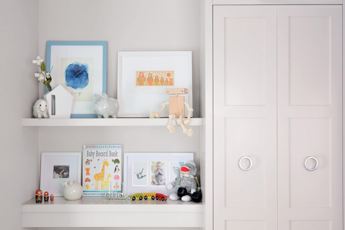
But the room is primarily a nursery, albeit one with an unconventional ebony and gray colour scheme. With black a trendy colour in nurseries today, the designer kept the original black textured wallpaper, and then softened the look with gray and white. It’s the room that garners the most favourable comments from visitors, the couple say, especially the 3D plaster wall sculpture created by Anthony Valin of Rustik Design Toronto from a sketch by Tryaskina.
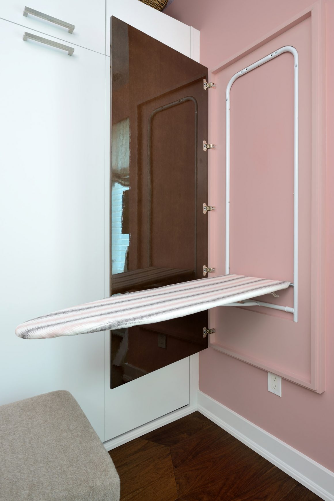
Another of the home’s features, a wall-mounted ironing board that folds down, was installed with Jean-Pierre in mind. He regularly invades Michel’s bubble-gum pink (a shade she saw online and “had to have”) dressing room to use it. His profession requires at least five crisply pressed dress shirts per week. “And I find ironing relaxing,” he says. “There’s something very satisfying about it.” When the board is folded up, a mirror with a custom lacquered frame is visible.
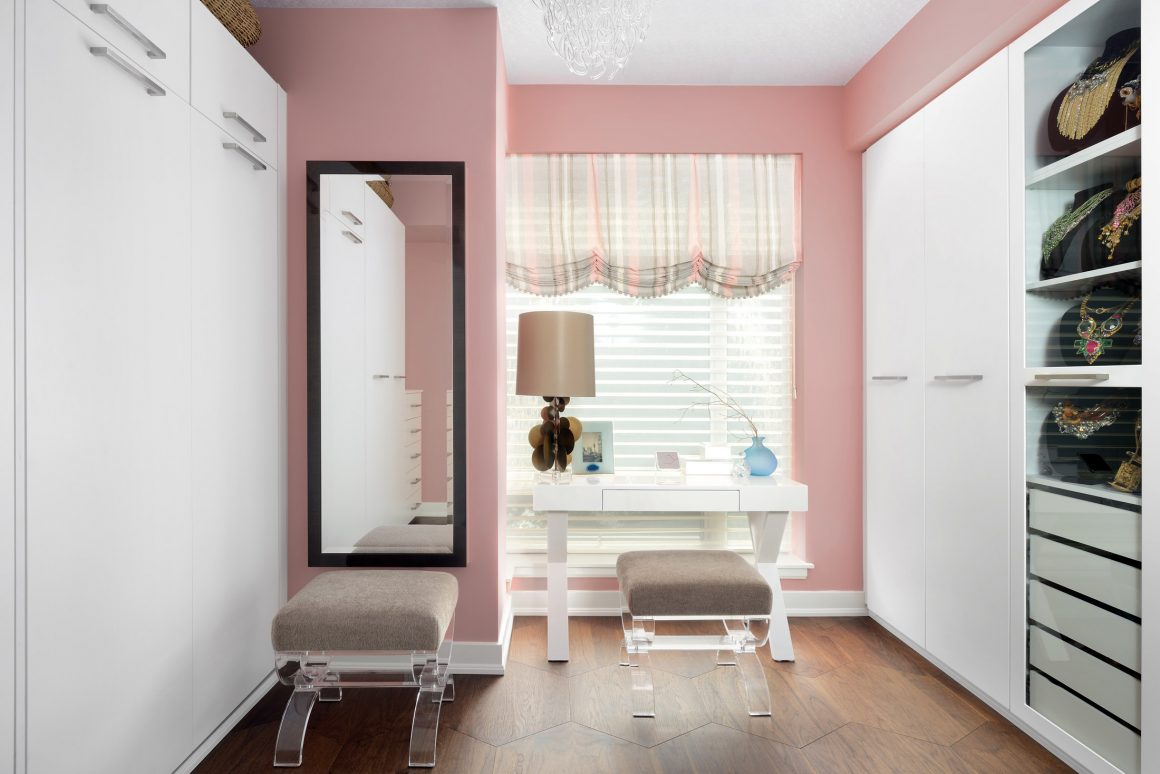
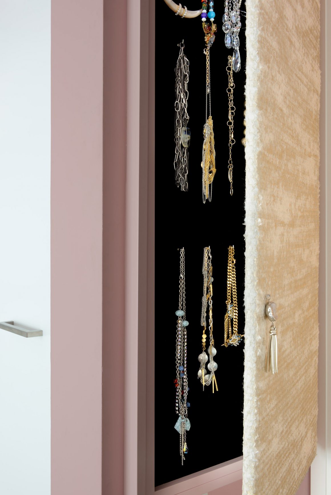
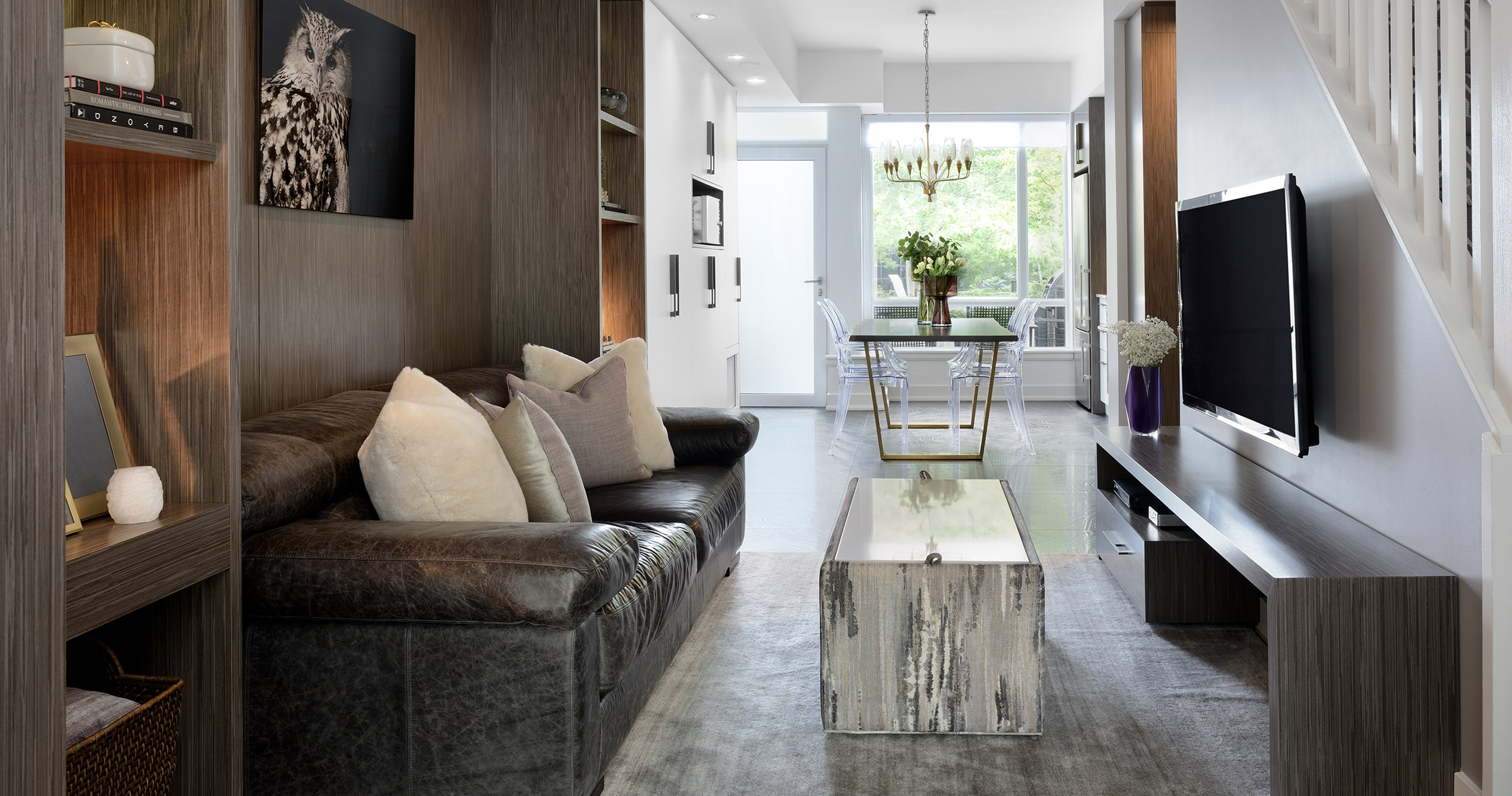
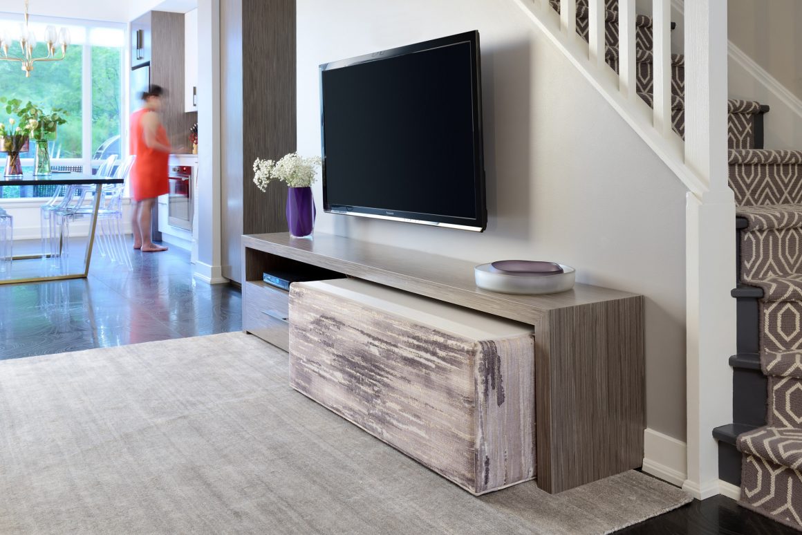
Tryaskina enjoyed coming up with custom solutions for the couple. Also in Michel’s dressing room, she created a slim-line panel mounted on the wall and covered with a luxe European fabric. It opens to reveal a cabinet housing the jewelry that Michel loves to collect. That panel in turn opens to provide access to an electrical panel. “They’re so unsightly and no one knows what to do with them,” says the designer. “This makes it a feature that’s both useful and attractive.” With space at a premium in the long narrow living room, Tryaskina designed an ottoman that tucks away under the custom television stand. With integrated storage, it provides extra seating and converts to a coffee table with a flip of the top.
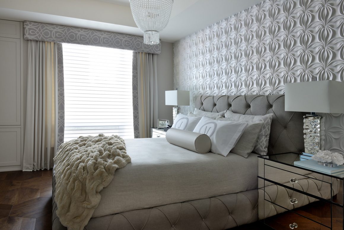
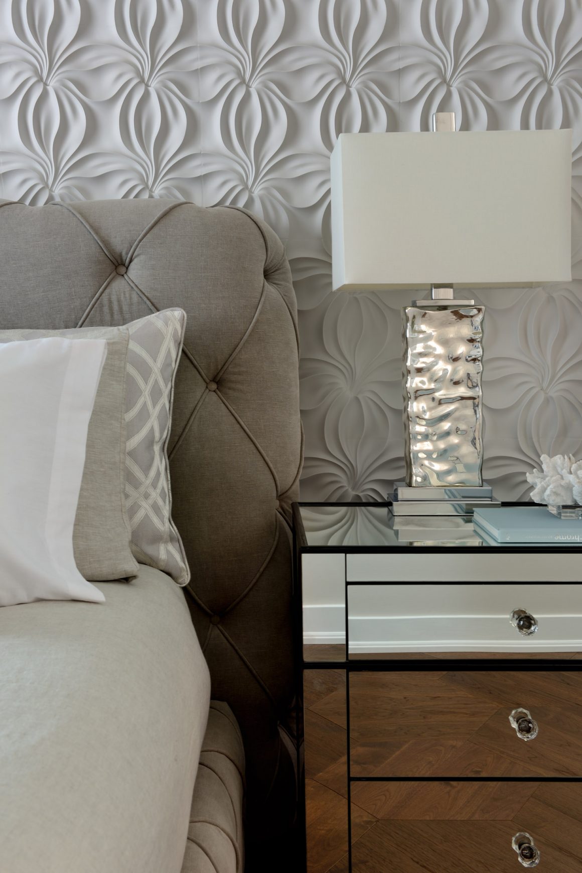
The designer combined new elements with some existing ones to give the home a cohesive modern-transitional look. The classy and elegant approach is most evident in the third-floor master bedroom with its ensuite bathroom. A serene colour scheme predominates, with layered textures on walls, floors and window treatments.
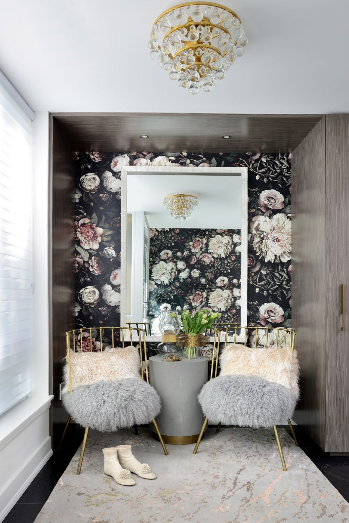
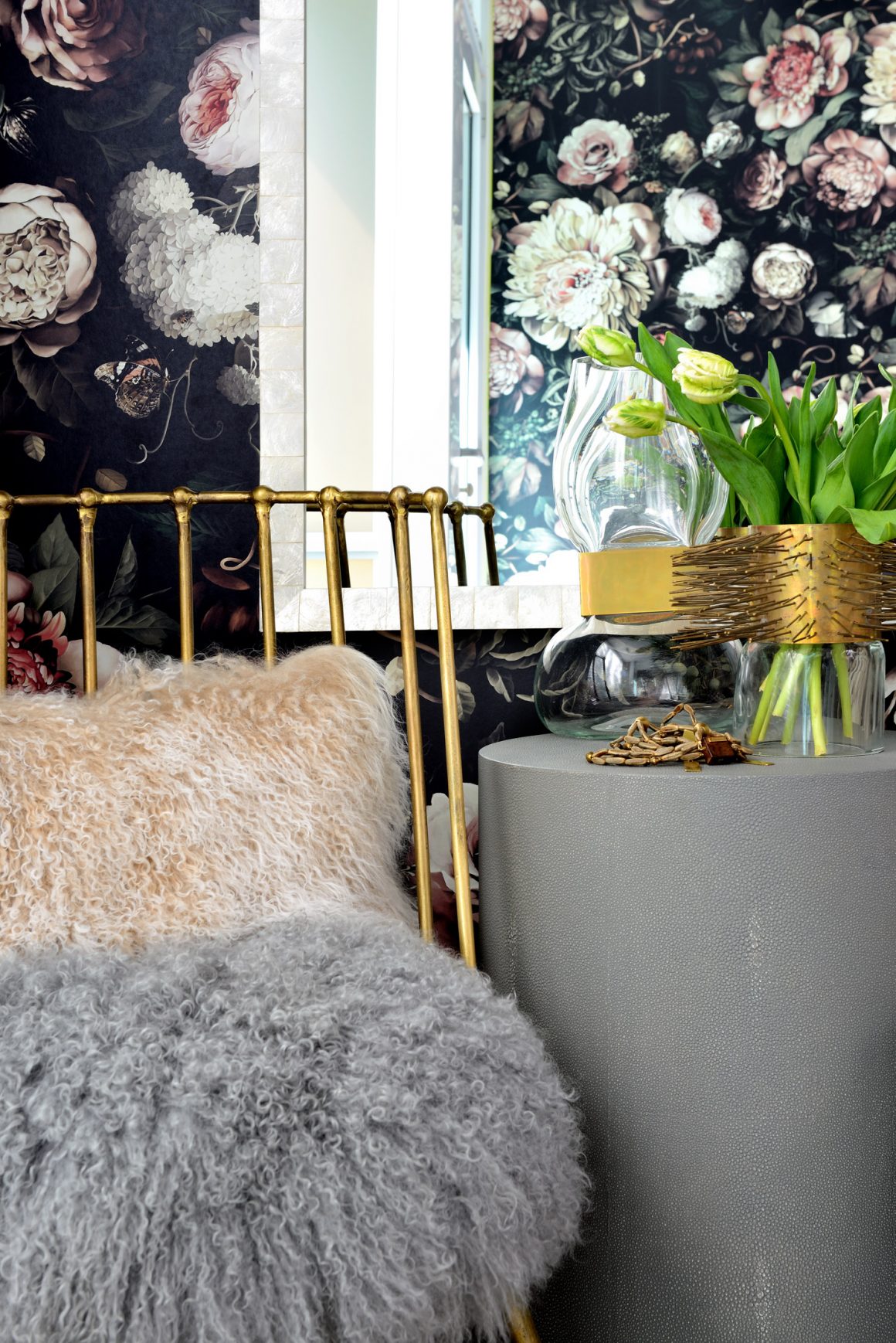
In contrast, the front entryway decor reflects the couple’s sense of fun. Michel had seen the dramatic floral wallpaper in the designer’s home and fell in love with it. A one-of-a-kind wall mirror with a mother-of-pearl frame hangs above a pair of bronzed chairs designed by Tryaskina; they are upholstered with two-toned Mongolian lambskin.
The homeowners admit they don’t make full use of the kitchen amenities. With Michel’s parents, who love to cook, living across the street, and many restaurants nearby, there isn’t much need. The couple find the home really works for them and their lifestyle; it’s the ideal place in which to bring up baby. “Having experienced the best and worst of renovations, I think you can have the best,” says Michel. “But you have to pick the right people to work with.” •
Estee Design Inc.
www.esteedesign.com
416-827-4220

