PHOTOGRAPHY: VALERIE WILCOX
STYLING: HEATHER LEWIS
If you grew up in a neighbourhood where there were a lot of children, you may remember a house where everyone would hang out. You didn’t give it much thought. It was just the way it was. Everyone always ended up there. It was simply the place where it felt good to be. If you think back, you can remember all the good times you had there. But what was it about that house? What was it about the family who lived there?
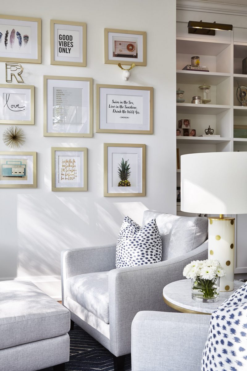
Whatever it was, that is what the owners of a small home in The Beaches area of Toronto wanted when they decided to build their dream home. They had bought the property eight years before and always had a plan to build an extension. But when the time came, and their family was growing, they decided to go big. They didn’t add on. They tore down and went back to the drawing board.
“When people come over, I want them to feel good, to have that warm feeling,” says the co-owner and mother of three.
So it was with that intangible and not-quite-defined aim in mind that the couple set out to build what they envisioned as the home they had always wanted.
One of the first people they turned to was Joe Sexton, the owner of Sexton Works, a home builder and renovation expert.
“They wanted their dream home and they got it,” Sexton states simply. “Everyone wants to go to (their) place to sit on the front porch. That is what they wanted and that is what they got. Making your dreams come true is possible. They were looking for a great place for their kids to grow up in.”
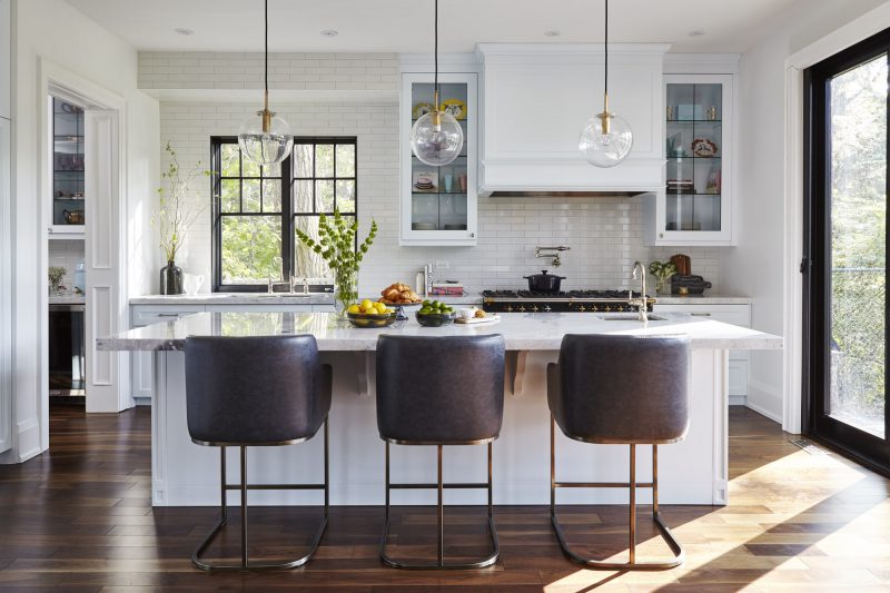
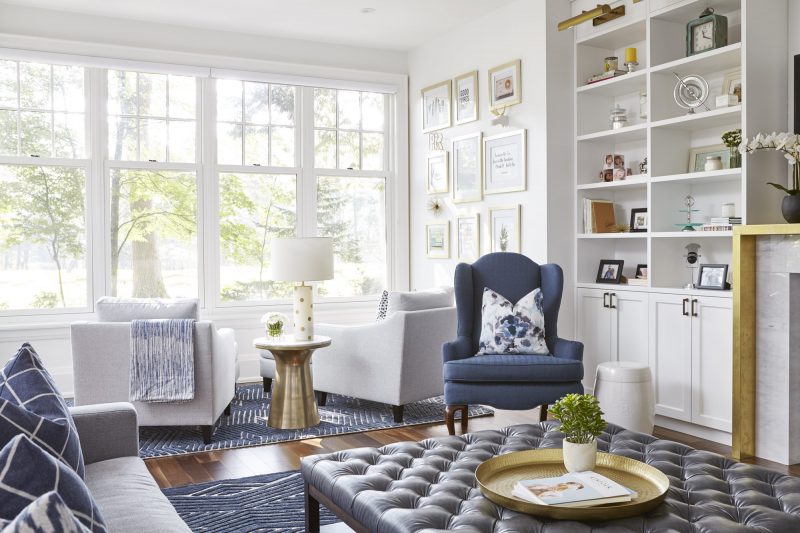
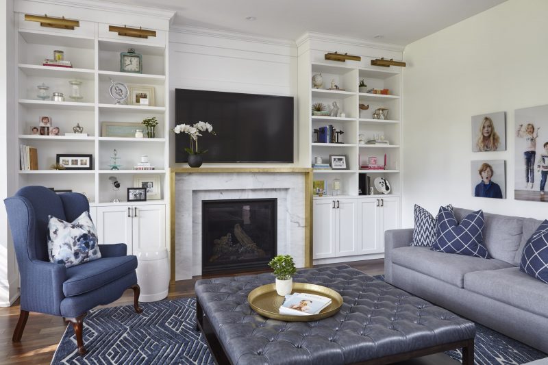
But they got more than just the right vibe. They also got a great look – a transitional-style home with a few eclectic twists that reflect the family’s personality. “It represents who they are,” explains Rania Ismail-Cherry, designer and owner of Fohr Design Studio, who planned the interior of the new home. “It’s definitely transitional with a huge play on old and new. It has a funky eclectic vibe, but more polished.”
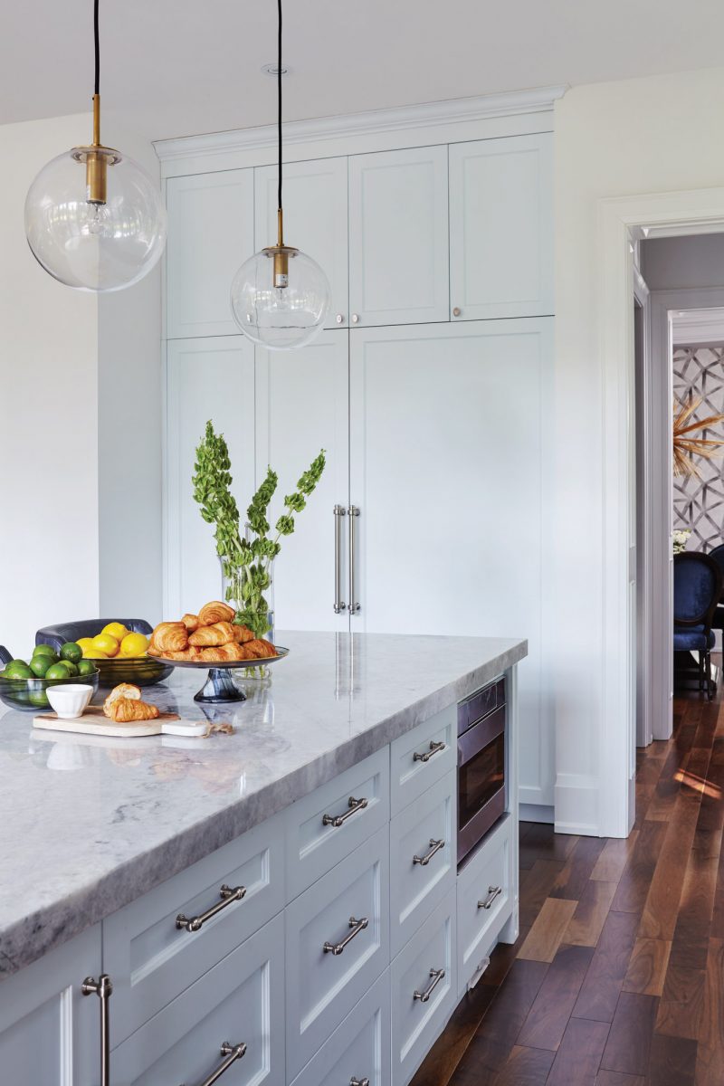
“She’s bubbly, fun,” Ismail-Cherry continues, referring to the homeowner. “And her kids are the same way. They have their own flavour.”
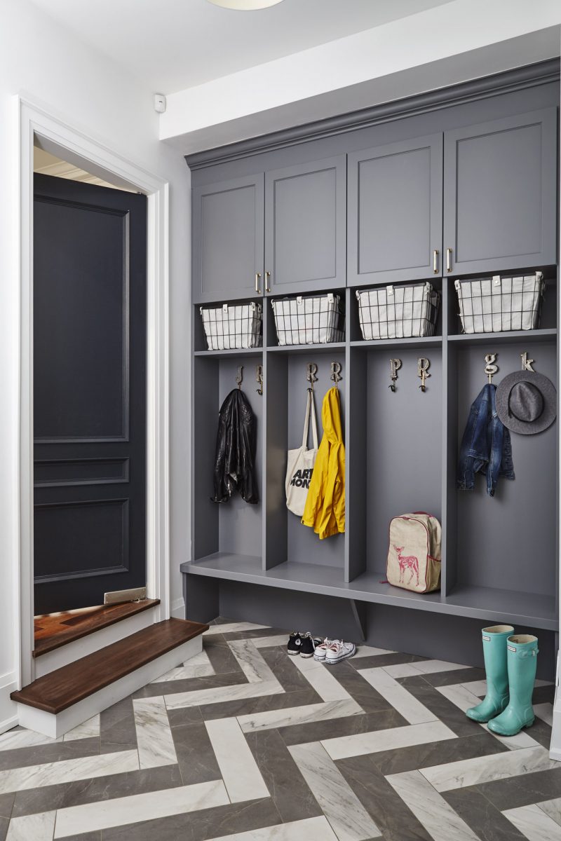
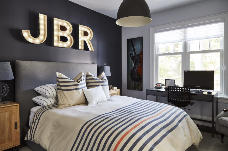
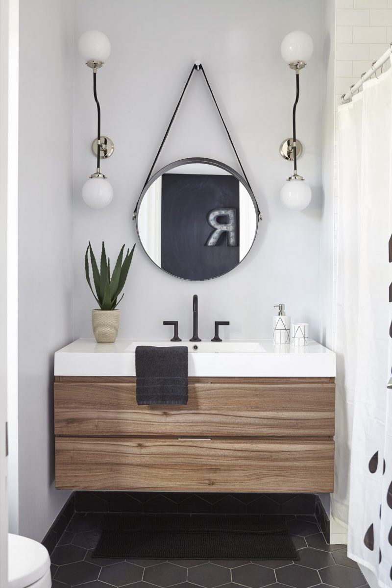
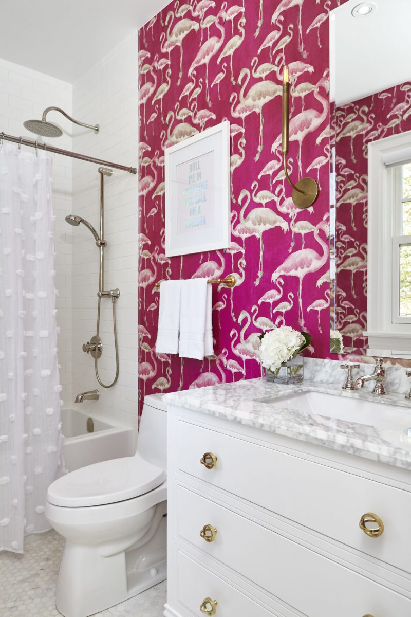
And that flavour is exhibited throughout the house in how they used bold colours, mixed antiques with modern pieces, and created a few spectacular surprises.
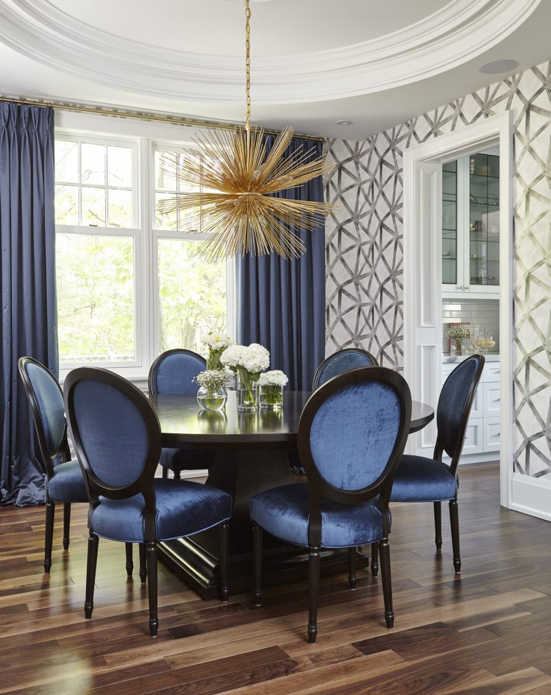
The dining room is a perfect example of unexpected gems. At first glance, the space appears to be oval in shape. But it’s not. It’s an illusion created by the coffered ceiling that features a circular design directly above a round table. “That’s a ‘wow’ room for sure,” says Sexton. “It turns your head.”
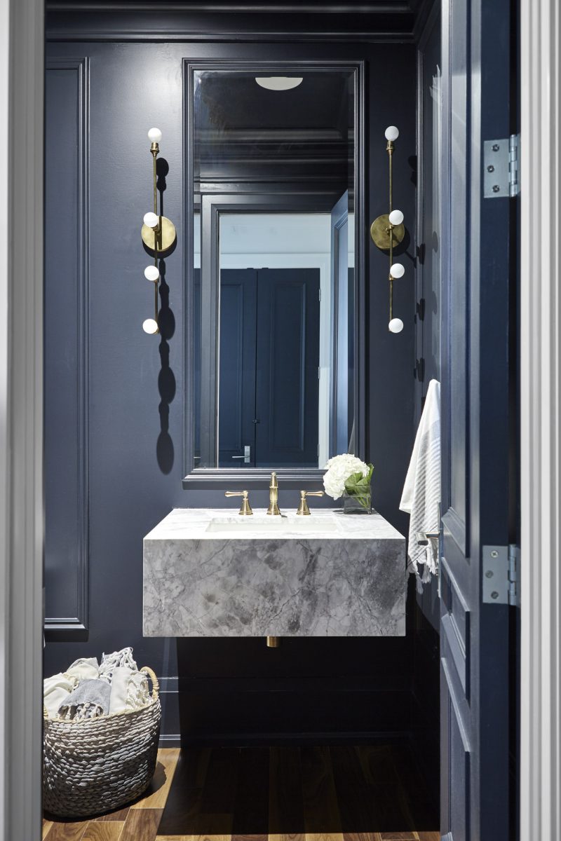
The design of the space, including the dramatic patterned wallpaper, “really took the room to another level,” Ismail-Cherry says. “It gave it a whole other dimension.”
And the gold-coloured starburst pendant above the table adds the sparkle. The royal blue chairs were inspired by the owners’ taste. The couple had six of the chairs in their previous home. Ismail-Cherry had them reupholstered in a colourful fabric to go along with the blue theme that is seen throughout most of the house, and she had four more chairs custom-built to match.
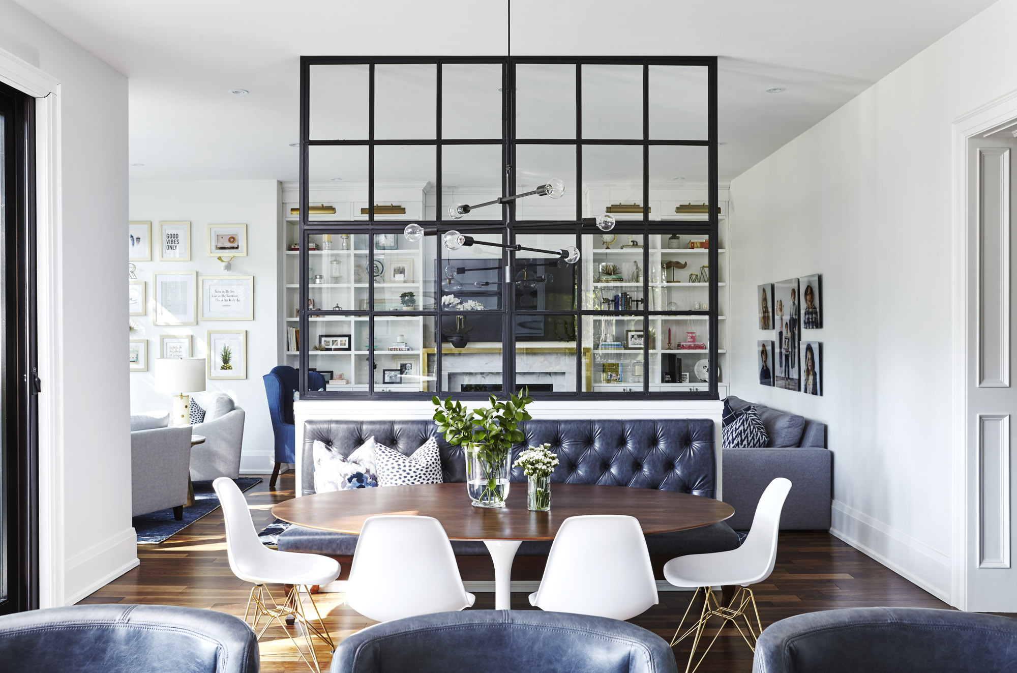
Ismail-Cherry’s favourite feature of the house is a unique glass and metal panel in the kitchen. Reaching to the ceiling from the top of a knee wall at the outer limit of the room, the panel plays both an aesthetic and functional role.
The homeowner, who has strong traditional tendencies, wanted a separate kitchen, Ismail-Cherry says. That would have disrupted the flow of the layout of the home. “So we persuaded her to do this metal-glass partition. You can still see through it and it lets the light in. It’s a really awesome feature of the house.”
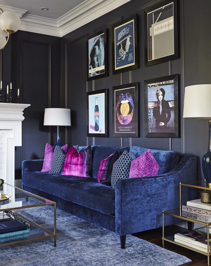
As for the homeowner, her favourite space is the living room, also known as the music room. The panelled walls are painted a dramatic almost-black: a Benjamin Moore colour known as ‘Soot.’ The walls feature framed posters of concerts and events the couple have attended over the years. The furniture consists of a mix: a contemporary velvet blue sofa with classic vintage wood-framed upholstered armchairs. Also on display in the room is the old saxophone and clarinet, which once belonged to the owner’s father.
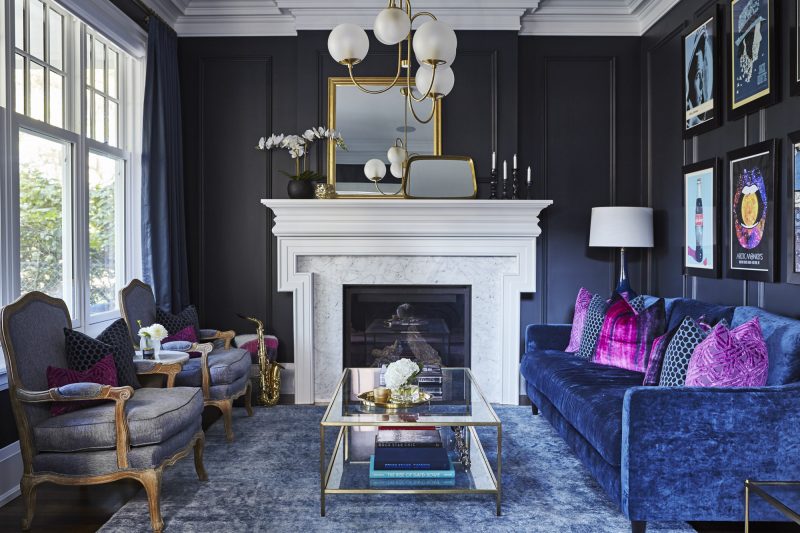
“It’s not your typical formal living room,” the homeowner says. “It’s unexpected. I don’t want to be like everyone else. I try not to be, anyway. That is why I went with a dark living room.”
Every room is different, yet the combination is harmonious. The home embraces old and new, traditional and edgy. No wonder everyone wants to hang out there. •
Fohr Design Studio
fohrdesign.com
416-670-3047
Sexton Works
sextonworks.com
416-357-8008

