PHOTOGRAPHY: LISA PETROLE
STYLING: NATALIE VENALAINEN
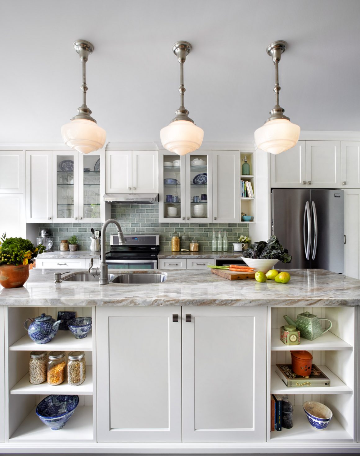
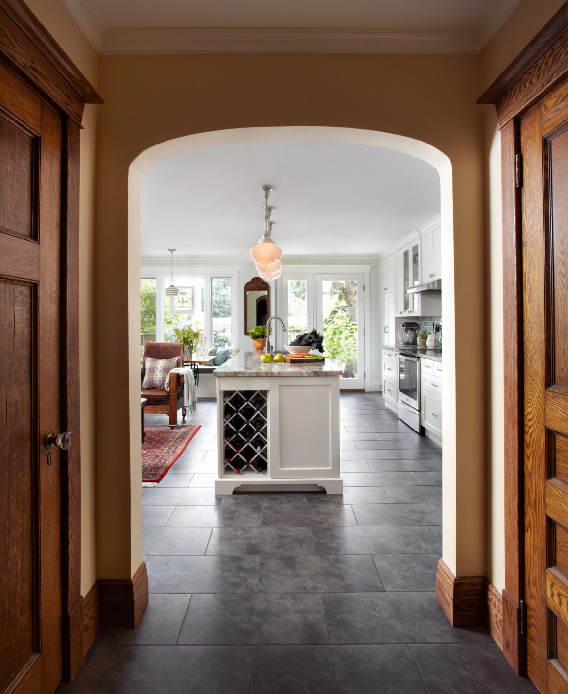
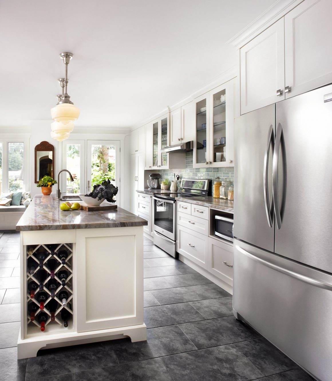
The island is on Kristi’s list of favourite elements about the renovation and she describes it as “functional, practical, with space for display.”
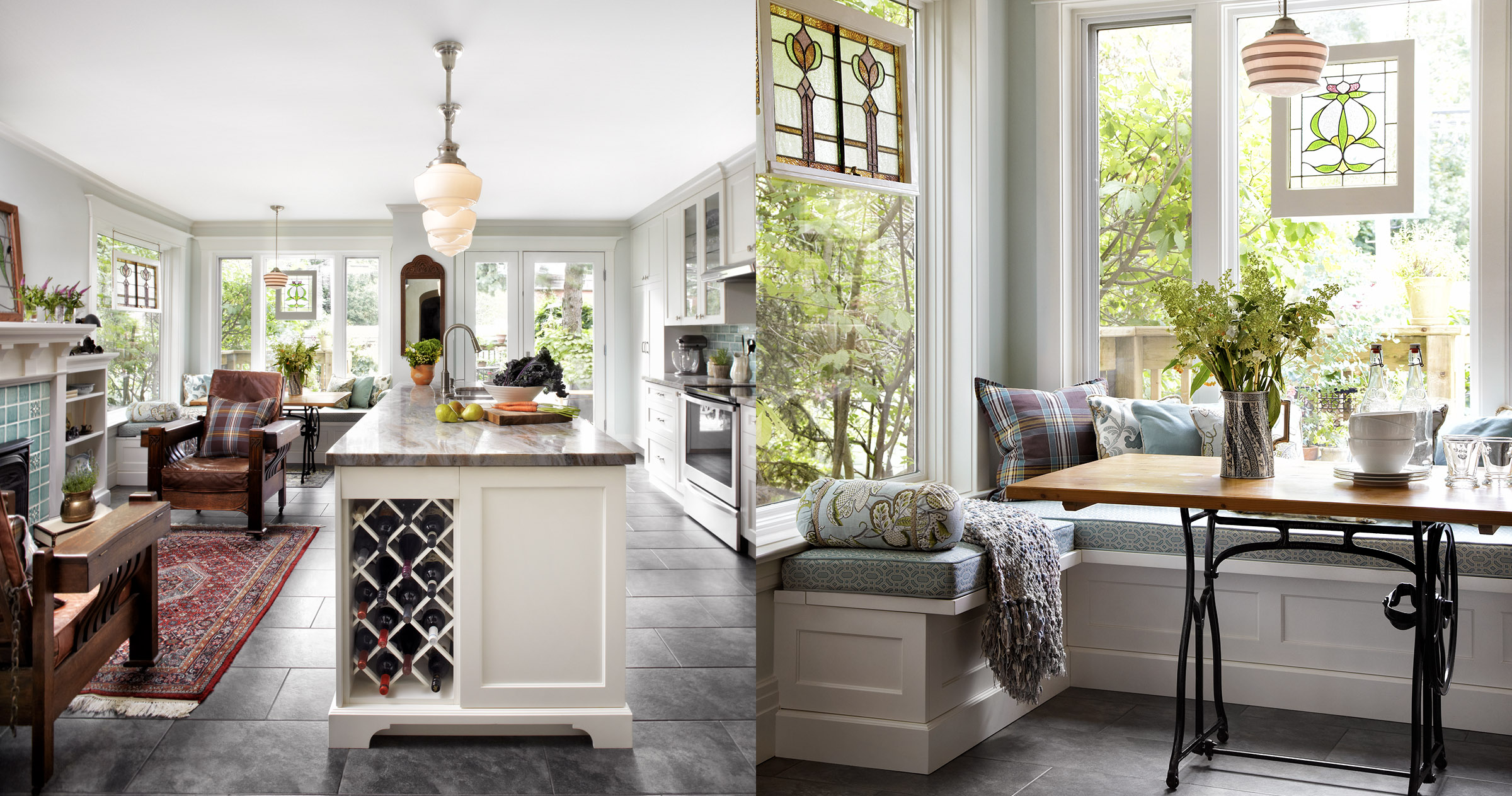
It was a small addition to the back of the house – adding just two feet, five inches in length – but it was enough to create a big change in the kitchen and living space of a home in Roncesvalles.
Kristi Gourlay and Jim Falconer loved the Arts and Crafts details in their 1912 house when they bought it about a dozen years ago, but disliked the kitchen, and, after some false starts, assumed that when they got around to it, it would be a fairly straightforward renovation. So they took the plunge and hired the team from Men At Work to enlarge and reconfigure the back of the house, including the kitchen and the combined laundry/powder room.
It didn’t take long to discover there would be some extra challenges along the way: the existing rear addition that previous owners had built wasn’t properly supported and roofed; there were issues with the previous building permits; the under-floor heating tubes had been punctured; there was moisture behind the drywall from the leaking roof; and there was a lot of mould. In addition, three plumbing stacks were discovered behind the drywall in the middle of the space. “There were,” in Jim’s words, “a few bumps along the road.”
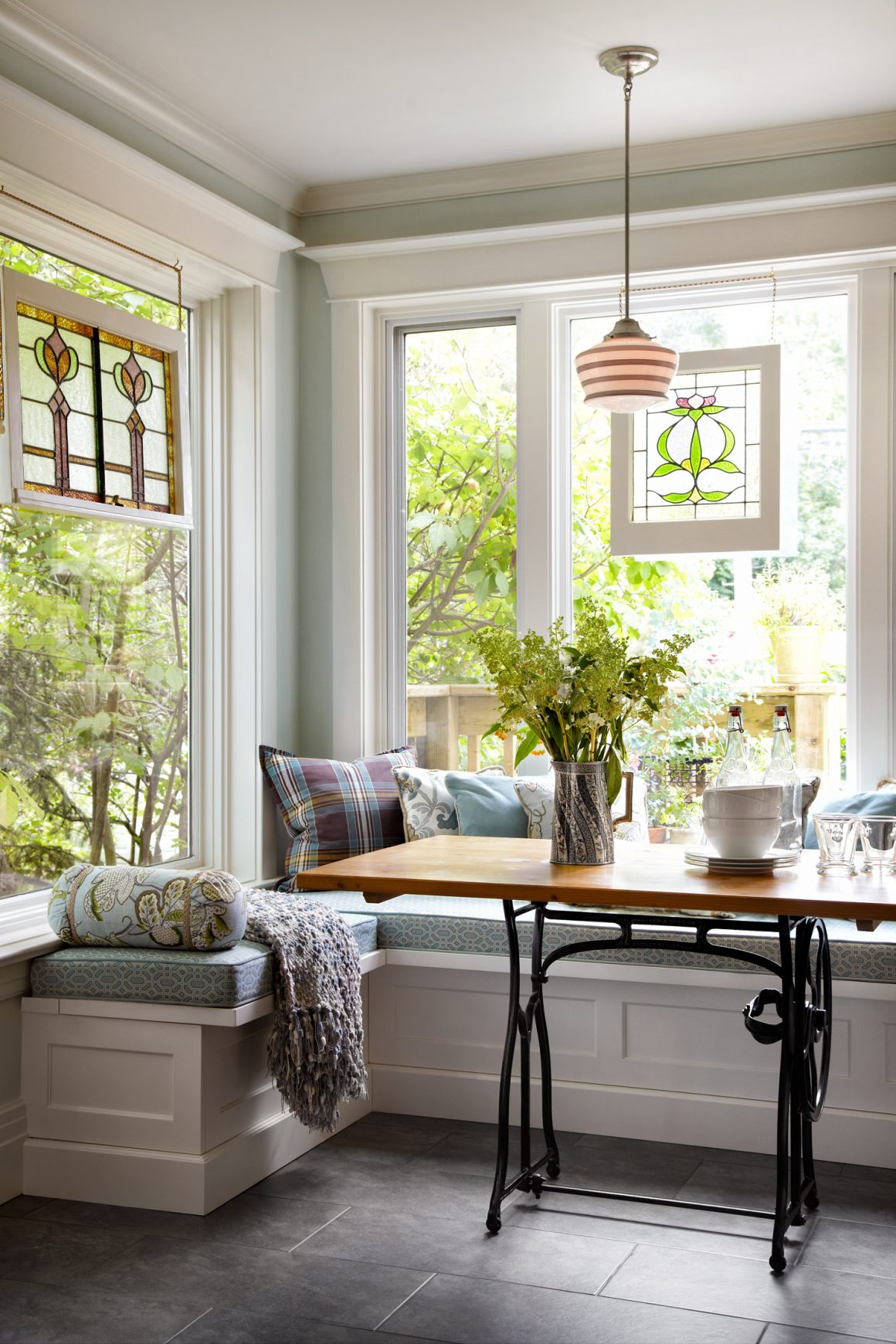
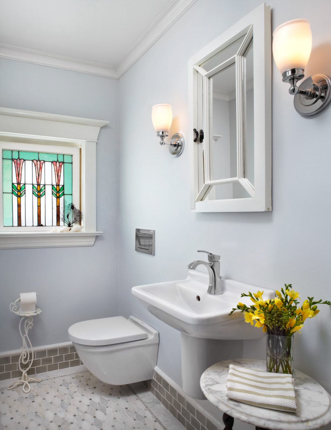
While the work crew tackled the structural problems, building designer Keith O’Brien revised the floor plan. He put the laundry on one side of the kitchen entrance, a separate powder room on the other. He flipped the fireplace and seating area from the west wall to the east, and reconfigured the windows and door at the back of the house to take advantage of the natural light. Adding the extra length to the addition gave the owners more continuous wall cabinetry, a longer island and counter, and a small area for dining that includes a window seat.
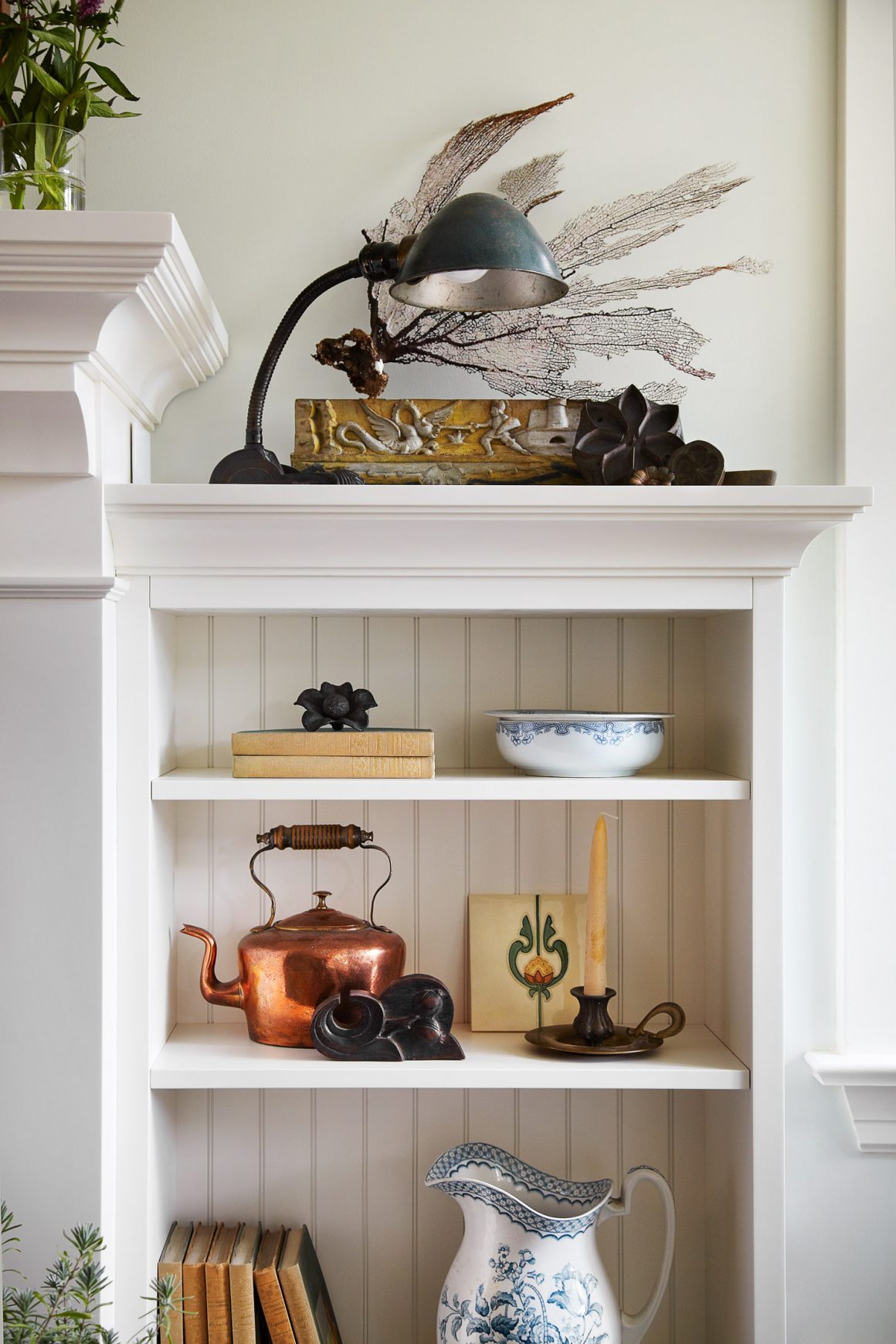
Both Kristi and Jim were keen to have the new parts of their home fit seamlessly with the style of the rest of the building. “We bought an old house not to gut it and turn it into something new,” Jim says. “There was enough character and we wanted to preserve that.”
The existing hallway from the dining room to the kitchen featured an archway, and because the older design details were so important to the owners, O’Brien created a second one, on the other side of the new laundry and powder room. “They pick up on the character of the house,” he says. “It defines the kitchen and dining room and hides the laundry and powder rooms. It was a way to give this space a little separation and privacy, using the archways to tie the two together.”
From there, Kristi and Jim decided to do the rest of the designing and decorating themselves. “We’re a couple of detail-oriented people and we’re also kind of particular,” says Jim.
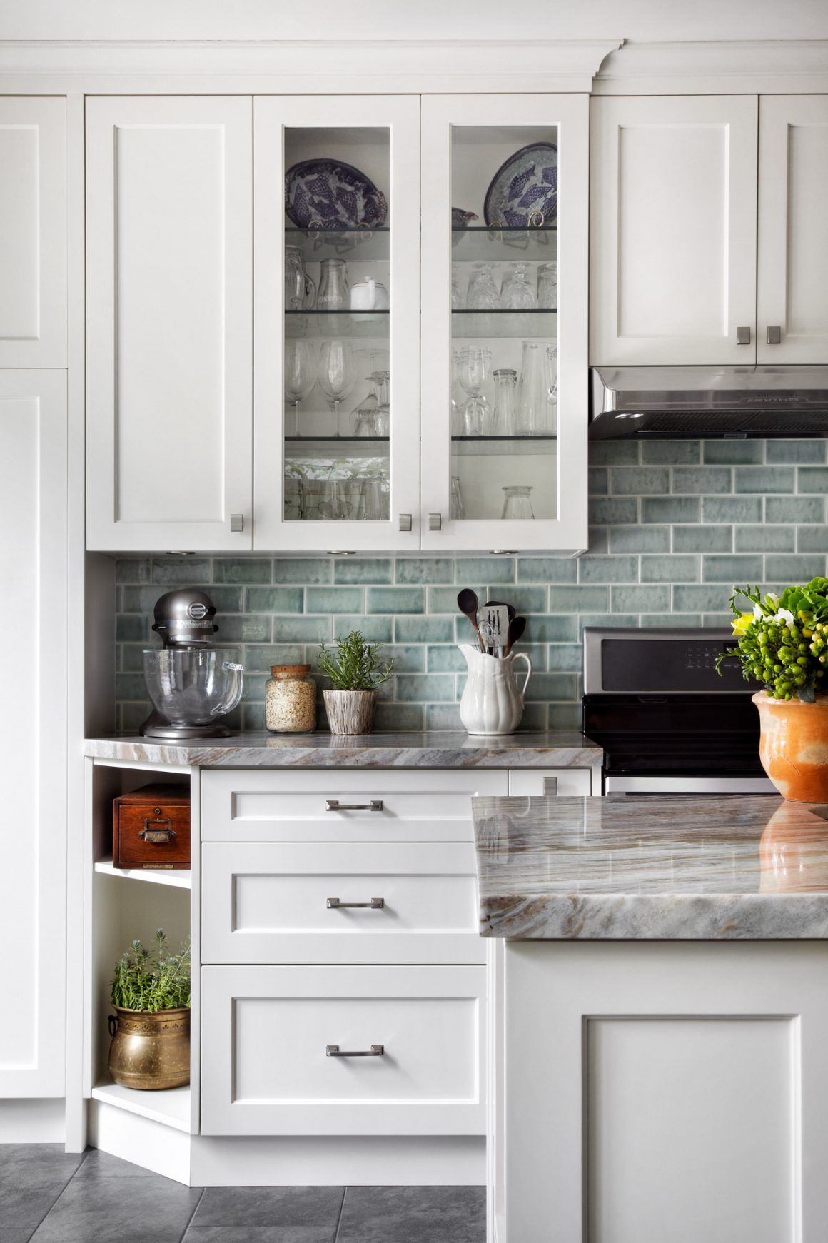
Kristi tackled the cabinetry, finding a door sample she liked at Merlo Woodworking, and sourcing other fixtures. “I didn’t just sketch out plans for the kitchen, I went through a pad of graph paper designing the space to the last inch,” she says.
She was also relentless in her pursuit of what she calls “the colour” – a hunt for tiles for the backsplash in just the right combination of soft blue, grey, green and aqua that she had in mind. She finally found one that matched her ideal from a supplier in Oregon that specializes in handcrafted vintage-look tiles, but only after she’d dragged Jim to just about every tile store in the GTA. She picked a similar, lighter colour for the fireplace surround.
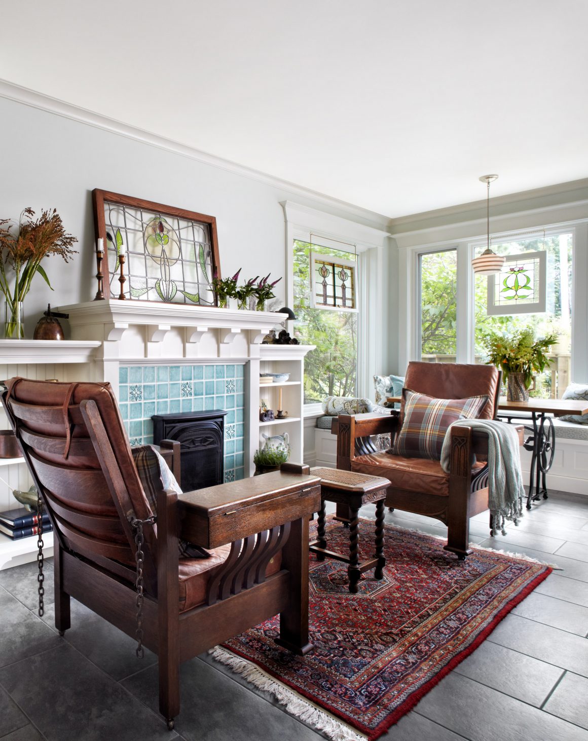
The couple love how the kitchen’s style fits with the rest of the house. They also love the comfortable window seat at the back where Kristi sits with the cats. One of the few things she might change, she says, is to add an extra light there for reading.
Looking back, they’re glad they took on the design “It was something creative and we would have full control and it would be exactly what we wanted,” Kristi says. “If anything went wrong, the responsibility would be on me.” •
Men at Work Design Build
https://menatwork.ca/
416-763-0763
Merlo Woodworking
www.merlowoodworking.com
416-748-5429

