PHOTOGRAPHY: ASHLEY CAPP
STYLING: CATHERINE THERRIEN
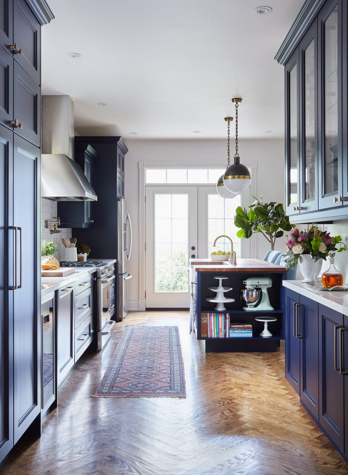
Interior designer Staci Edwards had her work cut out for her when she set out to remodel her own kitchen. The makeover was part of a major renovation of the main floor of the Victorian-era home in downtown Burlington, Ontario, where she lives with her partner and their infant son.
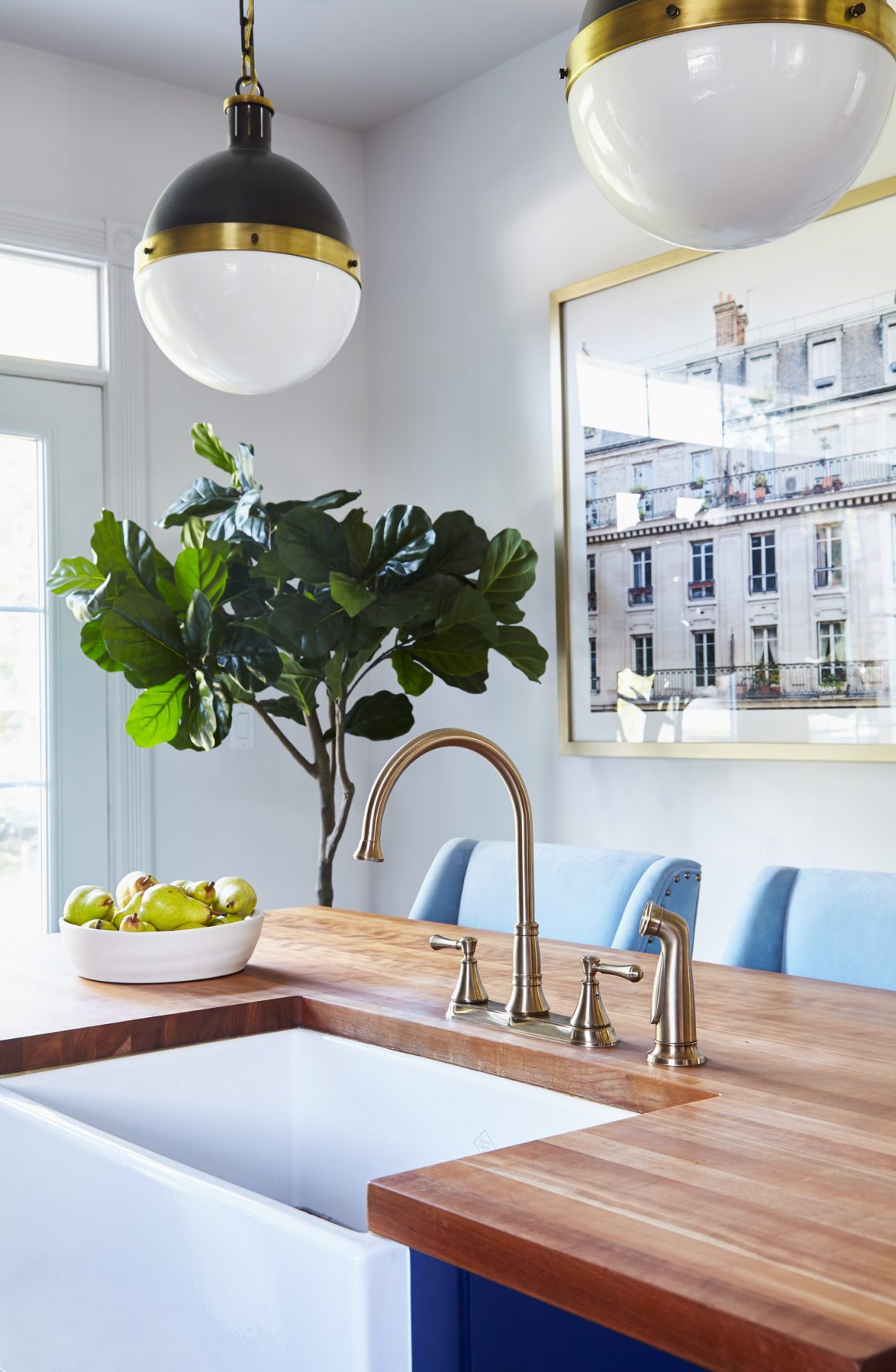
Staci didn’t want the contemporary open-concept kitchen design to conflict with the home’s historic charm.
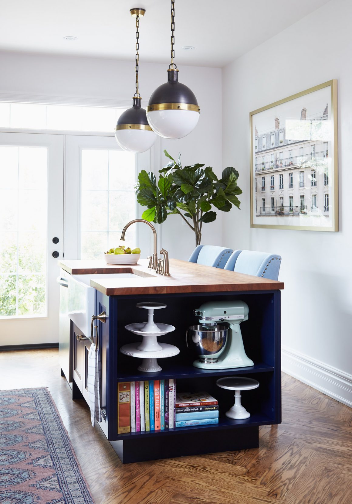
Adding to the challenge were budget constraints. The main floor of the two-storey structure is actually a self-contained, two-bedroom, 1,300-square-foot apartment where the family currently lives. However, they plan to eventually turn it into a rental unit, just like the one that already exists on the second floor of the house. Staci wanted a rich look without breaking the bank.
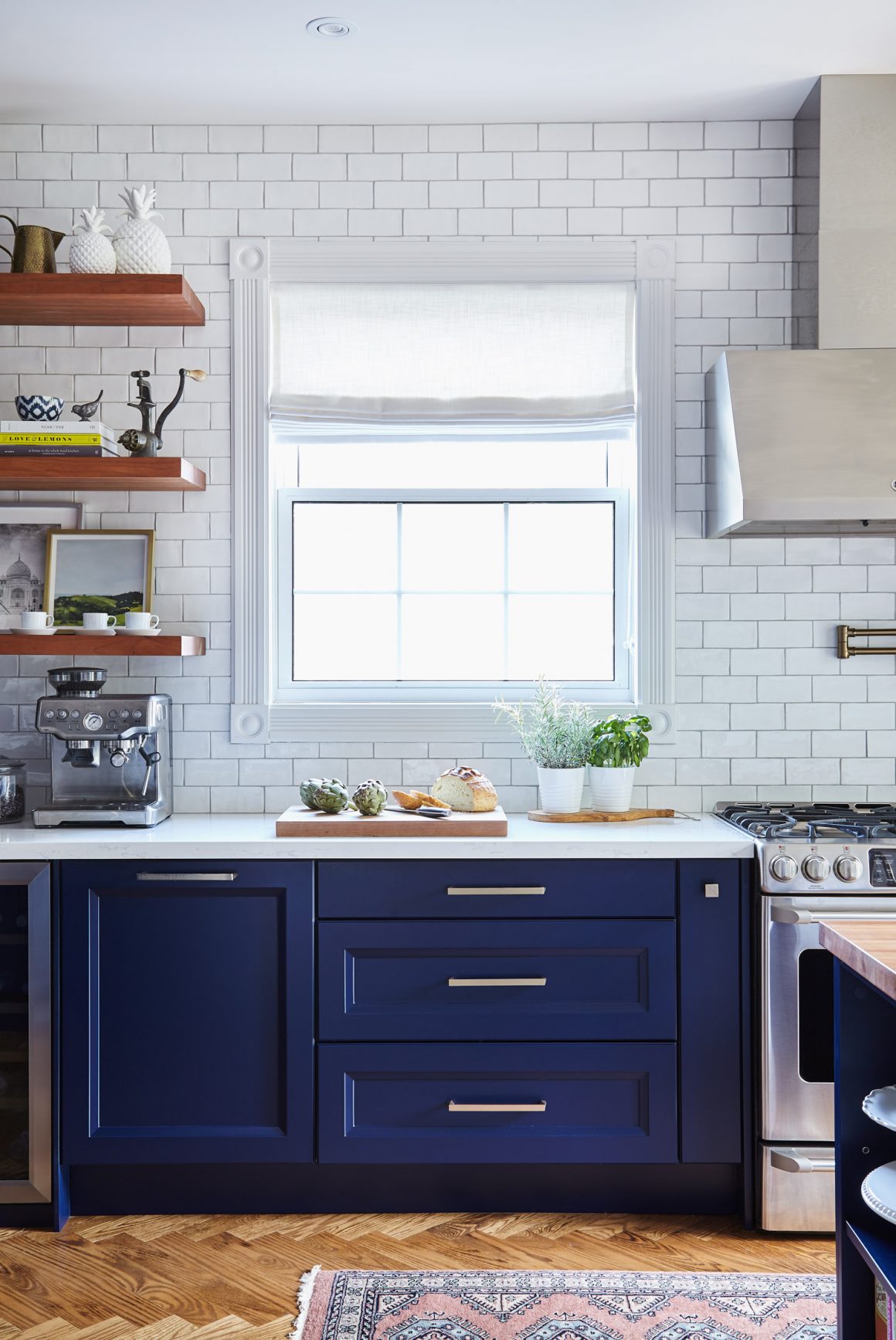
“Doing my own home was surprisingly challenging,” says Staci, the owner of the Mississauga-based design firm Staci Edwards Design. “When I am doing work for someone else, I am more practical, pragmatic and detached.” Being more emotionally involved, she found it difficult to make choices, to commit. “I kept thinking something even better might be out there. I see new things all the time.”
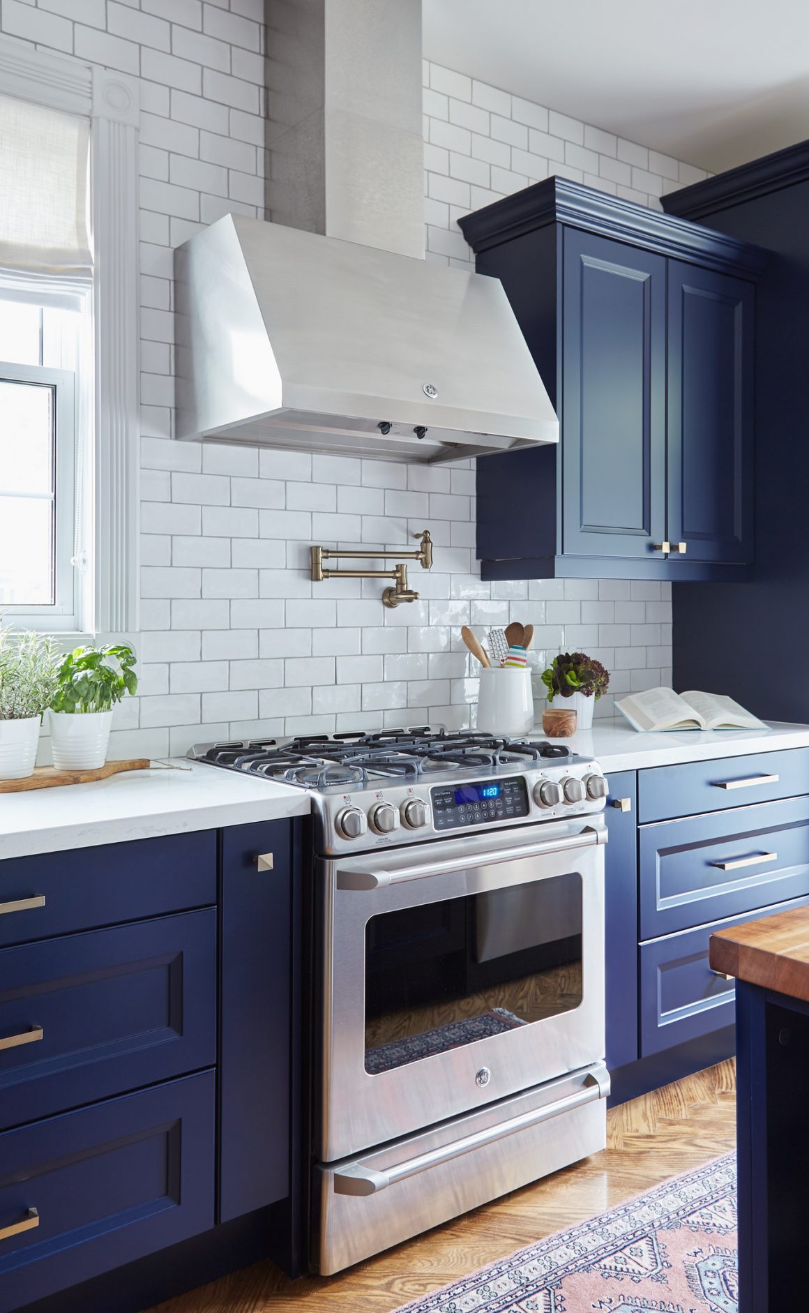
Keeping her partner’s tastes (he likes dark, moody rooms) and the family budget in mind helped, she adds.
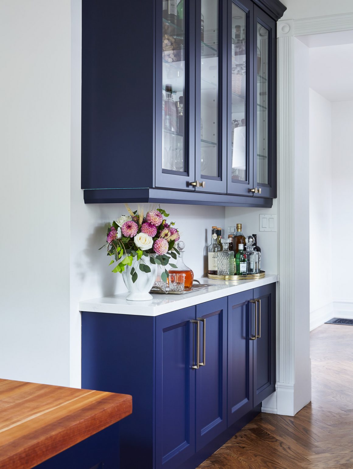
Much of the expense went toward redesigning the space to create the kind of flow and functionality she wanted. Two bedrooms had to be relocated to the other side of the main-floor unit to create flow between the new kitchen, dining and living rooms, and access to the backyard. There was a redundant second staircase to a crawl space beneath the house that was removed to free up space in the kitchen. The old ceiling height in the space where the new kitchen is now located was only eight feet high because it was part of an addition to the original structure, done in the 1960s. The ceiling was raised to 10 feet, in keeping with the rest of the Victorian house. And the bathroom had to be moved from where the new kitchen stands to a hallway leading to the bedrooms.
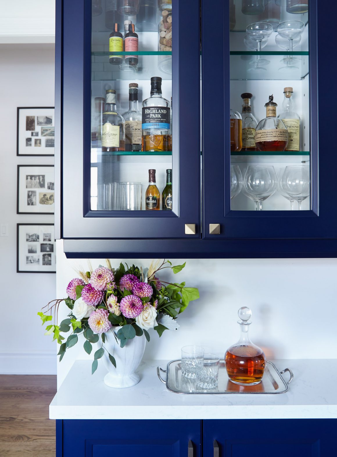
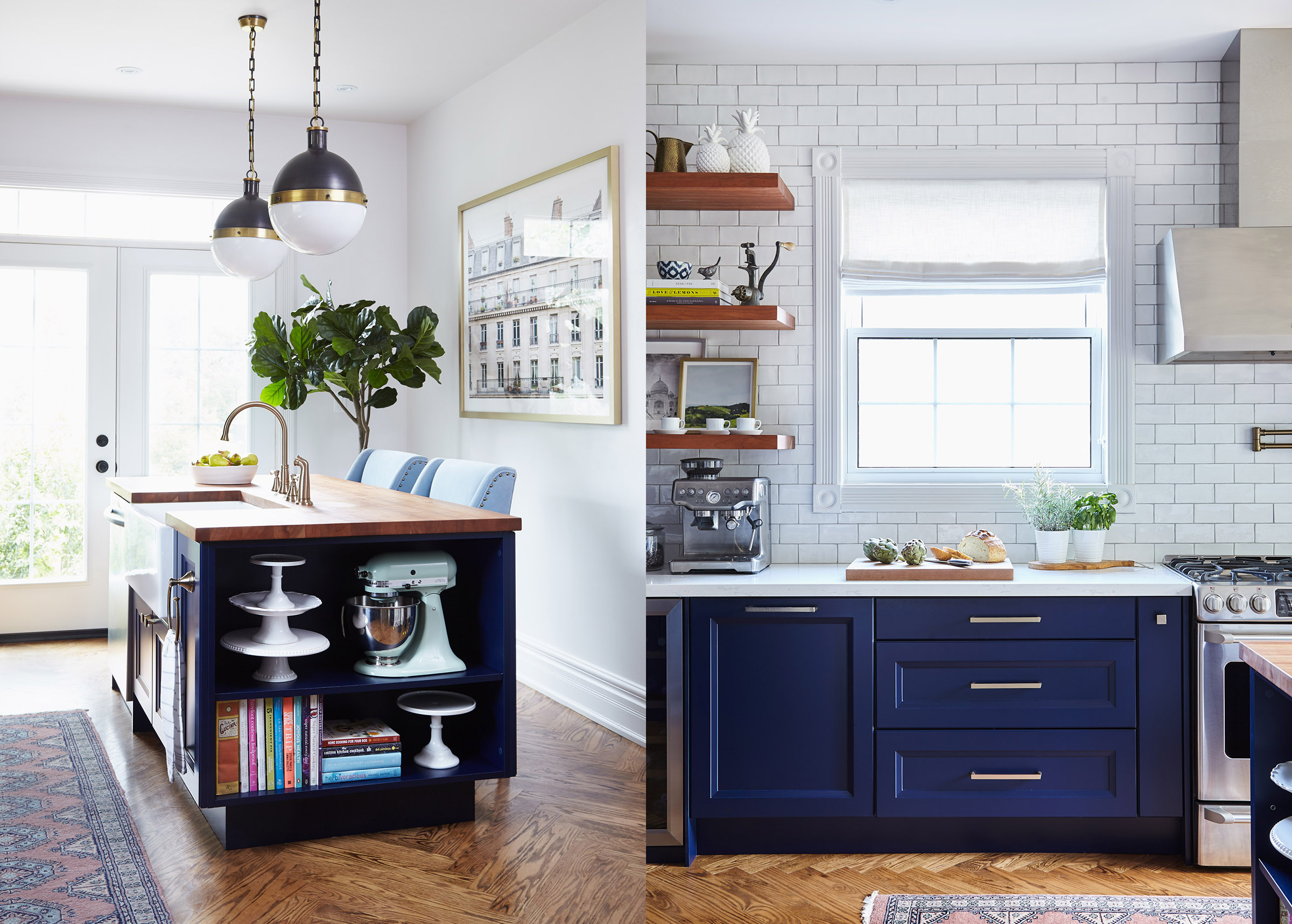
Aside from construction costs, Staci says, the big splurge was the hardwood floor in a herringbone pattern, a look she had long admired and wanted in her own home. She says she saved a little money by going with lacquered kitchen cabinets that had already been painted royal blue – not exactly the blue she had in mind but close enough. They look great just the same, teamed with the quartz countertops and the white subway-tile backsplash. And putting prints on the wall as opposed to original art contributed to the savings.
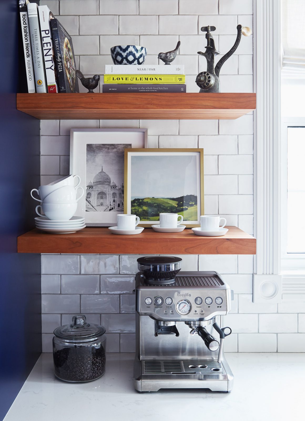
Staci says she is very happy with the result. The space is clean and modern-looking with a hint of Victorian charm, and yet still delivers enough of a masculine ambience to make her partner happy, too. •
Staci Edwards Design
www.staciedwards.ca
Email: info@staciedwards.ca
Phone: 647.970.9373

