PHOTOGRAPHY: JEAN-SÉBASTIEN SENÉCAL
STYLING: JEAN STÉPHANE BEAUCHAMP
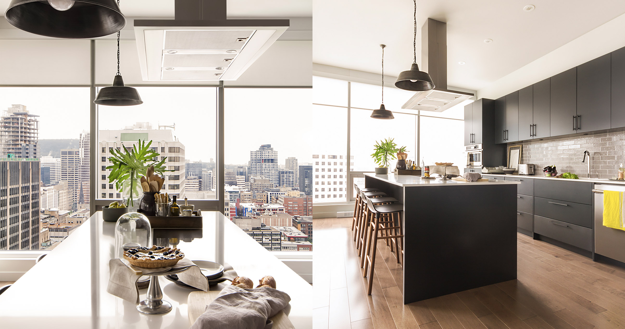
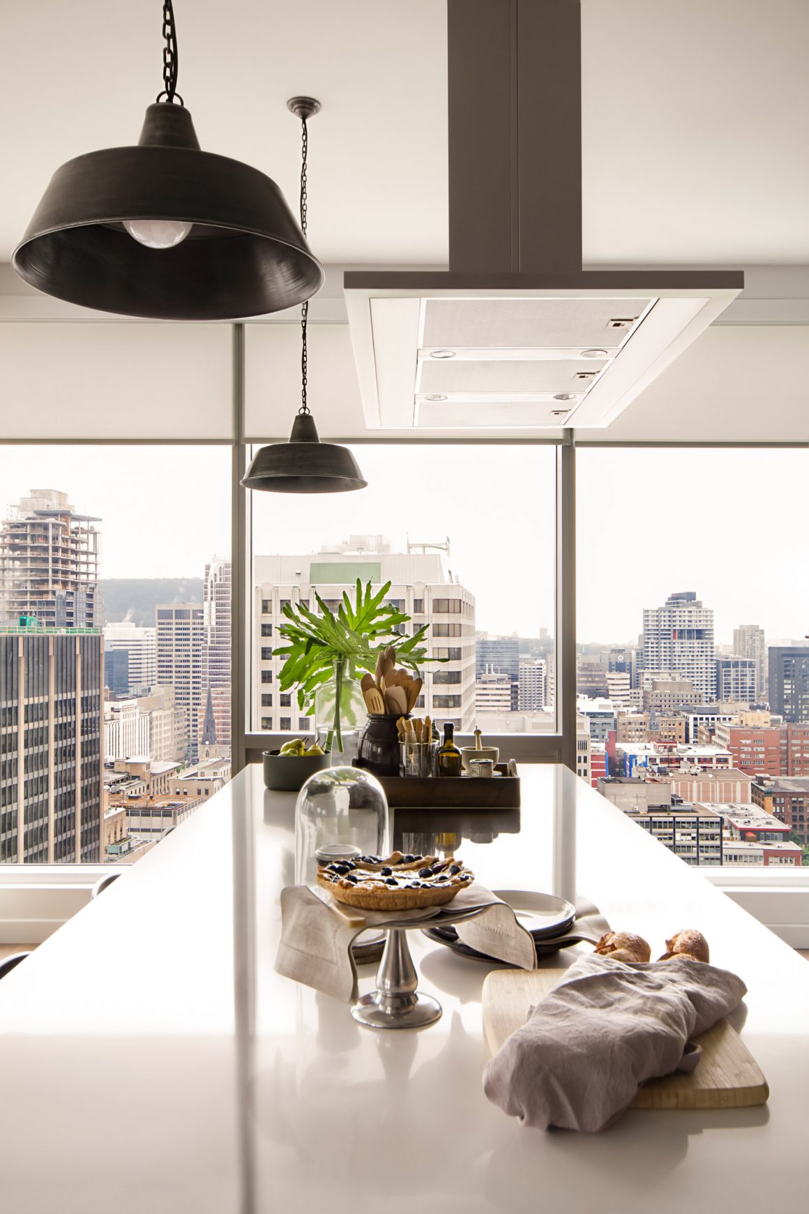
Every great chef has a source of inspiration, that well from which flows the desire to create a feast for the palate. For Fernando Serboncini that source is clear – especially on a sunny day. It is the view of Montreal from his kitchen on the 33rd floor at Square Victoria.
As he stands at his island cooktop, he surveys the city. Within his sightlines is the mountain, including the George-Étienne Cartier monument on the edge of Mount Royal along Avenue du Parc, and the elegant steeple that reaches from St. Patrick’s Basilica that is artfully illuminated after dark. Off to the left is the heart of downtown; to the right is the outline of Montreal’s iconic Olympic Stadium tower.
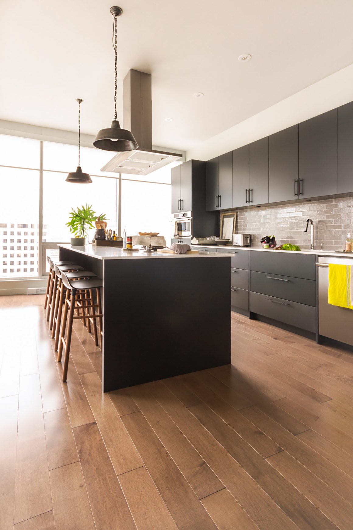
It is this panoramic view that not only set the stage for the design of his kitchen; it also dictated in large measure the colours that would be used in this space that is filled with natural light.
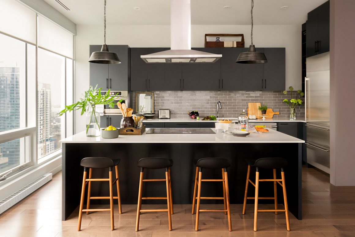
“Because it’s so bright, I said I want to do a dark kitchen,” explains Jean Stéphane Beauchamp, the principal designer and owner of the Montreal-based Jean Stéphane Beauchamp Design, explaining his choice of a lacquered finish for the cabinetry in Off Black by Farrow & Ball.
The next challenge was to ensure the kitchen plays off the view. How could the homeowner see the view while cooking?
The solution was to make sure that Fernando would always be looking out. This dictated that the cooktop be placed in the island. Why would he want to turn his back on the windows and face a wall?
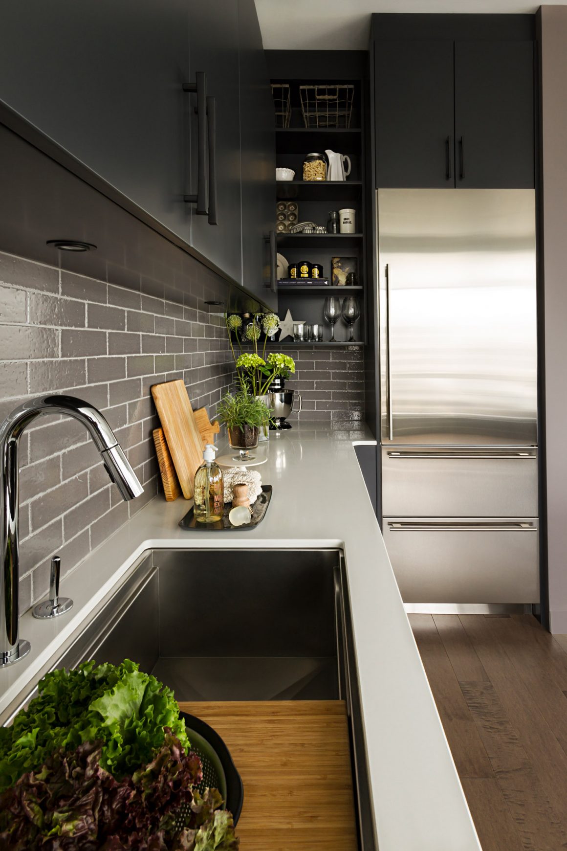
The Galley sink is set in a white quartz countertop. The backsplash is made of vintage bricks that were thinly sliced, glazed and baked. Quartz counters: Summum Granit; sink: Batimat; faucet: Ramacieri Soligo. Refrigerator: Sub-Zero.
Then came the next challenge: how to ensure the range hood would not obstruct the view. “We went with the most streamlined,” Beauchamp says, explaining the choice of vent, adding that it was positioned “as high as possible and still be effective.”
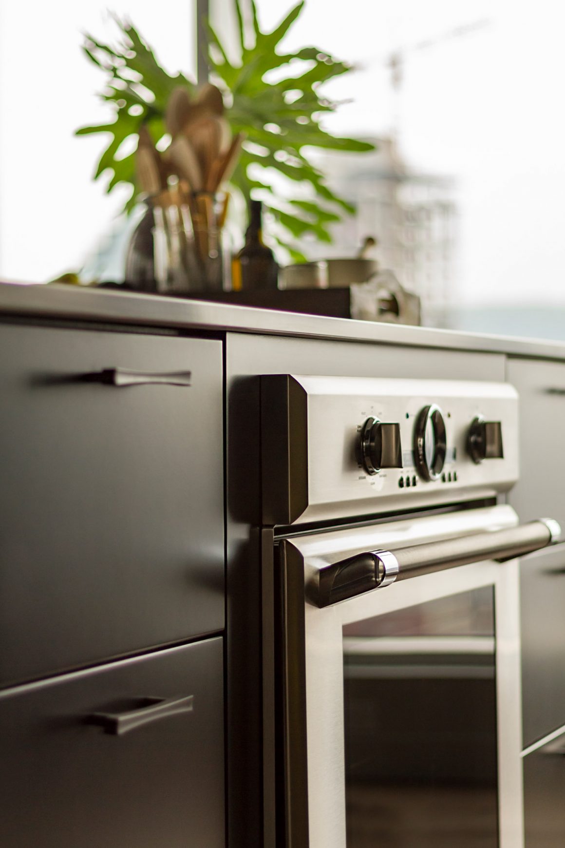
The result: A setting that inspires weekend breakfast feasts Fernando looks forward to creating. “It’s definitely a kitchen that doesn’t compete with the view, but holds its own,” says Beauchamp.
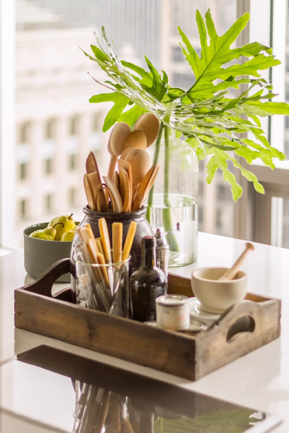
That it does, as it provides an urban vibe that reflects the city it casts an ever-present eye over – both urban and upscale, contemporary but visibly storied with parts of the past showing.
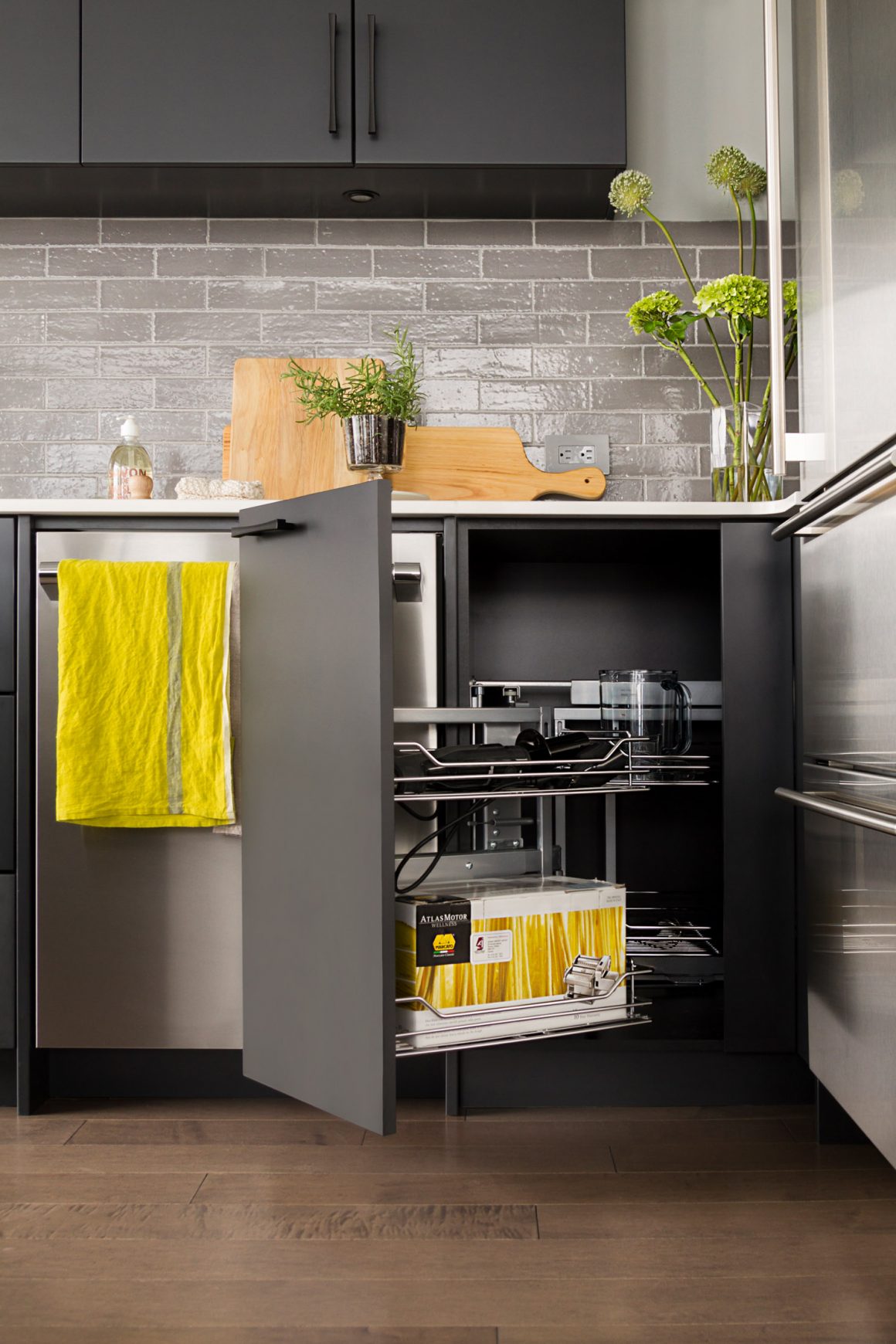
A glimpse of that vibe is found in the backsplash, designed using thin slices of glazed brick. “It gives you this beautiful textured tile with those beautiful lumps and bumps of brick,” Beauchamp says. “It’s quite beautiful.”
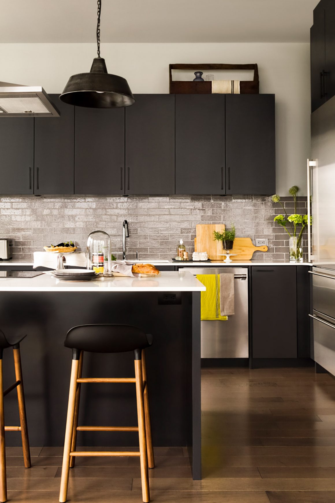
From the hints of vintage provided by the brick, the space also flirts with the contemporary, with a sink by The Galley. This linear top-end stainless-steel trough has discreet recessed edges to fit a series of tiered accessories, from bamboo cutting boards to strainers, to racks and inlaid serving bowls.
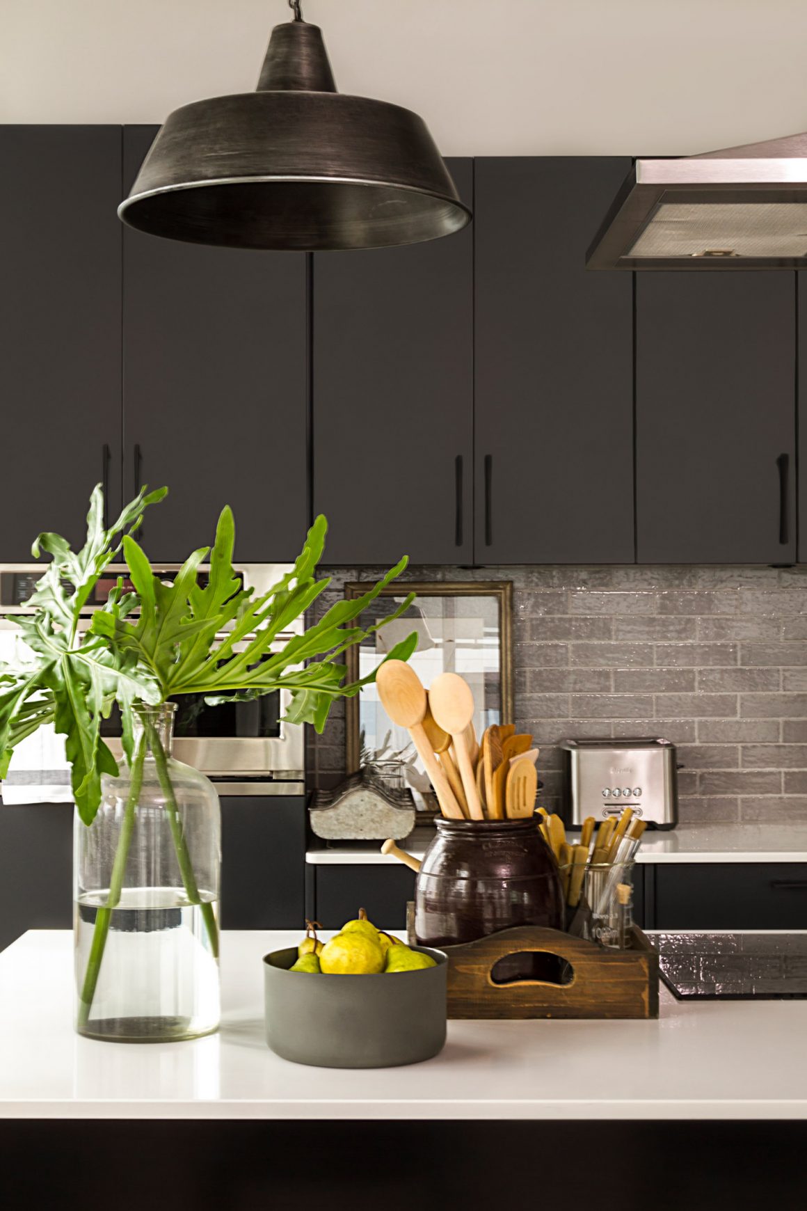
Asked to describe his kitchen in his own words, Fernando offers: “It’s not super-aggressively modern.” Then he pauses. “I like this modern, but slightly rustic look.” Prodding him slightly: Does he like the black? He doesn’t hesitate: “It didn’t occur to me to make it white.”
It’s a space – like his city – with which he feels very comfortable. •
Jean Stéphane Beauchamp Design
www.jsbeauchamp.com
514-759-8022

