PHOTOGRAPHY: SCOTT NORSWORTHY
Victoria Birkett and David Ceolin were attracted to the home they bought in 2007 because of its amazing view. It sits on an expansive ravine lot in the prestigious Baby Point neighbourhood of Toronto, and has an intriguing provenance as one of the early homes built by renowned developer/ businessman Robert Home Smith in 1925.
“We were attracted to this house because we felt that there was a lot of history here, and we liked the layout and overall feel; it was perfect,” Victoria recalls.
However, a few rooms – namely the existing dark kitchen and tiny master ensuite bathroom – were decidedly less than perfect. The homeowners wanted to open the house up to the ravine view and fill the space with light, so they turned to architect Wanda Ely to design a contemporary-style two-storey rear extension that would be in keeping with the existing traditional home. Throughout the house, Ely created views that framed the space to thoughtfully link the old and the new.
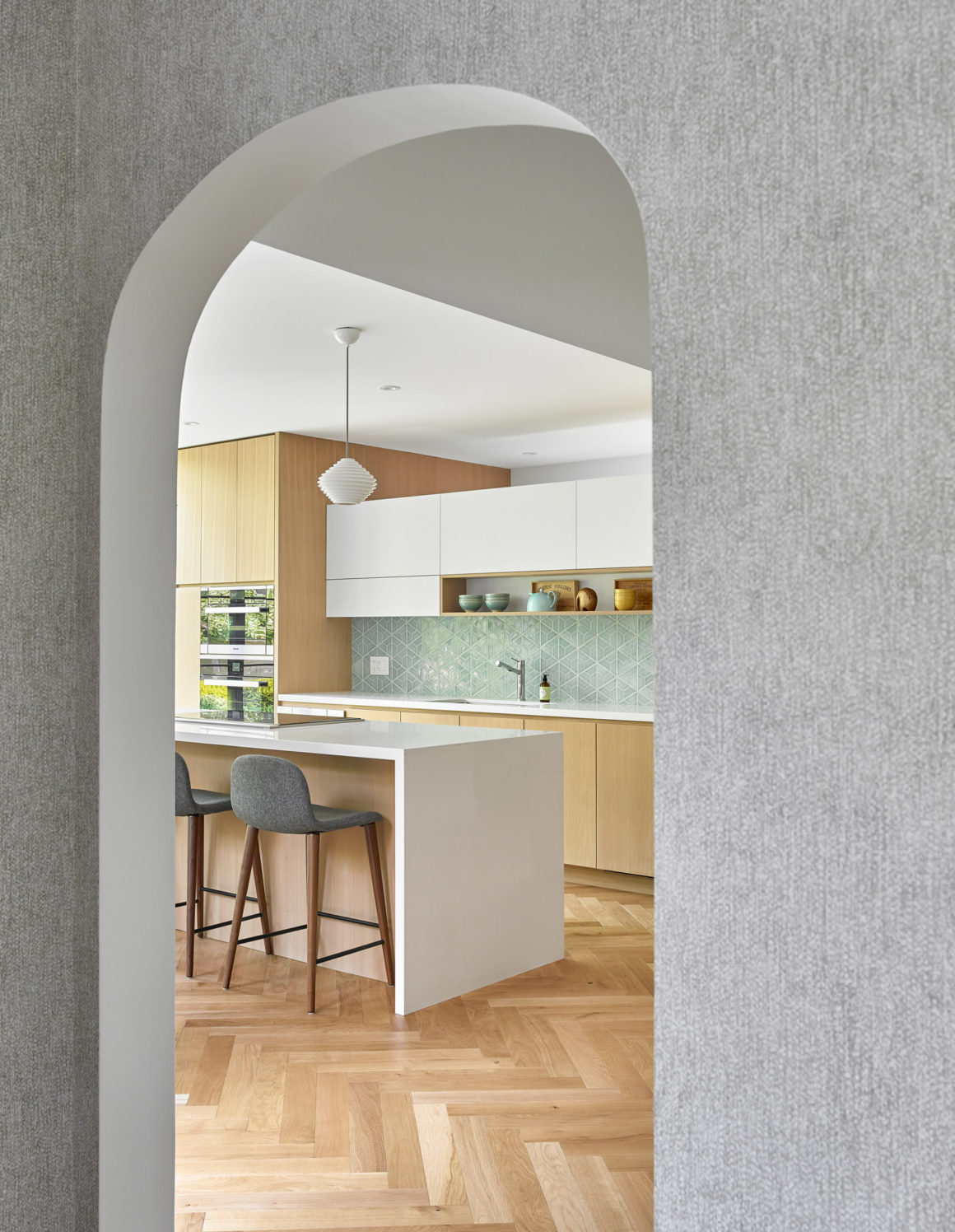
“We were mindful that the renovation was going to be very new and we were tying it into a historic home; we weren’t going to make what we were doing look old,” says Ely, owner of Wanda Ely Architect. “They wanted it to feel modern and fresh while making sure it didn’t look too disjointed from the existing house.”
The six-month renovation in 2018 transformed the stately home into a spacious, airy retreat for the couple and their two daughters. The neutral palette, accented with splashes of watery blues, honours the original blueprints for the property, which the homeowners still have.
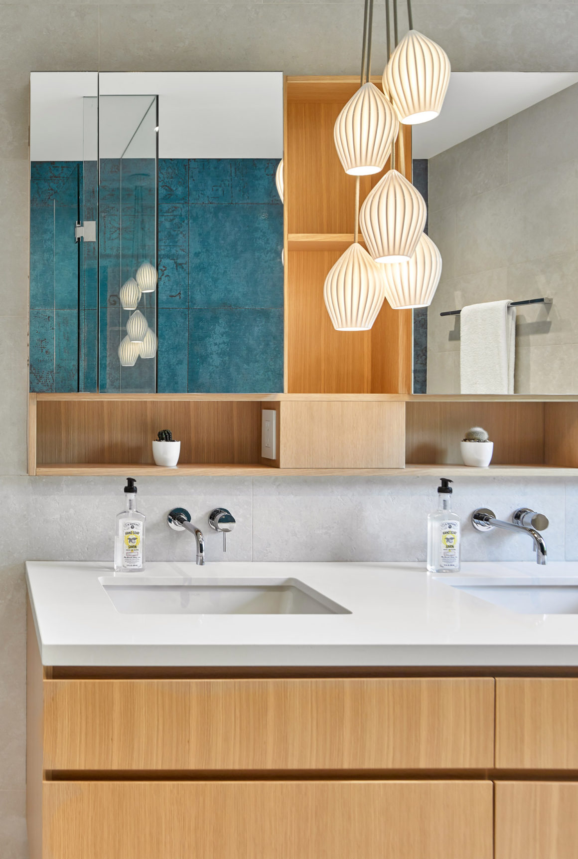
For the new ensuite bathroom, the couple requested a soaker tub with a separate shower, which Ely laid back to back to allow for a magnificent wall of blue porcelain tile as the room’s focal point. “The tile was designed with tapestry in mind and that shows in the really rich colour and pattern. It almost has a textile quality to it,” says Ely.
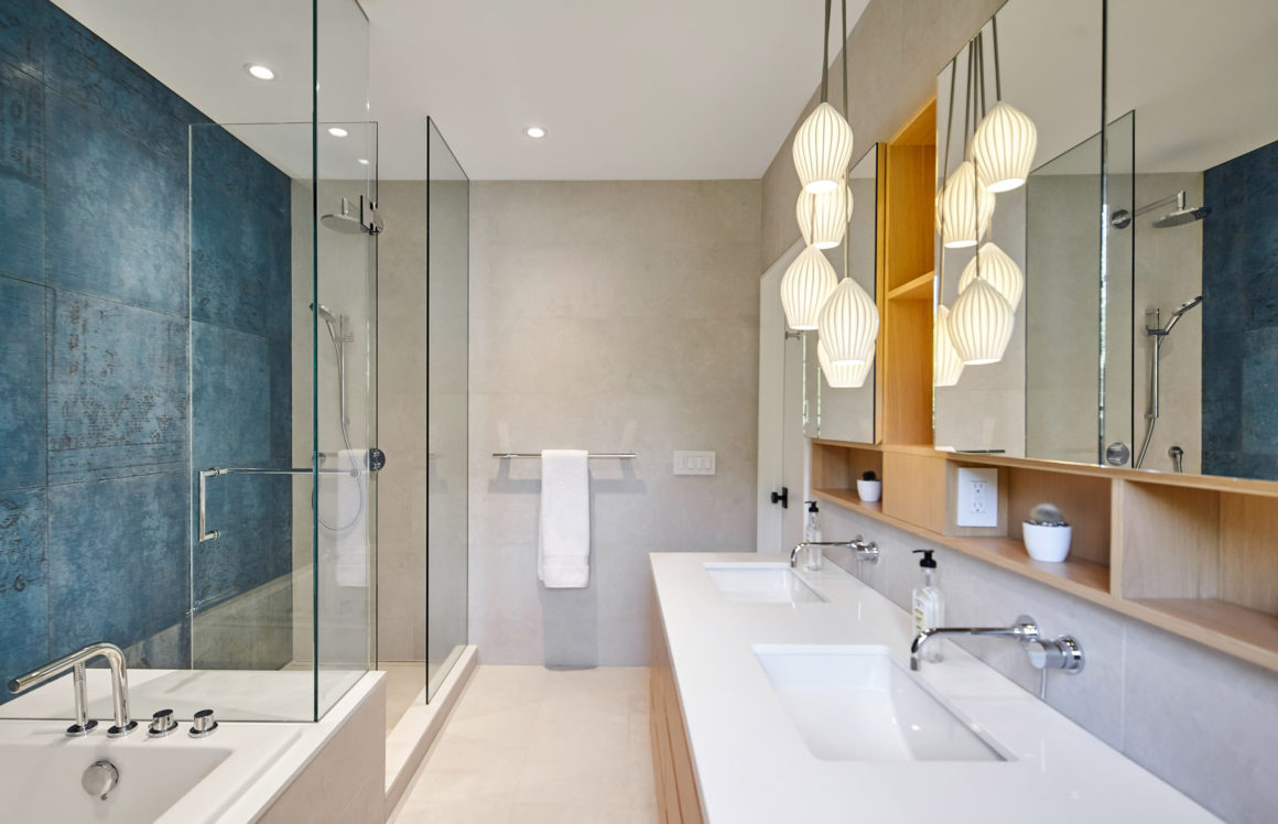
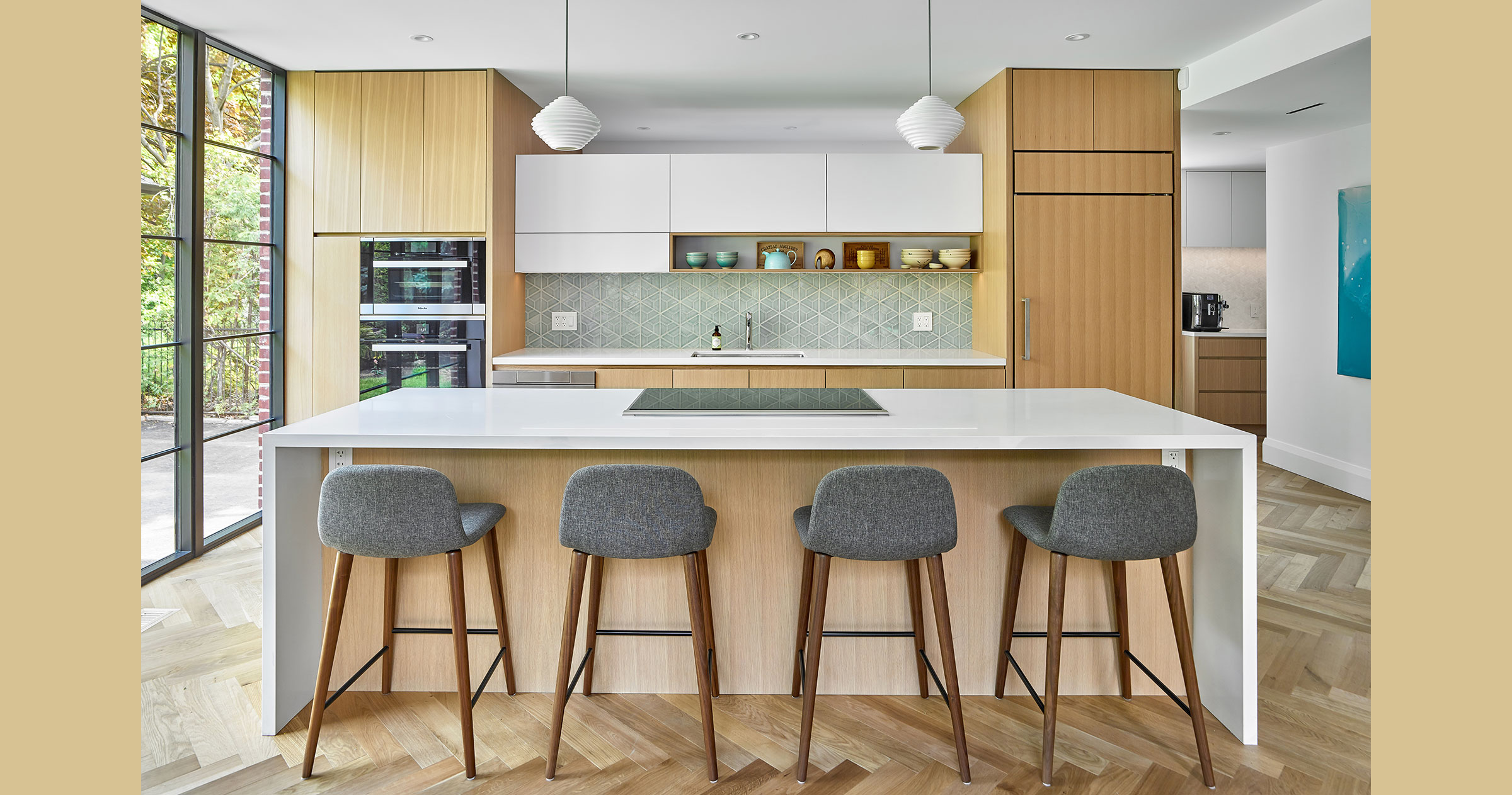
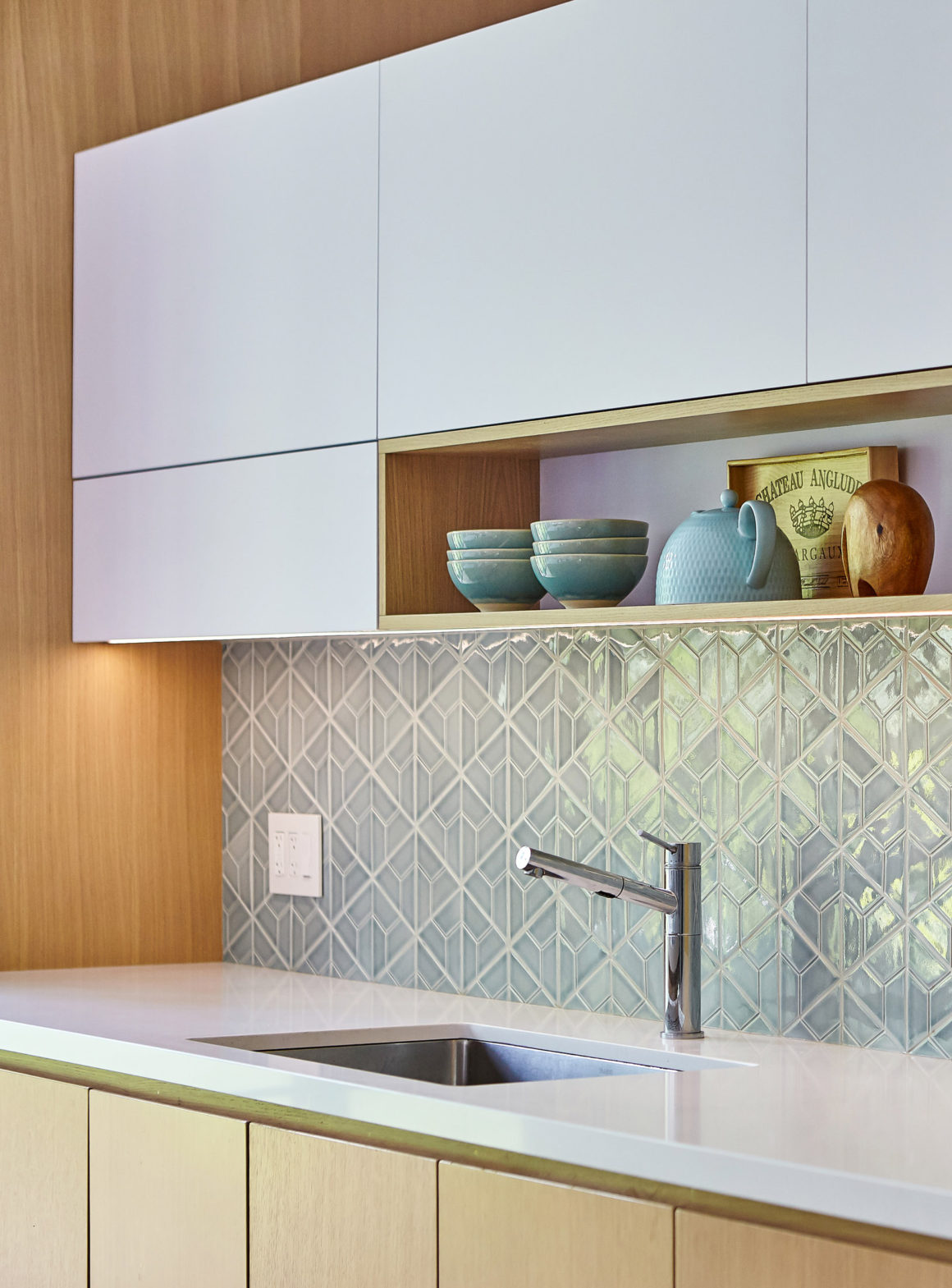
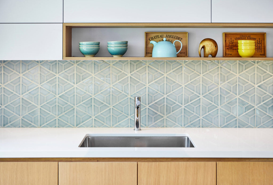
Victoria’s wish for a generous space filled with light was achieved, while David appreciates the streamlined storage in the floating white oak vanity and all the high-end finishes. “You feel like you’re walking into a luxury hotel bathroom,” he says, noting that the white quartz countertops and custom cabinetry carry through to their new kitchen.
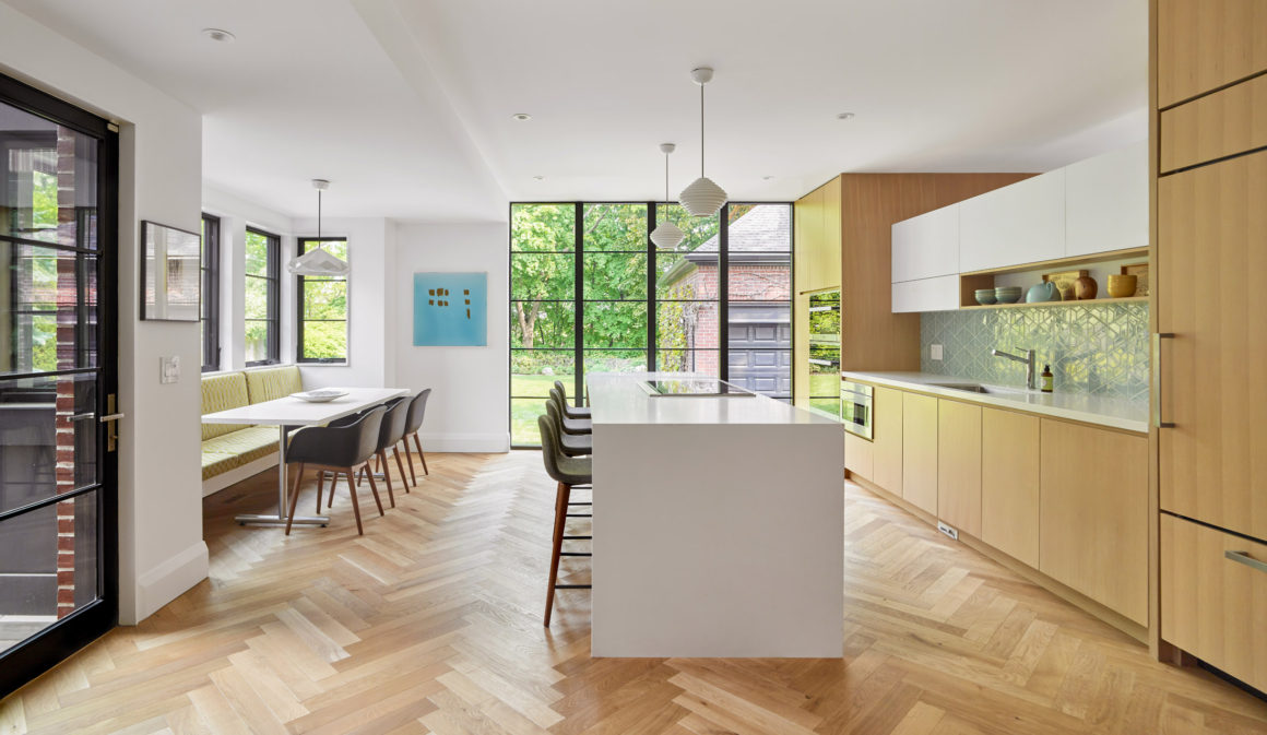
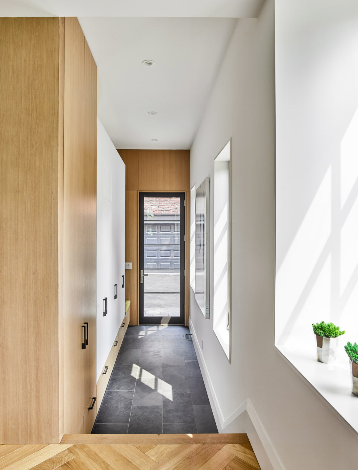
Here, Ely laid the engineered oak flooring in a herringbone design to contrast with the sleek island and cabinets, and to delineate the new space from the original flooring in the dining room. “We didn’t want to match the floors of the old house, because they’re from a different era. They’re quite dark with a lot of grain in the oak, which suits the existing house,” explains Ely. “They wanted something quite bright and fresh-looking for the kitchen, so we chose a floor that had a lot of character in it, and the herringbone pattern has a nice richness and a very classic, Old-World feeling to it. So it works in the old home, but it was very clearly a new part of the home.”
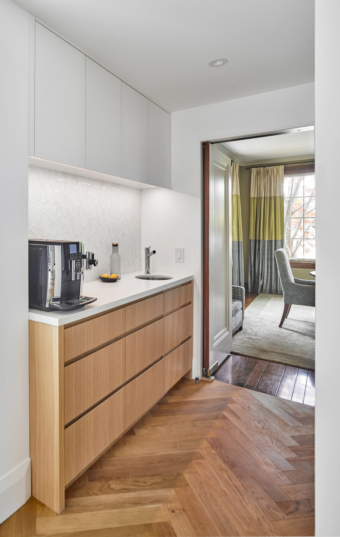
Between the kitchen and dining room, Ely added a servery and six-by-eight-foot pantry, which serves multiple functions, including storage for china and a space to serve coffee and dessert. “When you have larger gatherings in your dining room, sometimes you need extra space to put platters and other things,” David says.
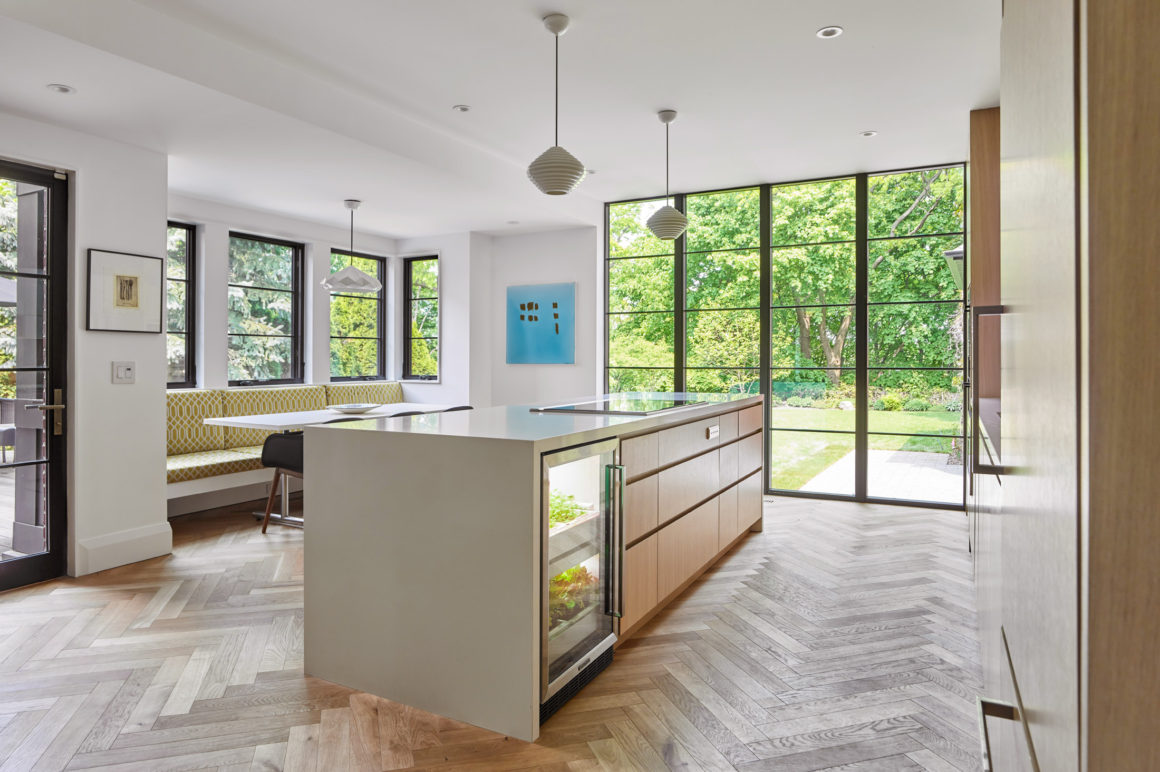
Most important, a wall of black-framed floor-to-ceiling windows allows light to flood the 18-by-20-foot space, giving the couple the gorgeous ravine view they were seeking.
“The old version of the house didn’t have a lot of windows, so the ravine was not part of the interior perspective; it felt very closed off,” says David. “Now, every morning we see birds and leaves; the seasonality really comes in.” •
Wanda Ely Architect
www.wandaelyarchitect.com
647-889-3984

