New Westminster penthouse offers light, views, space, privacy
BY PHILLIPA RISPIN
PHOTOGRAPHY: JW THOMPSON
STYLING: MICHAEL RICHARDSON
It all revolved around the staircase. Designer Michael Richardson and his husband, Brian Sevy, were searching for a new home. In an apartment building in The Quay they saw this two-storey penthouse with its sweeping, curving staircase, and Michael hated it.
“When we saw the unit I refused to buy it,” he says. “Brian wanted it and I did not. It seemed like such a huge project. I couldn’t see past the staircase and some of the rounded windows. I did not want to take it on.”
He and Brian made efforts to buy a house, but several possibilities evaporated. “Then this fell back in our laps,” he recounts. “I was kind of ‘Okay, we’ll try it.’ ”
The 3,500-square-foot property certainly had its advantages – enormous space, abundant light, terraces on two opposite sides on both levels – but it also had the staircase, which Michael deemed dated, as well as some arched windows and green window frames that he found less than enchanting. The process of getting to an interior that both he and Brian love took almost three years.
“It was hard to envision how to design around the staircase and the windows,” he says. “I originally wanted to change the staircase to something more contemporary: straight, and maybe floating, with glass railings. We also thought that we’d move it to between the living and dining areas, going straight up to the mezzanine. But logistically, it would have been too much, so I had to figure out a style that would go with the staircase.”
Michael considered going for a Hollywood Regency look but says, “I backed away, which is why the whole project took so long. Then I thought I’d like to do something contemporary, but contemporary- rustic, so it’s not so hard-lined. There are a lot of curves with that staircase and some of the windows. I knew I couldn’t do very hard lines.”
In the end, he found the right look, which he calls “Santa Barbara contemporary” because some of the details – pale walls, slipcovered furniture, wood accents – remind him of that more southerly coastal city. It’s stylish, comfortable and unfussy.
“I knew I wanted the walls in white, a very crisp background,” Michael says. “I wanted a monotone palette. I wanted it to have an art gallery feel, but I didn’t want it to be as cold as an art gallery.” He chose furniture with soft lines, such as the slipcovered chairs at the dining table, so that the decor would be “not so hard-edged.
“I also knew that just white and grey was going to be a little too much. I needed another tone also. So I brought in the rustic wood and walnut-y, oak-y tones to soften it up so it doesn’t look so minimal. And then we did the rustic sliding barn door into the den, and one that slides over the master closet.”
The rustic aspect also shows up in such furnishings as the dining table with its distressed wood planks, and the solid coffee table on the mezzanine. The most widespread wood effect is in the flooring, which gave Michael a challenge.
“Flooring was an issue because I wanted a true grey, without a brown undertone, and I wanted rustic wide planks,” Michael explains. “I had a really hard time finding it. I found the right colour in an inexpensive product from Rona. I took that piece to every expensive flooring place I could find, but their products all turned into a brown. So I ended up putting the Rona floor in, and I’m happy with it. But I couldn’t believe that I couldn’t spend more if I wanted to.”
The mezzanine (big enough to deserve its title of family room), and the master and guest bedrooms are carpeted, but the grey planks that Michael searched so hard for now run through much of the main floor: the foyer and hallway, the open living-dining area, the powder room, the master ensuite, the den; they even flank the tiles down the centre of the galley-style kitchen.
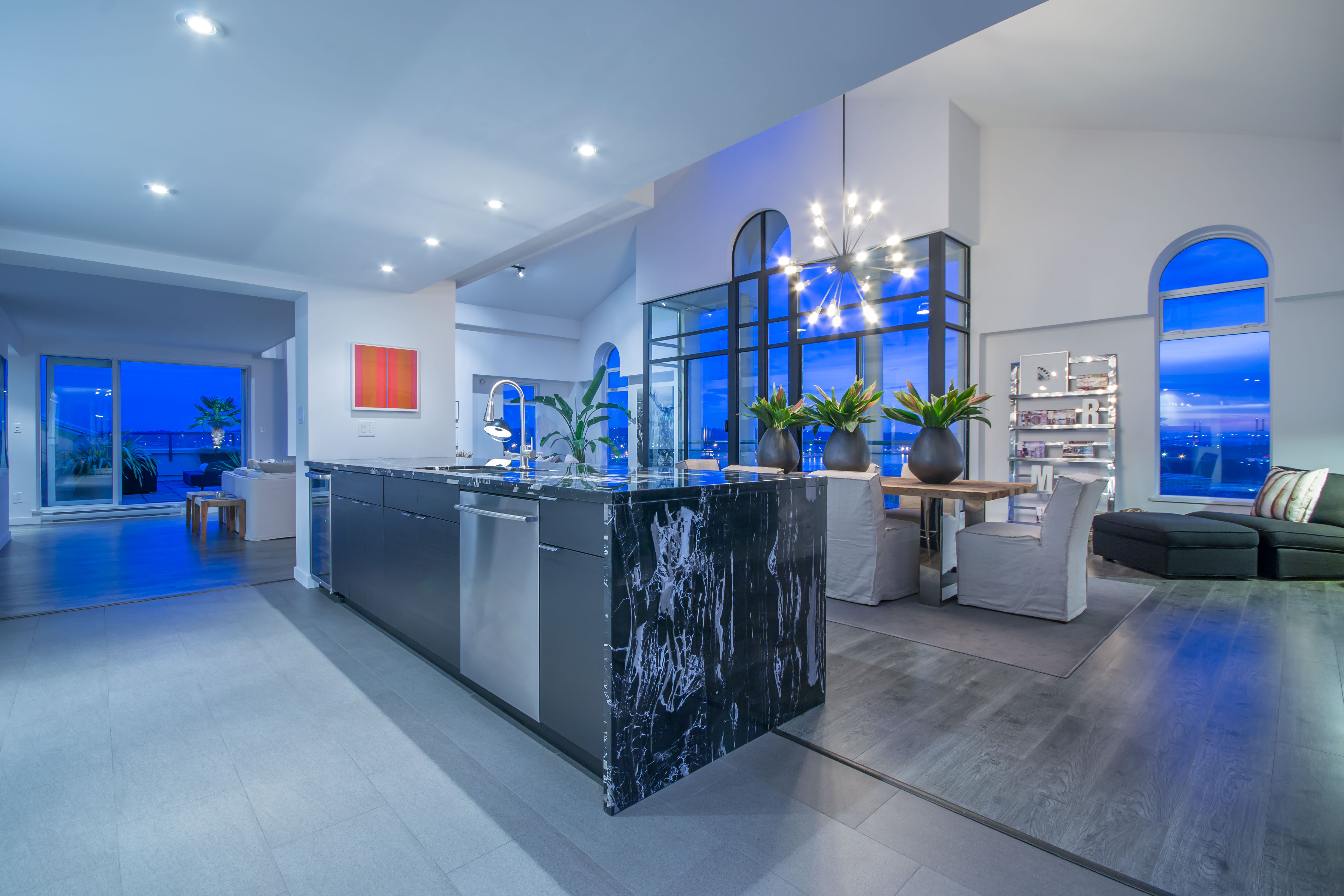
The den used to be a conservatory, but Michael walled it in, added a closet, and it’s now ready to be a third bedroom if necessary. Another major change was the opening up of the formerly closed-in kitchen so that it can take advantage of the light and views. The outstanding kitchen feature is a large and handsome island more than 12 feet long, clad in black marble.
“I like the play of the rich-looking marble with the rustic dining table and the counter stools, which have a little bit of that vintage, rustic look,” says Michael. Notwithstanding his satisfaction with how his home turned out, it’s still the basic envelope containing that home that pleases him most.
“Living anywhere around Vancouver . . . the expanse of space in this unit is amazing. It’s not replaceable. Places like this, they built them a long time ago because they could; nowadays we couldn’t replace this spacewise. To get this kind of volume, this kind of square footage and this kind of feeling of vastness – it’s unheard of. It would be very hard to replace, and even then you’re not getting this kind of grandness.
“This unit is the top two floors of the entire building. We have absolutely no neighbours. It’s like a mansion in the sky. It’s an amazing place in an amazing neighbourhood.”
This home is now on the market and can be viewed at www.ianwatt.ca/ActiveListings.php/Details/555/details

