PHOTOGRAPHY: MIKE CHAJECKI
STYLING: CYNTHIA SODA
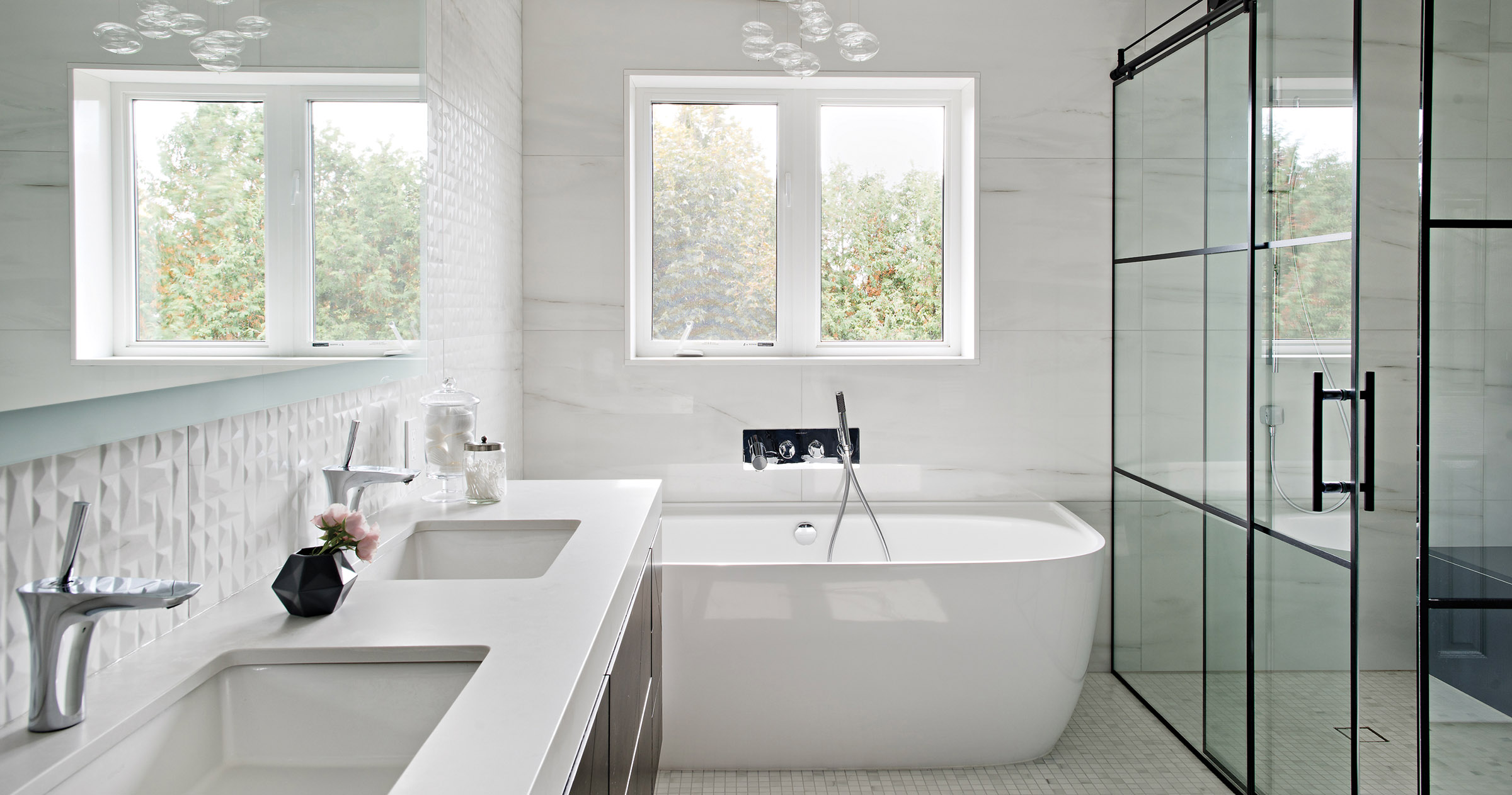
It’s not necessary to give up style when redesigning your home just because you have children, says Toronto interior designer Cynthia Soda. A mother of four, Cynthia renovated the master ensuite bathroom in her Stouffville home, northeast of Toronto, creating a chic sanctuary that her children also quickly came to love.
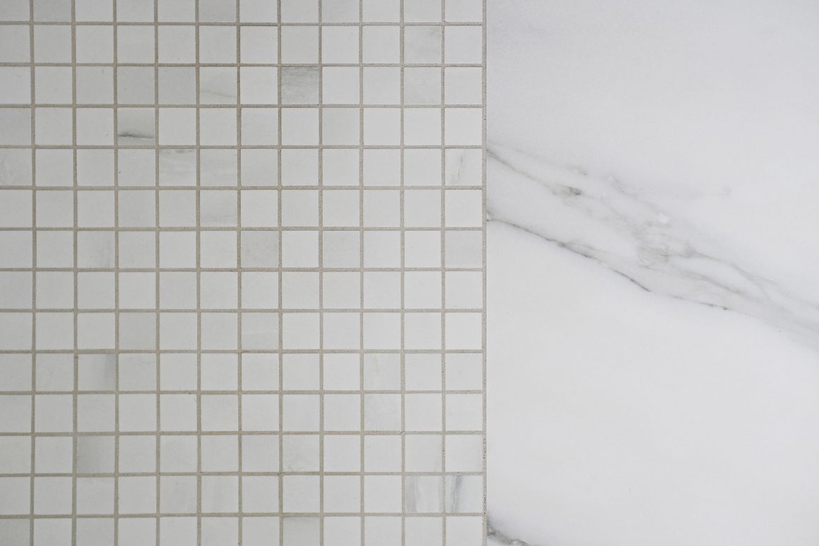
Using new high-tech fittings and fixtures, bold contrasting colours – notably black and white – and an array of durable materials, such as porcelain tiles, Cynthia, owner of Soda Pop Design Inc., transformed what was once a generic bathroom into a signature space that her whole family has been able to use and enjoy. And while redoing the room, she took the opportunity to add a heated floor.
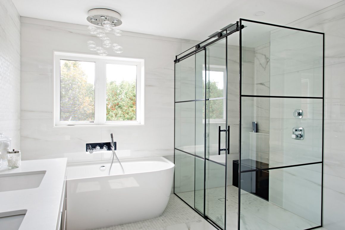
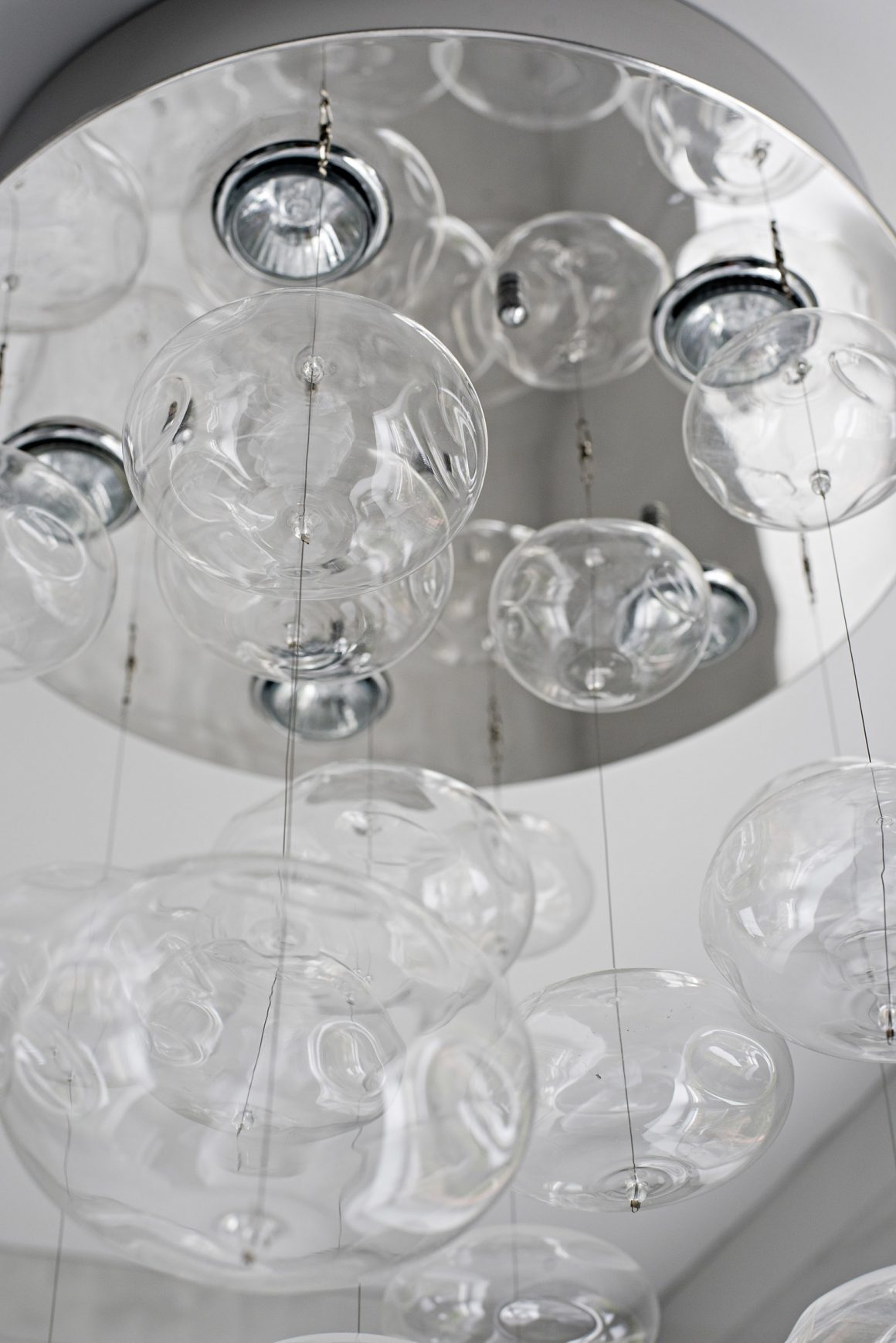
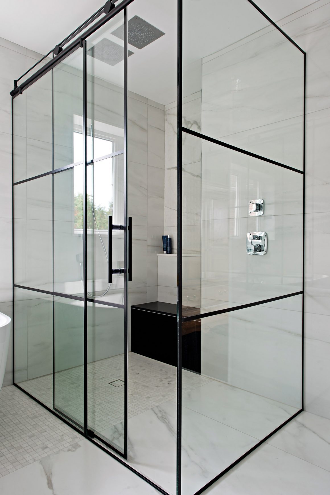
“You just modify the style to meet your growing needs,” says Cynthia of the family-friendly, contemporary style she has used throughout the house and more recently carried into the master bathroom. She says the 5.5-by-3.5-foot (19.3 square feet) walk-in shower features double Hansgrohe rain heads that are a hit with her children; so, too, is the quirky bathroom pendant light fixture that resembles suspended bubbles. “The kids just come in and out. They think the room is theirs,” Cynthia says. “That’s how we live our life. It all just makes sense.”
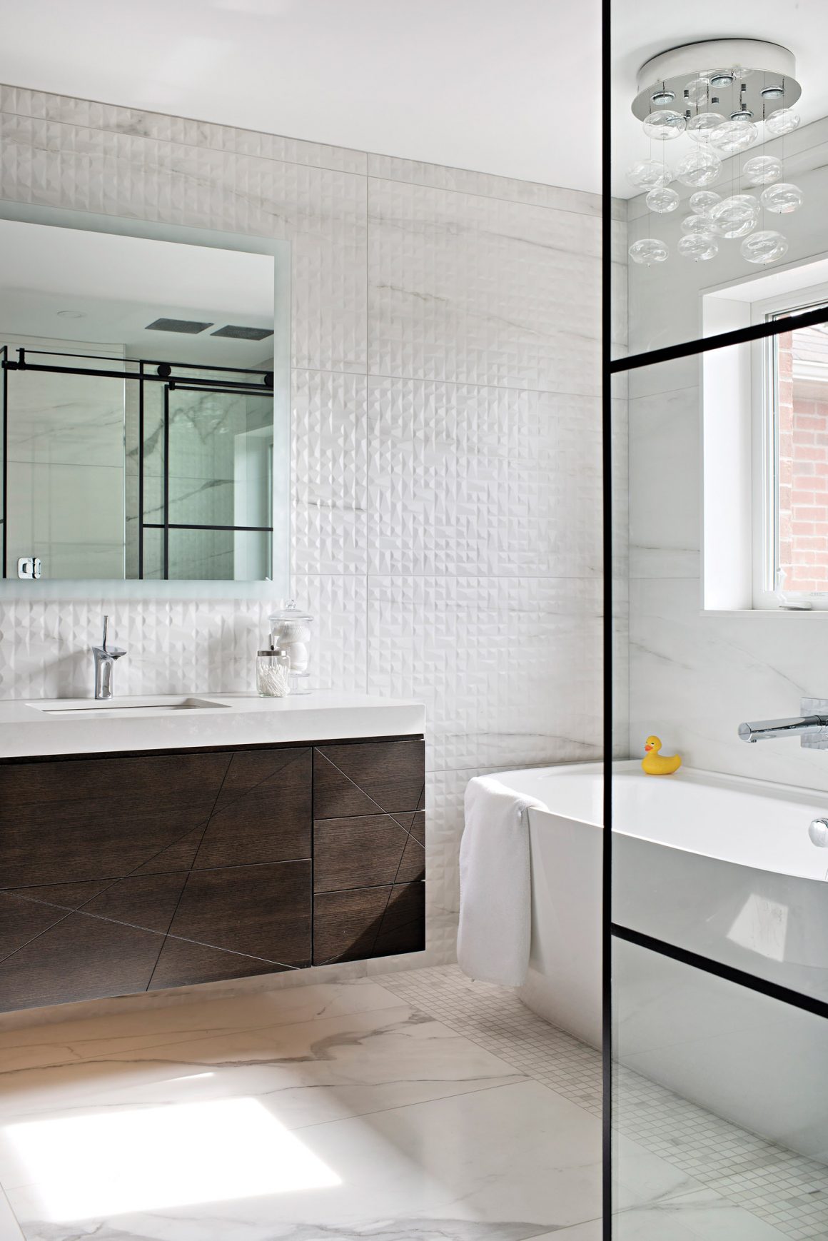
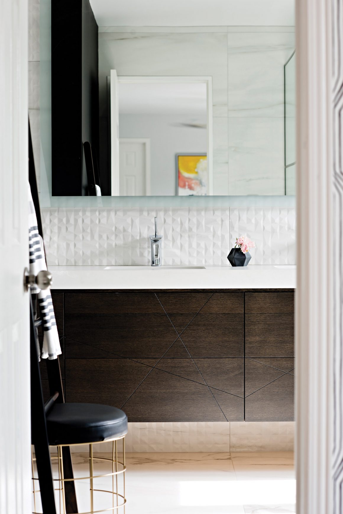
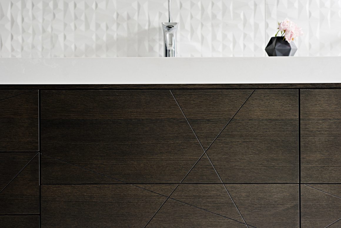
The principle design challenge was how to use the room’s 125 square feet as efficiently as possible. To that end, she says, she chose a wall-mounted double-sink vanity that boasts plenty of storage but still has a light appearance. The bathtub looks like a standalone model but actually abuts a wall. The shower door is on a roller system to conserve space. And the shower was given a built-in bench and shelving for further space-saving.
“When I’m not held back, I get the best results,” Cynthia says.
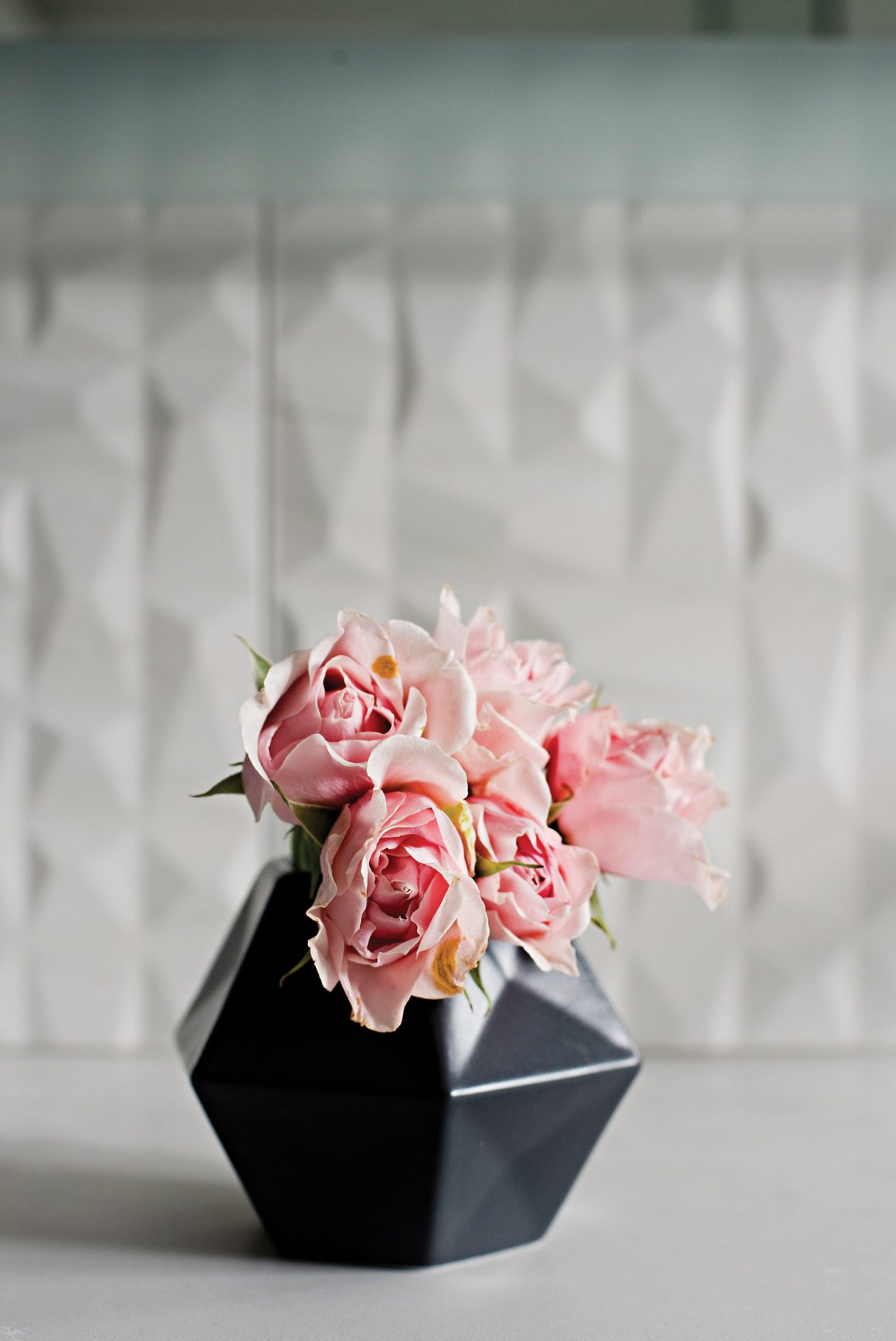
In this case, she adds, the big gamble was painting one wall in Benjamin Moore’s Black (2132-10). The classic black highlights the porcelain accent wall behind the double vanity as well as the floor, and draws the eye to the black metal framing of the curbless glass shower enclosure. “I try to take as many liberties as possible even with my clients but I don’t think I could convince many to go for black walls,” she says of the project. “I enjoyed the freedom. Black is a neutral colour. I love it.” •
Soda Pop Design Inc.
www.sodapopdesign.ca
Soda Pop on Instagram

