PHOTOGRAPHY: LARRY ARNAL
STYLING: ERICA GELMAN
Family members share traits, yet each also possesses a distinct personality. “The same holds true with the renovated bathrooms in this three-storey family home,” says Erica Gelman, owner and principal designer at Erica Gelman Design in Thornhill.
They were part of the update of the entire four-bedroom house. Because it is in The Beaches area, the designer evoked a coastal look by keeping details on the laid-back and uncomplicated side. At the same time, she wanted a contemporary design in sync with the urban setting. A neutral colour scheme — Benjamin Moore’s ash-tinted Intense White on the walls accented with driftwood greys — helps set the tone.
Originally, the second-floor master bedroom shared a bathroom with the adjacent bedroom. The floor plan was reconfigured to create two bathrooms: an ensuite for the second bedroom and a 10-by-12-foot master. A third bathroom on the top level received a makeover as well.
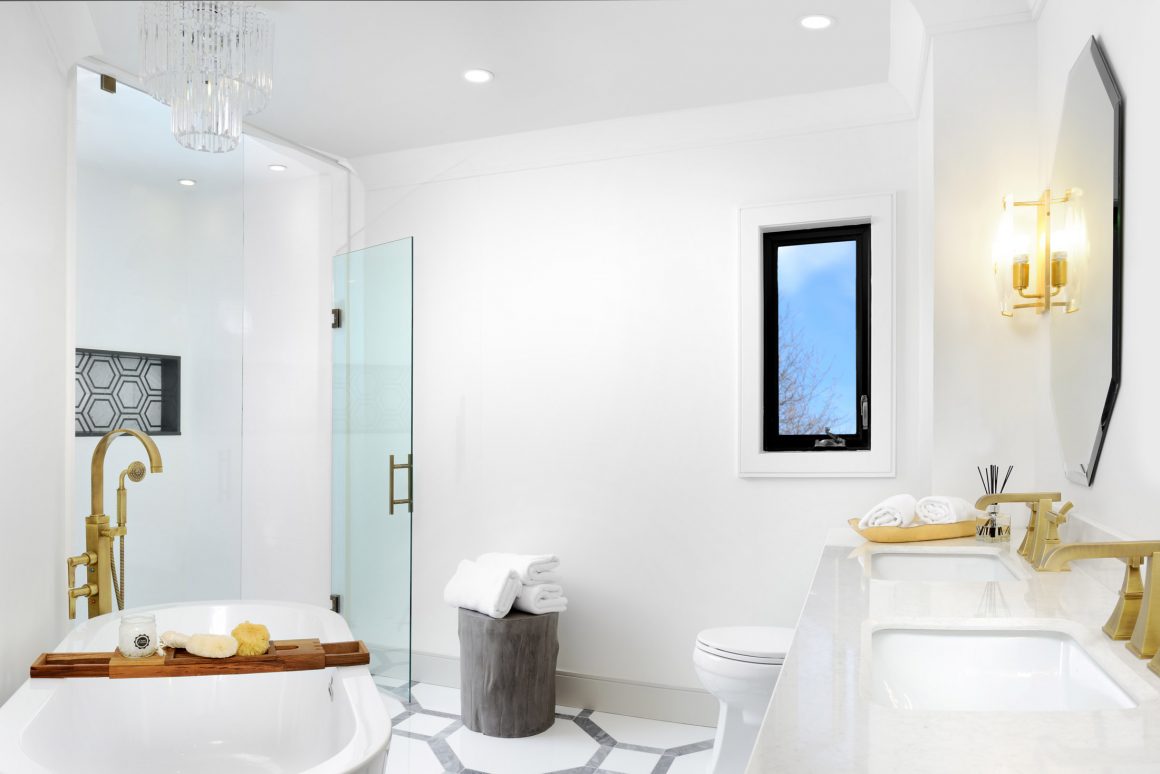
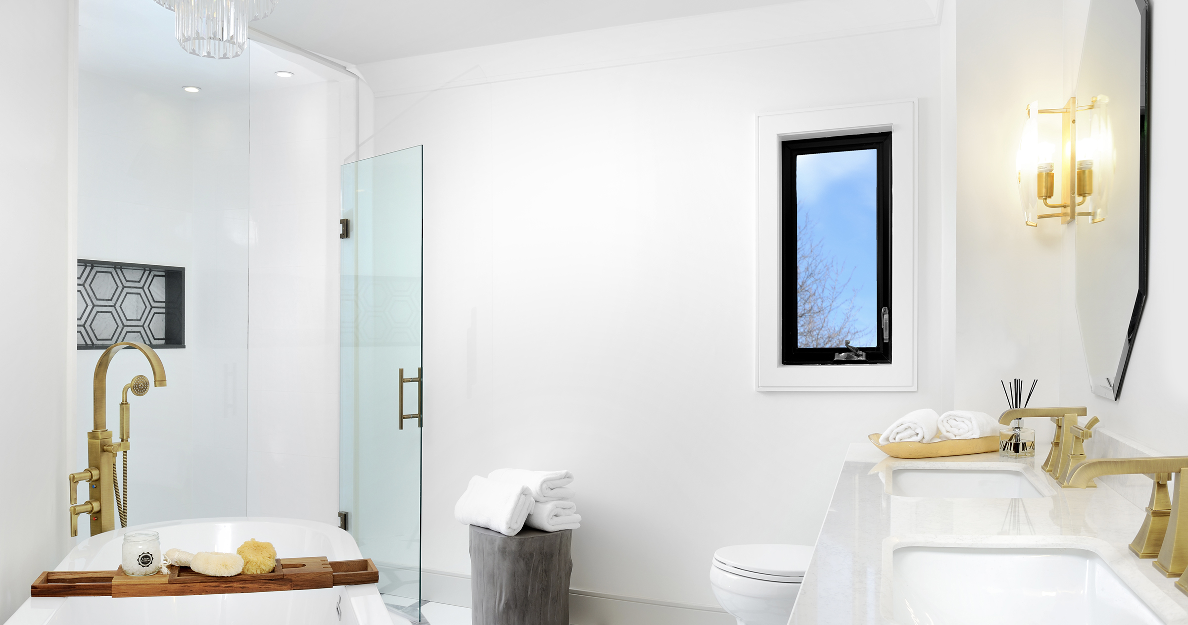
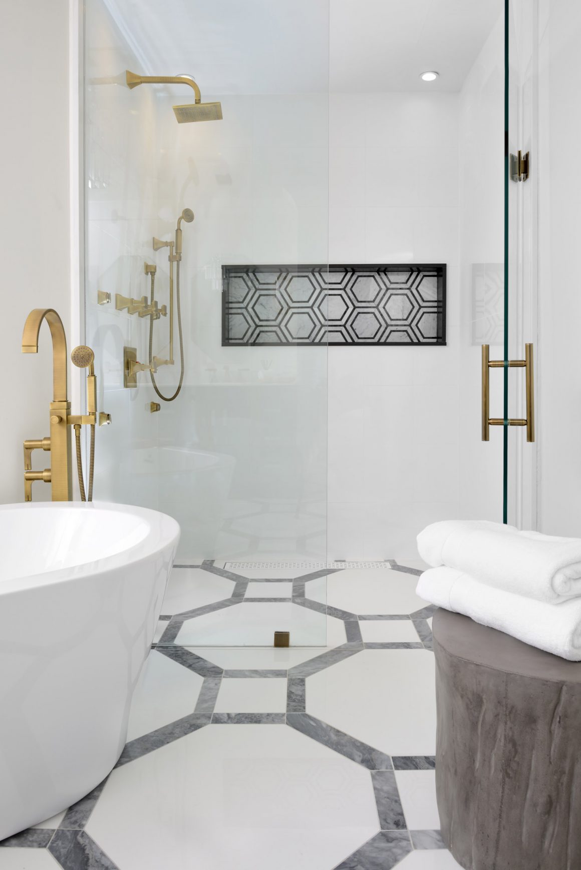
Each of the bathrooms has its own wow factor. For the master bath, distinctive hexagonal floor tiles fulfill this mission. “Pictures posted of it on social media have generated more response than anything else I’ve done,” says Gelman, “and I’ve been designing for over 14 years.” She wanted to add the luxurious look of marble without the high cost. Her solution: purchase 24-inch square porcelain tiles and have her installer slice the corners off. Then, long rectangular tiles were cut to frame them. A marble mosaic insert in the shower area echoes the motif.
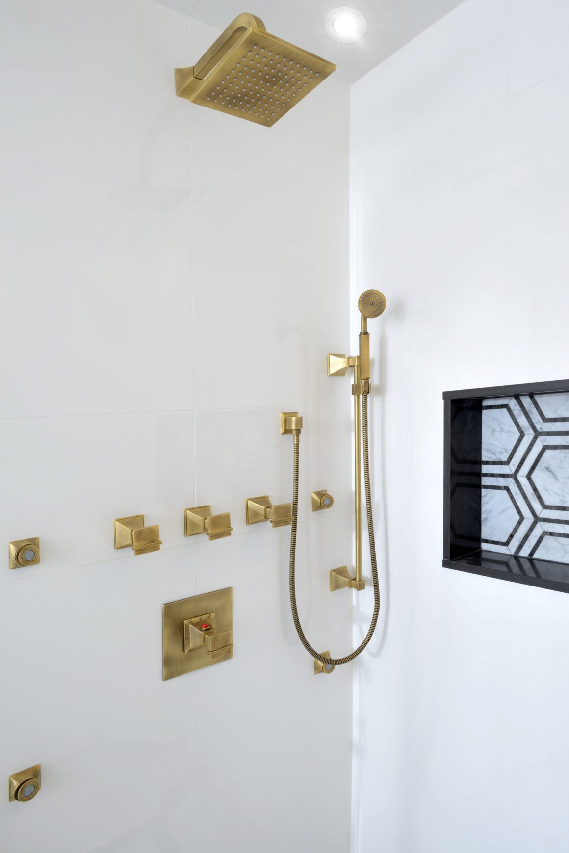
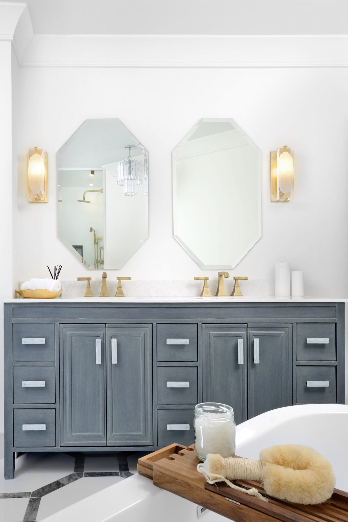
Brushed brass fixtures ramp up the luxury factor, something the designer tries to do with each project, while also being on-trend. The warm metal finish on the shower’s four jets and handheld and rain showerheads pops against the cool-toned tiles. And it makes the standalone tub even more of a distinctive feature. To keep within budget, Gelman installed an off-the-shelf vanity with a beachy weathered finish rather than a custom version.
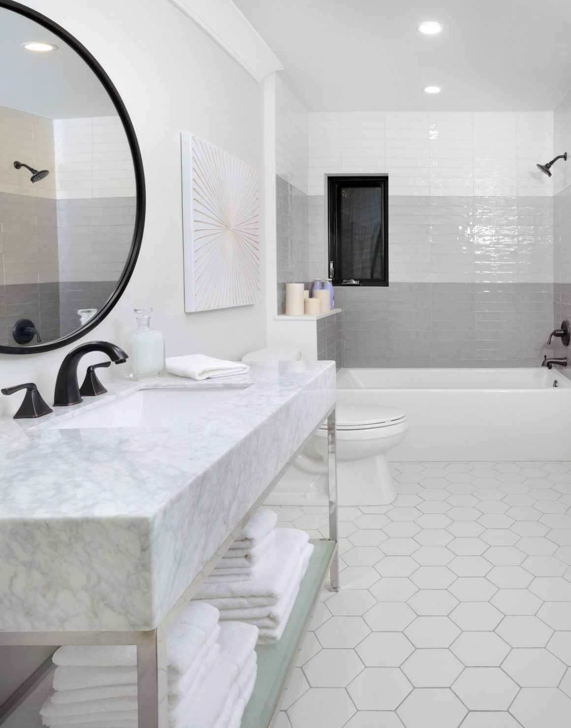
The hexagon theme was carried into the adjacent ensuite bathroom. The focal feature was created in the bathtub and shower area. Subway tiles were laid in bands of three colours, shading from dark grey at the base to medium grey to white at the top for an ombre effect. Black was used on the mirror over the sink and faucet atop the elegant marble-topped contemporary vanity.
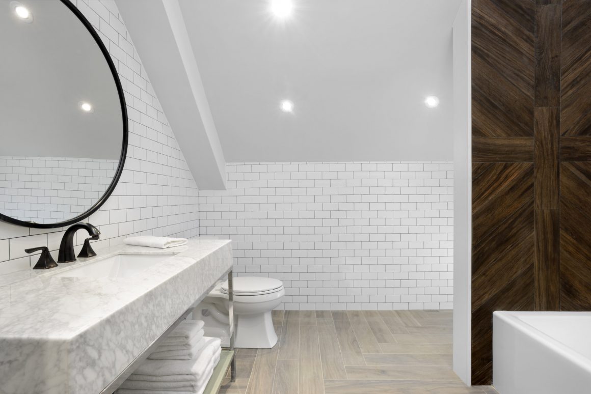
“Many people think that if you do, say, chrome fixtures in one bathroom, you have to do the same throughout the house,” says Brittney Marino, design project manager at Erica Gelman Design. “You absolutely can mix them, as long as you do it in the right way.” The black and chrome touches in this bathroom diverge from the brass used in the master bathroom adjacent. But the similar colour palette and hexagon theme create cohesiveness.
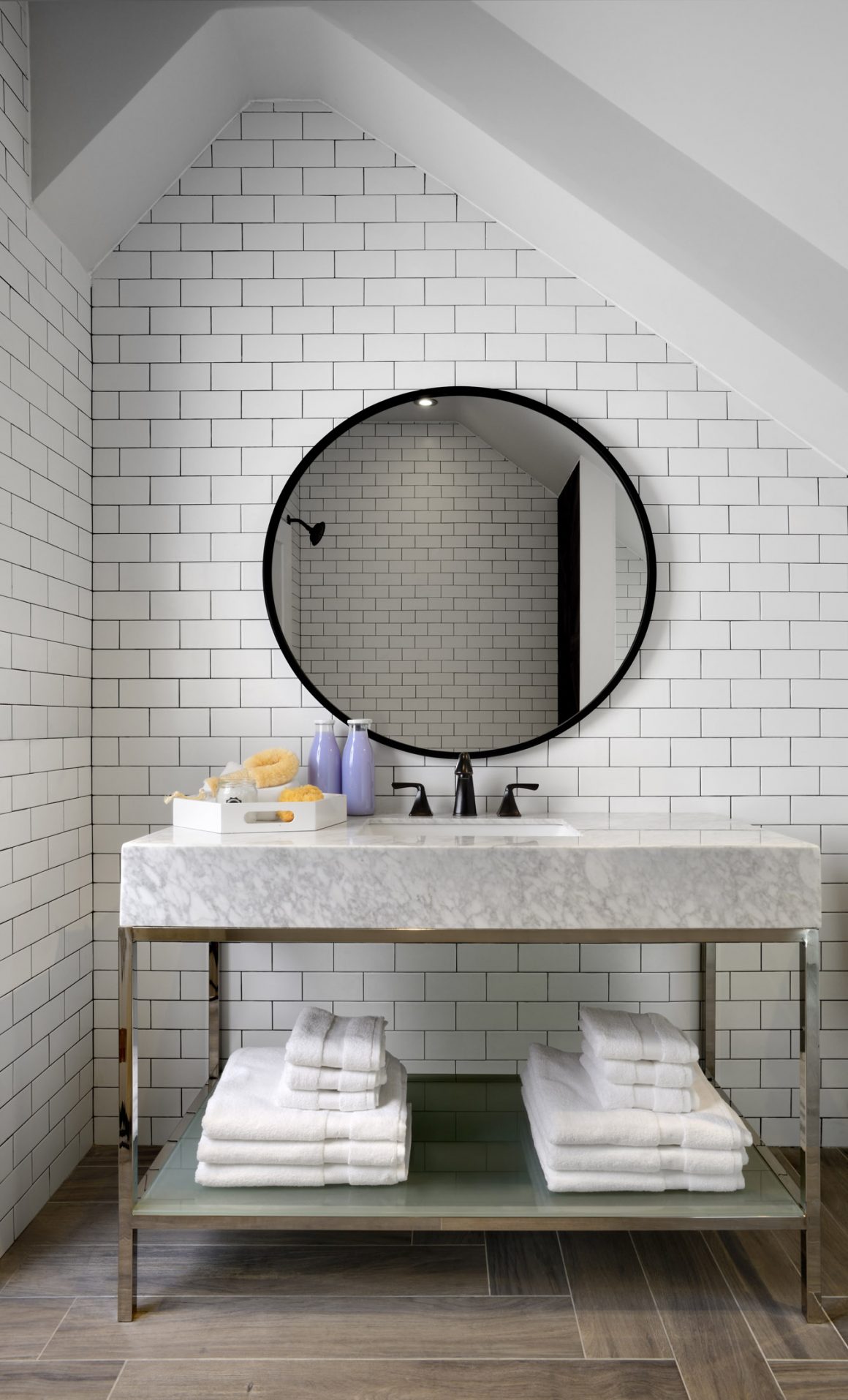
A completely different approach to finishes was taken for the third-floor bathroom, which is shared by two bedrooms. Because it’s under the eaves, interesting ceiling angles were formed. The designers emphasized them by covering the wall underneath with white subway tiles. Underfoot, porcelain tiles that mimic hardwood in a driftwood-grey colour with a warm undertone were laid in a herringbone pattern.
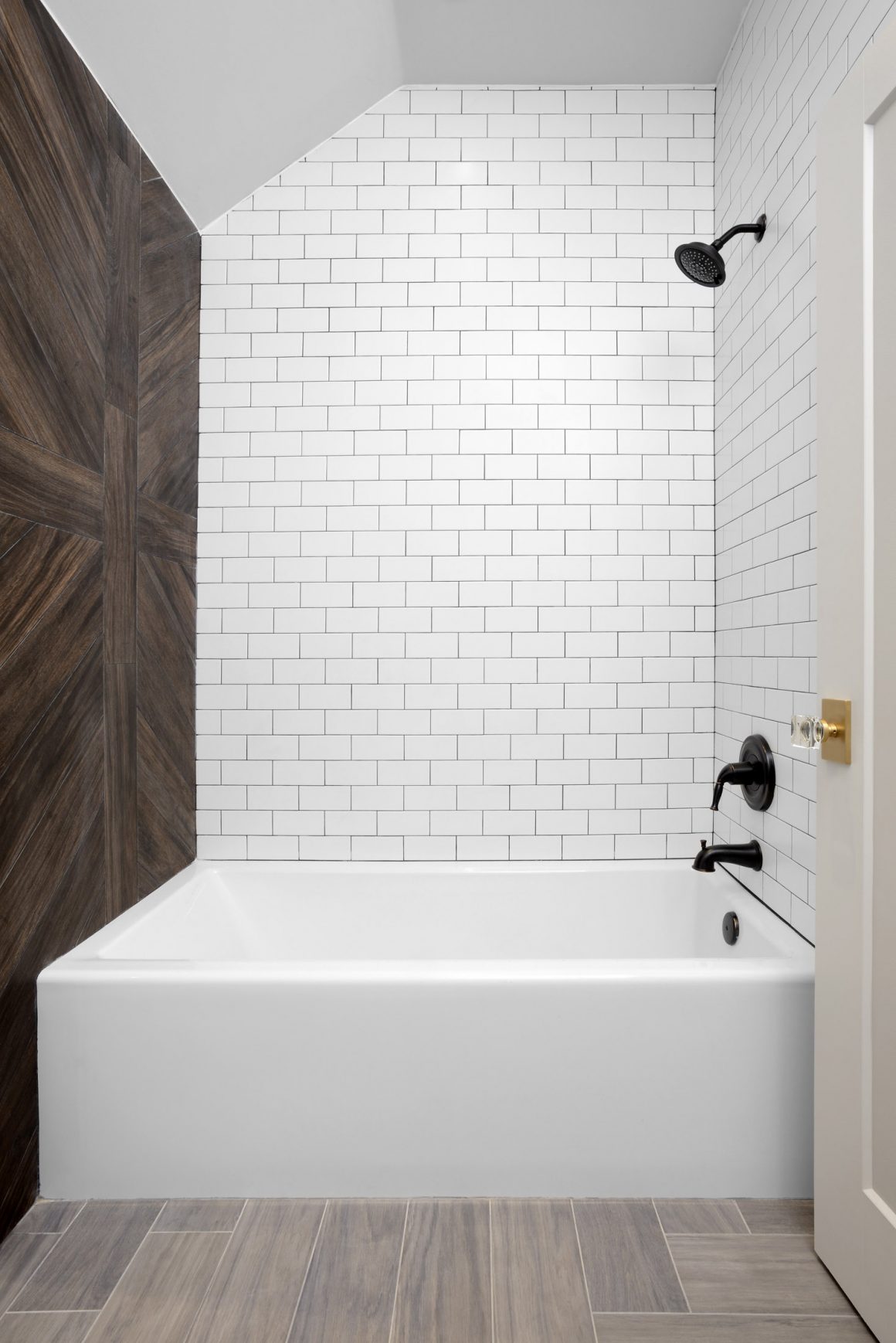
The toilet, originally facing anyone entering the bathroom, was moved. A wall was erected to cordon off the shower area. As well, it provides visual impact, thanks to simulated-wood tiles, this time in a warm walnut tone arranged in a cross-and-chevron pattern. “We went with the same marble vanity and black faucet and mirror used on the second-floor bathroom here,” says Marino. “This helped create a relationship between the two floors.”
In the end, each of the three bathrooms has a distinct personality and contributes to the overall design. “It shows you can have individual rooms with different identities, yet each can still feel like part of same space,” says Gelman. •
House of Design by Erica Gelman
www.house-of-design.ca
905-886-9008

