
THE STRONG AND INTENSE TYPE
Trends in colour are a long way from the pale neutrals that have dominated in recent years
BY CHERYL CORNACCHIA
When Behr launched its 2018 Colour of the Year earlier this year, the North American paint manufacturer captured the public imagination by erecting a full-sized, pop-up house in the middle of New York’s Grand Central Station. The house featured Behr’s latest palette of colours, including its signature 2018 colour called In the Moment, a sublime blue-green. Although the house was up for only a couple of days, it was seen by thousands of commuters, many of whom undoubtedly went home with ideas for colours in their own homes.

Similar pop-up events are not in the offing for Toronto’s Union Station or for Montreal’s Central Station, but bright, bold, even brash colours are making a comeback after years of neutral tones. There were hints of this trend last year when Pantone introduced its 2017 Colour of the Year: Greenery. But this year, one paint company after another has unveiled more daring colours. The trend is moving away from off-whites, pastels and neutral greys to deeper, more vibrant colours and jewel tones.
Just as financial analysts have been able to document a coincidental correlation between the direction of skirt hemlines and stock-market heights, so too have paint companies noticed that consumer preference for bold paint colours moves in tandem with consumer confidence in the economy. In contrast to rising unemployment, which accompanied the economic downturn that began in 2008, unemployment rates today have fallen to historic lows.
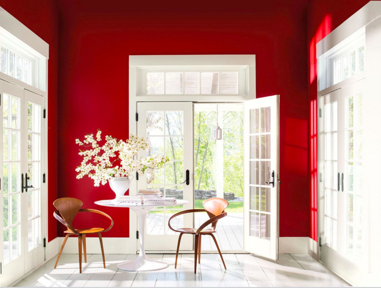
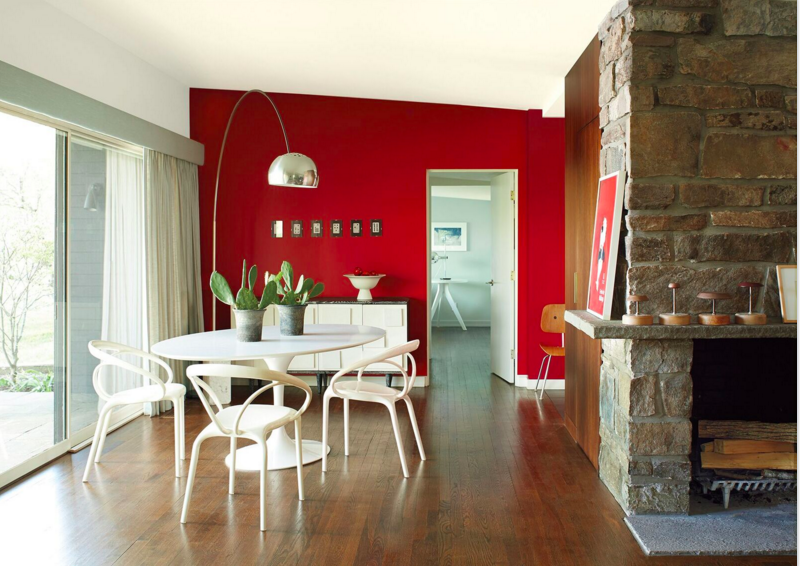
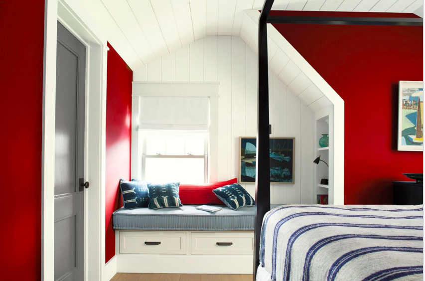
And colour trends have moved accordingly, a good example of which is Benjamin Moore’s 2018 Colour of the Year, Caliente, a vibrant red infused with orange tones. “It’s confident, it’s strong, it’s warm, it’s bold; I love it,” says Sophie Bergeron, a Benjamin Moore colour expert. “We used to think of red as an accent colour. This colour can be used in a full room.”
Twenty years ago, says Bergeron, reds were pure reds and blues were pure blues, meaning they could have an aggressive feel, and be difficult to use because they lacked undertones. Oranges and greys warm up other colours and add depth, she says.
Red also goes well in companionship with other colours, she says. “It has been with us from prehistoric times and cave art. It has meant different things in different eras. It has been the colour of the clergy, and also of royalty. Today, it is eclectic – mid-century, modern, anything you want it to be.”
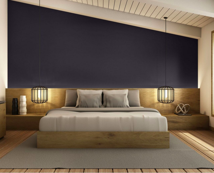
In fact, adds Bergeron, Benjamin Moore cited the shift to dark colours last year when it named Shadow as its 2017 Colour of the Year. “Shadow is a dark, strong, purple,” she says. “Before that, from 2012 to 2016, to be precise, we were talking about light pastels and soft colours.”
Erika Woelfel, Behr’s vice president colour and creative services, explains that neutral greys were perfect when spending habits were more conservative. It was a colour with long wall life. But those neutrals are “no longer a forecasting trend. They have acquired mass appeal and the trend is tapering off in favour of warmer neutrals in the brown, tan and sandy beige range.”
Behr’s first-ever colour of the year, called In the Moment, can be “fashion-forward, edgy” if paired with a bold orange or green; it can be calming if coupled with a soft gold, Woelfel says.
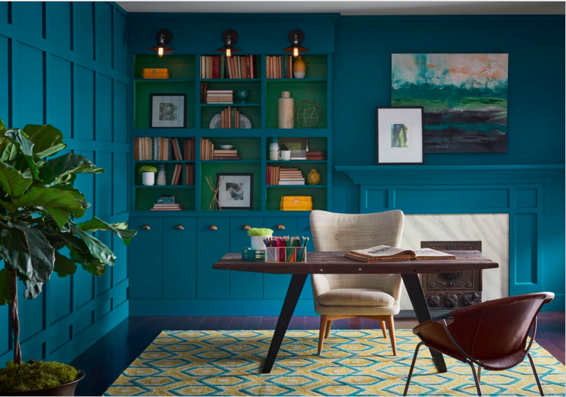
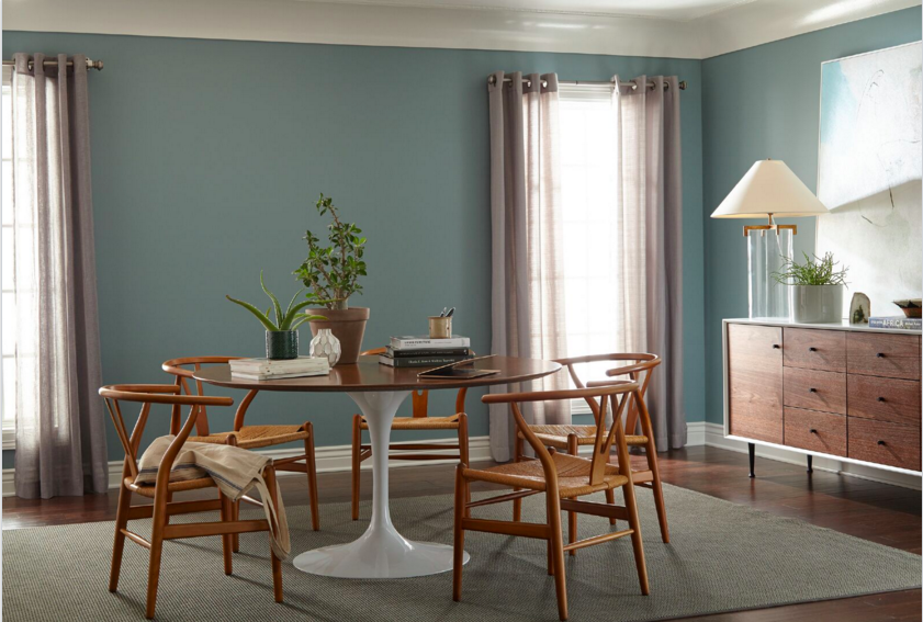
Oceanside, Sherwin Williams’s 2018 Colour of the Year, is a bold blue-green, with a hint of teal. Michael Plank, the company’s director of colour marketing, says several factors influenced the choice. One is the colour’s association with water. In recent years, Plank says, water has figured prominently in home decor – fountains and infinity pools, for instance, help evoke a calming, meditative ambience. Oceanside’s aquatic undertones are intended to tap into this trend, either on an accent wall or throughout an entire room.
The rich blue-green of Oceanside, says Plank, also pairs nicely with other colours, such as saturated reds, to create a more eclectic look. After years of consumer preference for neutral tones, Plank adds, there is growing consumer demand for “more saturated, edgy colours,” especially in such cosmopolitan settings as Toronto, Montreal and Vancouver.
In fact, he says, this move to bolder colours may be tied to immigration and globalization trends. To be sure, the colourful Shanghai skyline at night, cathedrals of Moscow and rickshaws of Jakarta are all good examples of how other cultures value bold colours. “There’s no science to it,” says Plank. “It just seemed the time was right” for a move to bold, something quite different from Sherwin Williams’s 2016 showcase colour Alabaster, an off-white, and the company’s 2017 Colour of the Year: Poised Taupe, a grey-brown warm neutral.
Sico and PPG Paints have both made their own bold statements for 2018 by identifying shades of black as their colours of the year. Sico calls its black Cast Iron, and PPG Paints has named its own version Black Flame. Although black is often described as the absence of colour, these companies are marketing it as the “new neutral,” suggesting that notions of neutral itself are poised to become bolder in 2018 and beyond.
“Black Flame acts like a black curtain, allowing your other decor elements to take centre stage,” says Dee Schlotter, PPG Paint’s senior colour marketing manager. “It’s a fantastic blend of black and indigo, two classic hues. The black creates the silence we crave in an information-heavy world while the indigo offers possibility and deep hopefulness.”
Black is under-appreciated as a paint colour, says Mylène Gèvry, senior marketing manager for SICO Paint in Longueuil, Quebec. Gèvry says Cast Iron pairs nicely with pinks, off-whites, brown-greys and nutmeg tones, adding depth to a room. “Dare to go darker,” she tells people. “This deep, grounding, black hue offers a respite from life’s worries.”
A respite from life’s worries …… which, after all, is what every home should offer.


