EXPLORE
Movato
  • Interior Design
    • Bathroom
    • Bedroom
    • Decor
    • Design Finds
    • Kitchen
    • Living Room
    • Paint
    • Renovations
  • Architecture
  • Landscape
  • Lifestyle
    • People
    • Places
    • Things
  • About Us
Movato
EXPLORE
Home in Canada
No Result
View All Result

Colour-Crazy

The year ahead promises to give us several luscious new colours for our homes

by Home in Canada
January 30, 2020
Share on FacebookPin itTweet itSend it

New colours for a new decade. This is the time of year when colour watchers introduce the new hues for the year ahead. Essential Home, a Mid-century-Modern furniture brand that takes its design cues from the 1930s and 1960s and turns them into furnishings, is hot for pastels.

Here are a few of the colourful looks you can expect to see in the months ahead:
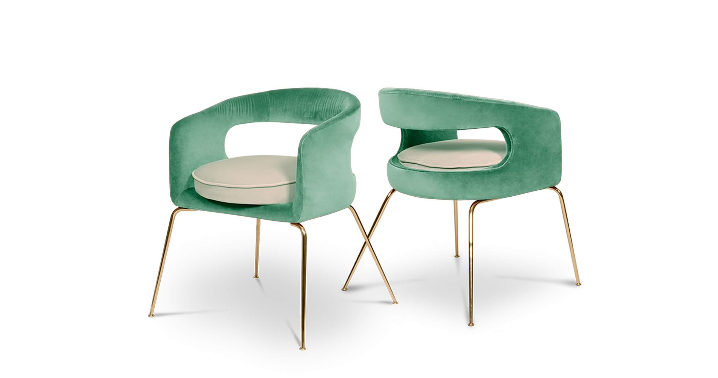
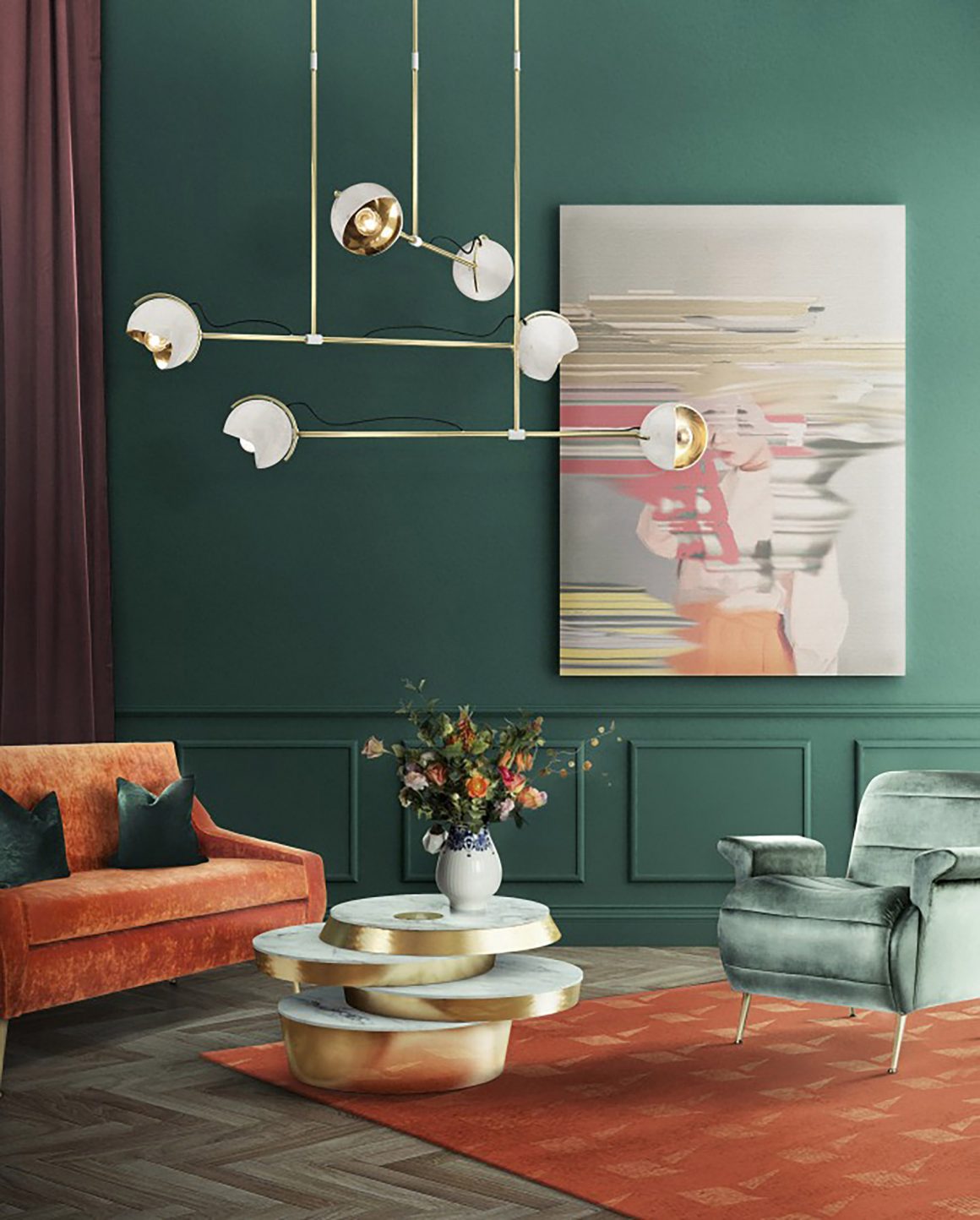
Neo Mint
Essential Home deems this to be the top colour for 2020. Chosen to harmonize science and technology with nature, Neo Mint also inspires some nostalgia for the past, while considering the present and future, too.

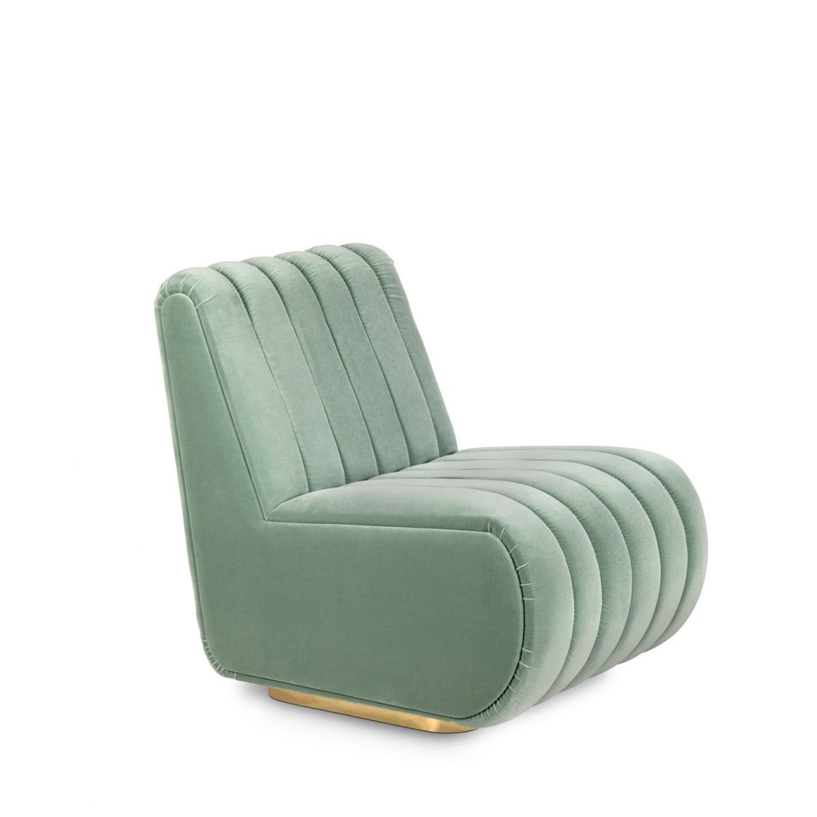
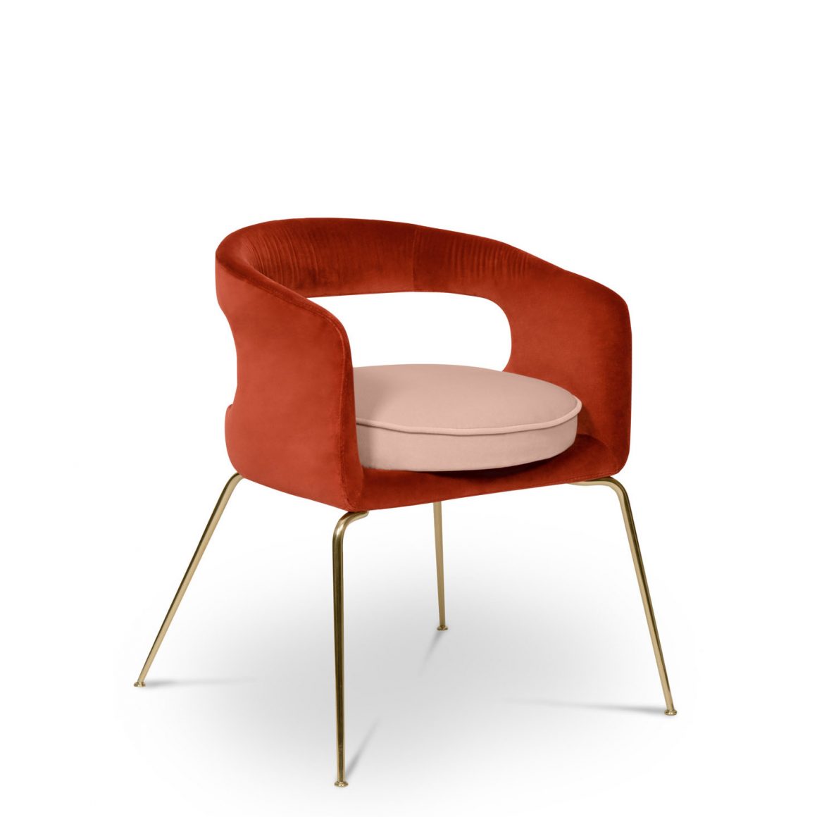
When used as an accent or contrast to such neutrals as taupe, minty greens can pop. For a fresh look, pair it with white or blue to echo the sea. If you want to call in associations with nature and the outdoors, mint green also looks great contrasted with similar shades of green. Combine with pastel pink or dusty rose for a pink-and-green combo, If you love purple, try lilac. Neo mint is a complementary colour to coral, defined by Pantone as the 2019 Color of the Year.

Not a fan of greens? Consider:

Mellow Yellow
It’s impossible to love Mid-century Modern design without being nostalgic. Sun-soaked yellow has a nostalgic feel that recalls the popular mustard tone of the 1960s, which has seen a comeback in recent years. Mellow Yellow is upbeat and versatile.
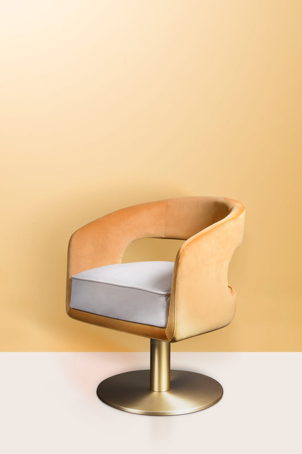
Cantaloupe
This is a subdued version of the oranges that have made waves recently, with a feel-good quality that is perfect for high summer. Traditionally regarded as a feminine colour, Cantaloupe has a broad appeal.

Cassis
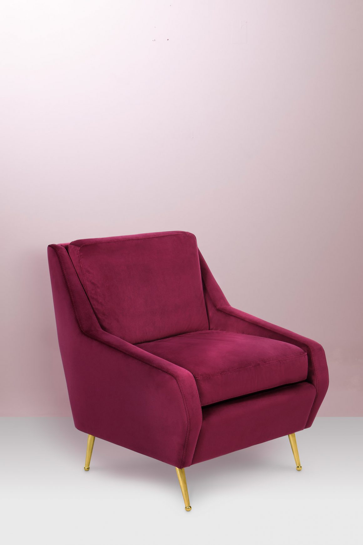
Grading from crushed blackcurrant to rich aubergine, the deep purplish tones of the elegantly understated Cassis draw inspiration from nature. A natural evolution from Millennial pink, as it continues the appeal.

www.essentialhome.eu

Tags: colourDecoratingdesignfurnitureTrends

Related Posts

Queen of Colour
Design

Queen of Colour

January 27, 2022

Photography: Donna Griffith https://www.youtube.com/watch?v=zITY9ORNpHo&t=4s It was a grey and blustery day in February, and I was thrilled that I was...

An Icon For Our Time
Architecture

An Icon For Our Time

March 11, 2021

Photography: James Law https://www.youtube.com/watch?v=58olvq62_WU Using the most innovative building materials as his paint brushes, and unusual cladding as his brush...

Nice Curves!
furniture

Nice Curves!

February 22, 2021

Photos courtesy of Gallotti&Radice Autumn is here, even though it seems like yesterday when we were all wishing for some...

Imari Ware
Decor

Imari Ware

December 4, 2020

English imari plates, 1 Masons, 2 Royal Crown Derby c 1920 - 1960 Imari. Is it the name of a...

The Future Is Karim
Design

The Future Is Karim

December 2, 2020

Photography: Jeffrey Hornstein https://www.youtube.com/watch?v=UdAqVqfEY3o&t=244s Publisher Sharon Azrieli's video interview with Karim Rashid Authentic collection by Riva 1920 The man is a...

Pandemic-Influenced Design
Design

Pandemic-Influenced Design

November 24, 2020

Sinks near the front entrance for hand-washing. Guest bedrooms and broom closets that double as home offices. Backyard vegetable gardens....

Next Post
In Living Colour

In Living Colour

  • Advertise With Us
  • Contact Us
  • Digital Issues
Made with ❤️ in Montréal

© 2020 Home in Canada

No Result
View All Result
  • Interior Design
    • Bathroom
    • Bedroom
    • Decor
    • Design Finds
    • Kitchen
    • Living Room
    • Paint
    • Renovations
  • Architecture
  • Landscape
  • Lifestyle
    • People
    • Places
    • Things
  • About Us

© 2020 Home in Canada