PHOTOGRAPHY: VALERIE WILCOX
STYLING: ELENA GOUCHTCHINA
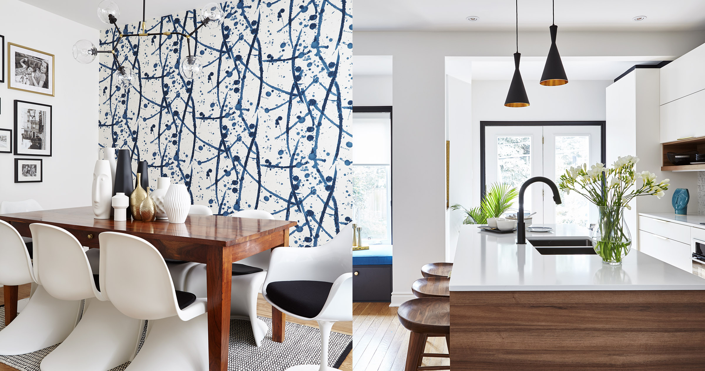
Wallpaper may be an afterthought for some. But it provided a starting point for the style update of this kitchen in The Beaches area, says designer Elena Gouchtchina, founder and design principal at Maison Interiors. “The kitchen island overlooks a big empty wall in the dining area,” she says. “I wanted to fill it with something that would look like a giant painting and inject colour and pattern.”
Her choice: Leo wallpaper from the venerable Parisian fabric house Pierre Frey. Designed in conjunction with the iconic ceramic studio Atelier Buffile in Aix-en-Provence, its splattered glaze pattern has an abstract look that evokes the works of Jackson Pollock. The colours used inspired the kitchen’s white, black and blue scheme.
The interior designer already had an idea of the homeowners’ tastes. Squash coach Greg Rowe and his wife Jen, a power company executive, had hired Gouchtchina the previous year to revamp the living room of their three-storey home. They loved its new contemporary look with a nod to Mid-century Modern design. Yet Gouchtchina worried they might find the wallpaper “over-the-top.” To her relief, the couple were immediately onboard.
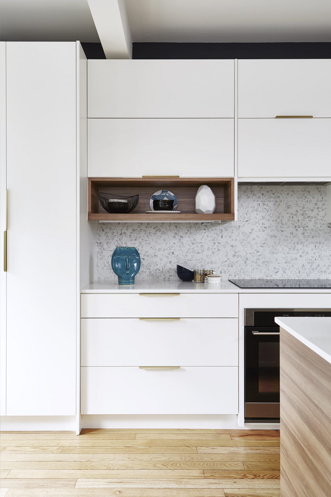
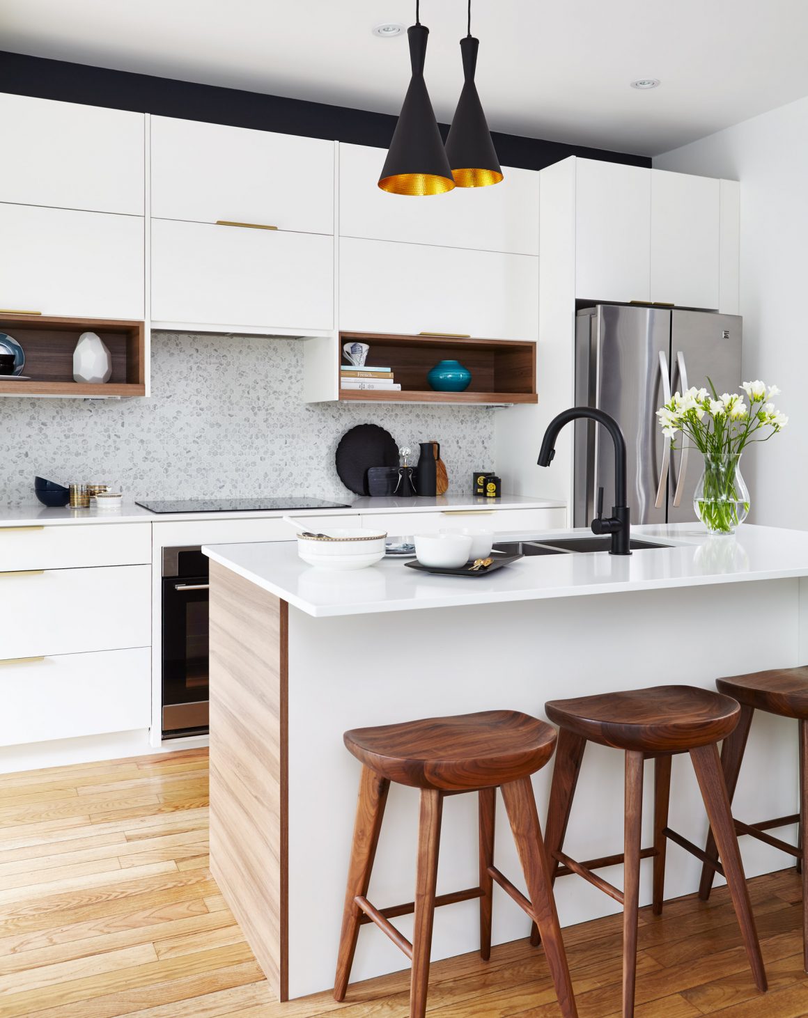
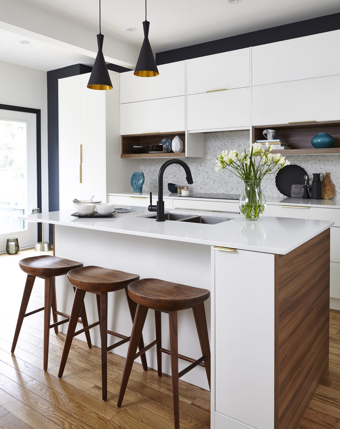
The designer first addressed the more practical concern of a new layout. The awkwardly placed refrigerator was moved and the half-moon-shaped island, a conversation piece that proved impractical to work at, was removed. So were the two-decades-old yellowish-beige builder’s basic cabinets and black countertops. By placing all cabinetry along one wall, it was possible to install a rectangular six-foot long island. A pantry was also enlarged and equipped with space-saving pullout shelving.
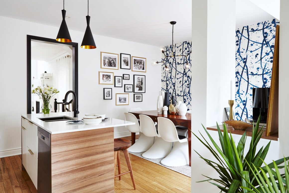
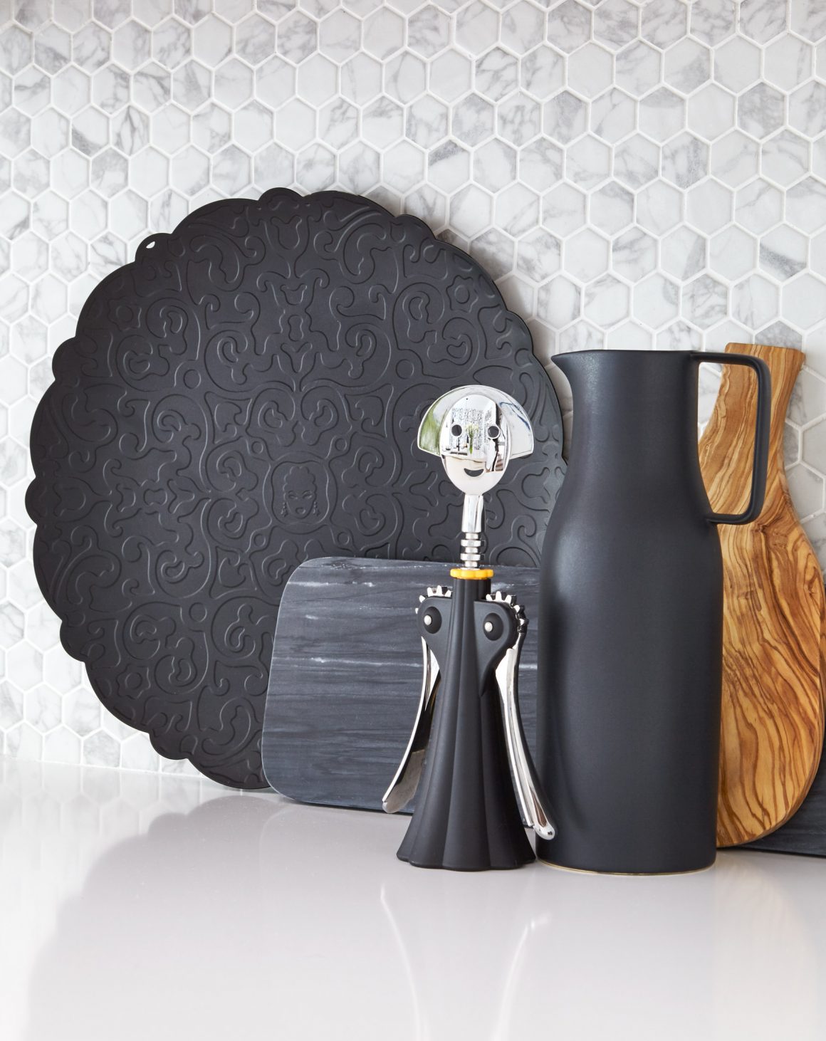
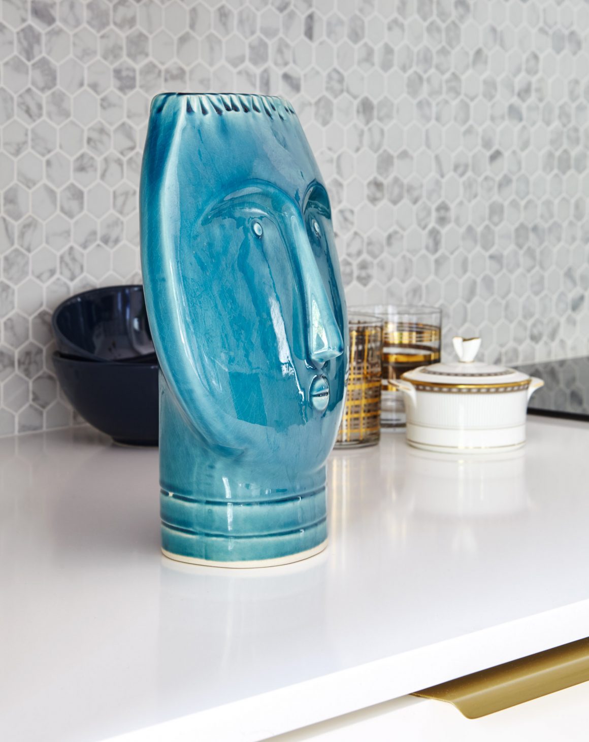
“After we toured the showrooms, the homeowners decided they loved the look of a white kitchen,” Gouchtchina says. “And minimizing clutter was also a big issue.” To ensure a seamless visual flow, the designer had the flat-front cabinet doors painted the same shade of warm white as the walls, and topped the island and counters with white quartz. Textural interest is provided by the hexagonal backsplash tiles made of recycled glass that resemble Statuario marble.
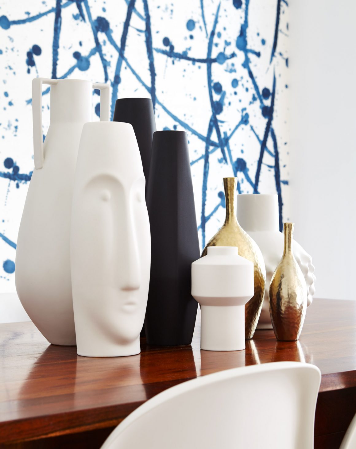
Gouchtchina judiciously placed wood accents to inject some much-needed warmth. To echo the living room shelving, two small open shelves in the kitchen are lined with walnut as are both sides of the island. A walnut shelf was added to a formerly awkward open niche feature, which now serves to display decorative objects.

As well, the original hardwood floors were retained over the entire main floor. But the combination of red and white oak posed a challenge for the designer. A uniform light stain was key to the look she wanted. After darker areas were bleached, the right custom golden oak stain was applied.
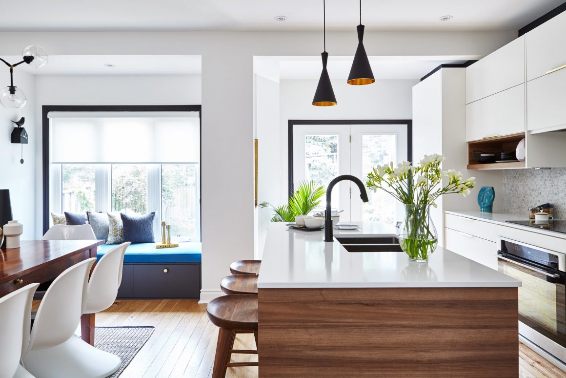
For drama, the wall behind the cabinets was painted a midnight blue, and the windows were framed in black. A matte black faucet is teamed with a stainless steel sink. “At first we were nervous about the dark accents,” says homeowner Greg Rowe. “But they are perfect with the wallpaper, which is my favourite part of the kitchen.”
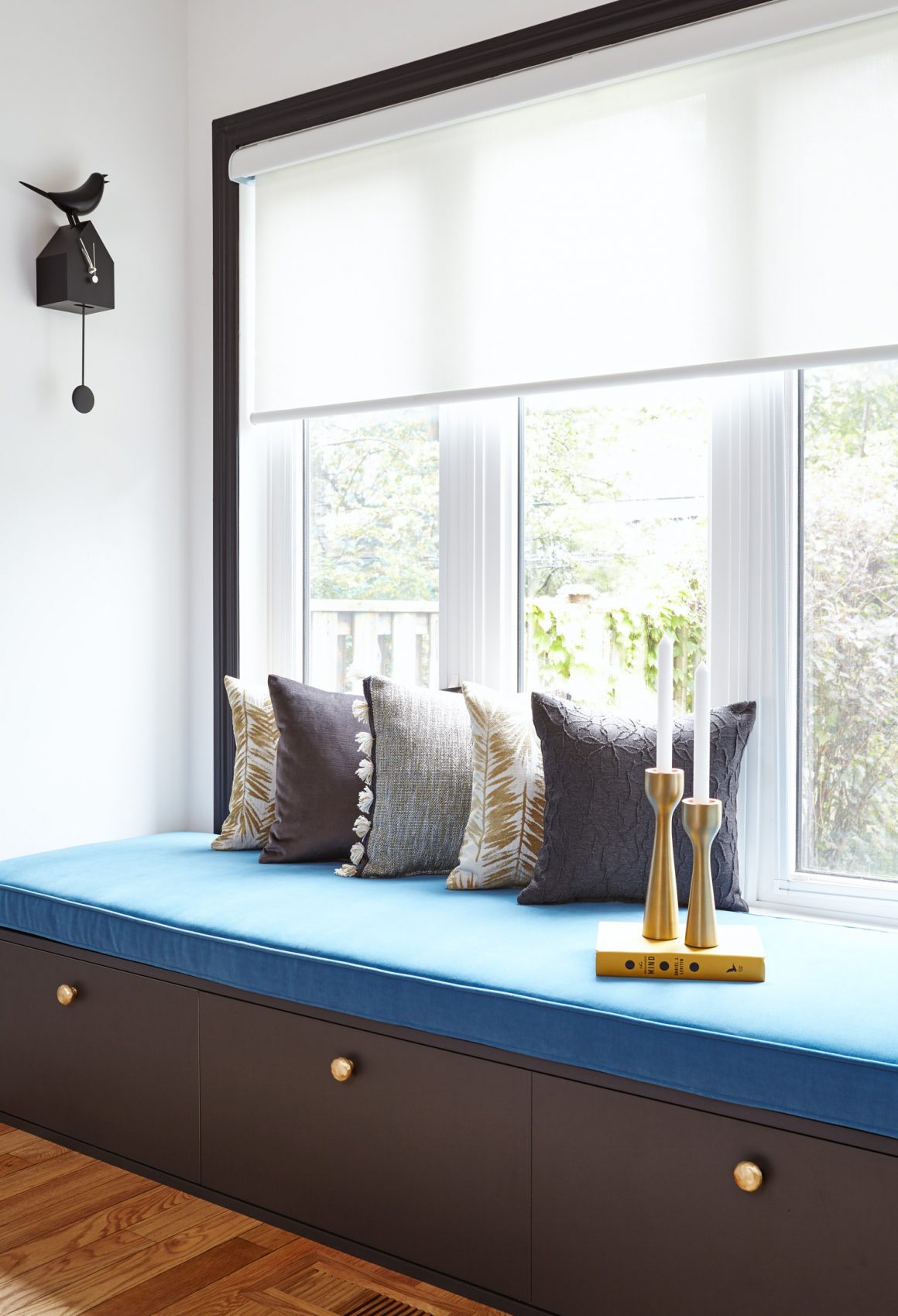
The spot his wife and daughters – Natasha, 20, and Chloe, 17 – gravitate to most is the 82-inch-long bench, placed under the window. They find its comfy cushions the perfect spot to sit on and gaze out at the backyard on one side, or interact with people in the kitchen on the other. Three large storage drawers hold such things as towels for when the family uses the outdoor hot tub. Jen especially loves to curl up on the bench on Saturday mornings with a mug of tea.
In the end, the family enjoys all aspects of their new kitchen. “It’s functional and beautiful, and a real pleasure to hang out in,” Greg says. “The style is contemporary but there are so many fun, personal touches that really make it us.” •
Maison Interiors
www.maisoninteriors.ca
647-938-2756

