Couple renovates townhouse and discovers less is more
BY PHILLIPA RISPIN
STYLING: DENISE PALISAITIS
The new Nuns’ Island townhouse was in a condo development called l’Alternative. The couple bought it, raised a daughter in it, and started a business in it. After 30 years, they were still in the same home, but it was feeling tired and out of date. There had to be an alternative.
There was: to renovate. “We had always liked the structure, the bones,” says the husband, an ad executive with his own agency and a strong background in graphic design. “It had a lot of unrealized potential.”
His wife, the executive director of a charity that enables young mothers to pursue post-secondary education, says that it had originally been “pretty and boho but was now showing its age. It was time for a change.”
And change it they did. They also tweaked their way of life. “We pared down our possessions,” she says. “We had a more European vision of life in small spaces, and we did that by making the place more functional.”
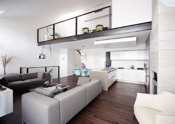
The home’s 1,100 square feet begin with the open-plan living, dining and kitchen space on the main floor. Then it’s four steps up to the two bedrooms and main bathroom. It’s up again to the mezzanine, which overlooks the living area, is used as an office and also hides another full bathroom with built-in laundry.
The home’s redesign takes advantage of every bit of storage room, with built-ins shoehorned into small spaces. The kitchen design is also maximized. “We increased the kitchen footprint by eight inches, which made a huge difference,” he says.
“Giancarlo Bonaldi, of Emporio Cuisine, even measured our dishes,” she says. “The kitchen was made in Italy and shipped over here, and it fit within a quarter inch.”
“I’ve never seen tolerances this fine,” he adds.
The eight inches added to the kitchen area, although important, were minimal. The main bathroom gain was maximal, managed by borrowing the entire walk-in closet area from the master bedroom. That was compensated for by building a row of closets down one side of the bedroom. The homeowners don’t miss the lost space: “We can get the most out of a small space,” she says.
“We always gravitated to a more minimal look,” he adds.
Sometimes the minimal look required maximal ingenuity. All the floors and walls are concrete, so changing plumbing and wiring would have been a nightmare. The electrical entry was upgraded but stayed where it was. Toilets were replaced but not moved, likewise for the kitchen sink. But how do you plumb a bathtub that sits where a bedroom closet used to be? Homeowners, designer, contractor, plumber, and carpenter together devised a platform raised just enough to route the pipes across the floor to the existing drain. The tub platform appears to float – a neat trick for such a substantial free-standing piece.
The tub, like the rest of the decor, reflects the homeowners’ desire for a stripped-down but warm aesthetic. “To me, the place had screamed post-modern, hidden under layers of less than ideal design,” he says. “We went for post-modern and comfortable,” she adds.
In their renovation quest, the homeowners overlooked no details. They replaced doorknobs and baseboard heaters. They replaced standard doors with ceiling-height ones that increase the feeling of spaciousness by drawing the eye upward. On the mezzanine, the bathroom acquired a space-saving pocket door.
The original concrete floors had been covered in most places by carpeting. The homeowners ripped out the carpeting and had the concrete resurfaced. While choosing tiles for the bathroom floor and wall at BAB, they discovered the red oak engineered flooring now on their main floor. The bathroom floors are tiled, but elsewhere the floors are simply polished concrete. The homeowners are so happy with the result that they haven’t yet looked for area rugs.
They’re particularly pleased to have found a Quebec company, Slik, which gave them stairwell and mezzanine railings that fit so well with their concept. The wire-and-metal-stanchion railings add a distinct industrial look while not obscuring sightlines. The same company suggested a clever design trick for the forward edge of the mezzanine, which was bland concrete: a faux I-beam that gives an edge both literally and aesthetically.
Both wife and husband are generous with their praise for designer Bridgit Bienstock of BKB Interiors. They had a firm idea of the design and had done extensive research (including buying living room furniture and choosing the kitchen) before Bienstock was involved, but she was vital in helping them realize their vision.
“She was a grounding force, important to the success of the project,” says the husband. “She was on top of the project continuously.” Bienstock also brought in a contractor, Tony Moriello, whom the homeowners characterize as “wonderful.”
The homeowners note that their design aesthetic has a strong European influence along with input from the local scene. “This home has a nice mix of what’s out there,” says he. “Do your homework. There are good people in Quebec to work with.”
“All the local artisans – it was a revelation for us,” she adds.
The renovation took nearly four months, during which time they lived elsewhere while visiting the site almost daily. It wasn’t an onerous situation and, although they’re glad it’s over, they were happy to be involved in the process.
“We had an immense amount of fun doing it,” he says.
Says she, “It was a labour of love.”
Cutlines:
LIVING ROOM:
The fireplace was built out and is now an extension of the kitchen wall as one continuous design element. The fireplace surround is a faux-concrete board from BAB. The large modern windows are a key design feature in the space. The Moooi pendant light was long coveted by the wife; the Arco floor lamp came from the husband’s pre-marriage apartment. Furnishings: Latitude North.
STAIRWELL TO MEZZANINE:
The husband refers to the Italian silicone lighting fixtures in the stairwell leading to the mezzanine as “our Dr. Seuss light.” “It’s a way to inject some colour into the design,” his wife adds.
MASTER BEDROOM:
The master bedroom features a pendant light by Ray Power, called Link. The bedside Birdie lamps are by Foscarini. Bedside tables: BAB.
MAIN BATHROOM:
The Artemide light in the bathroom creates reflections on the ceiling that look like water droplets, according to the wife.


