PHOTOGRAPHY: GILLIAN JACKSON
SYLING: TARA FINLAY
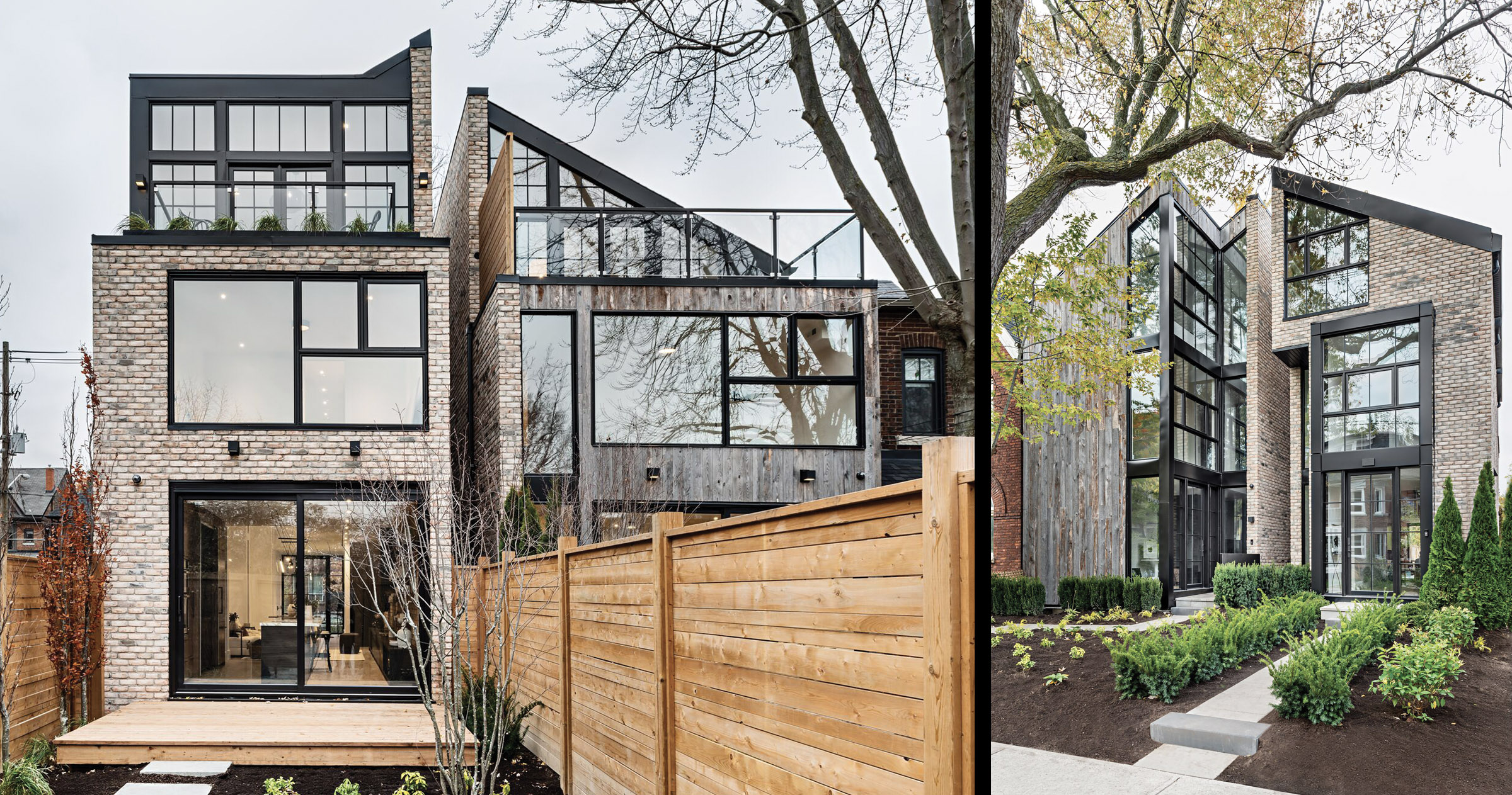
One spring morning in 2016 while he was en route to view a property for sale in High Park, Toronto designer Nicholas Ancerl spotted a pair of neglected semi-detached homes. Owned by a nearby church, the houses had long been vacant and were in such disrepair that Ancerl could see the sky from inside, thanks to a large hole in the roof.
Undeterred, Ancerl, who grew up in this dense urban neighbourhood, with its historic Victorian houses, quickly bought both lots.
He and his design team then brainstormed to define the scope.
“I wanted it to fit within the neigbourhood, and when we found an image of a converted barn with a modern interior, that became our concept,” recalls Ancerl, who owns Ancerl Studio.
Project manager Ashley Robertson suggested building a pair of detached homes that appear as a single house or as semi-detached. They would be in a traditional triangular barn shape.
“The idea was that walking down the street, it looks like one house, but when you stand right in front of it, you see the break between them,” Ancerl says.
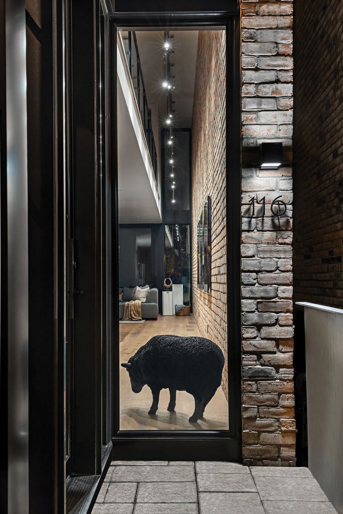
He ran brick all the way up both the exterior and interior adjoining walls, to emphasize the break point between the two homes. To create movement along the facade, he designed the home across five planes, each featuring a sloping roof that meets to form a hollow peak. Narrow recessed slits were cut into the side elevations with 20-foot-high windows bringing natural light into the centre of the house. Cladding the exterior with yellow-toned heritage brick and vertical barnboard planks softened the angular planes and black metal accents, while paying homage to this established neighbourhood.
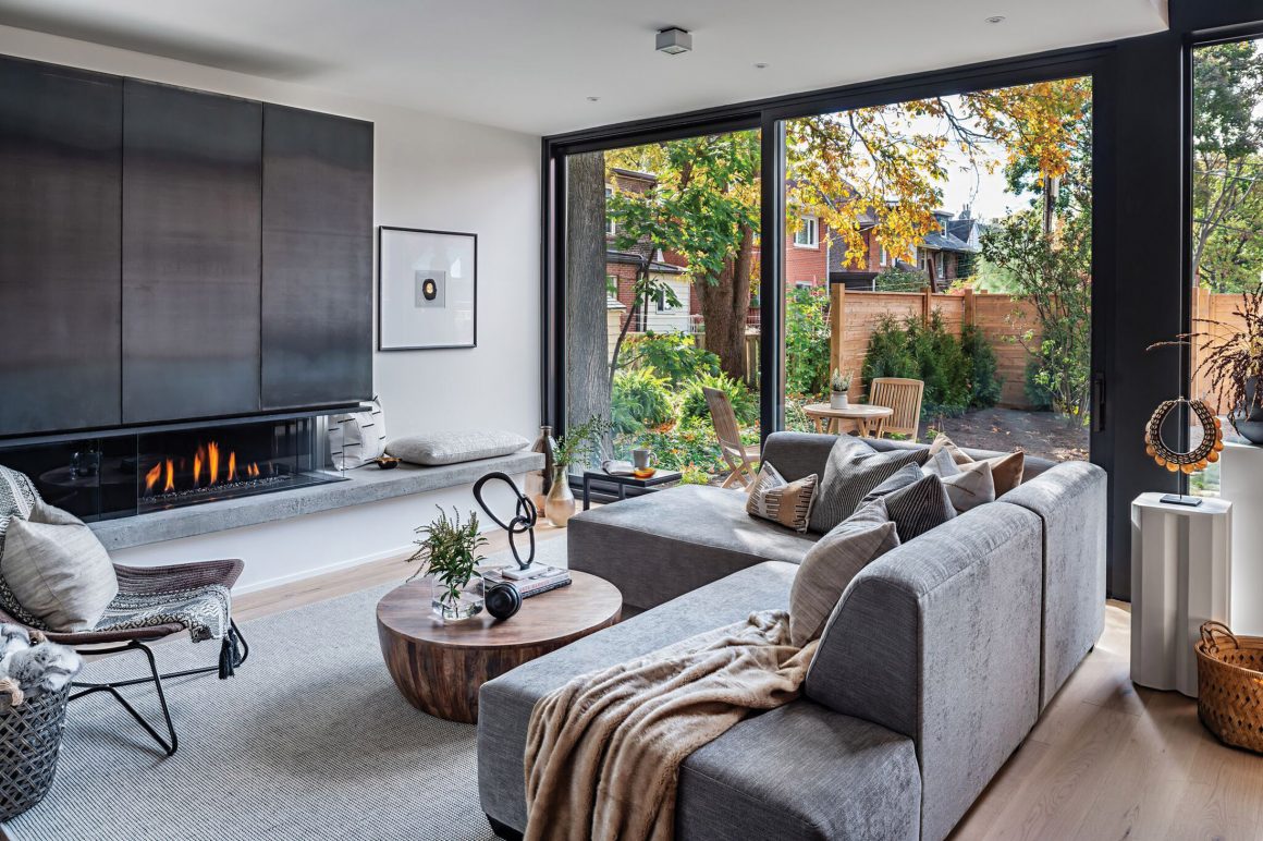
Over the 19-month construction period, Ancerl honed his vision for each property, keeping the design coherent. Each home has three bedrooms and four bathrooms. Each incorporates rustic and eclectic touches, and Ancerl juxtaposed materials, textures and unexpected combinations to forge two ultra-modern yet comfortable spaces.
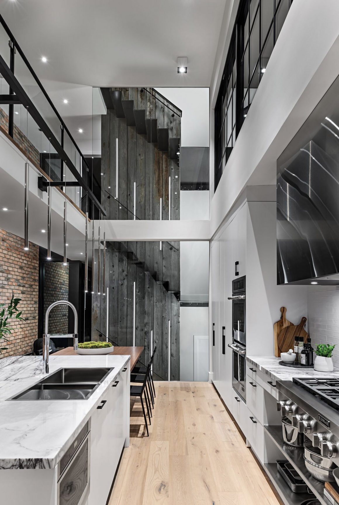
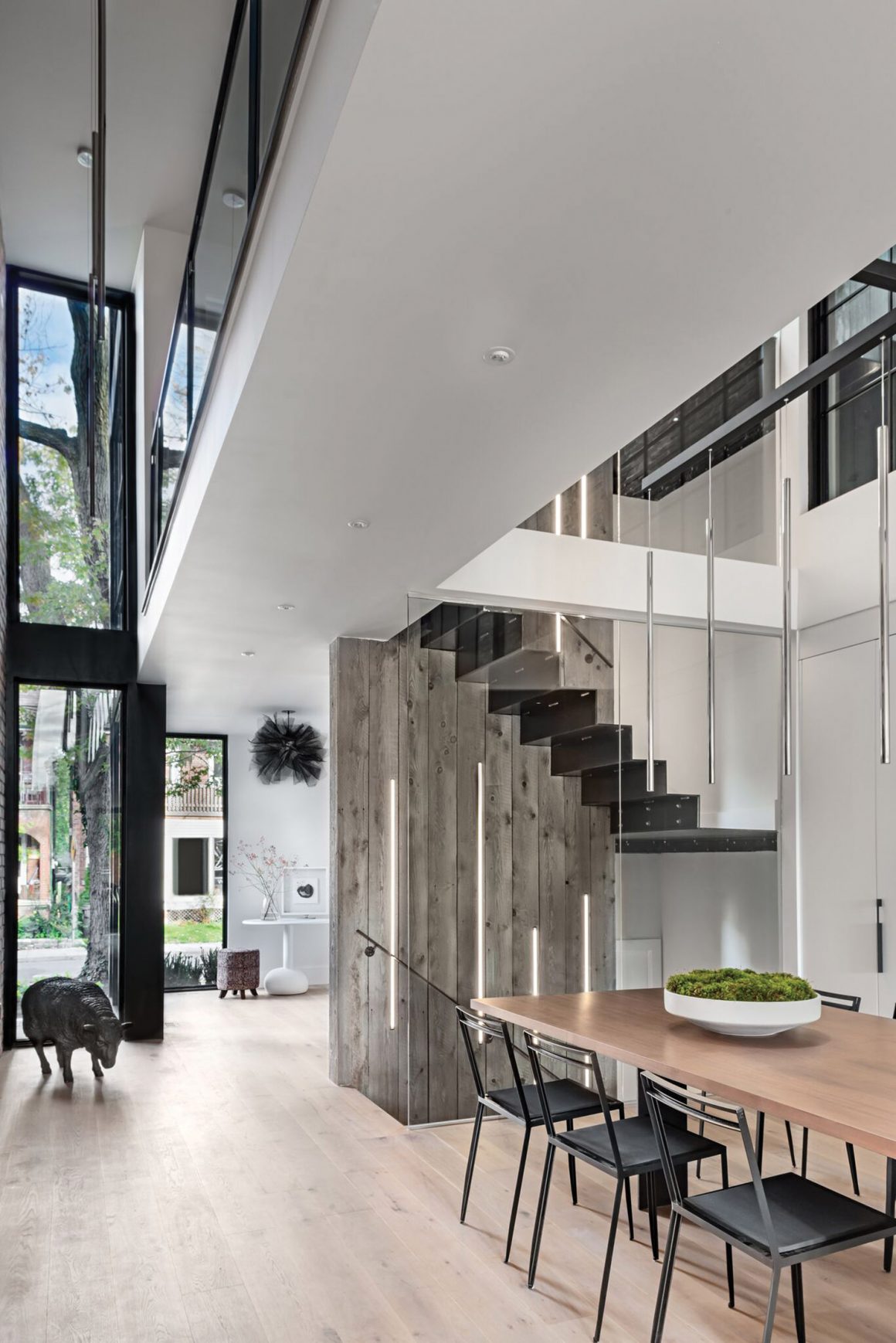
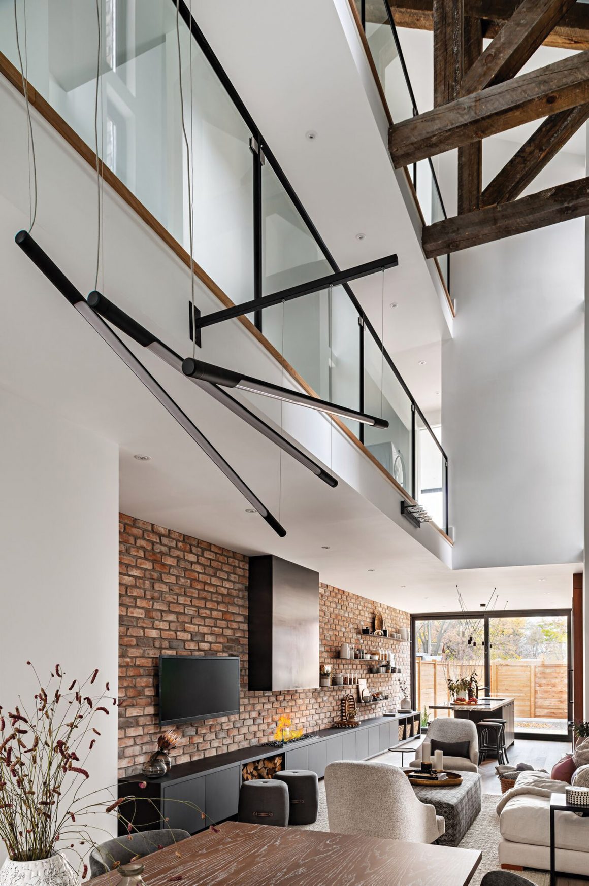
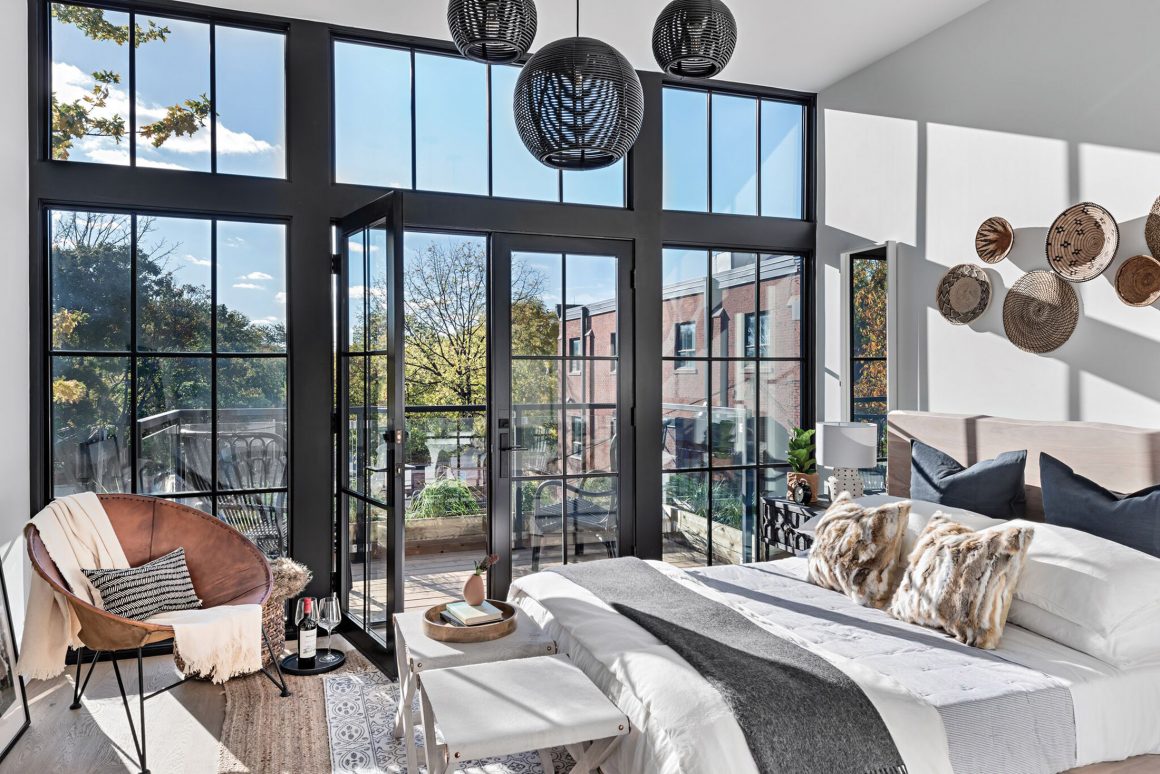
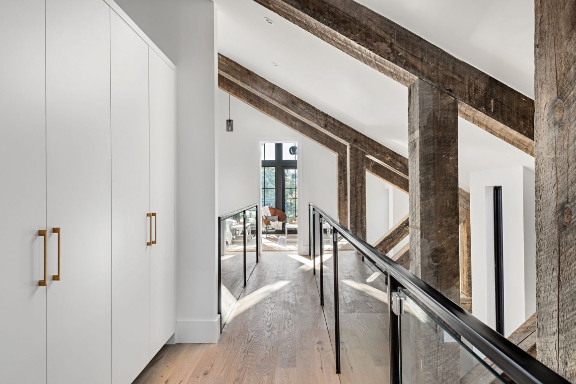
Using exposed shaved heritage brick, sleek marble, rugged barn wood and industrial-looking metal, he created clean lines and symmetry while maximizing the use of the 2,200- and 2,700-square-foot spaces. With ceilings of up to 30 feet and walls of windows encased by industrial black frames, each home feels like an airy loft.
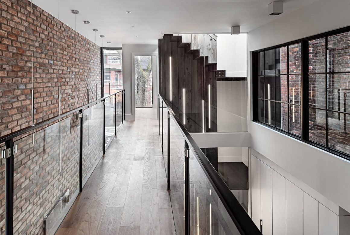
Ancerl introduced several striking differences between the properties. For example, in the larger home, a staircase made of thin, engineered steel makes a commanding focal point. “We put barnboard as the backing, and instead of step lights in the stairs, we installed strip lights cut out of the wood, going all the way up,” he says.
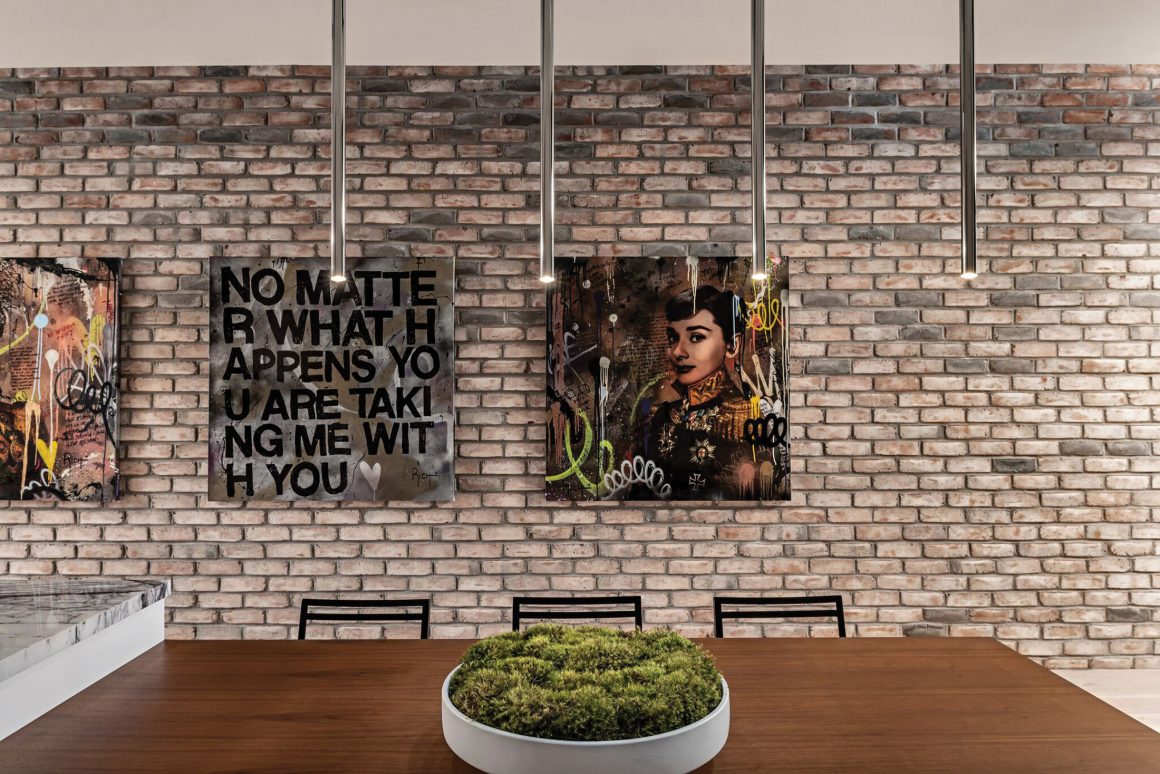
The house then opens up to a lovely view of the back garden through sliding glass doors. “When you look at the house from the front, you’re looking right through that two-storey window,” he says. “The brick goes up two storeys, and we hung tube lights to illuminate the art, like a gallery wall.”
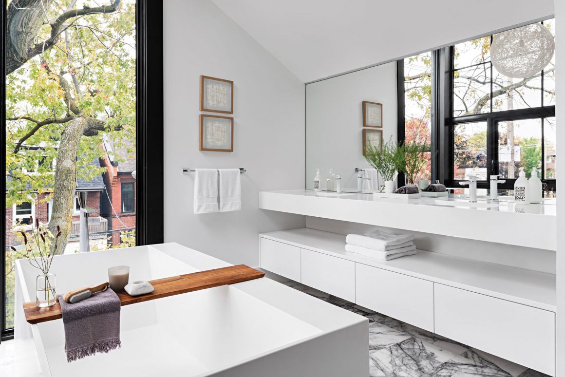
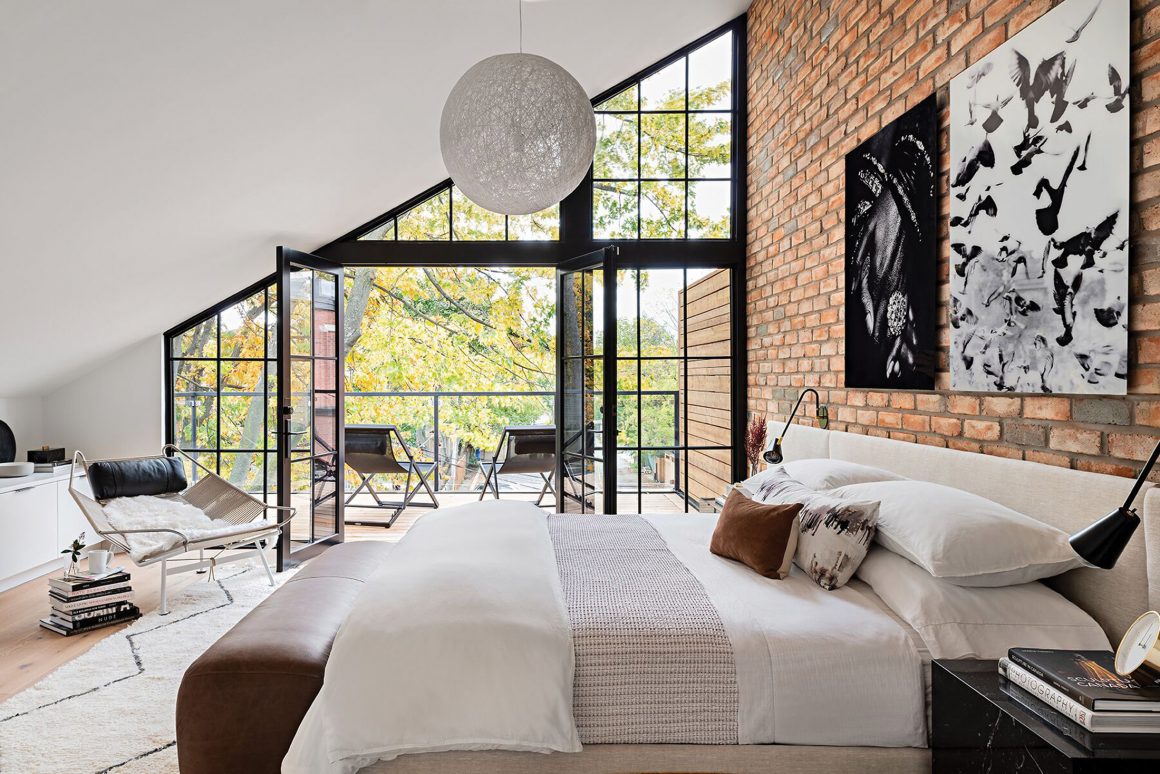
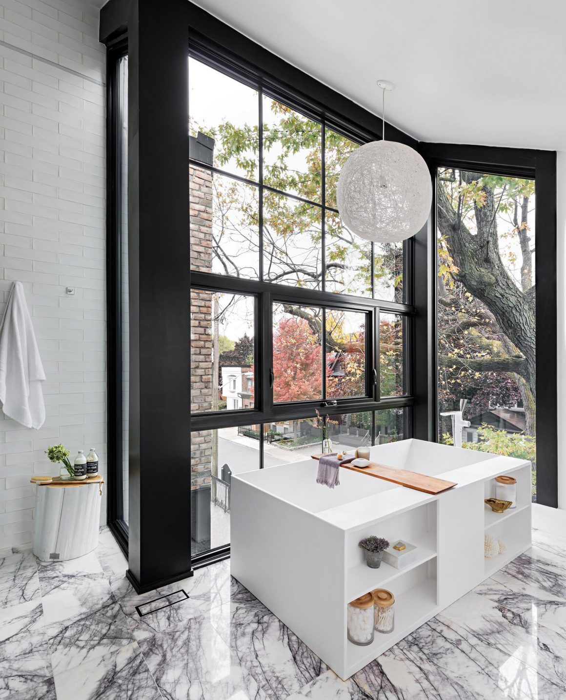
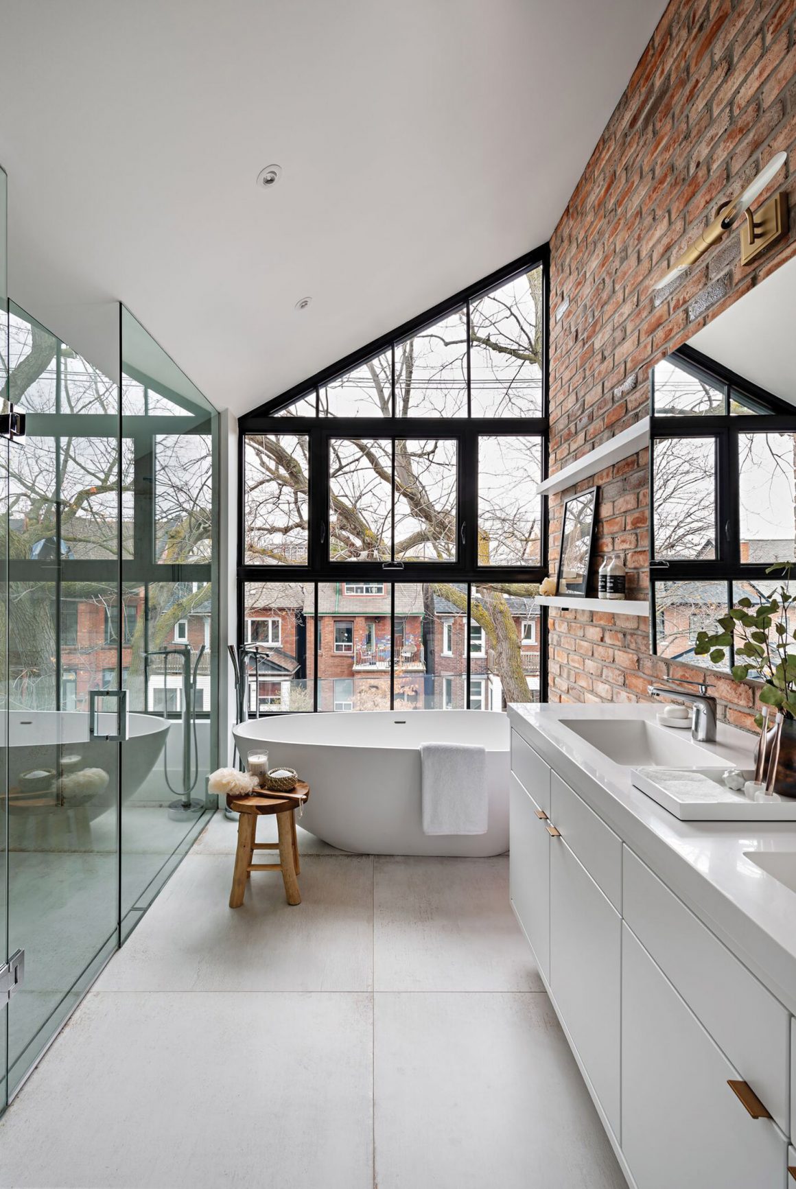
The entire third floor is devoted to the master suite, including a private balcony. A large dressing room leads to the ultra-glam bathroom, with a huge standalone tub and marble tiling.
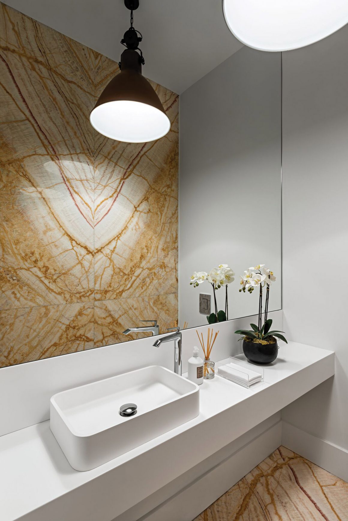
For the smaller home, where Ancerl lived, rustic 100-year-old barn beams criss-cross above the main living area. “They’re my favourite part of this house,” he says. “The recessed slits in the side of the house offer peek-a-boo views of the church next door, and the beams feel like they’re part of the church. There’s something about sitting in the middle of that space, with windows everywhere and 30 feet of sloping ceiling – there’s a lot of character within the functionality of the house, plus some three-dimensional wow.”
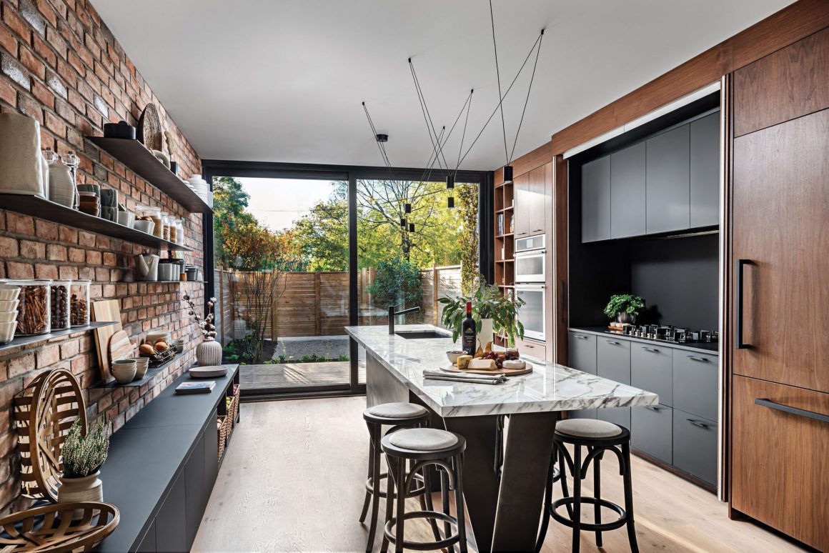
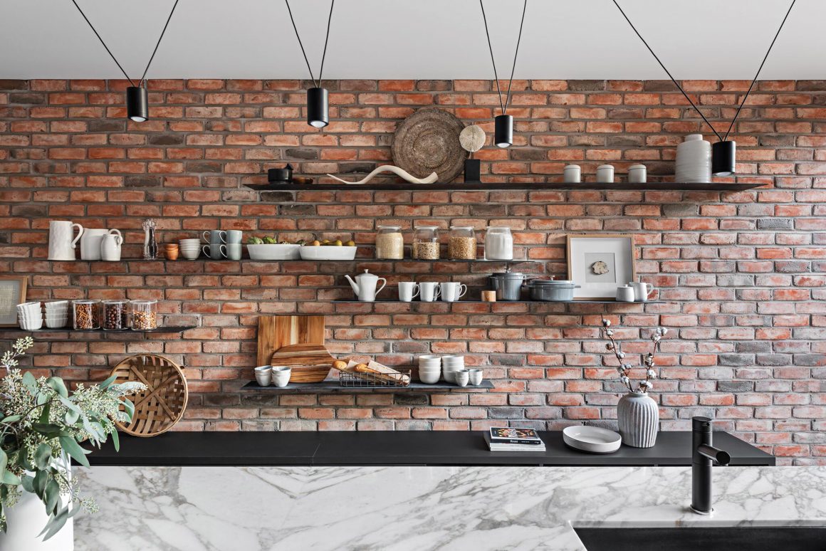
He designed a minimalist-style kitchen and dining area, with built-in black cabinetry at credenza height extending the length of the house. “With a long narrow kitchen, you want to keep it organized,” he explains. “We put in folding walnut doors that hide the stove area and surrounding black cabinets, which, when closed, make the space larger.”
He devised a similar trick in the bathroom, mounting a mirrored medicine chest that slides over open shelving above the tub.
Known for creating unique design narratives, Ancerl says this “accidental” project – one of the studio’s lower-budget ones – was a labour of love. “It’s my absolute favourite project. I’m proud of how we made these two houses look like one,” he says. “I call it divine intervention, because it worked perfectly for the lot. I’ve never had a house where so many people walk by, and just stare at it; it’s kind of cool and humbling at the same time.” •
Ancerl Studio
www.ancerlstudio.com
416-884-6020

