PHOTOGRAPHY: JASON HARTOG
It’s a growing trend in many suburban neighbourhoods: A new generation of homeowners is slowly transforming the look of established residential streets by tearing down older houses and replacing them with larger, more modern ones. It is known as “infilling.” And like any form of change, it has its advocates and its detractors. But on one street in the Mineola district of Mississauga, it also had David Small designing the transformation. His approach aims to put a respectful stamp on a modernizing trend.
The process involved with this project had several moving parts, but once completed, there is no mistaking the result: a unique, sleek, luxurious, drop-dead gorgeous, I-would-simply-love-to-live-there piece of real estate.
But let’s get back to the beginning, and the process. How do you go from dated side street to next-generation modern? “We evaluate the property,” explains Small, the principal designer with David Small Designs, which specializes in custom homes. “This one had a few unique features.”
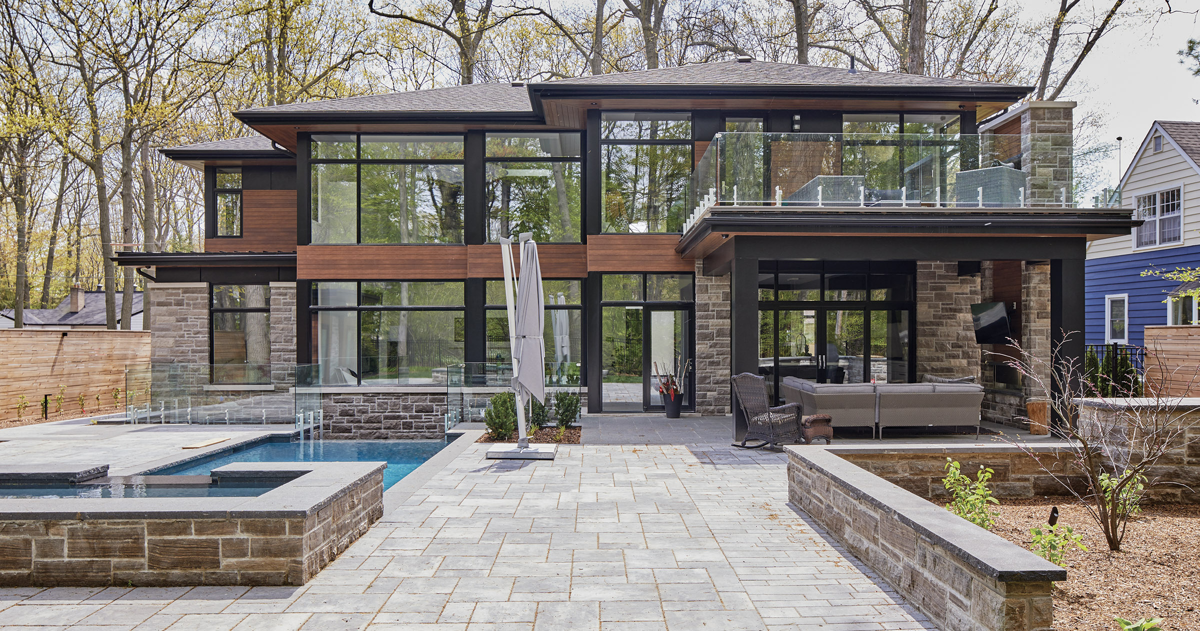
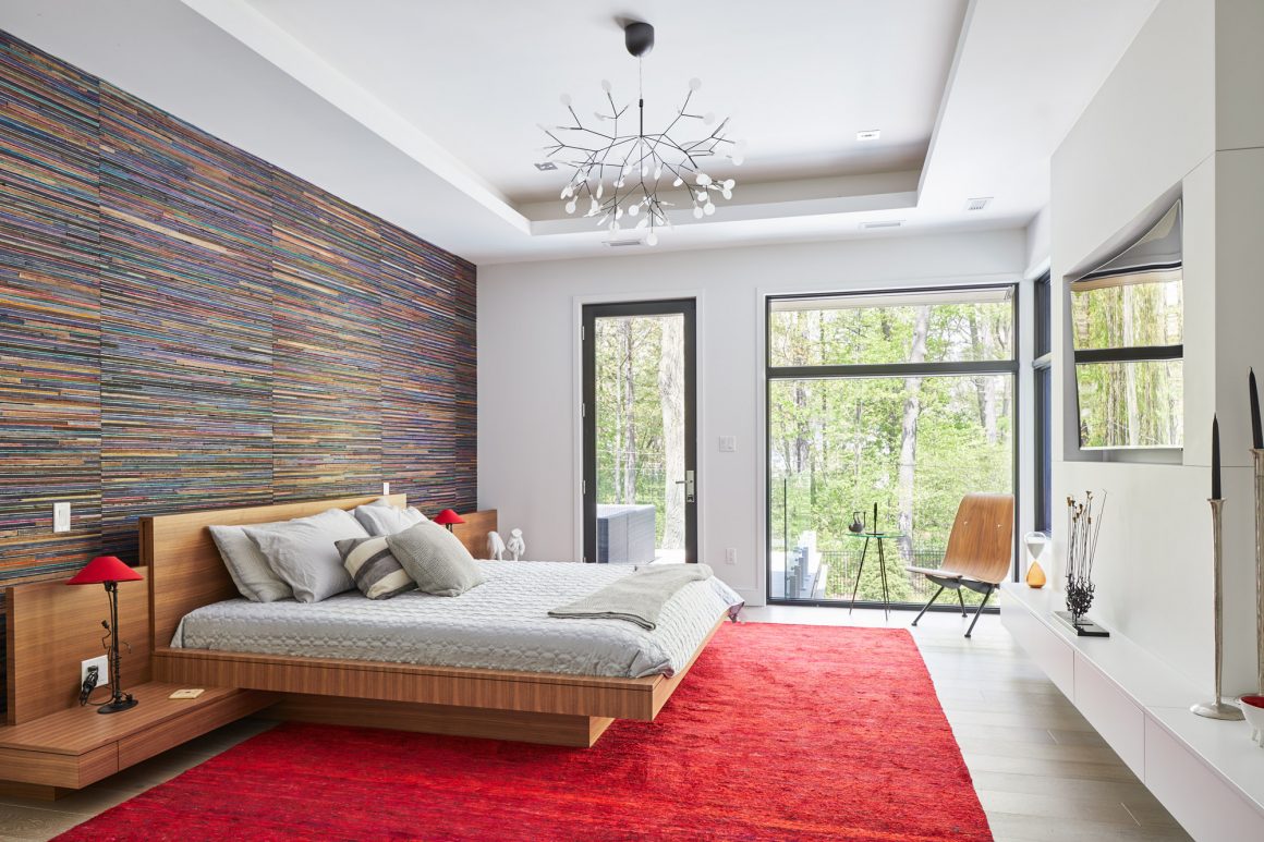
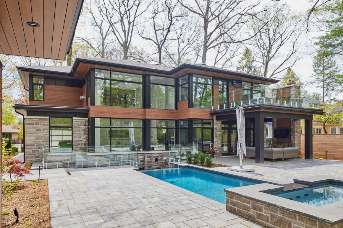
The first was that the backyard consisted of an established forest. “The objective would be to pull that forest view into the house. And the way to do that is with glass,” he says. This dictated the design of the rear of the new house. It would be a wall of glass.
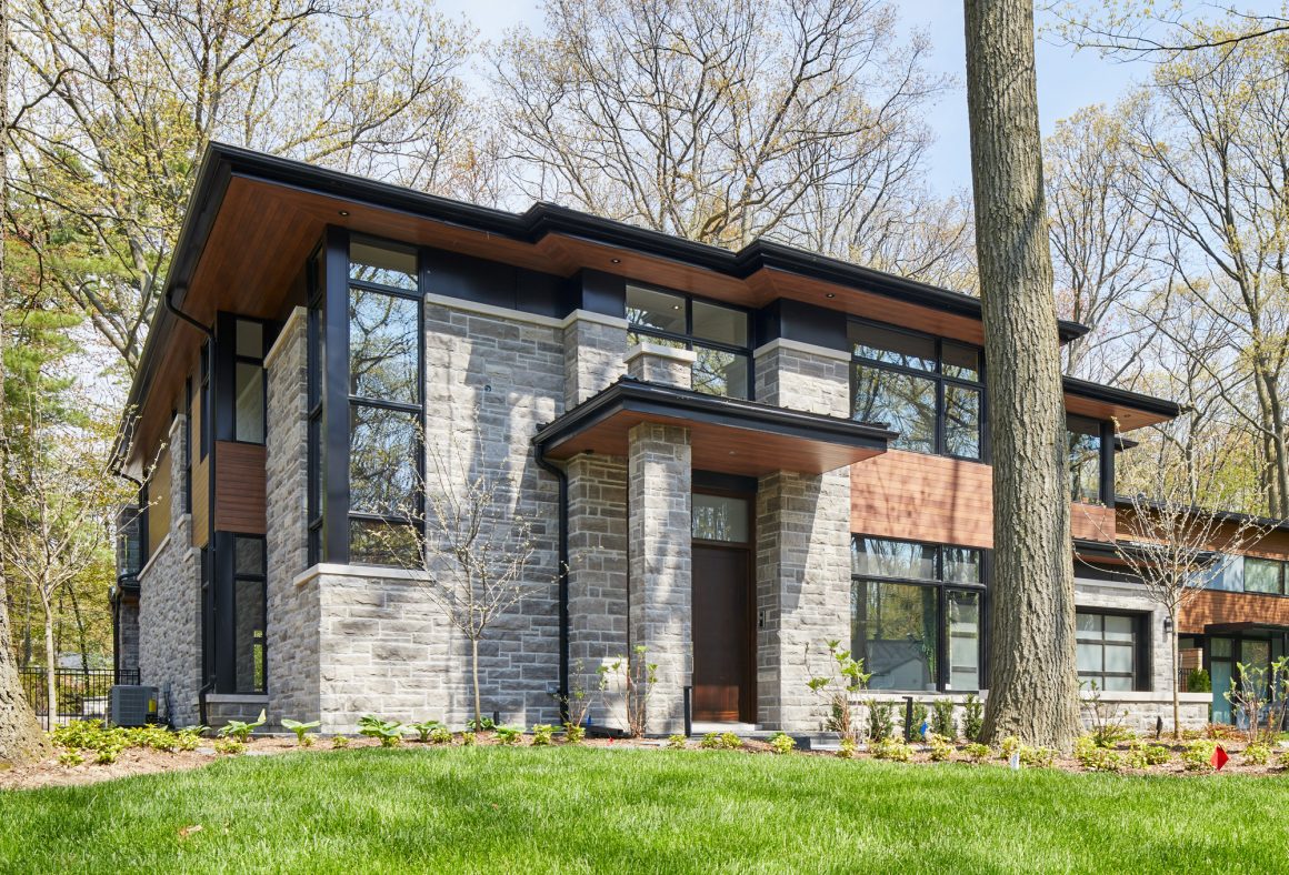
The second feature that was incorporated into the design was a sense of the existing neighbourhood. “We’re doing a bit of a different house on the street. We need to employ skill and sensitivity to mesh these things together,” Small says. This includes recognizing the materials and colours used on other houses on the street, and using similar components on the new house.
“We try to span the gap of being a modern two-storey house and an existing home,” Small says.
Spanning that gap is not always easy because the target, as he explains, is moving: Are you aiming to design for “five years ago, today or five years from now?
“In five years, in 10 years, it’s going to be a different street, and we still want to be relevant.”
And then there were the clients’ needs and wish list. “They were looking for a modern home that is cozy, which is our specialty. They wanted to be in the modern realm and they were willing to let my interpretation lead the way.” And that is how it started. Construction began in the fall of 2015.
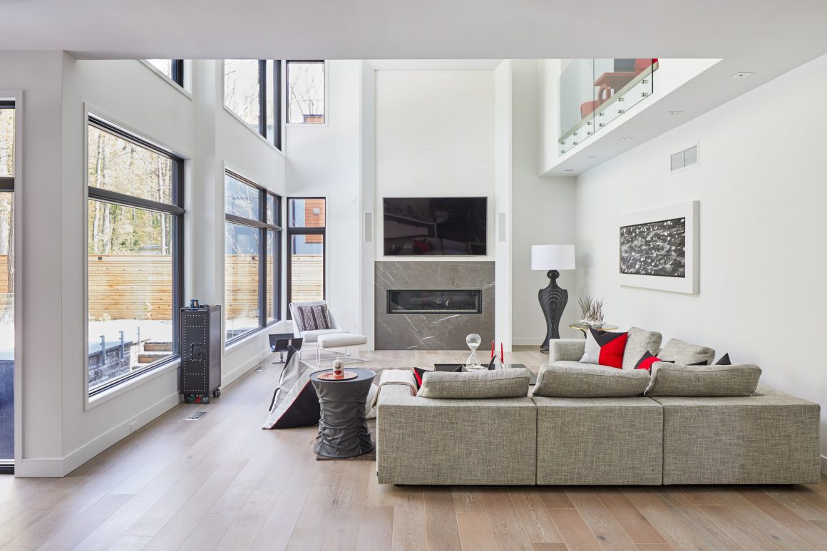
Small designed a four-bedroom, two-storey modern home with 3,570 square feet of living space. It’s a home that makes a statement. “It certainly tells the world it’s a modern building,” Small says. “But it says we made a building that belongs on the property.”
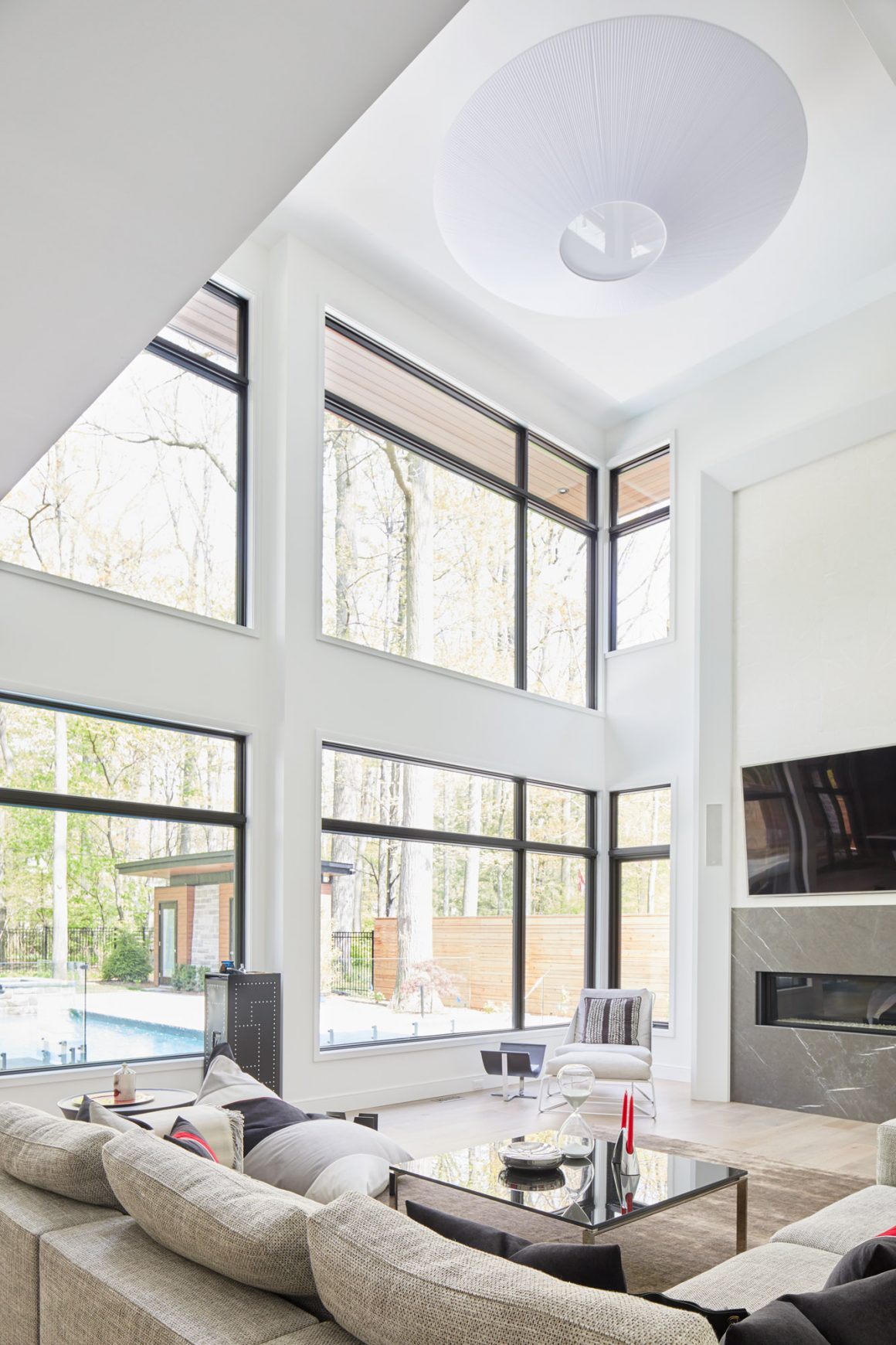
Although the new structure is taller than most houses on the street, and certainly larger than what was originally on the lot, Small purposefully designed it with what he calls “a horizontal emphasis.”
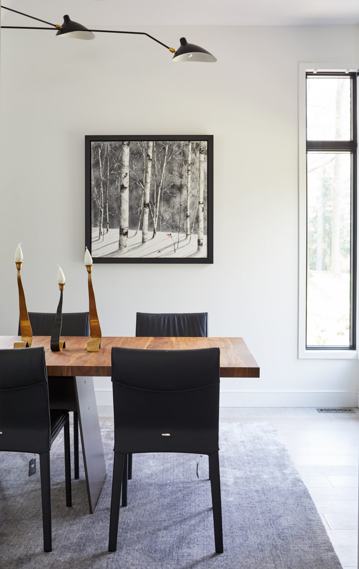
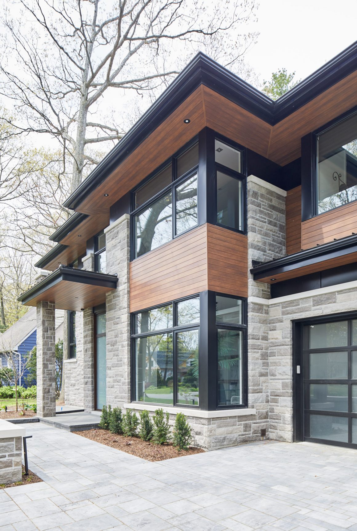
“It looks like gravity is really working on this house,” he says, pointing to such elements as the extended overhangs, the horizontal orientation of the windows, horizontal siding. These elements connect the house to the lot, he says. “When it’s connected to the lot, it’s connected to the street.”
The house’s front and side facades are clad in Owen Sound ledge rock, Longboard aluminum siding that has the appearance of wood, and dark-framed horizontal windows. It’s an impressive and pleasing combination.
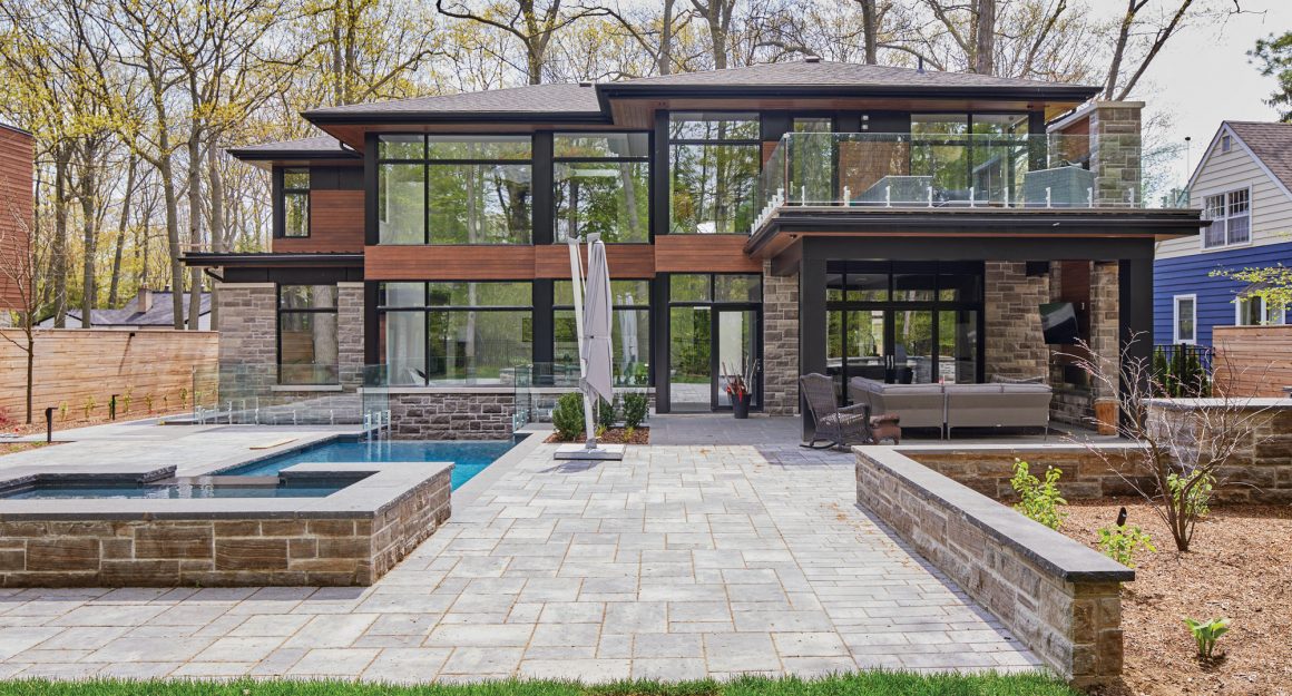
The rear side is mainly window, with the ledge rock retreating into an accent role and the aluminum defining the building’s levels, leaving the windows to take centre stage.
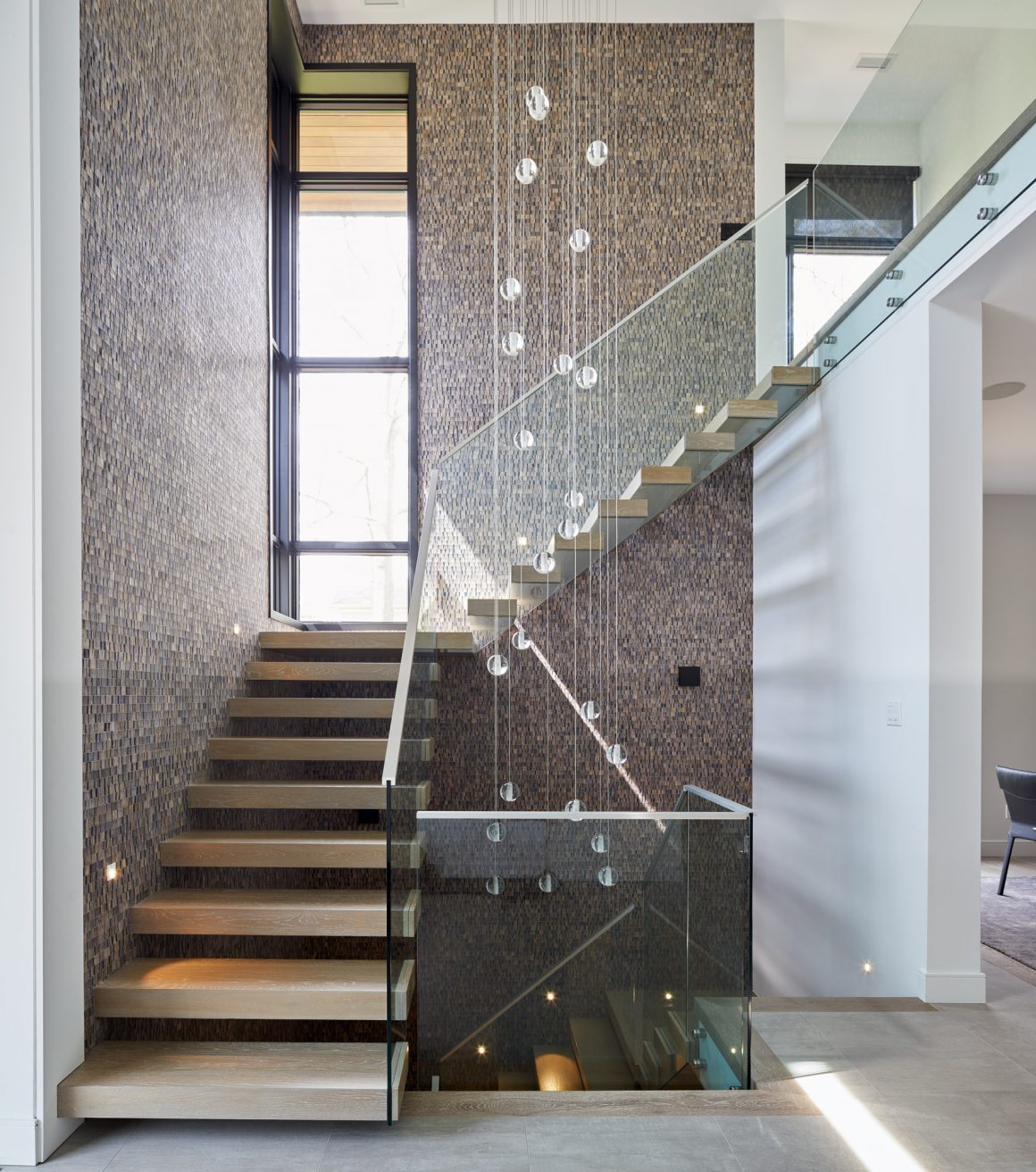
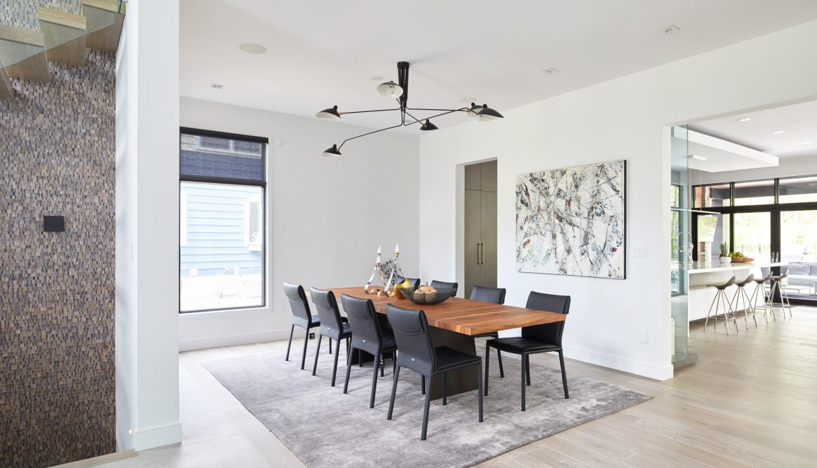
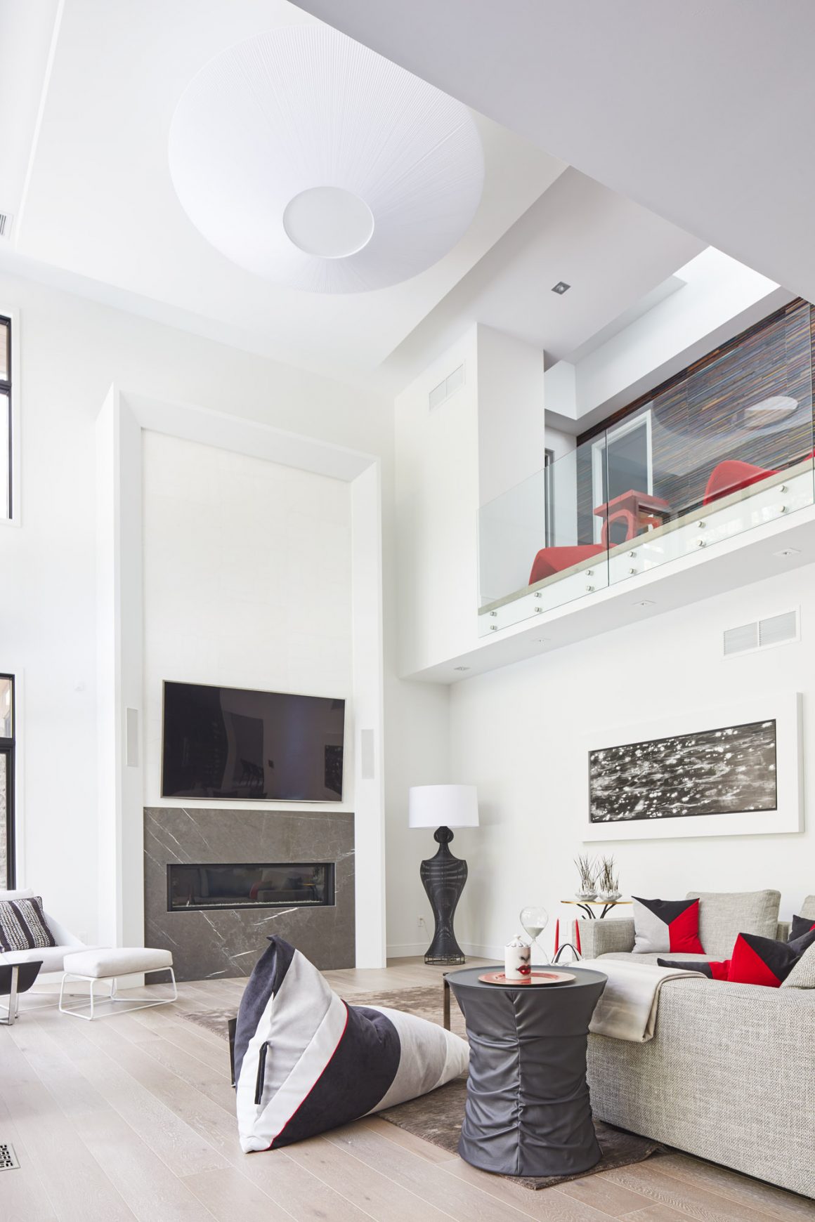
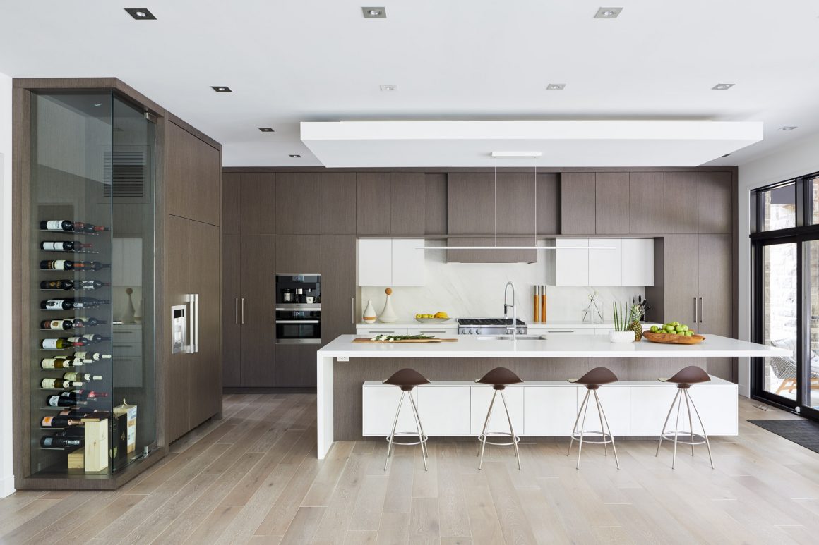
The interior can be summed up with two words: “open” and “connected.” The main floor is expansive, with the kitchen anchoring the floor plan. A wall of cabinets, made of engineered wood with a grey oak veneer and a matte lacquered finish, conceals the appliances and provides sleek styling. The living room is light, with engineered white oak flooring and a grey marble surround framing a horizontal gas fireplace. Gogo Design created the interiors.
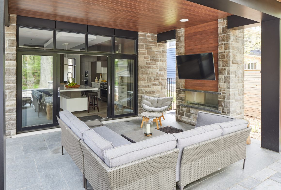
“In this design, when you are in the kitchen, you feel totally connected to the other parts of the house and the backyard,” Small says. All of the main rooms open onto the back wall of windows that fill the space with natural light.
“I was able to pull that fantastic view into many rooms,” he says, “really blurring the lines between the inside and outside.”
“I love this house,” Small says simply. “It will stand the test of time in the neighbourhood.” And he knows the neighbourhood will continue to change. It’s inevitable. “It’s a question of controlling it and nudging it,” he adds.
Or, you could say it’s simply a matter of design. •
David Small Designs
www.davidsmalldesigns.com
905-271-9100

