PHOTOGRAPHY: JEAN BLAIS
STYLING: JEAN MONET
Floral arrangements: Le Marché aux Fleurs du Village
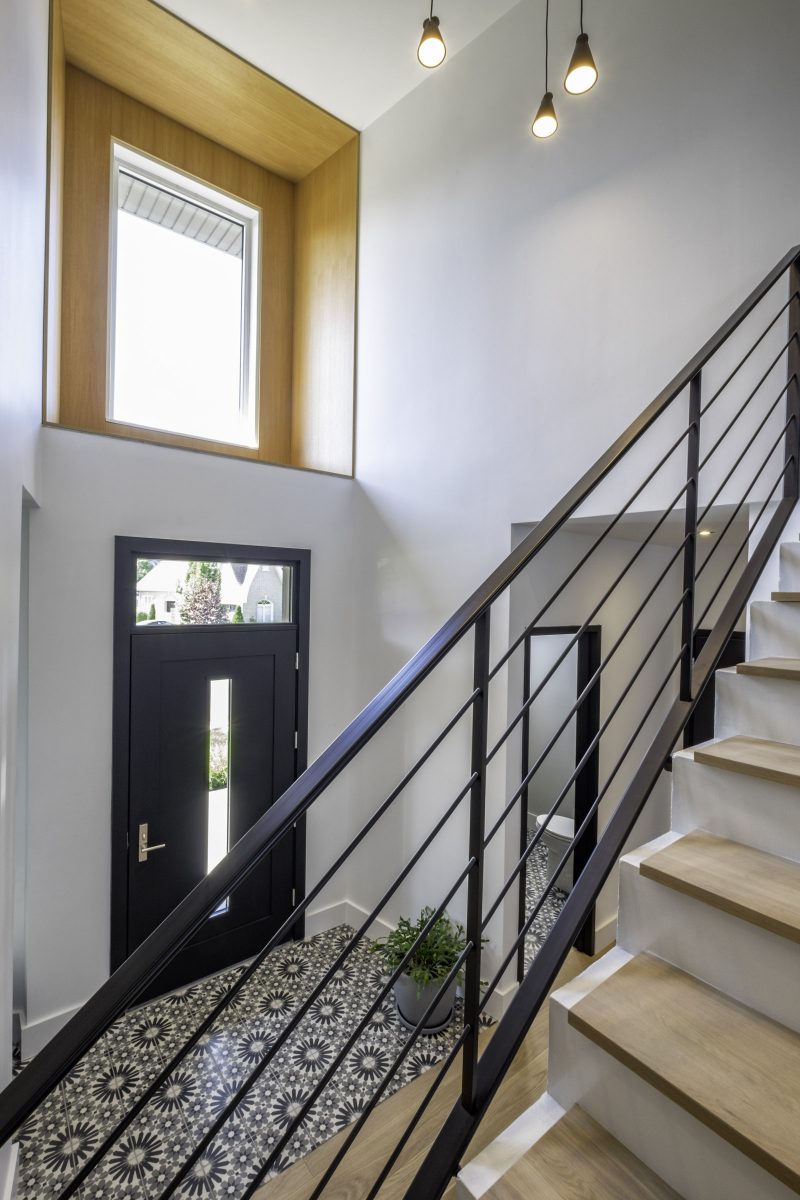
Homeowner Marie-Josée Lepine smiles every time she enters her Candiac home and sees the foyer’s bold floral black-and-white tiling. “I can’t help it,” she says, laughing. “Their design is so playful that they immediately put me in a more joyful and relaxed ‘glad-to-be-home-again’ mood.”
She and her husband, Edward Olander, wanted a home where they and their two young children could – in her words – breathe with ease. “Lots of open space with sleek, pure lines,” she explains, “but nothing so precious that it would make people feel they have to remove their shoes at the front door.”
They bought an older contemporary home in a neighbourhood they adore, knowing they would have to update it to their own tastes.
“Edward and I both wanted more of a masculine character for the home but, perhaps somewhat surprisingly, I sought more of an industrial feel while he asked how we could incorporate wood for some rustic warmth,” Marie-Josée says. “Fortunately for us, our designer nailed the combination!”
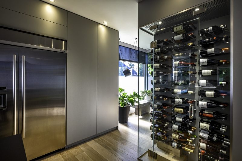
Manon Bélanger, the designer in question, achieved the couple’s goals with a palette of grey, black and white throughout the house. “The homeowners had wanted concrete flooring, but the existing structure would have to be fortified,” Bélanger says. “So instead, we installed concrete tiling in high-traffic areas but a matte white oak in a large plank in the main living area.”
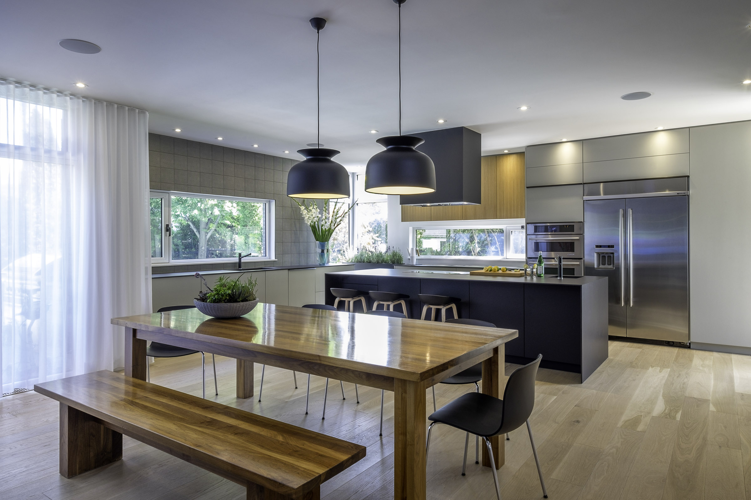
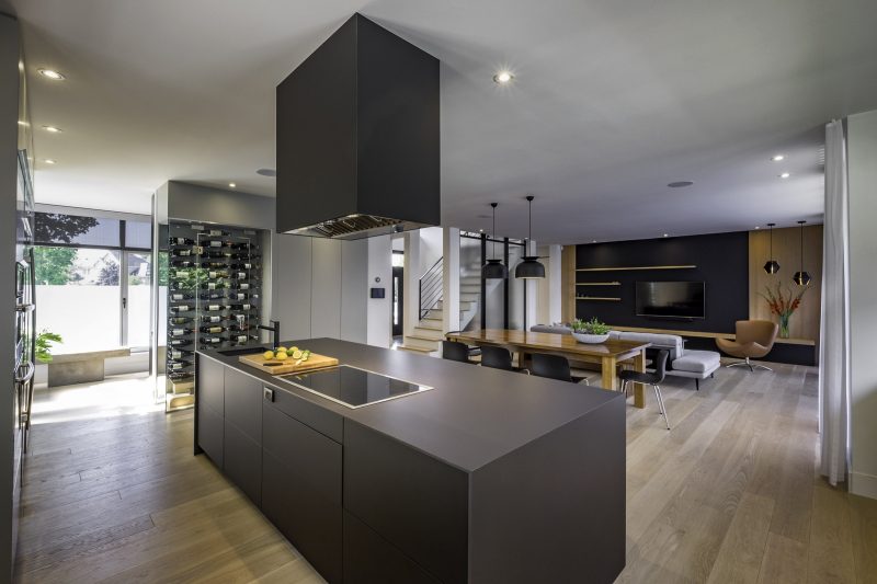
Deciding how to divide up the great room was the first order of business. “It was important to make the kitchen big enough for everyone but not so large that it would overly dominate the space,” Bélanger says. “We also had to figure out where to put the huge walk-in pantry that Marie-Josée requested.”
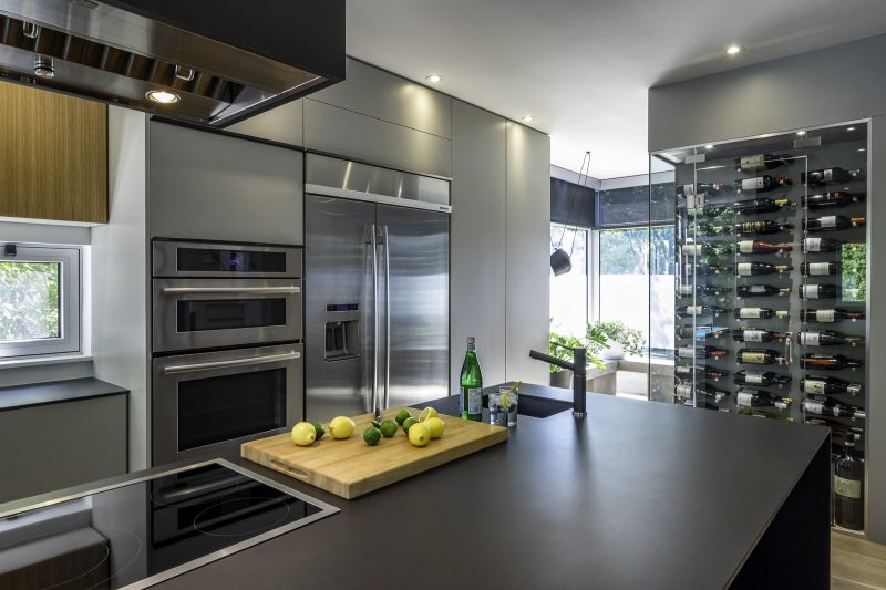
The glassed wine cellar divides the space without creating the sensation that a wall has been erected for the pantry’s sake. “People don’t even know the pantry is there unless we show it to them, which we usually do because we just love it so much,” Marie-Josée says. “And the cellar fits perfectly with our welcoming family and friends for a good meal and nice glass of wine.”
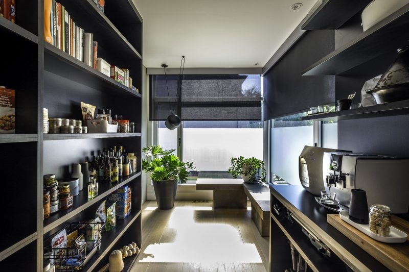
The pantry is a dream-come-true for Marie-Josée who initially fell in adoration of a friend’s walk-in space. “Most everything is stored there within easy reach,” she says. “And our kitchen counters stay free of clutter.”
Black lacquered melamine gives the pantry greater chic than white shelving could ever do. Its slim counters are in keeping with the current trend of having small appliances out of sight. “What’s nice is the homeowners can use the appliances right there inside the pantry with the electrical outlets we’ve installed, rather than hauling them to and from the kitchen,” Bélanger says.
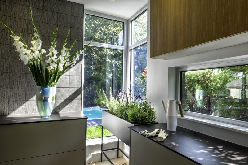
The breathing space that Marie-Josée desired is also incorporated in two windowed corners where Bélanger opted to keep the natural light unobstructed. “The ‘messier’ greenery and lighting in these corners give them a slightly more bohemian spirit than the rest of the house,” Bélanger adds.
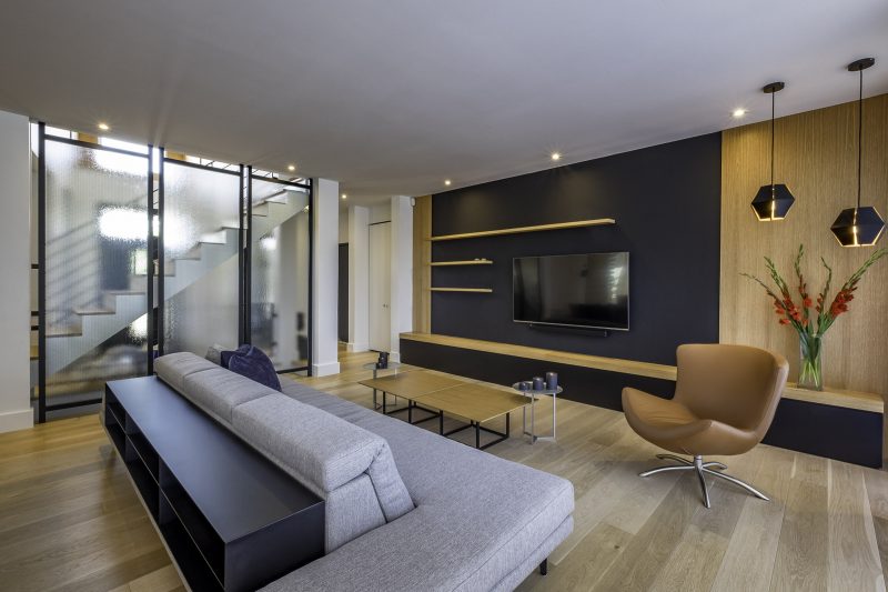
All of the main furnishings were chosen for comfort and for the children’s use. “I really like how the library is built into the sofa unit because it provides storage without blocking any of our view or ever getting in the way,” Marie-Josée says. “And Edward loves the wood background for the mounted television.”
Bélanger incorporated various black accents to ground the space. “The black cladding on the exhaust hood makes an initial impression but then it’s dismissed from our conscious awareness because it’s so dark and doesn’t obstruct any view lines,” she says. “The meshed glass dividers were already there, but we gave them some punch by repainting the wooden frames black to go with the rest of the room.”
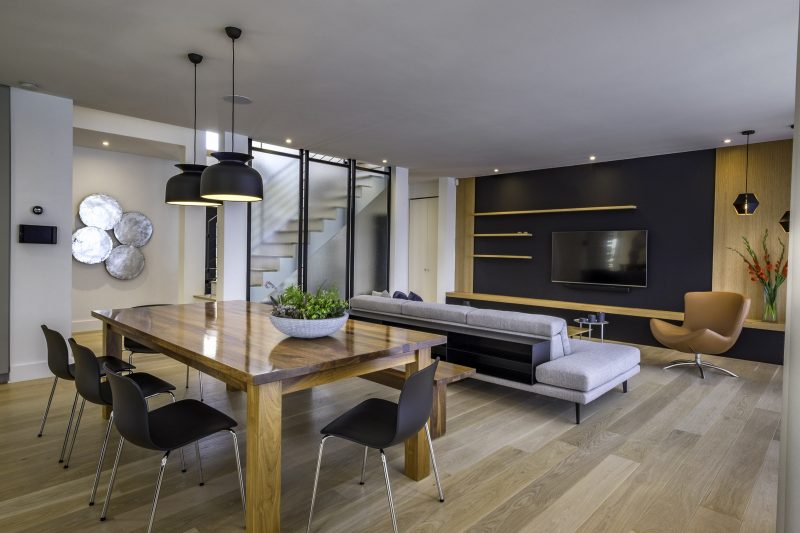
Her designer’s touch especially came into play in finding the perfect masculine-feminine balance for the kitchen’s backsplash. “From a distance, the grey ceramic from Patricia Urquiola’s Mutina tiles collection looks plain with a slight texture,” Bélanger says. “Yet up close, you see the lacelike flowers that subtly connect with the foyer’s louder floral tiles.”
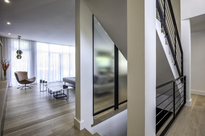
Back at the front entrance, a once-bland overhead window casing was tied into the home’s other rustic elements. Bélanger clad it in some white oak so that every aspect of this contemporary home ties beautifully together to add to Marie-Josée’s smile. •
Manon Bélanger, Designer
manonbelanger.com
514-570-1545
Le Marché aux fleurs du village
lemarcheauxfleursduvillage.ca
450-672-5554

