PHOTOGRAPHY: DREW HADLEY
STYLING: CATLIN STOTHERS
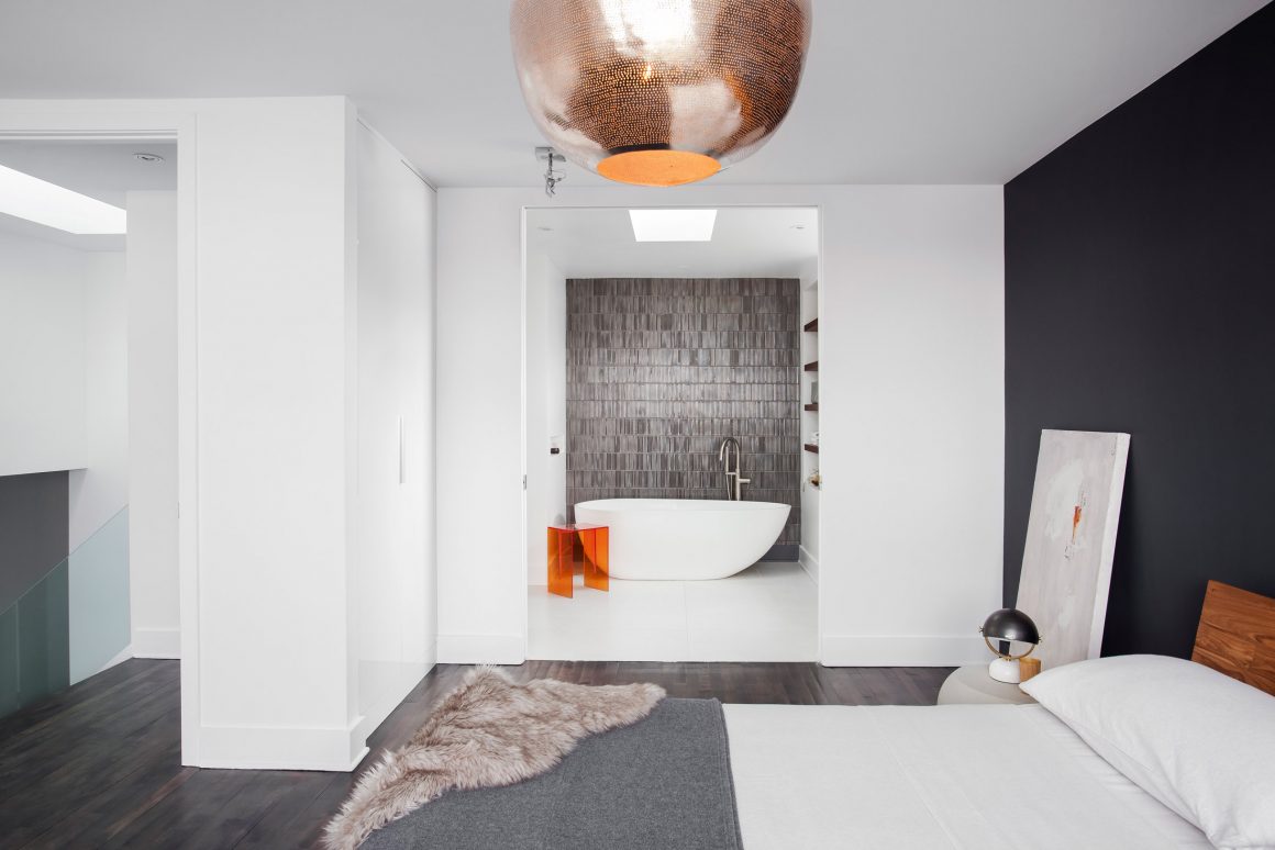
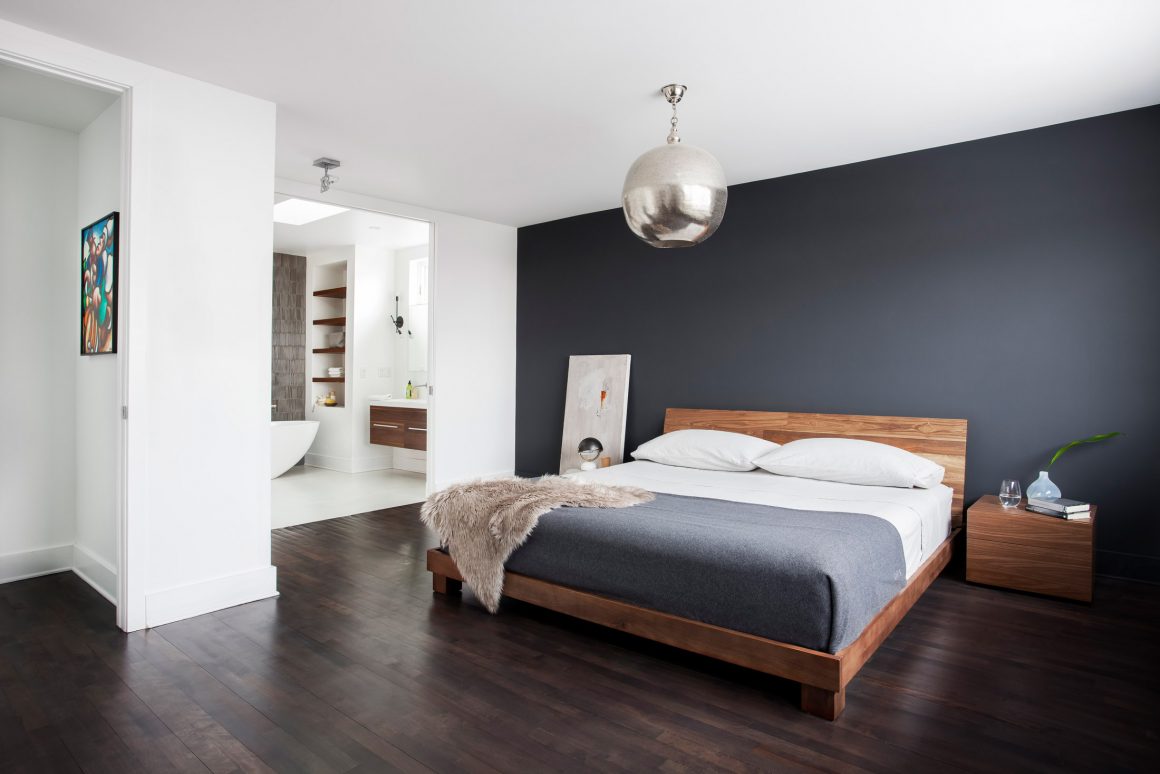
A new third-floor extension became the master suite for homeowners who wanted the relaxed feel of their bedroom to extend into their bathroom – with no walls or doors to hide the view of their luxurious soaker tub.
“Increasingly, homeowners are looking for an ensuite bathroom that feels semi-integrated into the master bedroom,” says Catlin Stothers, principal designer of Catlin Stothers Design. “I think that the trend in boutique hotels to have the bathrooms exposed to the bedroom, often partitioned by clear glass, has influenced architects and designers to reconsider conventional master bathroom layouts as they relate to the bedroom,” Stothers says.
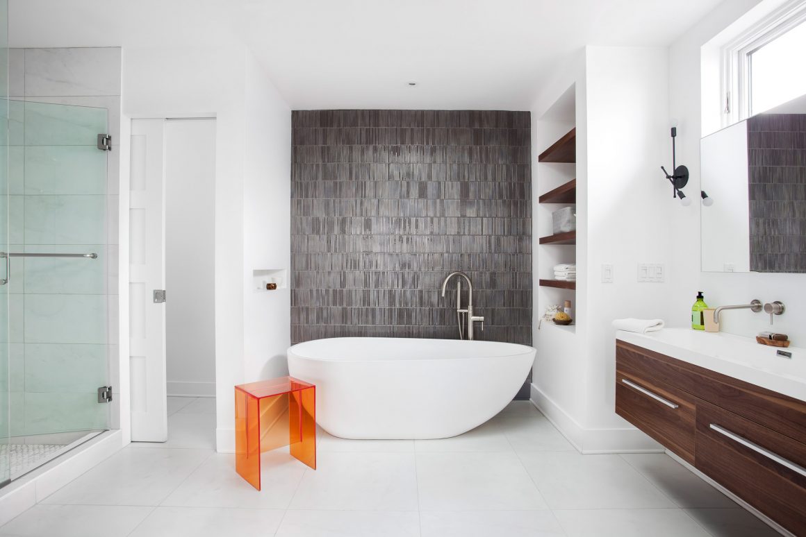
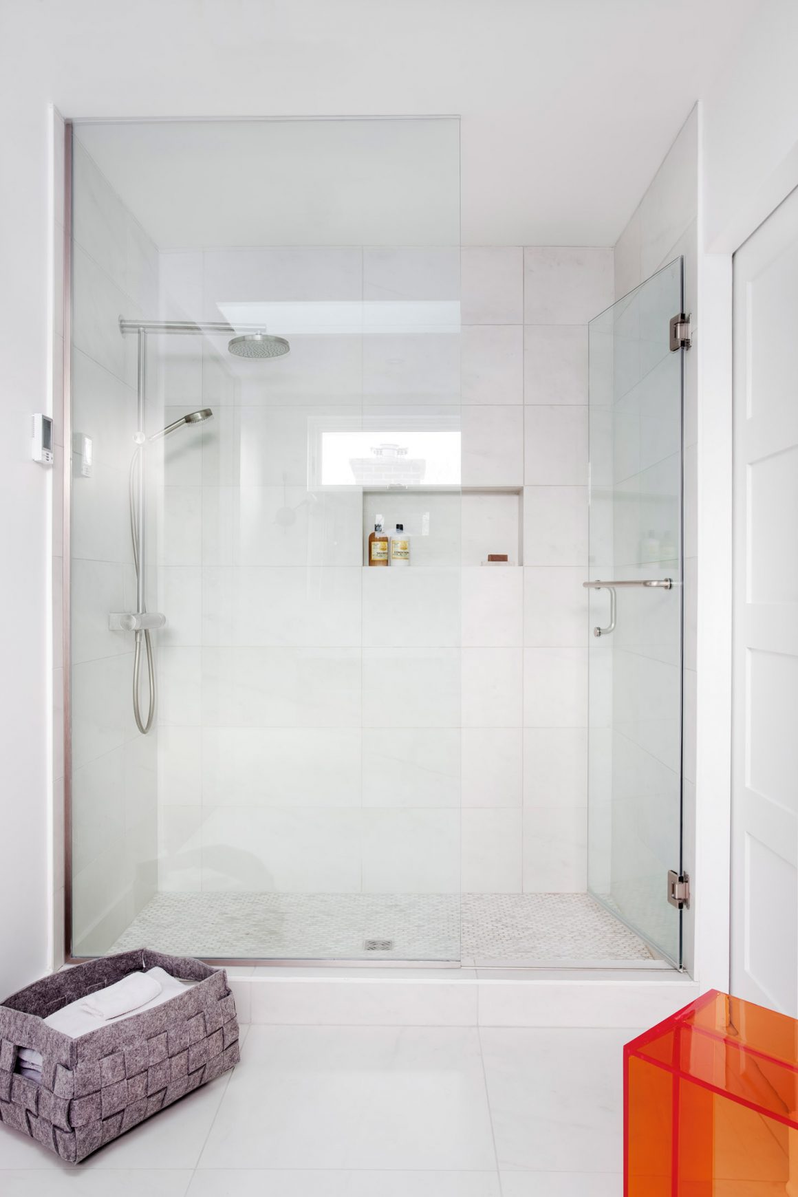
The tub and feature wall are open and visible from the bedroom. Partial walls on each side hide the shower on the left, the vanity on the right. The toilet is tucked in behind a pocket door, behind the shower.
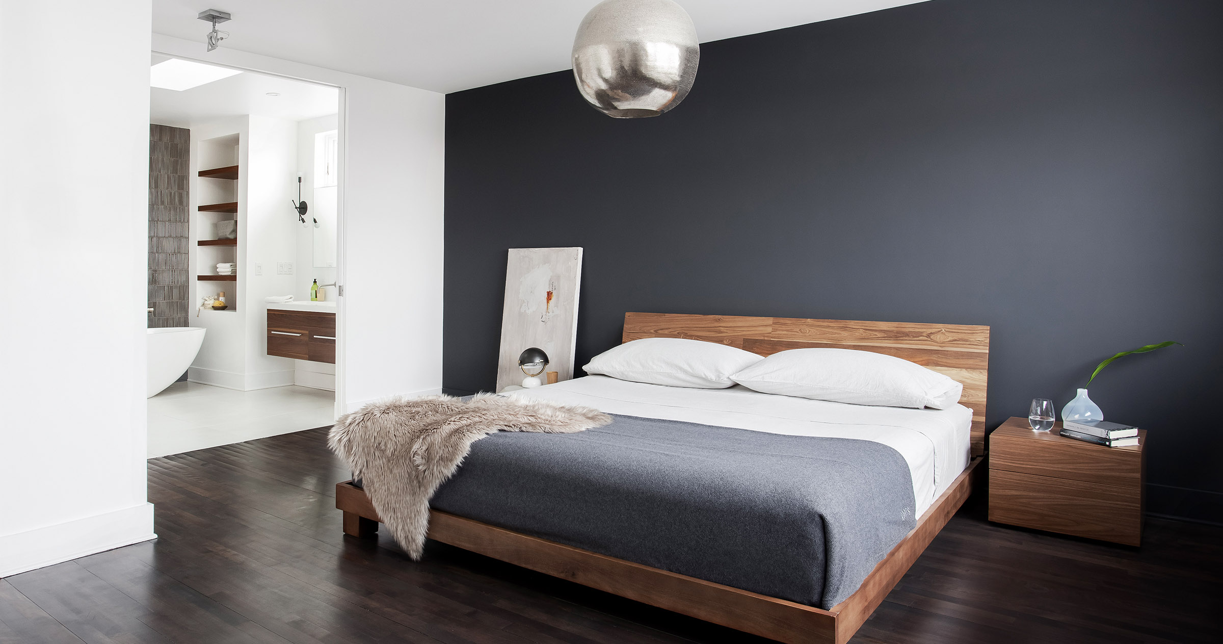
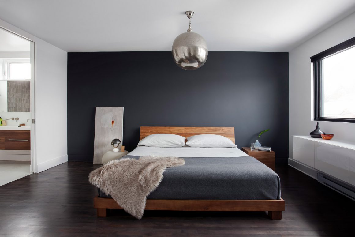
Part of a larger renovation of the split-level house, done in collaboration with MVA Architecte, the combined bedroom/bathroom has many of the same features and design elements as the rest of the home: wood floors in a matte, smokey-grey colour, white walls to showcase the owners’ art collection, charcoal and black accents, and a carefully considered amount of wood. The homeowners were keen to have their new space feel contemporary and less transitional than their previous decor; to be a little minimalist but not stark.
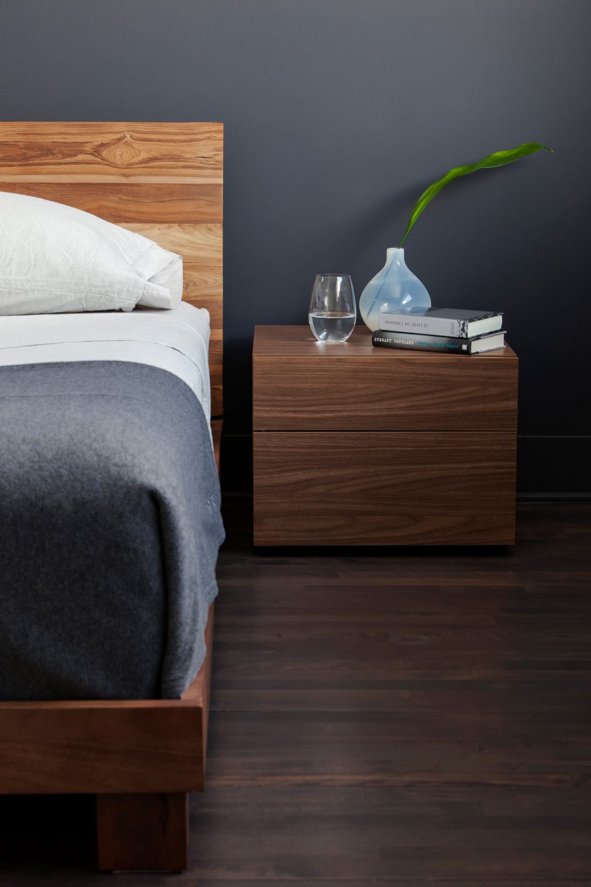
Getting that balance of wood features was key. “I’ve always been a big fan of the right amount of wood,” Stothers says. “If you take all the wood out, it’s missing something; no matter what material you might have, there’s an austerity to it that makes it not so inviting.”
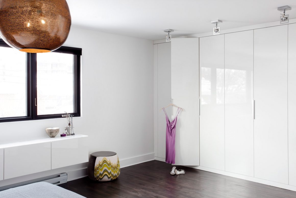
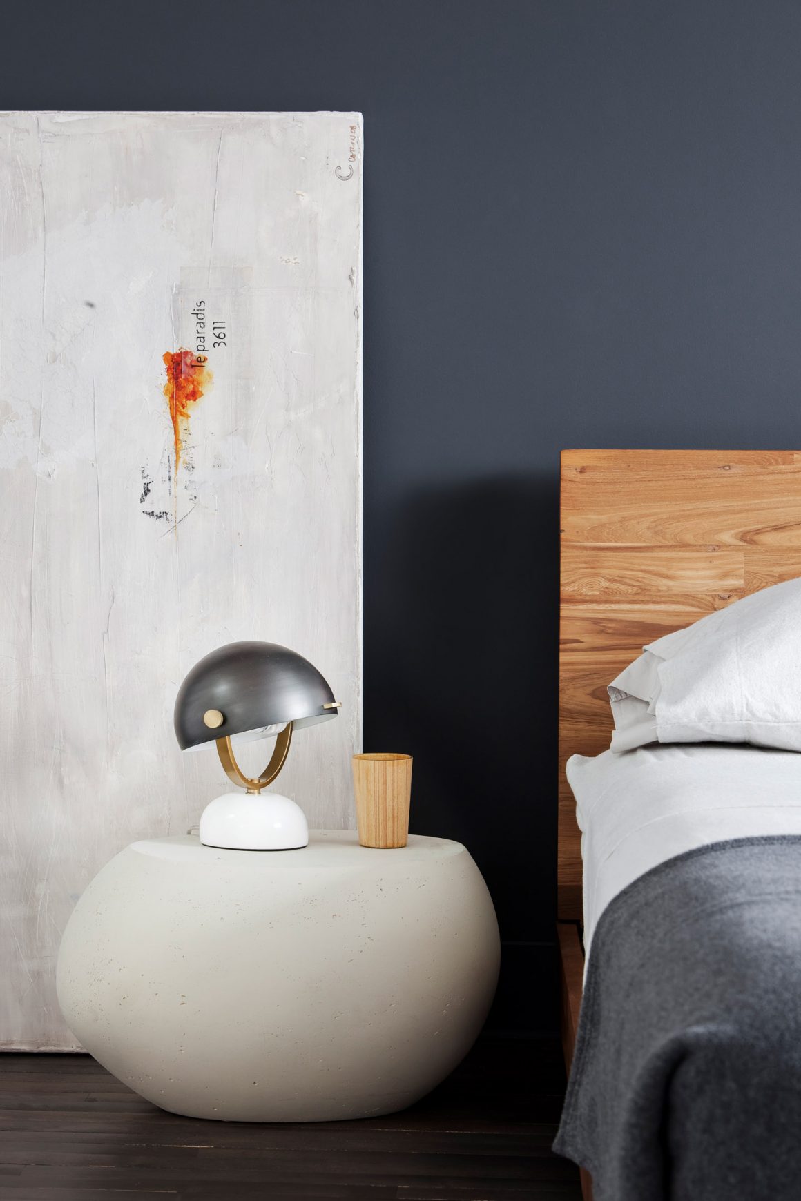
In the bedroom, built-in closet doors are as white as most of the walls, but one large charcoal wall frames the bed and sets off its acacia-wood headboard and frame and a side table. “We tried to keep the materials tone-on-tone, blending into each other,” Stothers says.
For the bathroom wall that’s visible from the bedroom, Stothers’s clients debated about whether to continue the white-on-white theme behind the tub, or turn it into a feature wall. Once they had rejected the white option, they went looking for something that would stand out, that they wouldn’t tire of, and that didn’t feel either too masculine or too feminine. Most of the mosaic patterns felt too feminine, she says. Instead, they settled on a handmade tile in a pewter, gun-metal finish, similar in colour to the bedroom wall. Because the tiles are handmade, they have slight variations and a sense of movement. “Usually you don’t want that in a tile; you want them to be crisp and square. We felt that it was okay that they were slightly wobbly,” Stothers says.
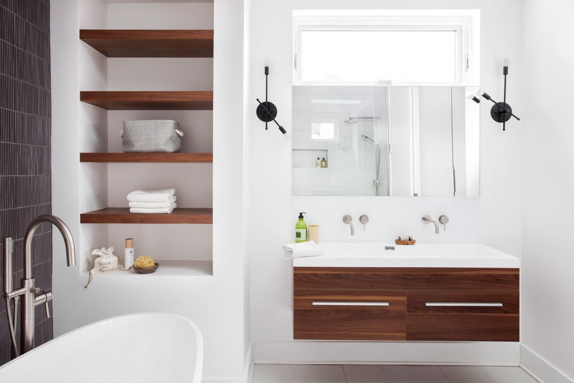
The floating vanity is made of walnut, as are the shelves beside the tub that add extra storage for towels and supplies. “We used walnut to bring in warmth and have it feel more cozy and rich,” Stothers says.
Natural light comes from the architect’s inclusion of a skylight and a small, west-facing window above the vanity that lets in the end-of-the-day sun.
Once the room was finished, the designer brought in a small orange acrylic stool for the photographs. “It added a little kick,” she says. Sometimes at the end of a renovation, clients run out of steam or money or both and aren’t always interested in choosing accent pieces. I’d sent the homeowner a picture, and she was like, ‘whatever you think.’ But she loved it, and it stayed behind. It makes a big difference when you’re able to see things.” •
Catlin Stothers Design
www.catlinstothersdesign.com
514-984-5122
MVA Architecte
www.mvaarchitecte.com
514-842-0407

