
PHOTOGRAPHY: LARRY ARNAL
STYLING: SVETLANA TRYASKINA
It was the perfect condo in the Forest Hill area of Toronto, according to designer Svetlana Tryaskina and her husband. They bought it. Then, she completely redesigned the interior in a way that she had always wanted. This was going to be their home. She was not working for a client, attempting to cater to their tastes. She was designing for herself. She was bold and brash with her approach. And that, it turned out, was the problem.
Before they had a chance to move in, the couple got an offer they simply could not refuse. The look of the condo made its value soar.
“I liked the location. I liked the building,” Tryaskina explains. But it was “really in rough shape. The layout was not good. The kitchen was closed in.”
The painted concrete walls “were in extremely bad shape.” They were rough and bumpy. The unit, which had between 1,300 and 1,400 square feet was not too large. She had to maximize every inch. “We bought it to renovate,” Tryaskina says, but as the work was wrapping up, the interiors captured the attention of buyers, who offered to purchase it. They wanted it for themselves – the exact space, with the exact decor, right down to every piece of art.
“It was a difficult decision,” says Tryaskina, the owner and principal designer of Estee Design, about the couple’s move to sell the condo. But the drama that she had created was spell-binding.
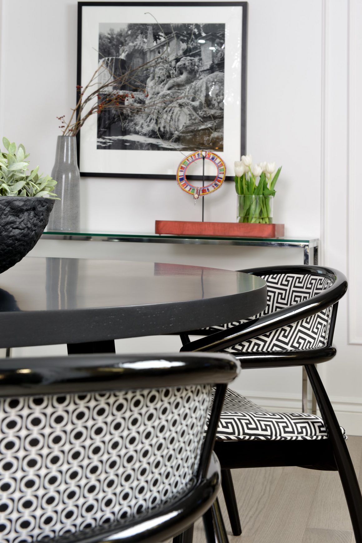
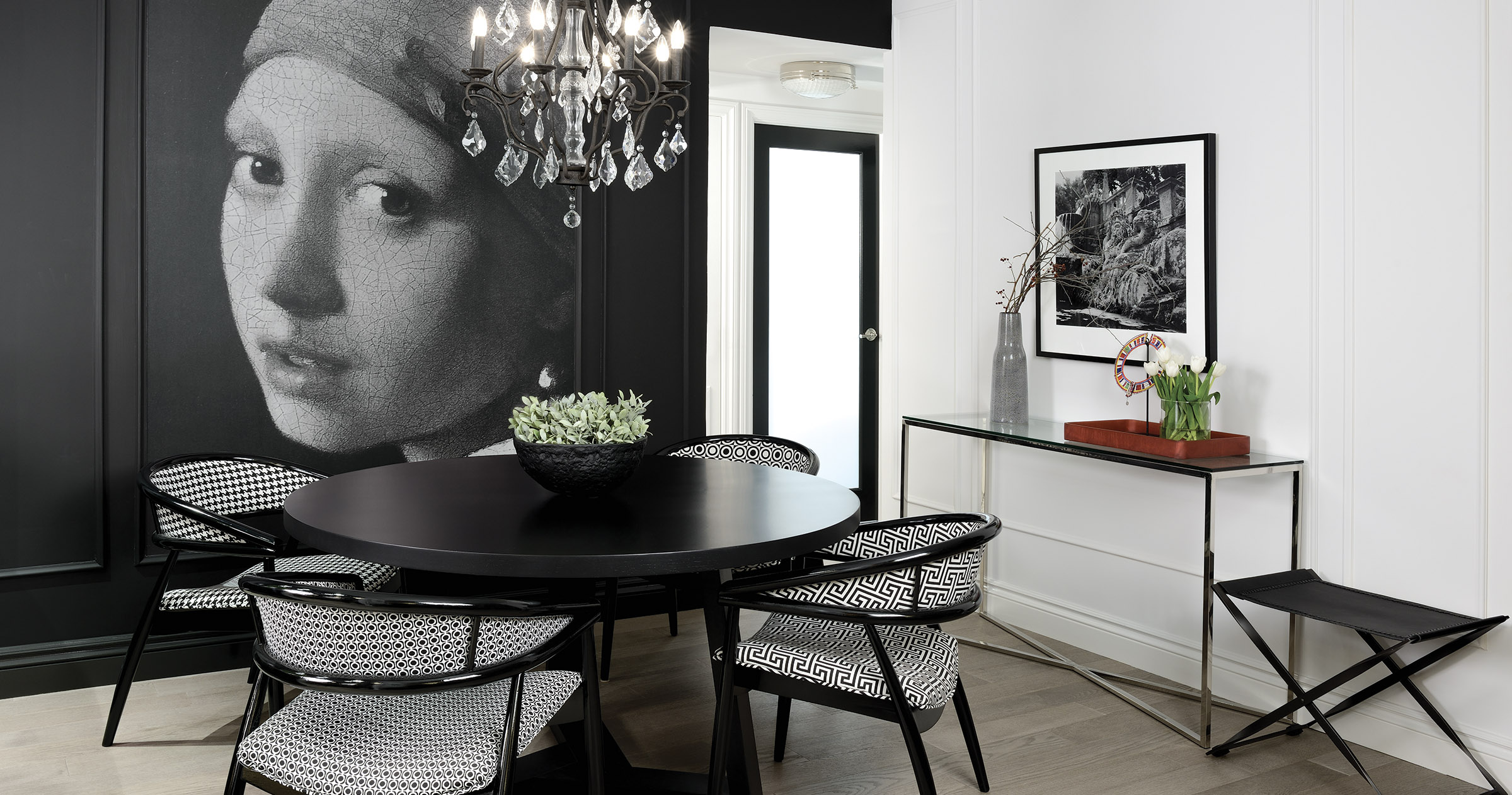
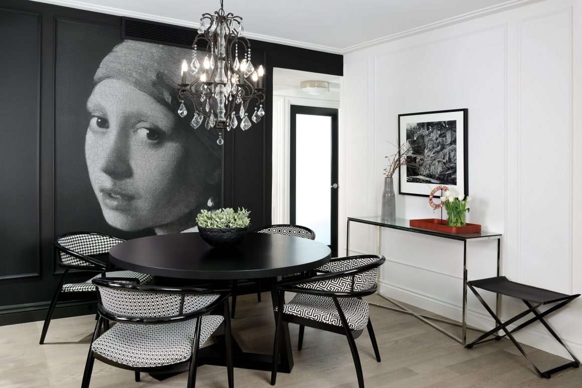
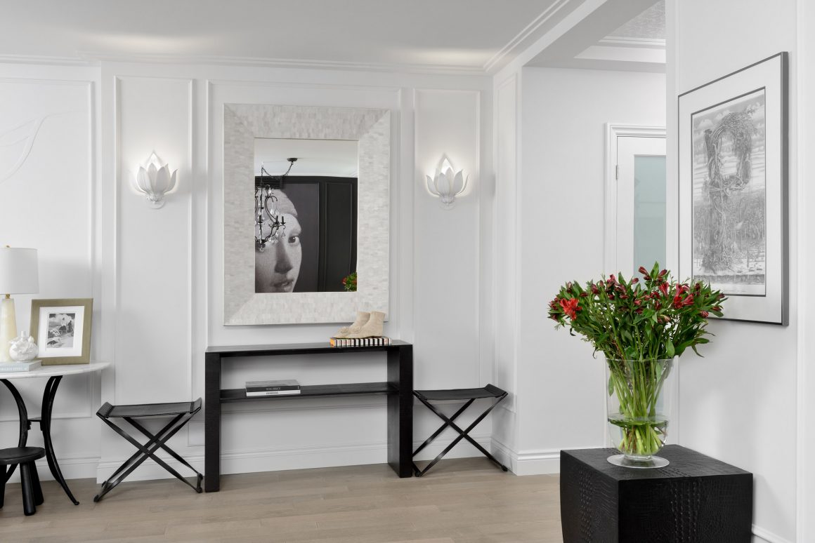
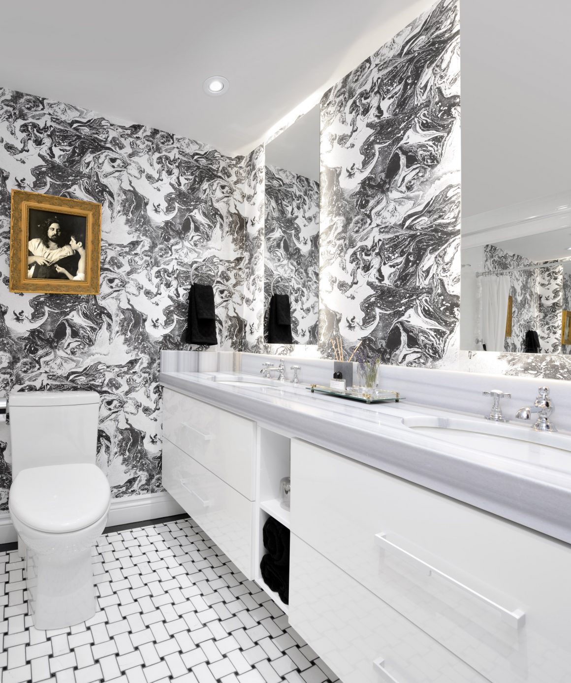
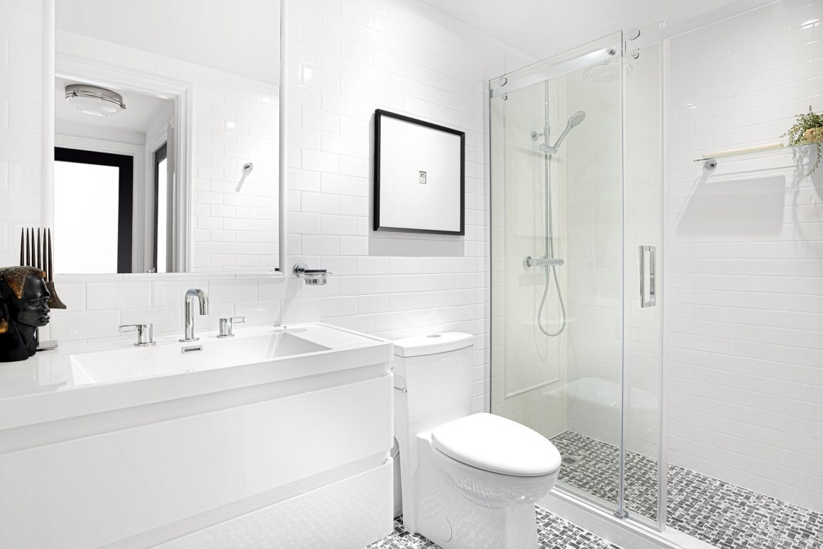
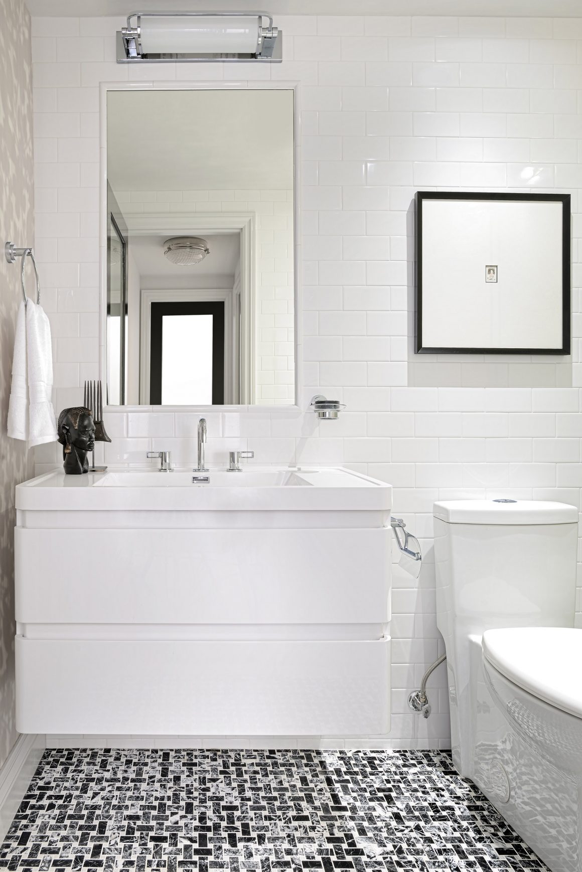
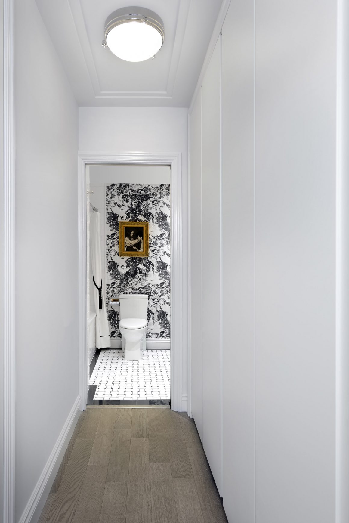
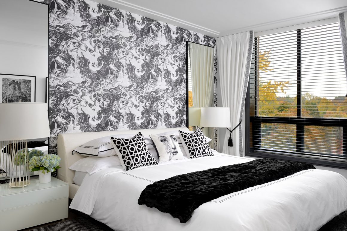
The look of the space started with one central theme, which she stayed with in every room except one. But how it played out on the walls, ceilings and floors took on a multitude of artistic dimensions. “When I bought this place, I challenged myself to do it in black and white, Tryaskina says. It went with what she called the “elegance and timelessness of this older building.”
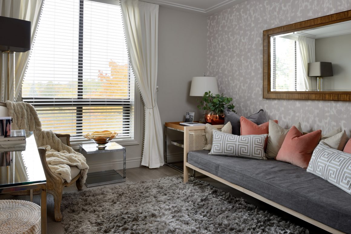
The only exception would be the guest bedroom, which would have “a safer colour scheme.”
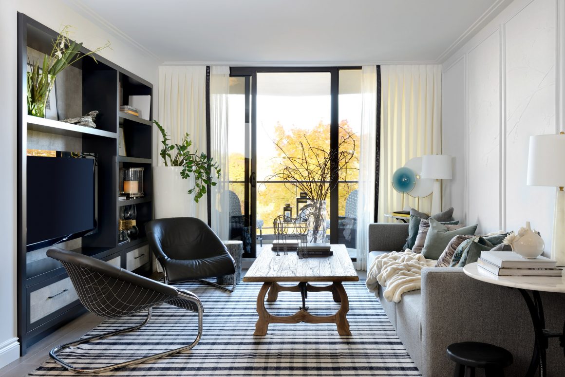
The result is a daring and dramatic look that holds a few surprises. “I just liked the contrast. I liked the sharpness. It’s luxurious and elegant. It has a high-end hotel feel,” she says.
Perhaps at the top of the list of dramatic moves was the use of a mural in the dining room. Featured on a black panelled wall is part of a reproduction of Dutch painter Johannes Vermeer’s classic work, the “Girl with a Pearl Earring,” which dates to 1665 and is considered one of his masterpieces. The crazing of the work, its size and its character dominates the wall and, in fact, the room. The contemporary look is all in keeping with Tryaskina’s black and white theme. The effect is singular.
The designer says she had to play with selecting only a portion of the painting, to see how it would be displayed on the wall.
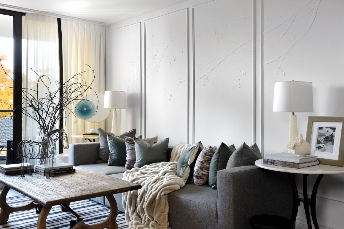
Another unique feature, albeit more subtle, which offers another dimension of surprise, is found in the living room, where this time a white wall is given a special artistic three-dimensional treatment.
Tryaskina applied a sculptural application to the wall. Here she drew Japanese-style branches diagonally across the panelled sections of the wall, with the image stretching from one panel to the next. She then had artist Anthony Valin of Rustik Design apply plaster to the drawing, tracing the details of the sketch. In a studio, he created plaster flowers that were added to the branches. When completed, the entire wall was painted.
“I asked that it be very, very low relief, very close to the wall,” she says. “And then he sprayed it with the same colour as the wall. It was white on white, the effect creating subtle shadows. He created such a beautiful piece of art. I had worked with Anthony on a previous project, and after that experience, I wanted to use his talent again.
“This is my favourite piece in the entire space,” Tryaskina says. The wall treatment “takes the room to a totally other level.”
The black and white theme dominates the bathrooms and master bedroom, where the same wallpaper dials up the drama.
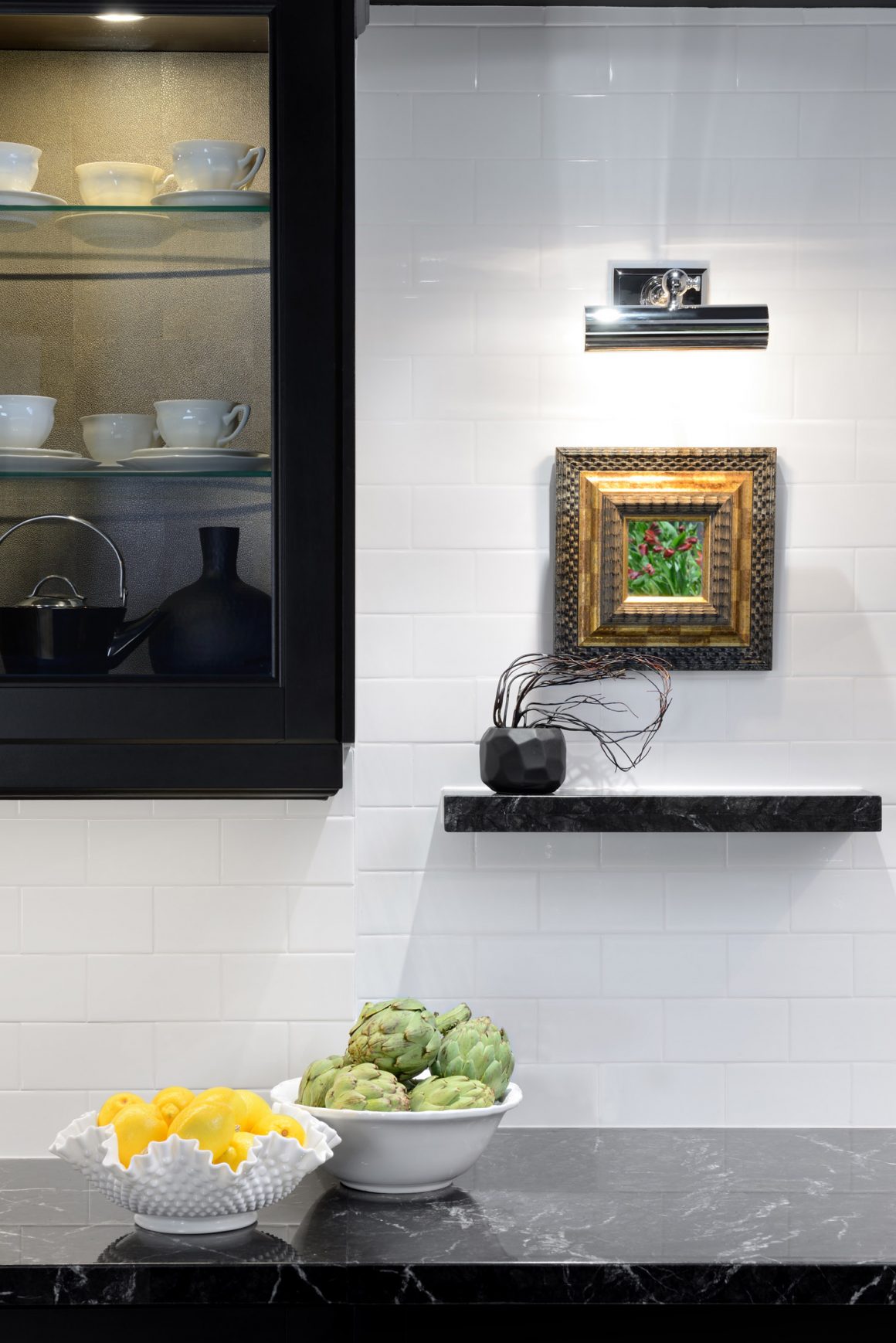
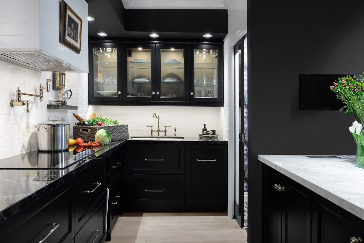
In the kitchen, the black and white theme is perhaps the most dominant, where the black ceilings with white cutout sections and black cabinetry set the tone. Along the wall, black countertops play off the white subway-tile backsplash, while the white surface of the island further adds to the contrast. And throughout, artwork adds a touch of classic sophistication in an unexpected setting. Framed pieces are found on the range hood and under the upper cabinets.
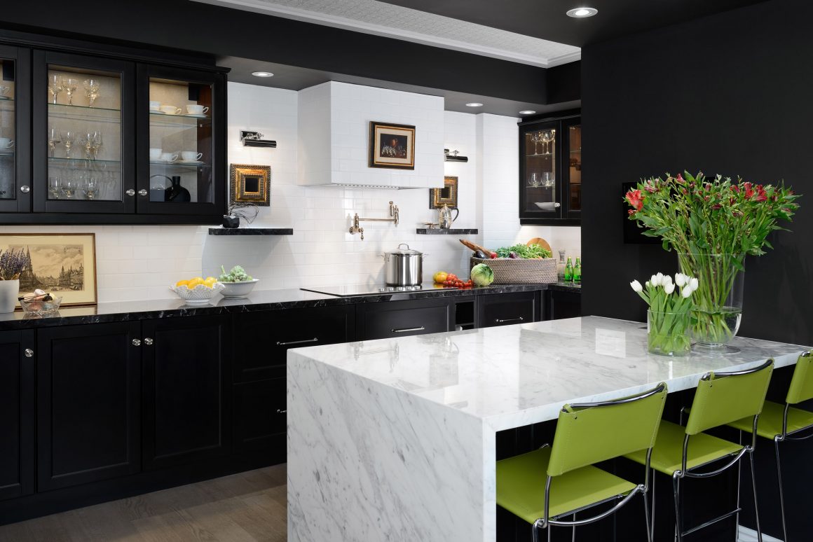
“Basically, I had to work with every square inch in the space: ceilings were brought down in the kitchen, switches were moved,” she says. “I don’t want to see switches. I don’t want them to interfere with my art.”
In fact, ceilings were dropped in some areas of the condo to accommodate a new lighting plan, and raised where possible.
And then she had to walk away, leave the home she had designed for herself.
“It was a difficult decision because I liked it so much,” she says, with an ever-so-slight tinge of remorse in her voice before she catches herself. “It’s done, and I am moving on,” she adds as she shifts gears with a more confident tone. She is currently redesigning her new home, she says, in black and white. •
Estee Design Inc.
www.esteedesign.com
416-827-4220


