Photography: Valerie Wilcox
Styling: Natalie Venalainen
Life in the city usually means living in proximity – often very close proximity – to one’s neighbours. If you need more space but like your home and don’t want to move, what do you do? You build up – which is exactly what the owners of this rowhouse in Toronto did.
In their two-storey house, which had two small rooms making up a tiny third storey, the owners didn’t have a true master suite, so that was on their wish list. The husband also worked at home, with his office in one of those two rooms. A better office was definitely on the list.
Designer Keith O’Brien provided the couple with an expanded third floor that now covers the same area as the floor below. It contains the master bedroom (11 feet by 16 feet) and bathroom (9.5 feet by 10.5 feet), two walk-in closets, and an office. In short, the entire third floor is a suite for husband and wife.
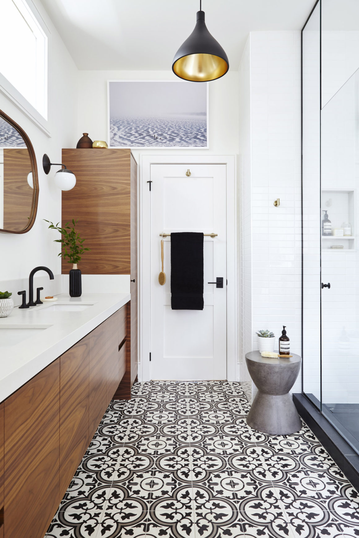
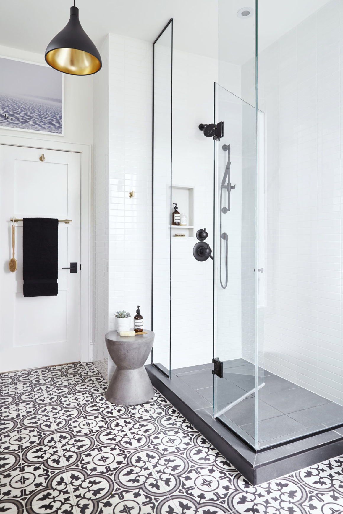
When it came to interior details, “the aesthetic was decided from the get-go. The floor tile was the major driving factor in the bathroom design,” says Natalie Venalainen, senior designer in the interior design department of Men At Work Design Build, which oversaw the transformation of the space.
“The husband and wife are in creative fields,” Venalainen says. “They are pretty decisive. They made decisions quickly and they knew what they wanted.”
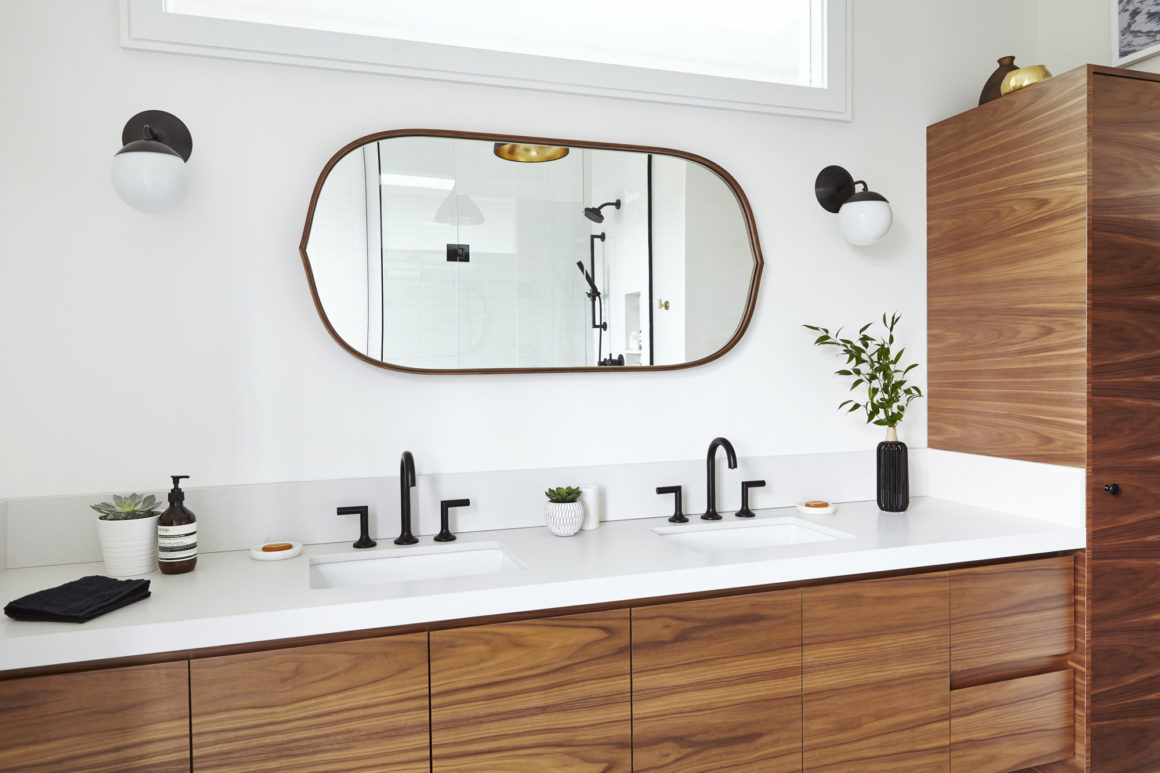
With the concrete floor tiles being such a strong presence, homeowners and designer dialed down the impact of the furnishings for both the bathroom and bedroom. The long bathroom vanity and the linen tower were custom-made by Allwood Carpentry Manufacturing and finished in walnut veneer. The countertop and backsplash were clad with Caesarstone quartz in the Fresh Concrete colour.
The sleek furniture, an intriguingly shaped mirror above the vanity, and the globe sconce lights on each side give the room a hint of a Mid-century Modern aesthetic. “I think the mirror plays off well with the globes and the pendant lights,” Venalainen says. “There’s a bit of tension happening.”
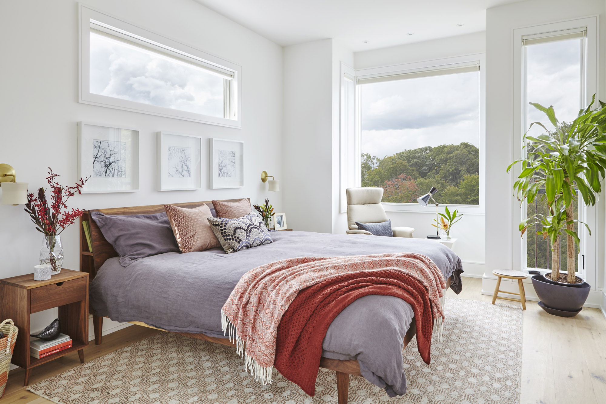
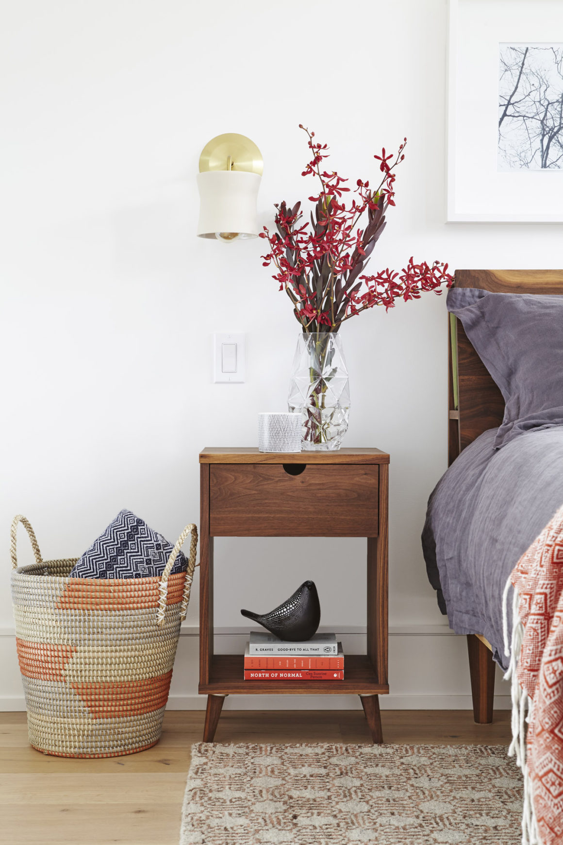
The mid-century vibe is carried into the bedroom, too. The handmade bed and pair of night tables in walnut were custom-made by Objets Mécaniques. They are clean-lined, unfussy. Since the bedside tables have a relatively small top surface, Venalainen opted to use wall sconces rather than tabletop lamps for lighting.
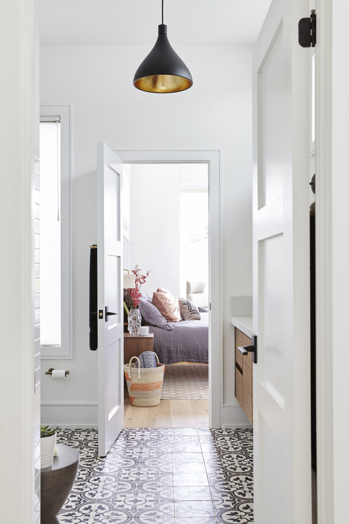
A rug with a subdued geometric pattern doesn’t clash with the bathroom tiles visible from the bedroom. The rug’s subtle orange tones reference the walnut furniture, and the bedding in purple and mauve is a quiet colour complement. A comfortable chair in a neutral beige colour makes for a reading nook by the large window.
“That reading nook is about bringing light in,” says Venalainen. Because the row house has no windows on either side, except in a jog down the wall against which the bed is placed, the back window is as large as possible. There is a transom window above the bathroom mirror that captures light from the hallway skylight. A similar transom above the bed provides light from the jog while ensuring privacy.
The number-one element at the top of her clients’ wish lists was “We need more light,” Venalainen says. “Natural light affects daily mood so much. One common thread throughout all our projects is natural light. It makes this space so much better.” •
Men At Work Design Build
www.menatwork.ca
416-763-0763

