
BY CHRISTINE McLAREN / PHOTOGRAPHY ROGER BROOKS
There is an art to designing a modern home that fits into a suburban neighbourhood of classic 1950s bungalows, a home that stands out from its neighbours without being awkwardly conspicuous.
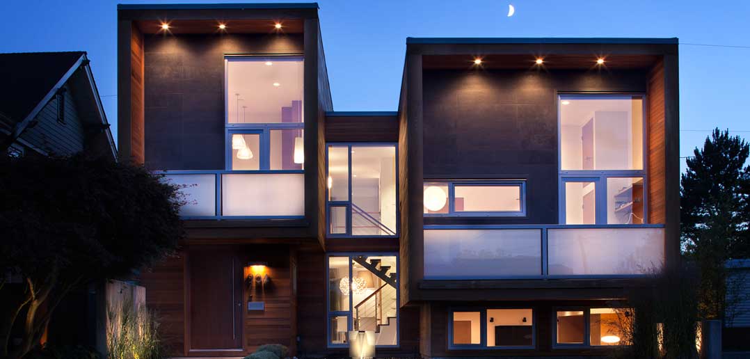
Architect Randy Bens has mastered that art. The proof is in New Westminster, on a quiet side street on the border of the Victory Heights and Massey Heights neighbourhoods.
With its bold exterior design of two simple, asymmetrical boxes, this home is unquestionably contemporary. But the secret is in the materials: a wrap of warm, clear-stained cedar siding with soft basalt insets that lends the place a relaxed, welcoming and distinctly West Coast look, and puts it right at home in the traditional neighbourhood.
“The geometry is really strong and bold, and if you use commercial-grade materials on designs like that, it sets a mood for the house that is maybe a little more minimal and sort of commercial,” says Bens. “It moves it a little too far away sometimes from the traditional idea of what a house is, and that can be problematic sometimes, especially for the neighbours. So the use of the cedar and stone was to bring a more human element to the strong geometry. The materials are contextual, but the design is unique in the area.”
The homeowners, a couple, couldn’t be happier about this. When they gave Bens creative freedom, they had envisioned building a concrete house, “but it just simply wouldn’t have worked here,” the wife says. What they got instead was a modern house “that really feels like a home.”
The use of natural materials to achieve this effect doesn’t stop at the façade. Honey-coloured rift-cut teak cabinetry in every room is a warm contrast to the basalt floors and tiling on the 16-foot-high floor-to-ceiling fireplace. Bens also made use of what is perhaps the greatest and most abundant of all natural elements: light.
The homeowner refers to Bens’s windows as “hidden treats” that playfully capture light in unexpected places. One such window, next to the fireplace, is at floor level and is barely two feet high. Its purpose: to send rays of light reflected from the outdoor viewing pond dancing across the living room walls. “It didn’t cost any more to put the window on the floor, but you get a little view of the pool. It makes it feel like the pool is sort of wrapping around the house, and you don’t know where it’s going to end,” says Bens. “Little things like that make it feel bigger and just add a little bit of interest.”
Another long, slender window sits flush with the ceiling in the upstairs hallway, allowing natural light to percolate through frosted glass near the ceiling of the master bathroom’s interior wall. A vertical slit in the home office gives the owners a view of their black bamboo garden out front.
The design was originally intended to be a modern renovation of a 1949 house on the property. So the foundation footprint and a large part of the house still maintain approximately the original blueprint, but a new second storey was added that is cantilevered in two directions. While the main living space and most rooms boast soaring new 16- and 12-foot ceilings respectively, the downstairs family room ceiling measures eight feet, offering “a space to really be a family,” says the homeowner.
Maintaining the original footprint kept the size of the house to about 3,000 square feet, which includes a two-car garage.
Bens worked creatively with the storage space behind the teak, preventing the need for additional furniture. He also included a 1,000-square-foot crawl space, and he lowered the ceiling just above the bathtub by a few feet to create a space on the upper floor to store luggage.
“Sometimes when you have more constraints, it leads to more interesting results. You’re kind of forced to be more creative in some ways,” says Bens. “I think it made a house that we never would have made from scratch.”


