PHOTOGRAPHY AND STYLING: RUTNAISH PRIHAR
Contemporary interior design, many say, reflects the modern art movement. But it was the eye of a photographer that interior designer Rutnaish Prihar brought to the design of her own newly built two-storey home.
Photography has been a life-long passion for the principal at RP Interior Design in Oakville, who also offers clients professional photography services. “Like interior design, it requires an eye for detail,” she explains. “I prefer a contemporary look, and for my own home, I wanted to inject lots of warmth and personal touches so we could enjoy it as a family.”
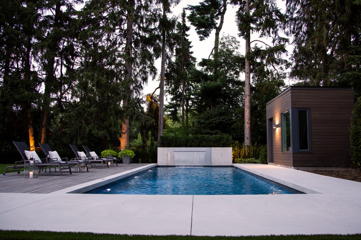
Rutnaish and husband Anoop Prihar found the natural beauty of the property’s Oakville setting impossible to resist. Set on a cul-de-sac, the 100-by-175-foot lot backs onto a wooded area that is part of a lakeside estate. The existing “complete tear down” house was removed to make way for a new 5,500-square-foot home that the couple share with two daughters, Sumeeta, age 21, and Aneesha, 23.
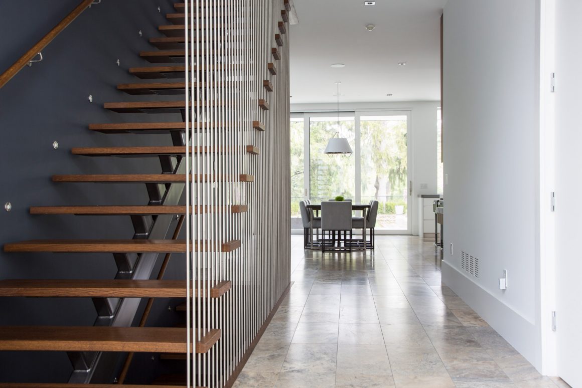
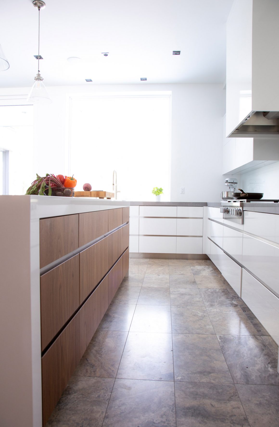
From the front door, the central hallway frames the camera-ready view of the verdant backyard provided by floor-to-ceiling windows at the opposite end. “I definitely wanted that view as a focal point,” Rutnaish says. “Which made the flooring so important as it leads the eye into the heart of the home, the kitchen and family room on either side.” She placed marble floor tiles in a soft grey colour with warm undertones in the hallway, kitchen and dining areas. Most remaining rooms have six-inch-wide oak hardwood planks underfoot. Walls are painted a soft white throughout.
The living room lies to the right off the front entry and connects to a formal dining room. To the left, the main staircase leads to five bedrooms and four bathrooms on the second level.
Rutnaish wanted the main staircase to have an open and sculptural look, and to provide a wow factor. She used stainless-steel dowels to create vertical design interest. Against them are set warm walnut treads on a centre stringer that seem to float in the air. There is also an elevator by the front entrance for the convenience of older relatives when they come to call.
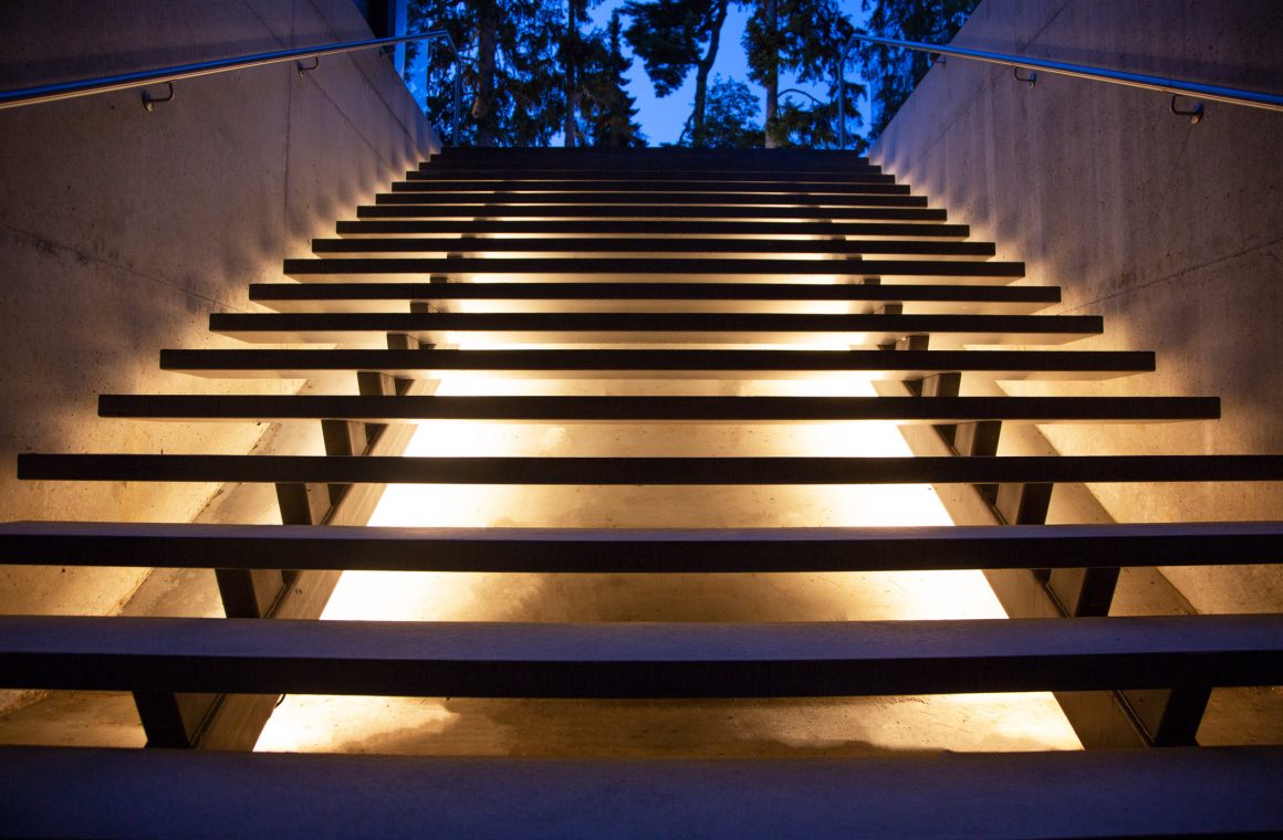
Another set of stairs is outdoors by the pool; it leads to the basement. “I designed it so that when you get out of the pool, you can go to a basement bathroom instead of using the main-floor powder room,” Rutnaish says. “The outdoor stairs float on a sloped concrete wall, supported by two stringers that are anchored at the top and bottom. I had tape-lighting attached to the bottom of the stringers to illuminate the stairs at night, while also creating another design feature.”
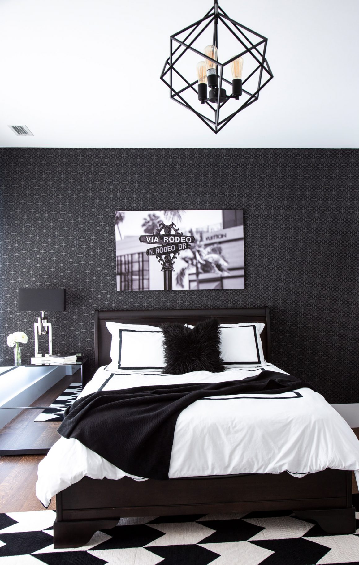
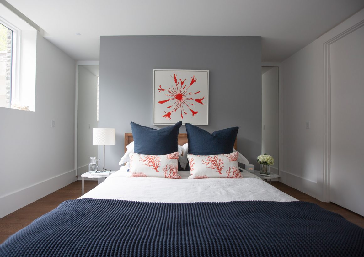
The basement boasts a guest bedroom. And the bathroom that lies off the gym is equipped with a steam feature. There are also a billiard and home theatre rooms on that level.
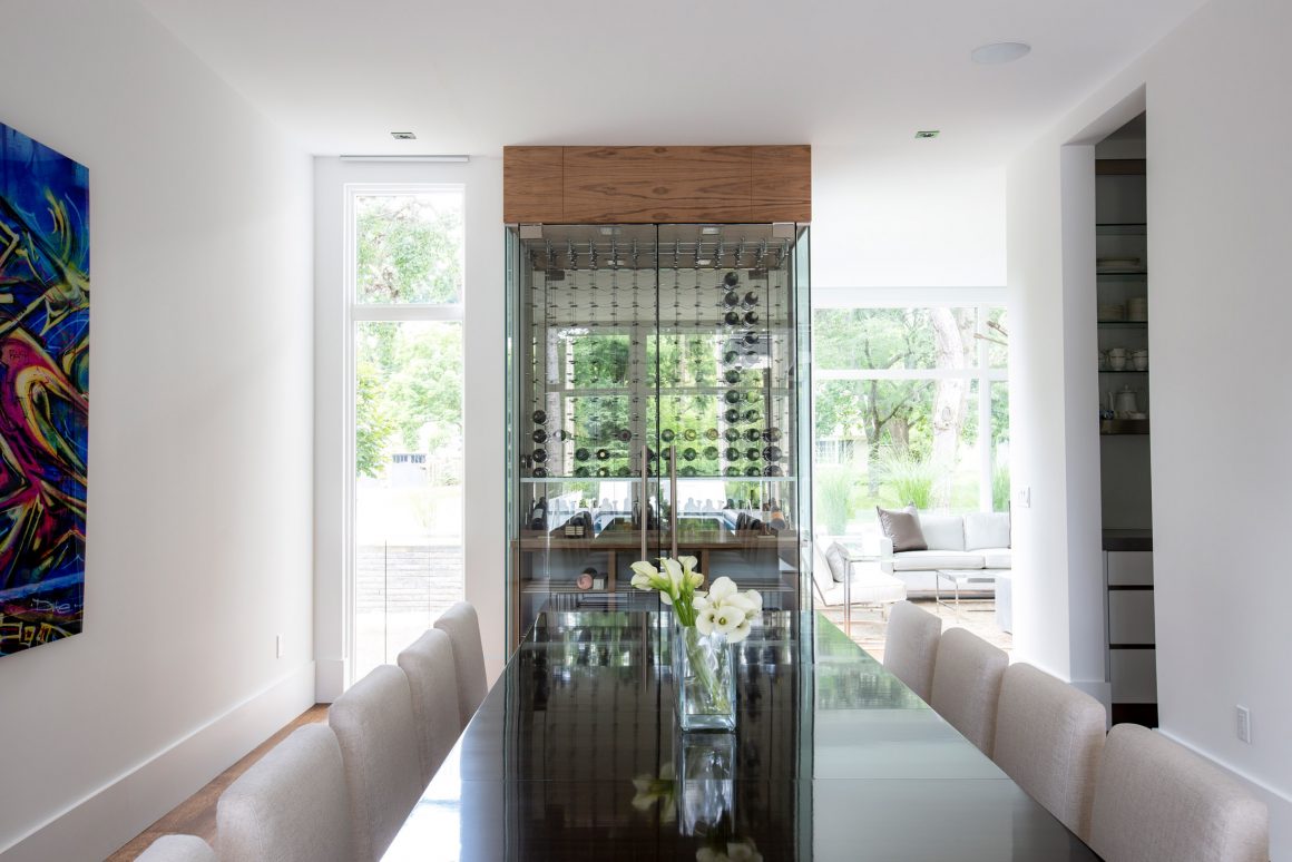
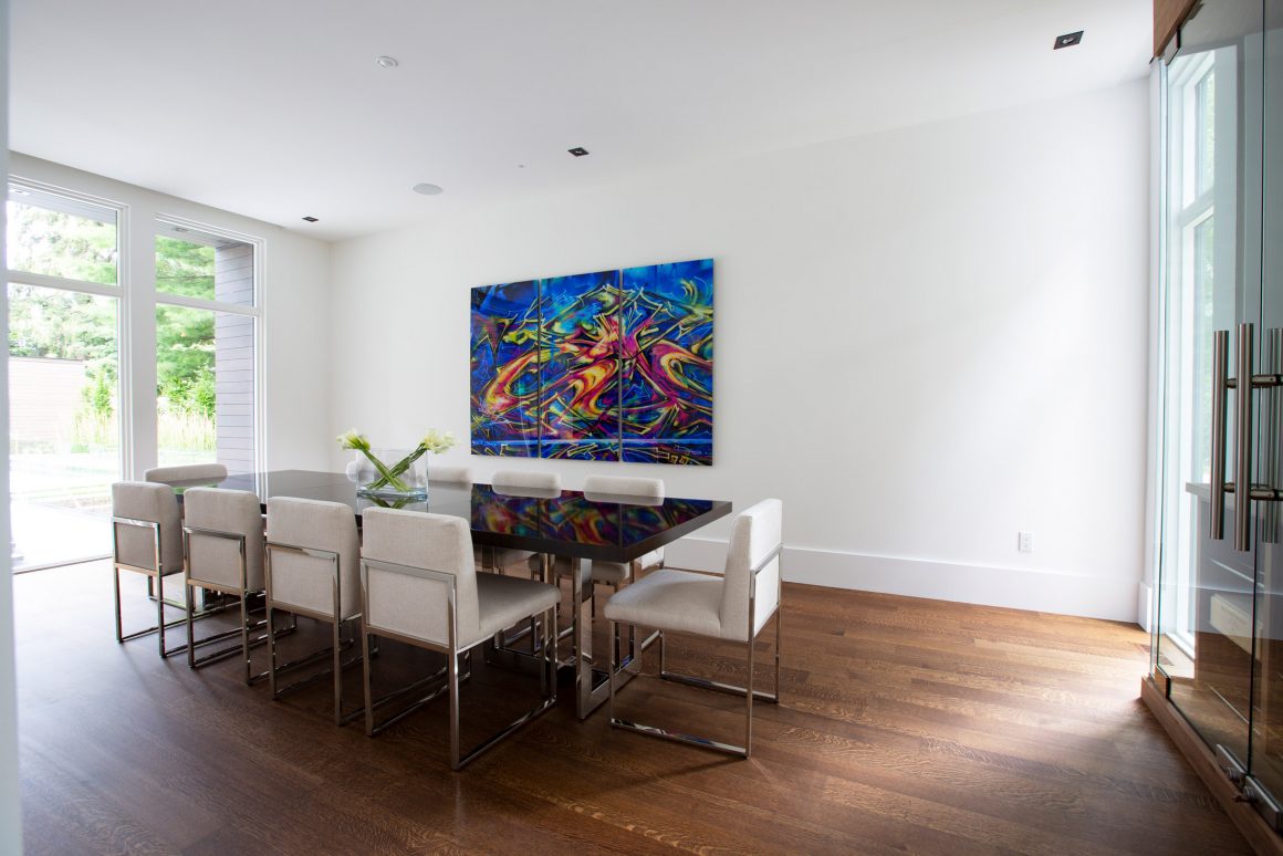
Another unique touch throughout the house is provided by strategically placed artworks, all original creations made from photographs taken by Rutnaish during the family’s vacations abroad. The stairwell’s charcoal-grey walls are lined with shots of New Zealand landscapes printed on sheets of brushed aluminum. For the largest work, which dominates a wall in the formal dining room, the designer enlarged a photo of colourful graffiti found on a street in Melbourne, Australia. She had the image printed on metallic paper and mounted onto three three-by-five-foot panels.
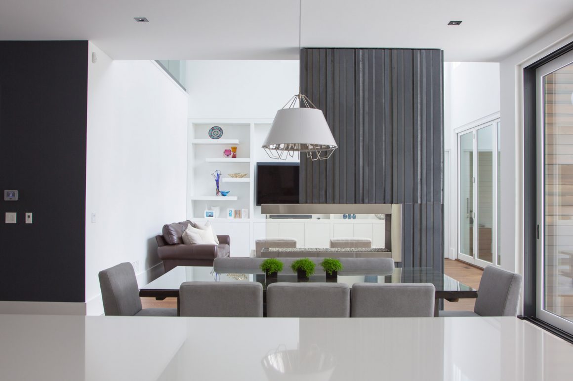
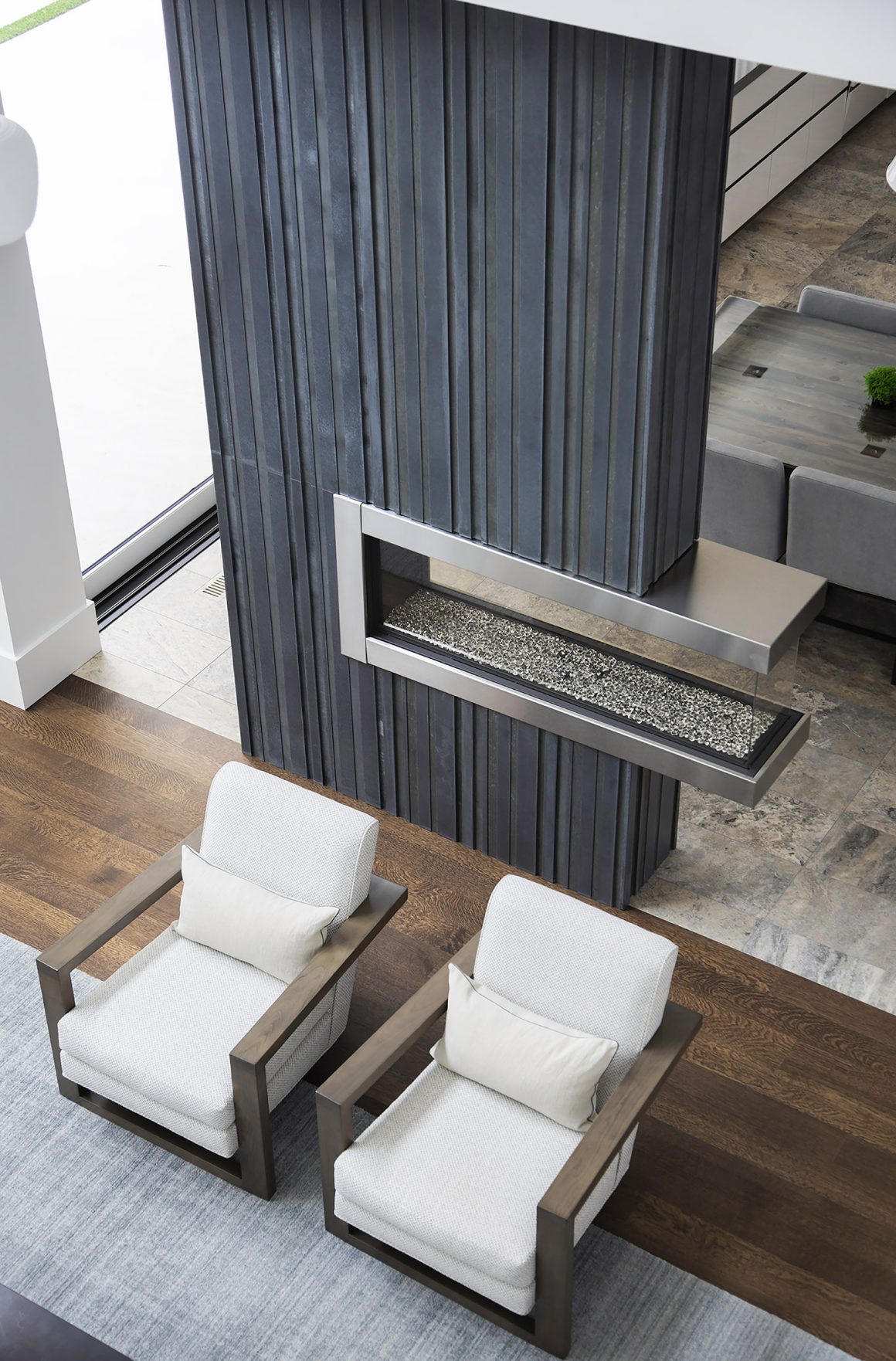
But it is the open-concept kitchen, informal dining area, and family room that the family uses the most. A dramatic feature was added to provide a focal point while defining the family room: a floor-to-ceiling room divider. The inset three-way gas fireplace adds ambience. “I covered it with precast smoky-grey concrete panels,” says the designer. “It gives a beautiful texture and a natural warmth.”
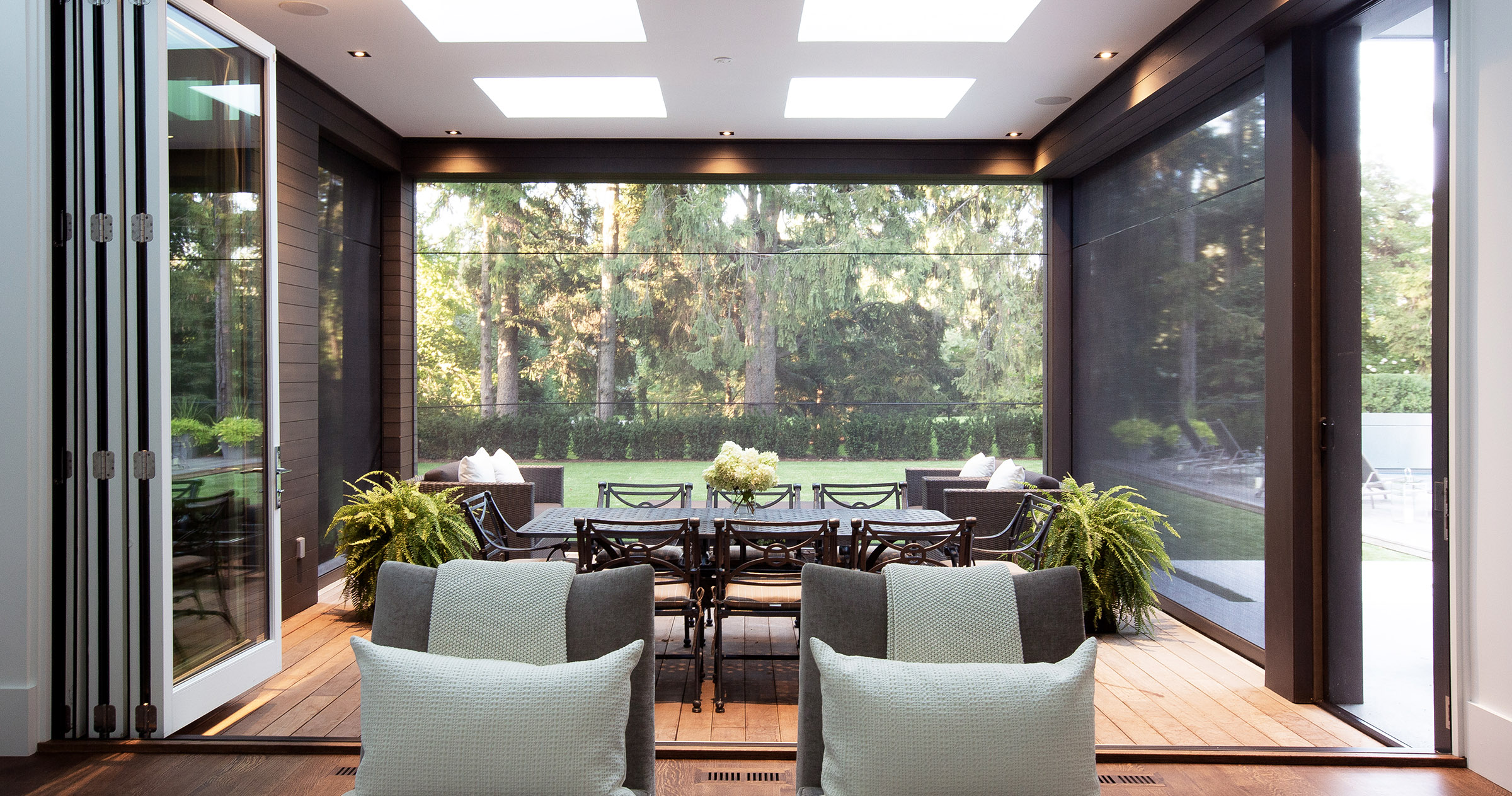
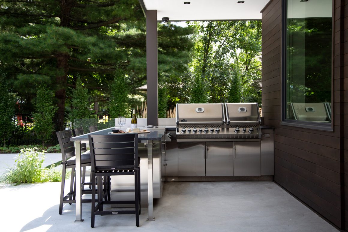
The family room is flooded with light, thanks to four skylights. Bi-folding patio doors open easily, then tuck discreetly to one side, creating a seamless flow onto the back terrace. In good weather, the family can enjoy al fresco dining there. Automated screens slide down when mosquitoes are buzzing, and the family room television tilts so it is visible from the table.
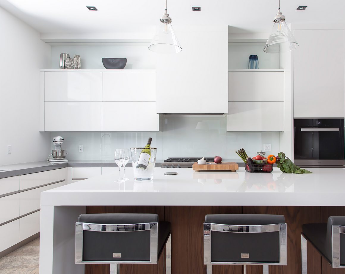
Rutnaish is most often found in the kitchen where she does most of the cooking. The white quartz-topped island is also her favourite place to work; she plugs her laptop into the pop-up electrical outlet. “Many people think contemporary design is cold and stark,” she says. “I find the clean, minimal style of my kitchen very inviting. I really enjoy sitting in it.”
The kitchen’s design all started with a dishwasher, one with a touch-to-open design. Loving the clean latch-free look, she was inspired to run long, linear white lacquer cabinetry, all free of visible handles or hardware. The uppers have touch-latch opening systems, the rich walnut-faced lowers discreet finger pulls. The cooktop and other appliances are seamlessly inset, and the range hood completely hidden behind a panel.
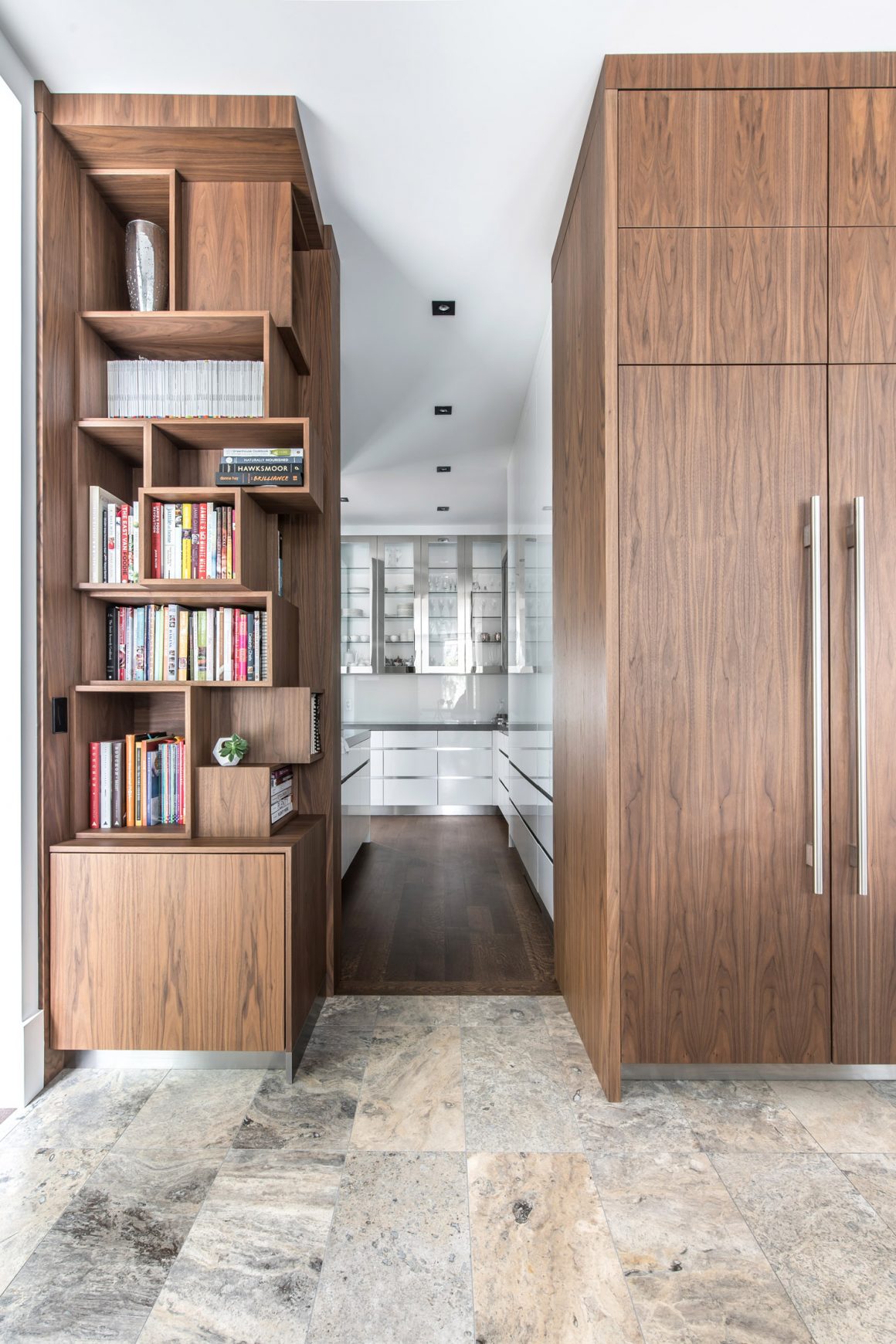
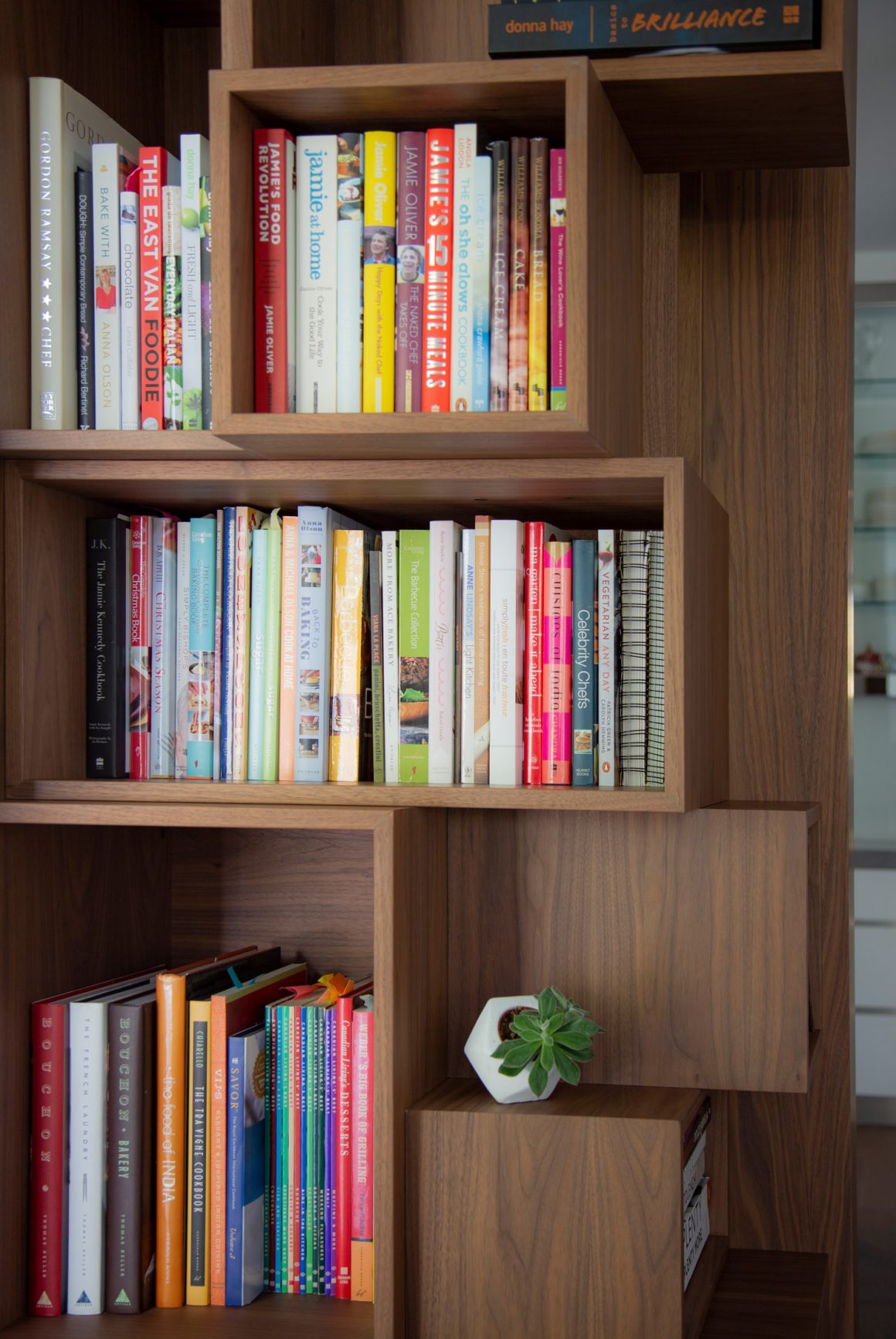
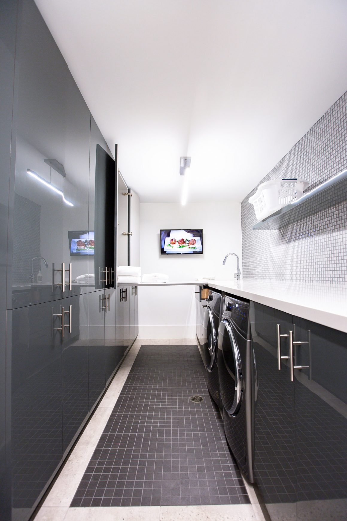
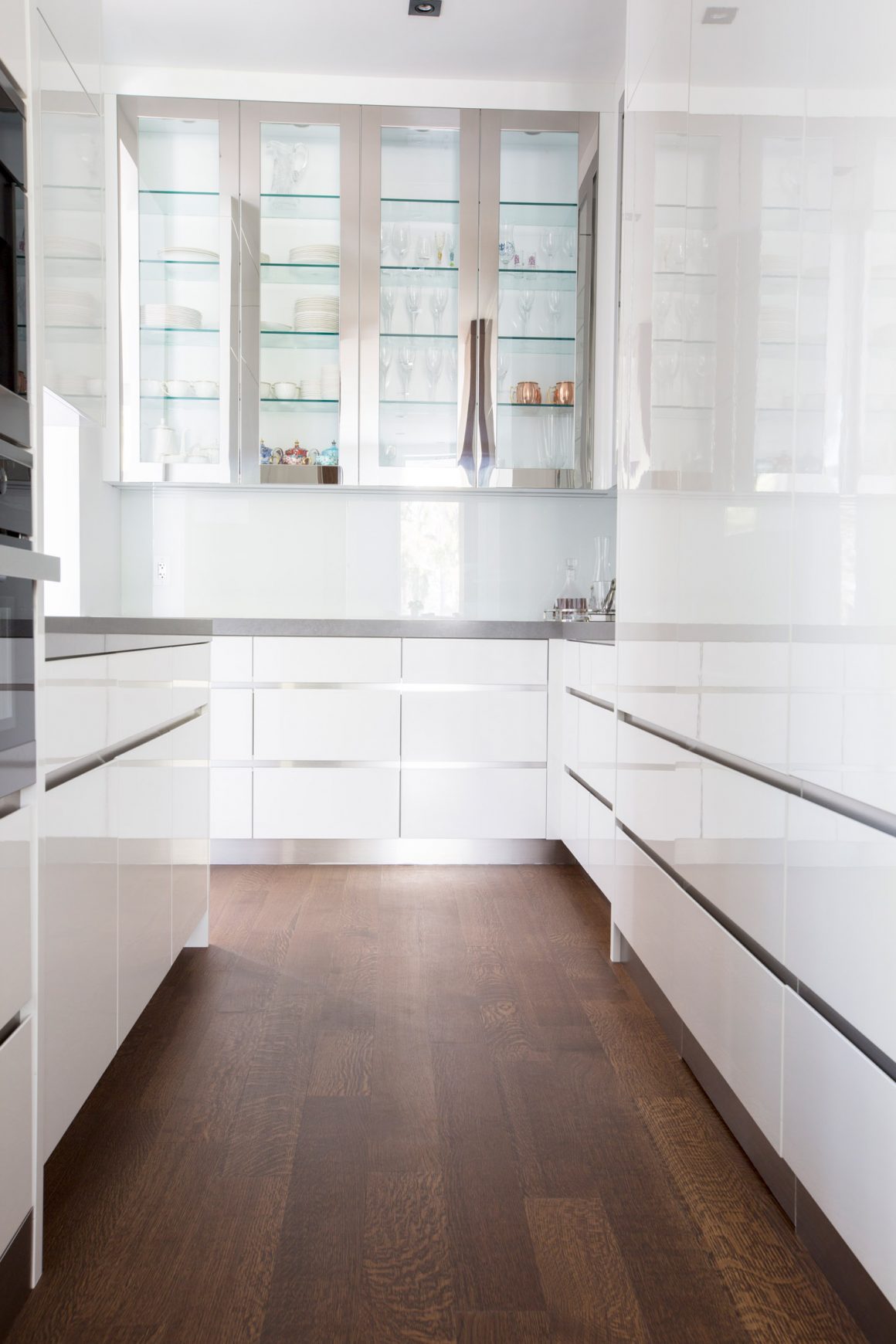
Her home’s many storage options on all floors are the envy of her friends. A butler’s pantry between the kitchen and dining room houses a coffee station and microwave oven. In it is a hidden door that opens to reveal a full-size pantry. To house cleaning supplies and other odd items, there is also a bank of cabinets in the basement laundry room.
For now, Rutnaish enjoys designing projects for other people. She has no further improvements planned for her home, no urge to tweak the design. “I’m still happy with the results,” she says. “I want to stay for a while; it really is home.” •
RP Design
www.rpinteriordesign.ca
416-727-5817

